Gucci has stayed exciting and industry-leading in popular culture during a period where others are struggling to stay relevant. In the luxury fashion industry, brands have been slow adopters of utilizing innovative digital solutions and experiences to connect with consumers. Gucci however, buck that trend in a big way.
Back in 2019, Gucci brought video games to its app with a new section called Gucci Arcade, inspired by creative director Alessandro Michele’s “unique ability to combine the past with the present, using contemporary technology to tell stories in an eclectic and pioneering way”. Inspired by vintage video games from the 1970s and 1980s, Gucci Arcade allows players to immerse themselves in worlds inspired by House prints, motifs and codes. Not one to settle for (already) award-winning games, Gucci asked us to raise the bar.
A fun, dynamic game with multiple levels of increasing difficulty.
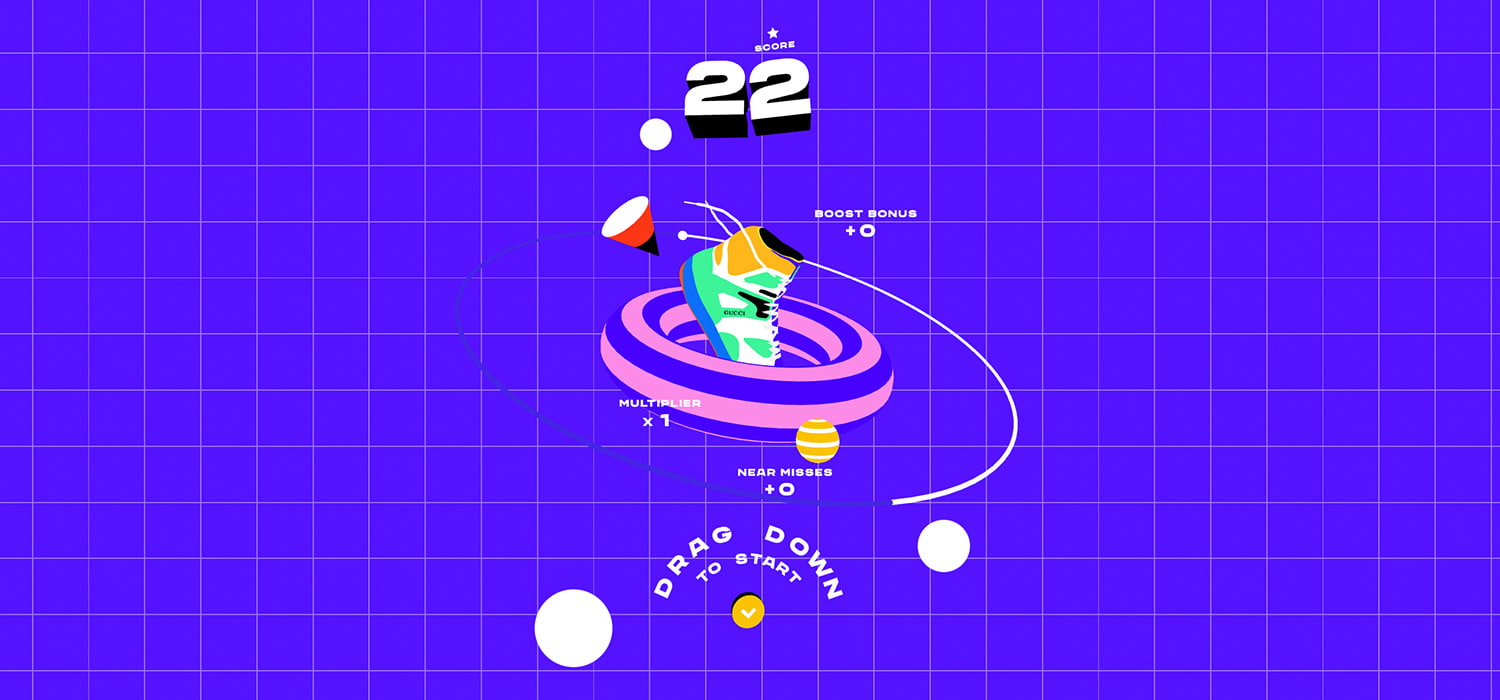
We were asked by Gucci to create a new game concept to launch the new Gucci Basket sneaker, and to do this, we created Gucci Burst; a fun, dynamic game with multiple levels of increasing difficulty that created a splash online and further propelled Gucci into leading the way in luxury fashion digital.

Intro animation of the Gucci Burst logo
The sky’s the limit
It’s not often clients come to you with a brief as open as this. And even if they do, they themselves tend not to be as open as the brief. But in this case, Gucci allowed us complete creative freedom. From the very beginning, we committed to close collaboration and openness, allowing us to show our process and thinking the entire way through the process. While the creative freedom excited us, this also posed a challenge in being able to nail down a direction. So, we approached this one small step at a time, imposing our own parameters to make progress.
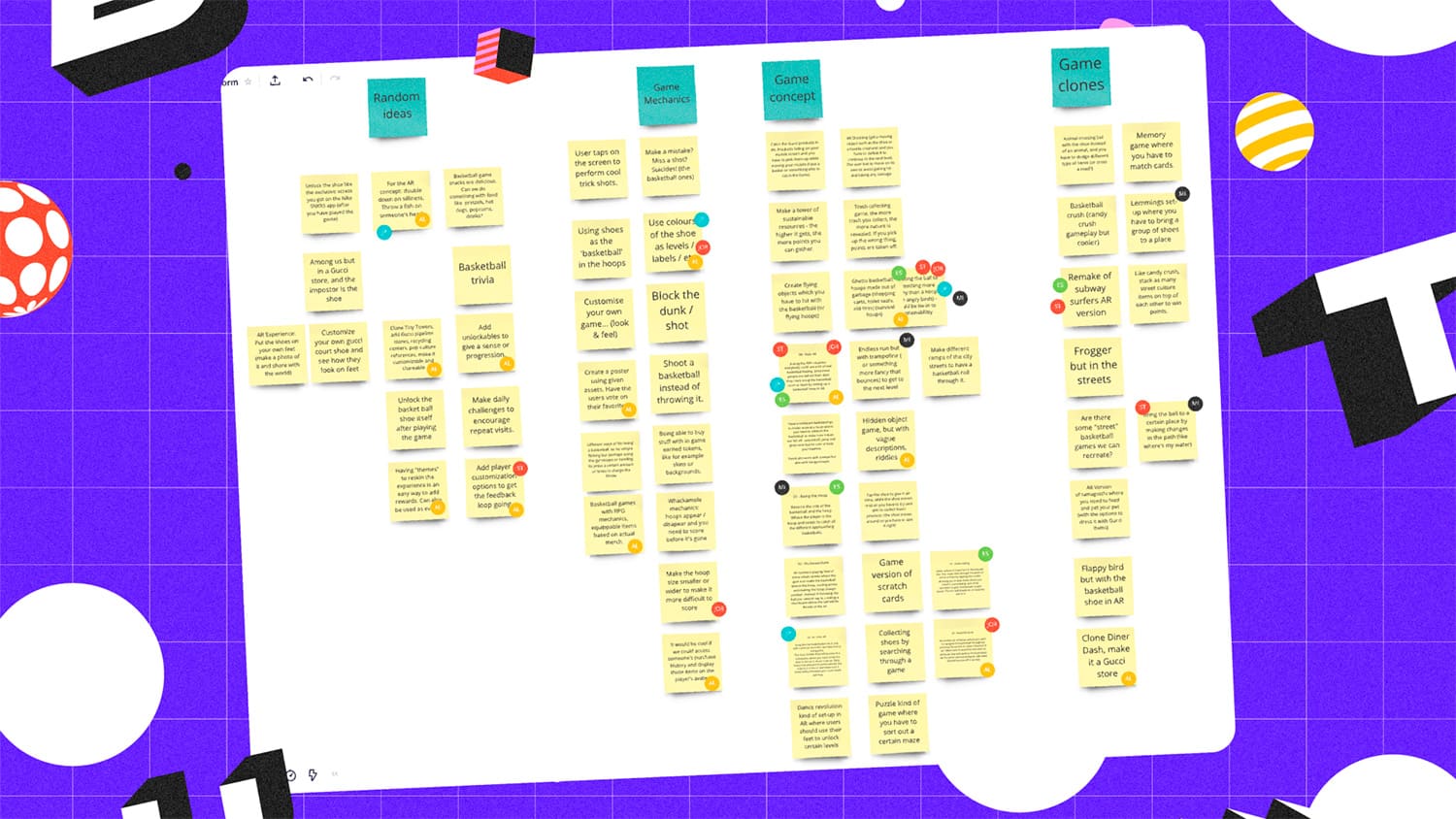
We began by defining a theme. As the sneakers were inspired by basketball, we agreed that this would inform the gameplay. Once this was defined, we had brainstorming sessions, to explore the possibilities for games that could feature basketball themes, whether that be through the gameplay, design direction, or assets.
We whittled the gameplay concepts down to three, detailing key features of the gameplay, providing creative references, and additional features we’d include, like boosters.

After discussing the concepts together with Gucci, we landed on a route, which drew from different elements from a few different concepts. An endless runner game with multiple levels that would increase in difficulty as you played, incorporating elements like power-ups, slow motion, and multipliers.

Mobile display of gameplay
Memphis design direction
So, we had the game concept nailed, but no idea of what this would look like. Earlier on in the process, when discussing the wider campaign around the Gucci Basket launch with the Gucci team, they spoke of a physical pop-up store that would be launching alongside the digital campaign.
We were also able to take advantage of a style that mimicked 3D with certain elements, but allowed us to use 2D.
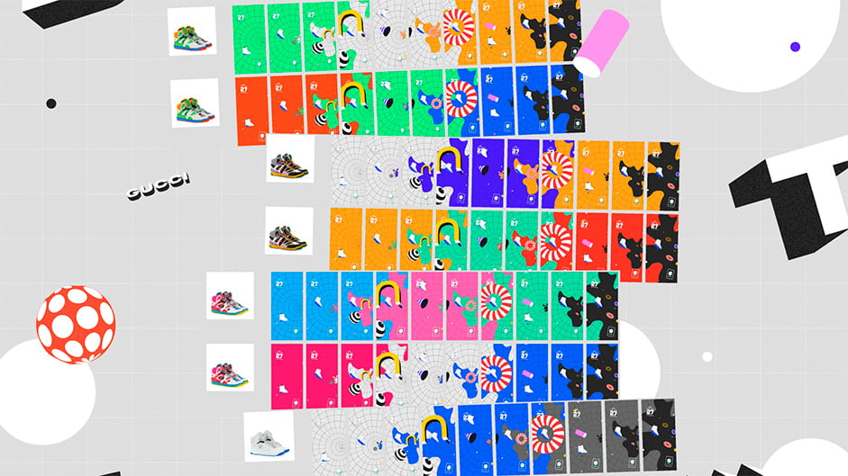
This physical extension of the campaign had beautiful, bold decor, inspired by Memphis design, so we decided to align the digital experience with this. The bold colours of the shoe were reflected in the experience itself, with each level of the game coordinating with a primary colour of the sneaker. Through using the Memphis design direction, we were also able to take advantage of a style that mimicked 3D with certain elements, but allowed us to use 2D.

Ambition vs. Time
“If we just had one more week!”. We’re sure anyone reading this can relate.
Remember when we mentioned the fact that the Memphis style direction was perfect because it allowed us to mimic 3D while using 2D elements? Well, originally all objects you see in the game were intended to be flat, but in a 3D environment. A week and a half into development, we came up against some issues with this. Collisions between the sneaker and the objects were not registering correctly, as well as masking objects at the right time. Ultimately, we weren’t achieving the right feeling of depth with this solution.
This meant we had to pivot our asset style from 2.5D to full 3D, to remove those pesky development obstacles. In the end, the objects were pretty simple to recreate in 3D without impacting performance, so it was a win win.
To keep the client in step with us, we used sprints in an agile approach, which allowed us to pivot quickly. Especially useful in situations like us figuring out that the 2.5D asset approach wouldn’t work.
Process Innovation
There were two new ways of working that we established throughout the process of creating this game.
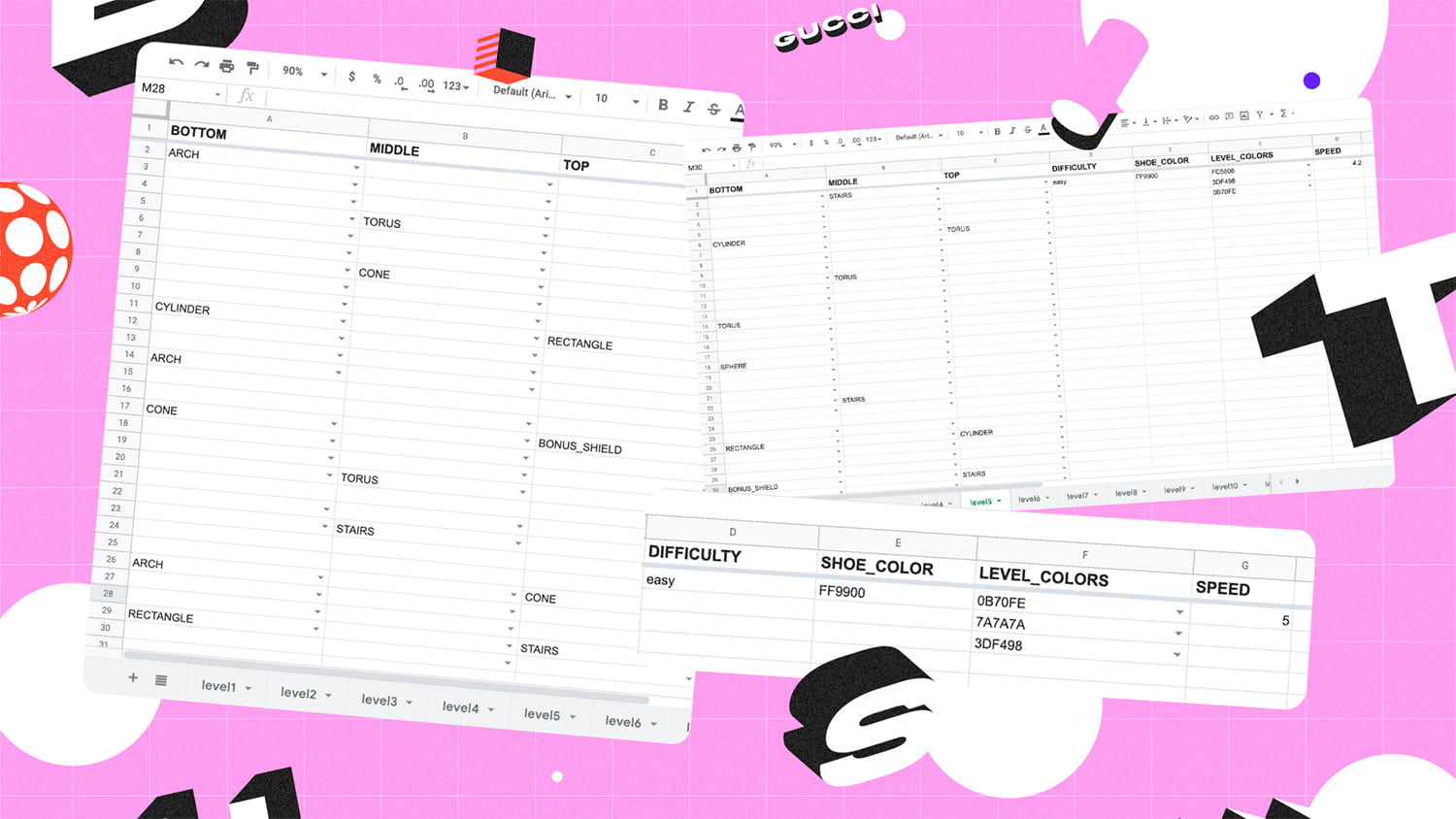
The first, was that we utilized a lesser known technical solution (good old Excel spreadsheets) to lay out the rules of the game, which were then ported into the game itself.
We created a structure whereby each page represented a level of the game, and each column was used as a structure for the three lanes where the shoe was able to navigate in the game (top, middle, and bottom). Rows were utilized to represent each space or obstacle that needed to be shown.

We then used the Google-sheet API to transform that sheet data into an easily manageable layout to build the Three.js obstacle system. This allowed non-developer team members to collaborate closely with developers throughout.
Secondly, the motion design was less of a motion example that our developers would recreate. Instead, we used the actual motion file in the game, meaning we shifted our iterative approach from development to motion. We created the animation in 3D software and exported it to a file, which could be directly used in development with barely any tweaks. This meant the development team could focus more closely on gameplay rather than spending additional time figuring out how every single transition would be built, and allowed for greater flexibility throughout.
A bit about Tech
As we began with a 2D approach to this project, our first port of call was to take a look at all those ‘old-fashioned 80’s’ games on the web that were made in plain canvas. Initially, we thought we could take this same route using Pixi.js a well-known library that allows you to create beautiful and immersive 2D animated graphics.
We wanted to push this further and experimented with a 2.5D technique, something called isometric projection. This look was achievable using the 2D-projection tiling plugin from Pixi.js or another less common library called Travisojs.
The third and final option, Three.js, turned out to be the most suitable, and pretty performant for a mobile-first game. Three.js is one of the most widely used and renowned JS libraries existing that uses the power of WebGL.
The Hyperboloid’ makes the perfect backdrop for gooey WebGL animations.
And we couldn’t end this section without talking about the Hyperboloid. Something that you’ll only understand through taking a peek behind the scenes of this project, is how we used a strange background shape to create this game. We used an entirely different shape, affectionately named ‘The Hyperboloid’ which was used to convey the speed of the game, mimicking the aesthetics of a space warp tunnel. It makes the perfect backdrop for gooey WebGL animations.
A developer's 'zoom out' of the creation process and how collision works
Conclusion
Gucci Burst is one of our favourite projects in the history of Superhero Cheesecake to date. It taught us that teamwork and close collaboration between all members is the key to creating something awesome. It never ceases to amaze us what you can achieve on a tight schedule, with a collaborative client, and a collective drive and ambition to raise the bar.
Company Info
Superhero Cheesecake is a global, award-winning creative digital studio based in Amsterdam. We create industry-leading interactive experiences rooted in craft and driven by tactical thinking, for creative minds at modern brands.
Check out more of our work here. Or better yet, come by for a beer. It’s on the house.
