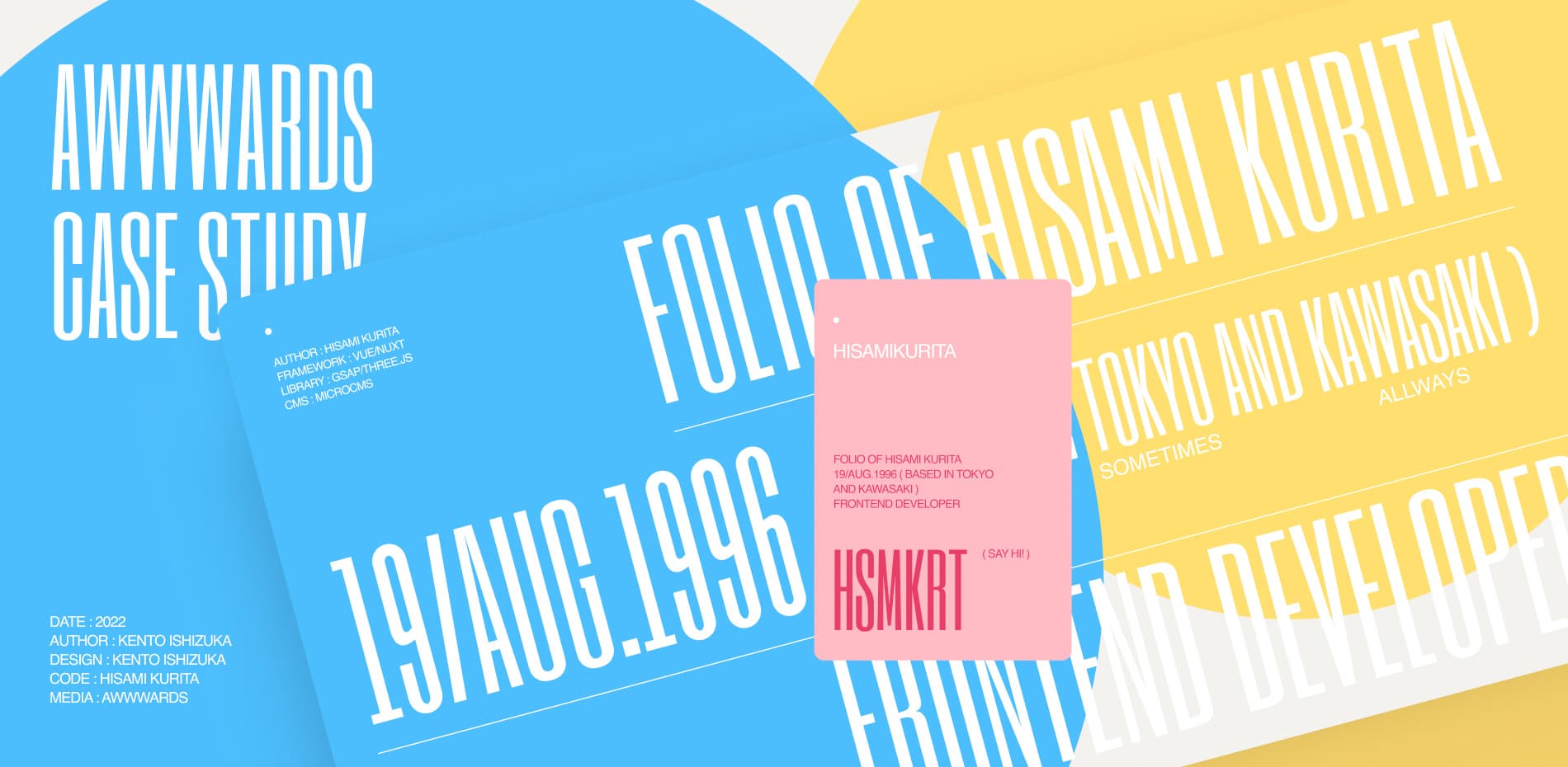
Hisami Kurita is a front-end engineer working for LIG inc. Since the impression of him from both inside and outside the company was very different, we created this site to properly foster an image of him.
Although he is very active on social networking sites, especially Twitter, there is a gap between Hiami's actual image and that of LIG employees. We created this site in the hope that it would fill in these gaps and correctly form an image of him as he should be, regardless of his position.
We worked remotely to direct the design and animation, and just prior to the release of the site, we worked face-to-face to direct the microscopic interactions, including detailed easing in the interaction section, and were able to release the site in June 2022.
Design points
BRAND DNA
Hisami Kurita’s image inside and outside the company was somewhat different, and there was a side to him that had not yet been revealed. He is energetic on social networking sites, and if you read his posts , many people would get the impression that he has a "childlike spirit. On the other hand, in addition to his "craftsmanship," he also has a "spirit of challenge. I can proudly tell you that I know his personality, as I have been involved with him on various projects. However, even LIG employees who work with him do not know this side of him, probably because they have not been exposed to his personality directly since remote work has become more common due to COVID-19. Because of the lack of physical contact, many people have not been able to form a proper image of his true nature.
The theme I needed to focus on was how to embody his DNA. I thought about how to express tones such as "childlike spirit" and "spirit of challenge" as well as DNA such as "craftsmanship." I know him well, so it didn't take me long to come up with the general framework. All that was left was to create a website in his true blood and design the image as it is. The key point in this production was how to fill the gap between the external image and his true self, as I knew him. I proceeded with the production based on the following three main points.
The childlike spirit that everyone once had. Interaction and design based on motifs that evoke this feeling.
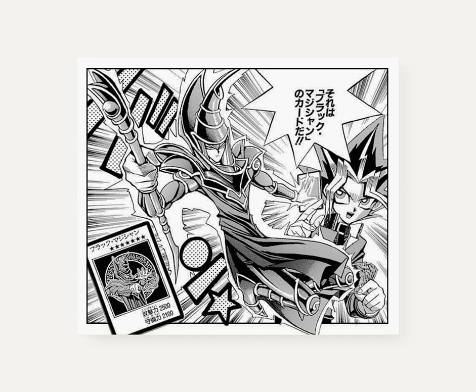
We were inspired by Japanese card game animation to express the "child's mind”. Many children growing up in Japan have the opportunity to experience card games such as "Pokemon" and "Yu-Gi-Oh! They treat their beloved cards with great care, and some may even keep them in their drawers for safekeeping. They would like to be like Yugi, the main character of "Yu-Gi-Oh! Based on this concept, we designed the menu to resemble a desk drawer, while the actual cards themselves are used as motifs in the design to express the "child's mind”.
We tried to give the cards a sense of dynamism in every part of the design. The cards are designed to look like the main character, grabbing the card and cutting it out with great force, or as if the card is dancing. The cards are shuffled in a quick and somewhat familiar way.
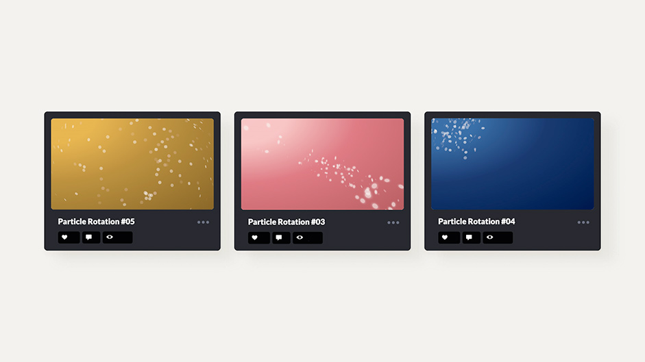
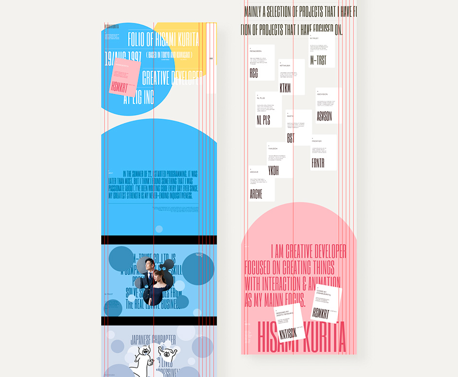
The color scheme is based on his three color schemes, which are based on his animated world, which began with his contributions to Codepen. Other design elements and typefaces were selected to emphasize the fun aspect of the work, while at the same time designing as if to design emotion rather than design as function.
Thoroughness of direction. A design that beautifully coexists pop cuteness and edgy coolness.
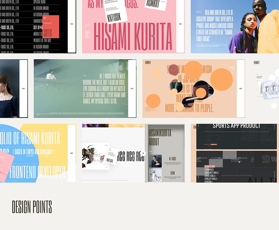
We aimed for a design in which the use of pop, cute colors and edgy fonts and layout coexist in perfect harmony, with no gaps in any part of the design. When designing based on "childlike spirit," many people may imagine a POP tone or a cute tone. However, his DNA has two additional qualities: "craftsmanship" and a "spirit of challenge.
In order to create a website with his true blood, we designed the colors, rectangles, and interactions to have a "childlike" feel, while the layout and typography were designed to convey the qualities of "craftsmanship" and "spirit of challenge". In addition, in order to fully express Hisami Kurita's world, a grid system was used to create a sense of unity, even if the color scheme was changed for each achievement and each page was designed with its own originality.
Development (By Hisami)
Page Transitions and Smooth Scroll
Since I was going to focus on the performance and direction of page transitions on my portfolio site, I was absolutely determined to implement it.
Asynchronous transitions fetch information asynchronously from the server, so page transitions are fast, and you can freely add movement during transitions. Inertial scrolling tends to be more relaxed than the default scrolling, so preferences tend to differ.
At first, I was going to implement asynchronous transitions in barba.js, but I decided to try it in Nuxt.js because I had to implement the meta tags and other details in barba.js by myself, and I also considered future trends.
I was torn between LocomotiveScroll and ASScroll for inertial scrolling, but I decided to go with ASScroll because of its low learning curve and high affinity with WebGL.
Animation implementation with Three.js and GSAP
After learning Vue.js/Nuxt.js all the way through, I started implementing the portfolio site. I always use Three.js and GSAP when implementing animations.
Three.js is a library that makes it easy to handle WebGL. However, even though Three.js makes WebGL easy to handle, it is very difficult. Therefore, I try to use WebGL only when I cannot express movement in other ways or when performance is significantly degraded. Frankly speaking, I prefer not to use WebGL if it can be expressed with CSS.
The curved movement of the cards on the archive page is also a movement that cannot be implemented with CSS, so I implemented it with WebGL.
The pickup section of the top page switches between the previous and next scenes by moving the wheel up and down. As explained above, the meta balls and particles are rendered using WebGL and Canvas2D, but the animation for switching back and forth between scenes is implemented by moving the key JavasScript objects in GSAP.
The pickup part was the part we put the most effort into, so it was also difficult to implement. The pickup section jacks up the scrolling when a certain line is crossed, forcing it to move its position and prohibiting scrolling, but since this behavior goes against the browser's native behavior, even if it works well on PC, it may not work well on SP.
Animation and Performance
I think performance is an inseparable issue when implementing animation. To be honest, I would like to know more about performance, but one basic thing I am aware of is to avoid moving the animation when it is not visible.
I use the Intersection Observer API to stop movement when the loop is off-screen. Personally, I believe that performance improves through the accumulation of small details, so I try not to skimp on the details.
Technologies
- 3D WebGL Library : Three.js
- Page Transition : Nuxt.js
- Smooth Scroll : ASScroll
- Animation Tool : TweenLite, Gsap
Creative team
Producer, Creative director, Art Director,Designer, Interactive Art Director, Photographer, Video : Kento Ishizuka
Front-end Developer, WebGL Developer, Back-end Developer : Hisami Kurita
