Stop, take a moment, and make the right choice: how SeaCat defined a turning point for Studiogusto
With a long history of love for making things nautical, the brand Rossinavi wants now to provide an answer to a difficult question: can luxury items like yachts be ever sustainable? SeaCat is the first catamaran of Rossinavi shipyards fully integrating the vision and technology of the new BluE platform, the hybrid and sustainable concept leading the brand to the future. That is the reason Rossinavi asked Studiogusto to work on the project: the change the brand wanted to make, needed to be translated into the digital world, with a breathtaking experience.

3D is a good answer, but not always the best
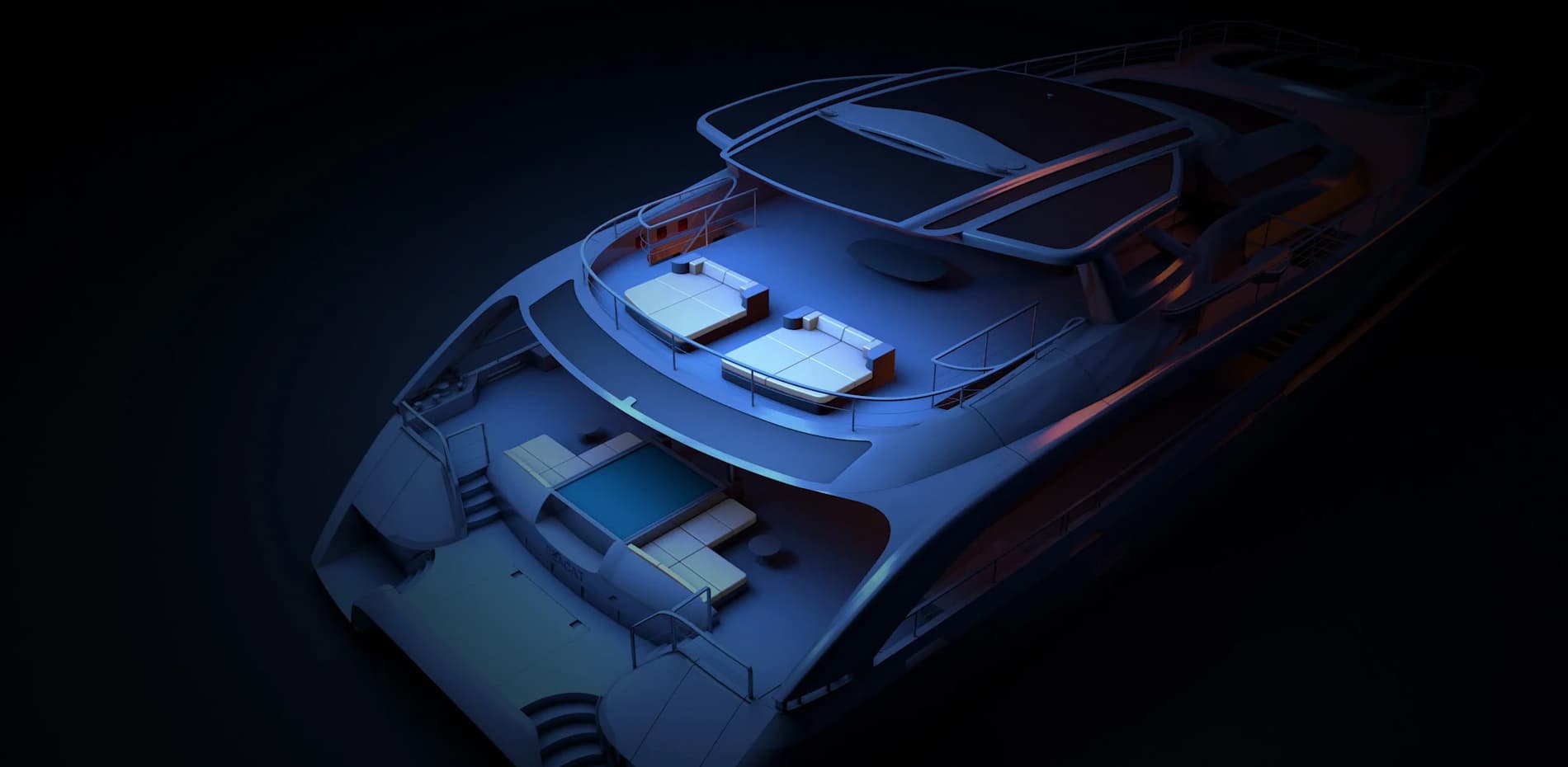
When the team started thinking about how to make the project stunning, we for sure thought about integrating 3D web solutions like Three.js, but it really took just a few minutes to understand it was not the right choice in this case: SeaCat is a beautiful boat in real life, but also overly detailed for the digital world in terms of polygons, geometries and lights. Walking down the path of 3D would have resulted in a project not able to live up to the client’s expectations, and most of all to our own ones.
Walking down the path of 3D would have resulted in a project not able to live up to the client’s expectations
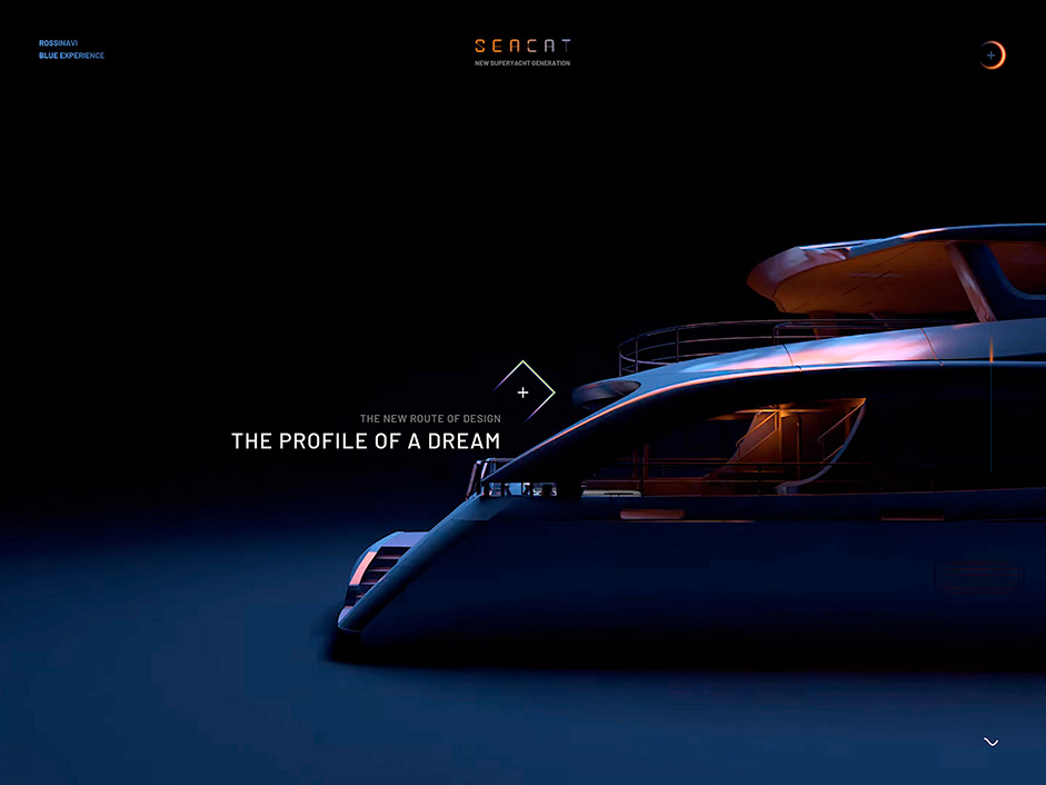
So our next question was: how do we reach such a high level of detail, yet keep the experience smooth as silk? And the answer to that question was simple and challenging at the same time: we rendered the boat in videos made in Cinema 4D. The most obvious step would then be to open the website with a single beautiful video, but that would not have been very performance-friendly.
Go small or go home: splitting as a tool for a smooth experience
We decided to split the first part of the website into five sections, representing five values of the boat, with five single videos that allow you to pass from one to another in play. This enhanced dramatically the performances, because having more and smaller blocks granted us a way faster loading. After several attempts to find the perfect way to build bridges among the contents, we achieved a satisfying solution: when going backwards, the website plays a reverse video to overcome the lower result we expected if we had used a play in reverse javascript. Plus, the videos are preloaded in chronological order before the page opens.
Using so many high-quality videos is definitely tricky and could represent the end of an effortless and beautiful experience for the user. We solved the problem in advance by exporting them in .webm and storing all the files into an AWS S3 Bucket served with Cloudfront CDN Service to optimize the resource requests. This way, breaking the chronological order by going backwards or also by jumping from one point to the farthest one is still a completely smooth action.
Clip-Path made our menu work
Two bars start the navigation of the menu, with opening and closing movements. At first we used CSS clip-path to develop them, but we soon realized the result was not on point: it had several performance problems, mostly with the browser Safari. So we switched to SVG clip-path to mask the opening of the menu, and it worked pretty well.
After opening the menu, the user goes through three different carousels, one for the small central image, one for the big background ones, and one for the titles. Titles are also divided into three parts, all masked in small CSS clip-path.
We didn’t forget how to use WebGL though: you will find some small gems like the decorative filaments on the right side slides.
A magic trick: go to the Hybernation section and guess how we make lights appear and disappear
Inside The Big Powerbank page listed on the menu there is the Hybernation section, where the SeaCat boat is docked near the seashore. Using the swipe, the yacht goes from light to dark in a very smooth and fluid way. We achieved this level of experience by creating a single video doubling the width of the viewport, and placing two videos side by side. One video has the lights on, the other the lights off: by swiping there is an immediate transfer from one half of the full video to the other.
Using the swipe, the yacht goes from light to dark in a very smooth and fluid way
The SeaCat website was entirely developed with Next.js, and as an extra, we are proud to say we also took care of the sound design on our own. All the experience with Rossinavi was just effortless and amazing: finding a client that trusts you entirely with a project like this is perfect. Plus, they have been happy with every single step and choice we took throughout the project. This definitely made things easier in creating something we are very proud of.
Studiogusto is a Culture–First Creative Agency that develops beautiful digital products, brands and experiences.
