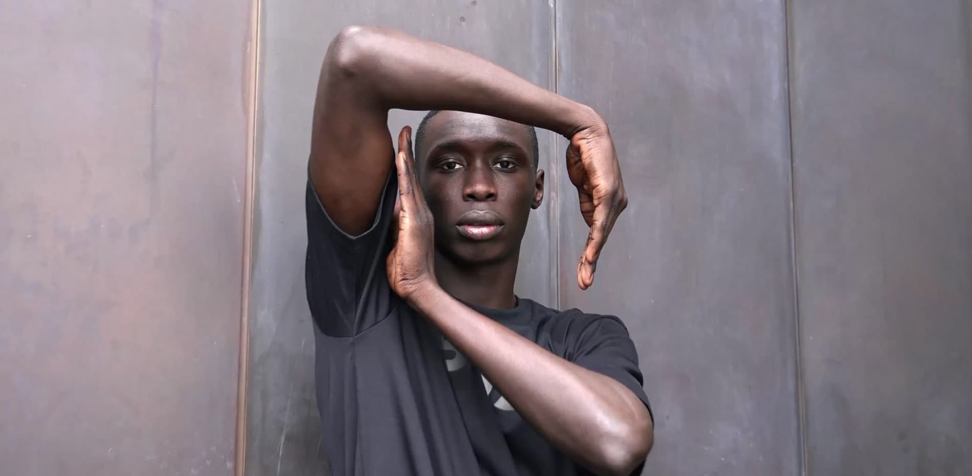
“Hiiii, we are doing an interview with TikTok star Khaby Lame and we would love an interactive format to accompany our print.” — Sara Krüger from ICON Magazine was on the phone, and we were on fire.
Having worked on tons of interactive editorials for Highsnobiety, we were excited to weave in our latest experience with WebGL to create something new and magical.
The visual approach
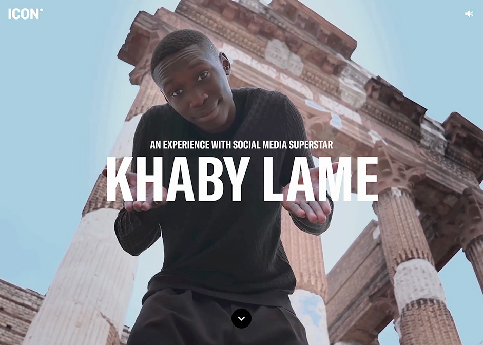
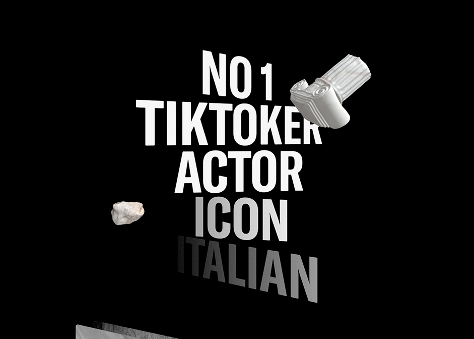
Khaby Lame, TikTok star number one, is known for charming the world by creating funny content without the use of language and spoken words, but only with gestures. When Sara introduced us to creatives Dirk König and Lisa Fessel on the top floor of Alex Springer’s golden tower in the middle of Berlin, we quickly decided to work with short video sequences to be paired with catchy questions as bold headlines.
Giving the user a sense of control and exploration is what makes interactive experiences so different from other linear storytelling.
Dirk was really drawn to an example with bold rotating headlines, and we decided to make this website a long rotating machinery, directly interlinked with the user scroll. To me, giving the user a sense of control and exploration is what makes interactive experiences so different from other linear storytelling. To match the Roman colosseum as the shooting location, we decided to add 3D pillars and columns. I am personally a big fan of rotating 3D objects. They add depth, are cute and are tons of fun.
Additional Interaction Elements
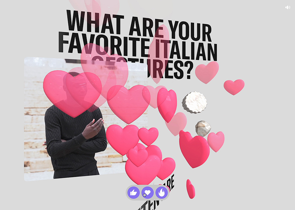
There is a little emoji bar in the interview section. By clicking on the buttons, the user enables a splash of likes, hearts, and fires. I loved the visual effect, but struggled to find real purpose in this bar as, unlike on social media, clicking doesn’t impact anything. But I soon realized that the sheer joy of causing an explosion of colorful emojis is purpose enough.
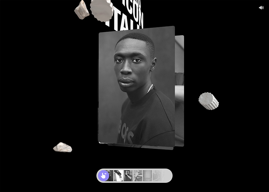
We added a little dragging UI for the image galleries, and I was surprised at how nice it felt having this conventional slider paired with a tilted bunch of WebGL images. I will definitely apply this approach of regular HTML interface interacting with 3D content in future projects.
Code and architecture
Our approach for including 3D was to harness the simple responsiveness of media queries and mixins in HTML/SCSS and to pair them with the complexity and richness of WebGL through ThreeJS.
We started by coding the basics of the design with simple responsive flex boxes containing layouts with video, images, or headlines and text. Then we added the javascript classes containing the WebGL code for each module. These modules then read data attributes and style values from their assigned div, applying 3D model and textures, copying position and scale, and adding a resize event listener to re-copy and apply these values again 🙌🏻 voila. We have a responsive system to pair 3D objects with normal HTML code.
Fine-tuning position and scale were achieved easily by applying new CSS values in the inspector and slightly resizing the window.
We used the same principle for all modules on the stage. React modules with image and video contain the textures used in 3D and take care of the play/pause of the video when in the viewport. Again their javascript class counterpart creates and adds 3D models and textures with ThreeJS and mimics the position and size of their assigned HTML element. The same is done with text, and I really really loved doing this with text. Text javascript classes read out regular headline tags content, font family, font size, and line height, and apply this to 3D text - making it easily responsive and adaptive.
Rotation and fine tuning
Done with basic module creation and displaying assets and text, we added rotation in the WebGL classes based on the assigned HTML element’s position on the screen and some more parallax depth and variation by adding more variables and parameters from the divs down to the 3D magic. ✨
Then it was really about adding all the content and fine-tuning the variables and page to make sure we have an even distribution of objects and the flow feels perfect.
I love going to watch contemporary dance pieces, and I recently understood that creative coding is like writing a choreography. We let objects dance, coding interface to enable interaction between elements, and re-watching the movement over and over to modify parameters bit by bit until we are happy with the flow of the website.
Creative coding is like writing a choreography. We let objects dance, coding interface to enable interaction between elements
One of my big favorites in the project is the gradients we applied with a shader to the headlines depending on their rotation. Adding multiple headlines into the one text block caused a beautiful fade-in of the words. We also added some noise to the gradient - the devil is in the detail.
Sound
Adding sound was a last-minute request, but made all the difference. Before this project, I did not quite understand the importance of satisfying as many senses as we can. Leaving out sound completely ignores the fact that our ears want to be entertained too.
Sound producer Lina Dörsam delivered a slick mix of five different audio files which start and stop through triggers which are placed within the various sections. Despite the fact that this is not big coding magic, it still has the surprising effect that the beat picks up when Khaby starts dancing, and this completely transforms the mood. So don’t be scared to use non-invasive audio in your coding.
Final thoughts
I often struggled to articulate what it means to be a creative developer, and it took me years to take ownership of my creative influence in projects as a coder, but I feel that with our latest ventures into WebGL, and especially with this project, we broke the barrier of design and development and started melting those two by coding interactive magic.
Technologies
We mainly work with React, and we use NextJS even if there is no CMS attached. The pages load faster through code splitting, and it comes with many other performance tweaks.
For WebGL, we worked with ThreeJS and developed a starter with an asset loader, a base stage class, and some reusable utils.
We always take our learnings from our projects into the next starter to constantly increase our standard of development.
The project is deployed with Netlify.
Company Info
Rocani Studio is a Berlin-based creative development studio working with international brands, renowned agencies, and cultural institutions.
