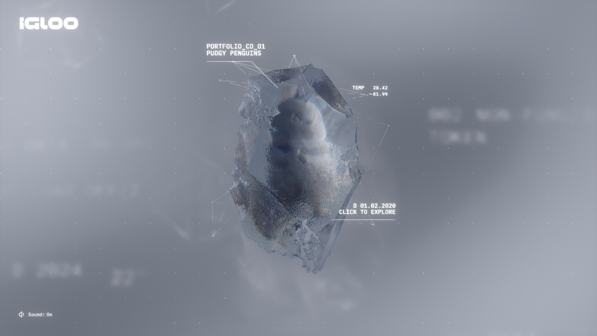
Our friends at Bureaux proposed a collaboration to create the landing page for Igloo Inc., the parent company of Pudgy Penguins.
The main objective of this project was to highlight the company's various portfolio projects using a scrollable and user-friendly navigation, all while making sure the design was visually appealing and consistent with the brand's guidelines.
Given that the landing page would have just three sections, we quickly realised that one of our biggest challenges would be creating a scrolling experience that kept users engaged, incorporating plenty of interesting interactive elements.
Process
After Bureaux supplied us with moodboards to set the tone and style, some of their own renders and 3D assets, and a general outline of the site’s content, we began designing our first concept.
At this stage, we prefer using grey mockups and sketches to communicate our ideas. The focus here is on mapping out the user journey, along with key interactions and navigation elements.
For sections that are difficult to communicate with static mocks alone, we create simple “previs” animations. These are quick, untextured renders designed to clarify our ideas and get everyone on the same page before we dive into execution.
Design
Since our team is made up of technical artists, our next step is to start working on both the code and 3D art simultaneously, directly in the browser.
We have custom tools that make it possible to update changes to shaders, textures, and models in real time. This approach allows us to iterate quickly, explore various options, and determine what works best for each element.
“Iterating directly in the browser makes it easier to explore options and prototype effects, often leading to better results.”
Another advantage of working directly in the browser is that we can continuously measure performance during development, making adjustments as needed to ensure smooth navigation on low-end devices.
While experimenting with scene transition effects in the build, we discovered that chromatic aberration aligned perfectly with the aesthetic we aimed to achieve, so we decided to incorporate it into a few elements and materials.
Animation
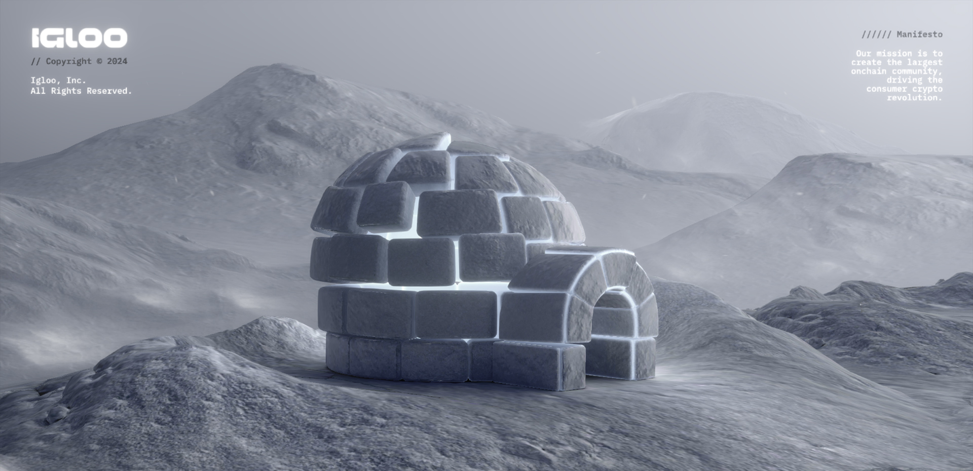
An early concern was that opening the site on an outdoor scene might not align with the future-forward tone of the brand. To make sure we were hitting the correct tone from the very beginning, we decided to inject some additional tech vibes with an intro animation.
The sequence was animated in-engine using a combination of code and custom shaders. In addition to keeping file size down, this real-time approach helped us maintain a consistent visual style across the site, and allowed us to immediately make edits without needing to wait for any expensive renders to complete. The end result was a smooth, highly-performant animation that displayed at high resolution on all devices.
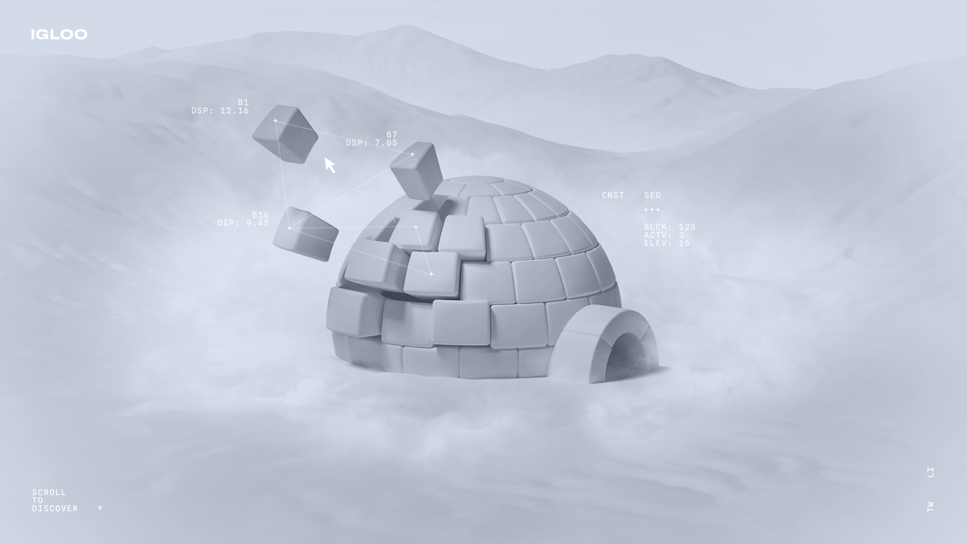
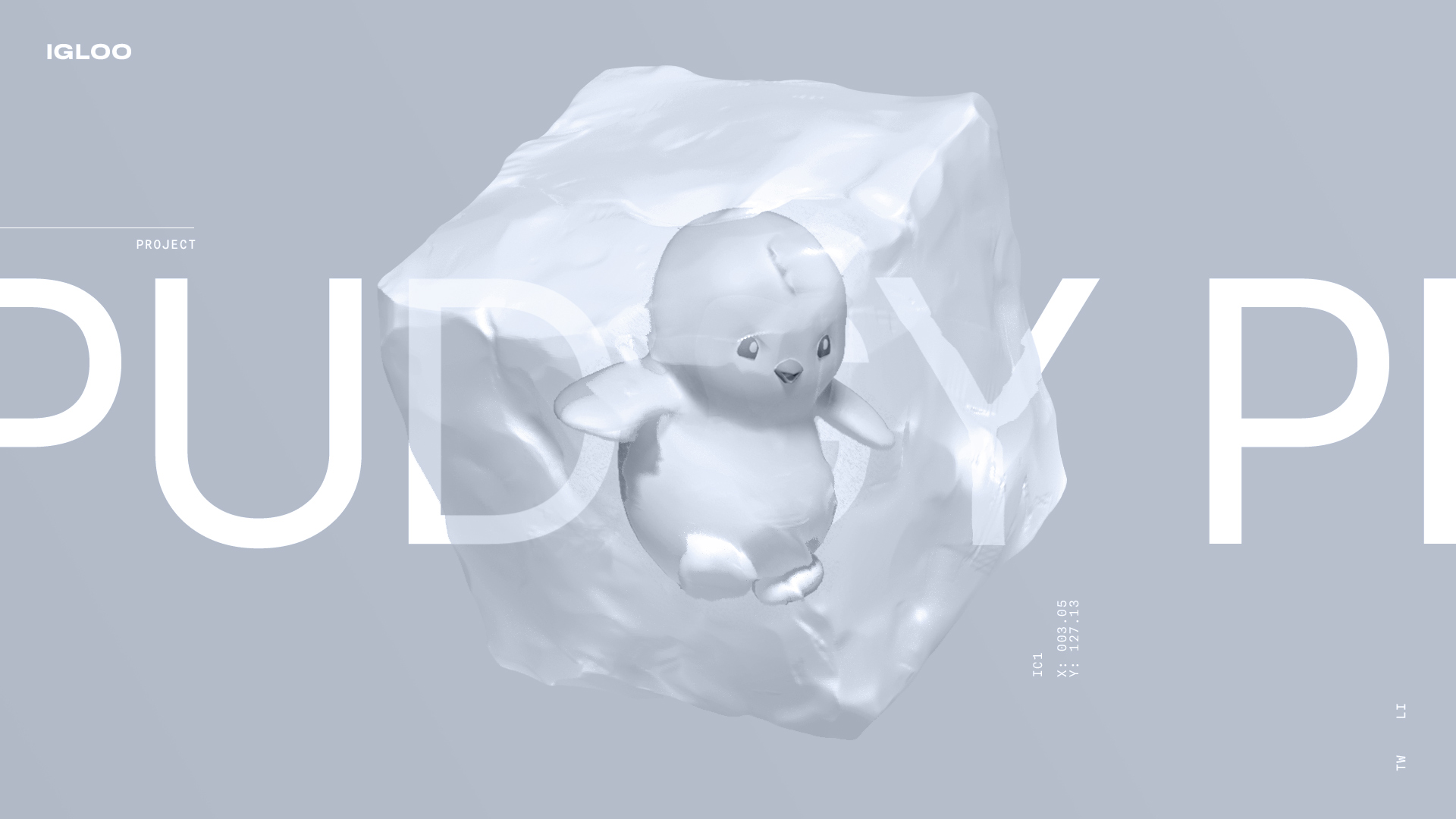
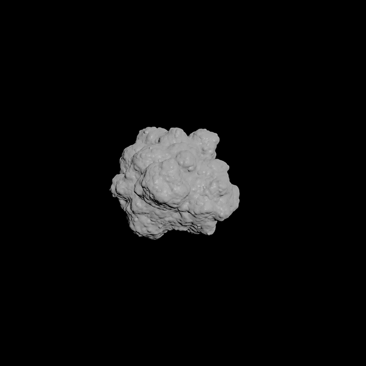
Ice Blocks
Each project was represented by an object encased in ice. Our original plan was to use the same ice block for each project. However, during prototyping, we quickly realised that the projects looked too similar to each other when scrolling past. To add some variation, we decided to create a unique ice block design for each.
With the possibility of having to add more ice blocks at a future date, we wanted a workflow that would help us create a variety of detailed 3D models in a short amount of time. To solve this, we wrote a custom algorithm that mimicked the growth of ice crystals inside a container. This way we could pick a base shape, such as a cube or cylinder, and then ‘grow’ a detailed ice structure inside of it.
"Procedural approaches need to be chosen carefully, since setting them up can take a significant amount of time."
When choosing a procedural solution such as this, it’s important to weigh up the potential time saved over a more typical 3D modelling approach. Considering the time constraints we were working with, and the unknown amount of additional projects to come in the future, a procedural workflow was the best choice for us in this case.
Interactive Particles
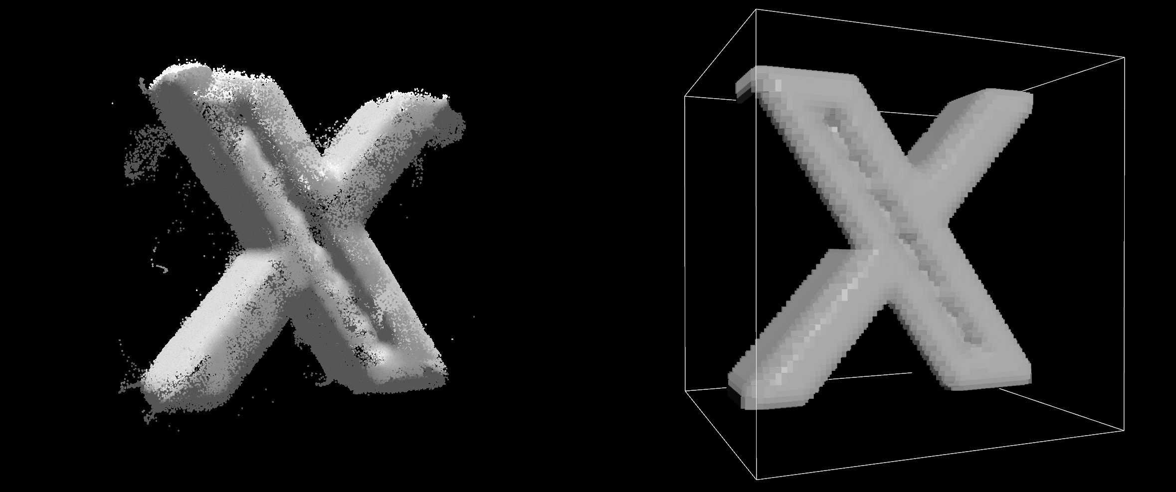
For the links section, we chose to create an interactive particle simulation that would form different models based on the selected external link.
To achieve this, we needed to research how to efficiently export volume data into the browser. In traditional game development, volume data is often exported using images with different slices of the volume, but this method usually results in large, heavy images that aren’t very efficient for web load.
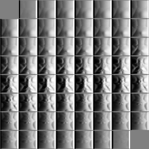
To address this and allow for the packaging of any desired data, we developed our own exporter that converts VDB data into a browser-friendly format. We then added a compression step, which resulted in a smaller file size than what you would see in a typical website image.
With the data side sorted, we moved on to developing an interactive particle simulation that swirls and forms different shapes.
To make it engaging, particles change colour based on their speed, and also glow as they shift into new shapes. The team at Bureaux provided us with music and sound effects which we implemented to match the movement of the particles, making the interaction both playful and satisfying.
UI DESIGN
At some point during development, we decided to implement the UI using WebGL. We made this decision primarily because of the two main text effects we wanted to achieve:
- Glitches: These can be easily created using a simple WebGL shader, which doesn’t affect performance. In contrast, the traditional HTML/CSS methods for achieving glitches usually require clipping and masking, which can be resource-intensive.
- Text scrambles: When using traditional HTML/CSS, these effects force the browser to recalculate styles every time the text changes. This can significantly impact performance, especially with long texts and complex layouts. By using WebGL, we can change letters by simply adjusting the offset of the SDF texture, which is much more efficient.
"Implementing UI in WebGL can unlock a range of high-performance effects."
Technologies & Tools
3D and textures: Houdini and Blender.
UI design: Figma, Photoshop and Affinity Photo.
Programming: Three.js, three-mesh-bhv, Svelte, GSAP, Vite, and vanilla javascript.
Sound: Davinci Resolve.
We use our own set of tools that provide us with a high level of control, allowing us to create original web experiences and multiplayer games. We frequently develop custom solutions for each project, such as the volume data exporter or the expansive fluid simulation for Igloo Inc.
Additionally, we focus on minimising initial loading times by using custom geometry exporters and implementing various strategies for loading textures and compiling shaders, both during the initial load and in the background.
This low-level approach is essential for us, when performance and creative freedom are top priorities.
Abeto
We're a small, specialised team of technical artists making interactive experiences and games on the web.