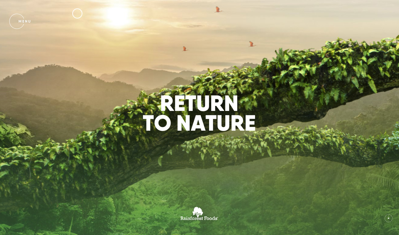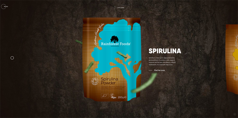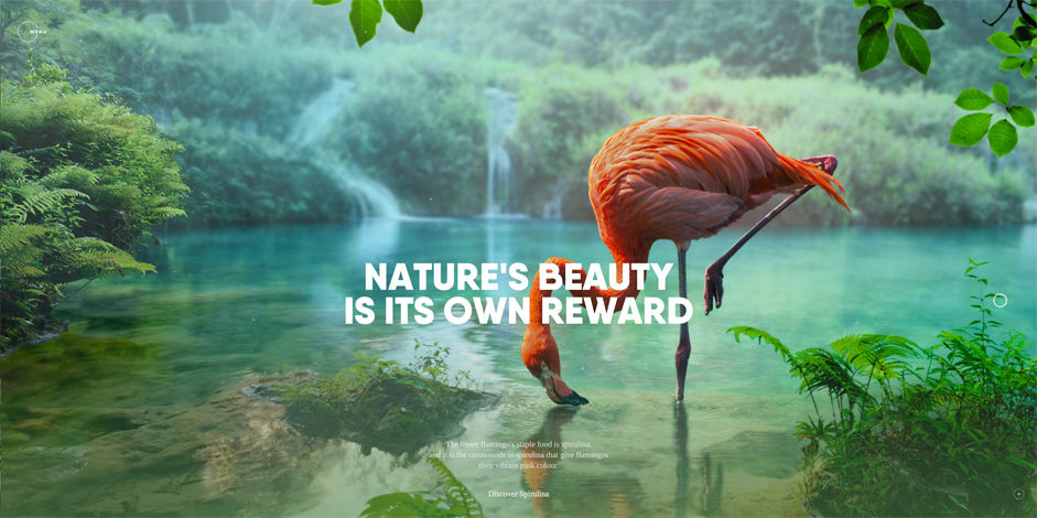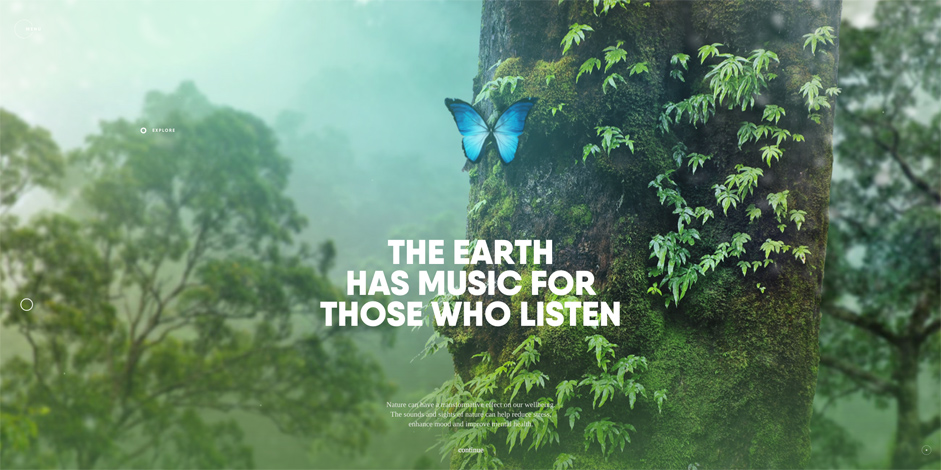
We are very proud to announce that Immersive Garden (France) have won the first SOTM of 2017 with their dreamy and interactive Rainforest Foods Experience. Immersive Garden shares with us the processes behind making their highly creative site.
The Project
We started this project with the ambition to create an experience that would be different to what we are used to seeing and wanted to craft an immersive universe, very visual and emotional.
The theme of nature was to be at the heart of the experience, we have used the superfoods products and their remote location to imagine a storytelling that would match the different natural benefits, to create a narration around man’s connection with nature.

We wanted the users to spend a bit more time than they traditionally do on websites, we wanted them to be surprised and to convey a positive mood to craftily associate the storytelling with the Rainforestfoods products.
We have chosen to create a photorealistic universe added to scan techniques, as well as parallax and rotations to give an illusion of depth, 3D and immersion in the scenes without ever really using 3D technologies.
Regarding the process, we spent a lot of time crafting the various universes in order to make them work with the product they deal with and have a holistic coherence and variety, so that the user stays surprised all the way through. This involved a lot of mounting and mate painting, that was then prototyped on after effect before reintegrating image by image on the website and making it all interactive. (Yes, it was as complicated as it sounds)

We didn't want to leave anything to chance, so even though the interface is minimal, to really give sufficient space to the visual, we spent some time making this interface smart and innovative.
Development required a lot of R&D to allow us to explore the extent of possibilities we had, while keeping the experience as fluid as possible."
Technologies and Server Architecture
For hosting we used Ukfast at the client’s request, but we wouldn’t suggest it. We prefer amazon or OVH, the server architecture used was an Apache server and PHP.
Regarding the technologies used, the website is full static so no back-end was needed. For the front-end we mainly used WebGL via PixiJS and CSS transform animations. We tried an alternative version using Three.js but the performances weren’t very good. The final version doesn’t include any 3D, the depth effects are emulated via synchronized parallax with a scale.
For the Stack we used Gulp + Browerify + Babel, with Stylus for the CSS.
The Homemade Framework (LightJS) is based on WebComponents. Components have been created around PixiJS classes in order to use the framework data-binding for the animations.The JSONs files are generated from Texture Packer as well as others manually created, allowing to construct the different slides.

We used the following tools; Texture Packer to generate the atlas textures. A script in NodeJs to separate the alpha layer from the color (premultiply alpha channel) to compress the color in JPEG and alpha in PNG (black + alpha). This way the PNG can be compressed even more with less noticeable artifacts (only few bandings on gradients). Color and alpha are then recomposed during the website loading thanks to globalCompositeOperation of a canvas tag.
Thanks to everyone who voted and tweeted, the winners of WLOKS bundles are:
@mchiama, @chrisweinhapl, @gabrielkarasek, @JeremieDevoos
