The internet and technology have forever changed the music industry. With these innovations, it’s easier than ever to record and distribute your music and it’s not at all rare to see major artists putting albums out recorded in their bedrooms.
Over 60,000 new songs a day are being released and completely shifted industry structures. For artists to develop community in this modern construct, they need to leverage the tools around them to find new ways to cut through the clutter of the internet and immerse fans in the story of a song.
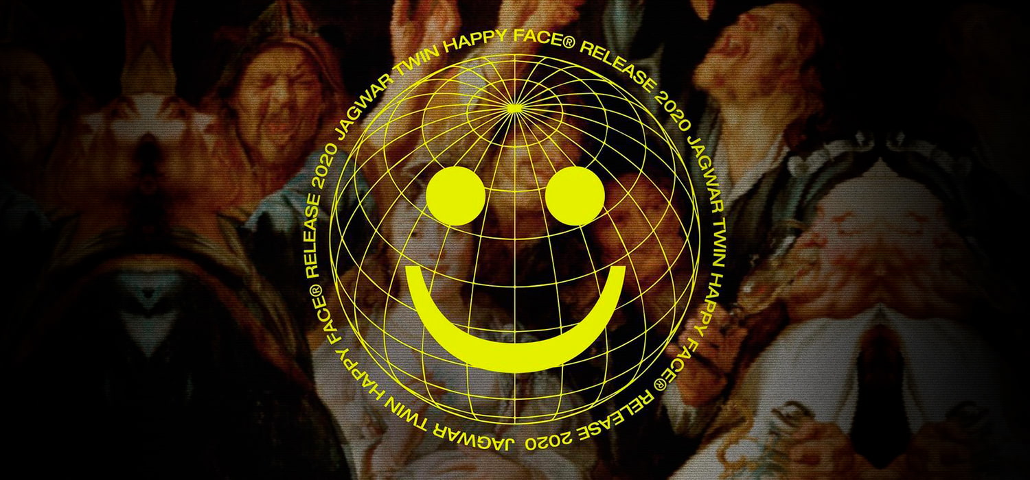
Jagwar Twin is one of those artists, having left the major label system to release music independently. Their first independent single “Happy Face” is a song that speaks to the current state of the world: Even while the world is burning around us, we put on a “happy face”, hold a smile, and continue going on with our “normal lives”. We took this idea and built a release strategy to bring fans not only into the world of Jagwar Twin, but also into a digital experience where they could immerse themselves into an upside-down world, inquiring what it really means to be happy in today’s digitally-connected society.
With this experience we were able to wrap a deep-rooted universal human concept into a high-design yet simple user experience, anchoring a striking visual identity with facial recognition to create a massive and organic wave of buzz ... and it worked!
Building Anticipation
Without explanation, we dropped social posts telling fans to visit deathofmygeneration.fun, a cryptic splash page featuring seemingly disconnected copy, a countdown, and a phone number. The site screamed “World Gone Mad, Let’s Start the Show” with a CTA asking fans a simple question “are you content?”. Fans who called the number were met with a creepy vocoded manifesto asking them to leave a message “are you content or content?”. Not only were they creating our next layer of social promotion, but they were signing up to stay looped on the drop.
The Voicemail Loop
We took the fan-sourced voicemails, ran them through a vocoder, and repurposed them into additional social content to create more fan anticipation, confusion, excitement, and action.
SITE LAUNCH: Unlocked with a Smile
When the countdown ended, we drove fans back to the site with a final thought … “There is a test involved, like there is in every moment, but my hope is that it will make you think about the world you want to create and help you to see yourself more clearly.”
When users enter the site they are greeted by a bomb going off behind a happy face icon which follows the user’s mouse cursor throughout the screen. To start the experience, fans are asked to look into the camera and put on a happy face. Once happiness is detected through smile recognition, we start the experience.
By holding a smile, fans could hear the song before it was available on DSP’s (sounds easier than it is) but we built the site to flash “smile more” at them if they started to lose their smile. If a smile was lost, the branding would melt and the music would come to a full stop, ending the experience.
All fans received an animated gif of their experience to share out to social media and drive the next batch of users to discover the site.
Gated Merch Capsule: BUY!BUY!BUY!
Hollywood on your timeline telling you what to wear and what to like and how to be!
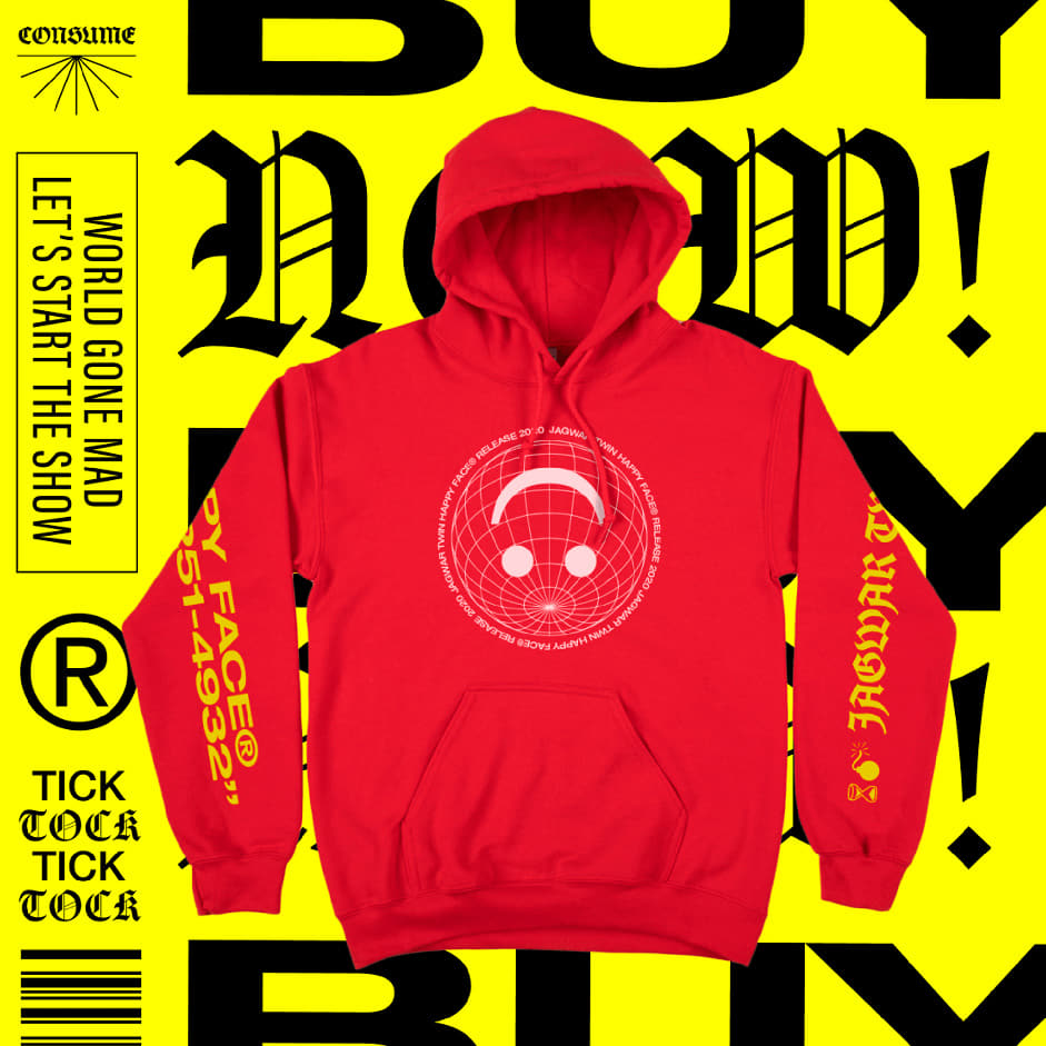
In a digital age, we often must ask ourselves if we’re the product. To play into this, we designed a limited edition merch capsule, backed by a custom e-commerce store, that could only be unlocked by getting through the whole song without losing a smile.



IG Bomb Post
IG Woman Post

IG Melt Post

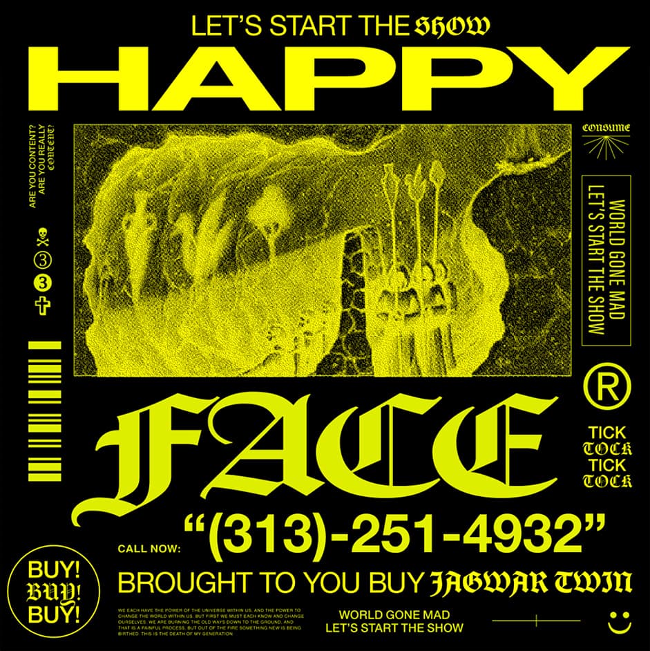
Custom Merch
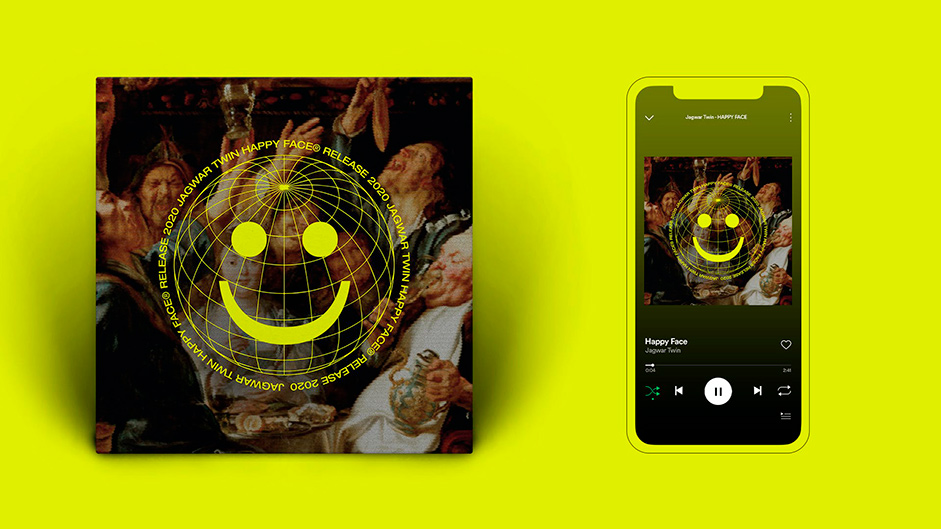
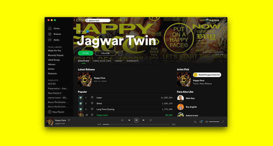
Design
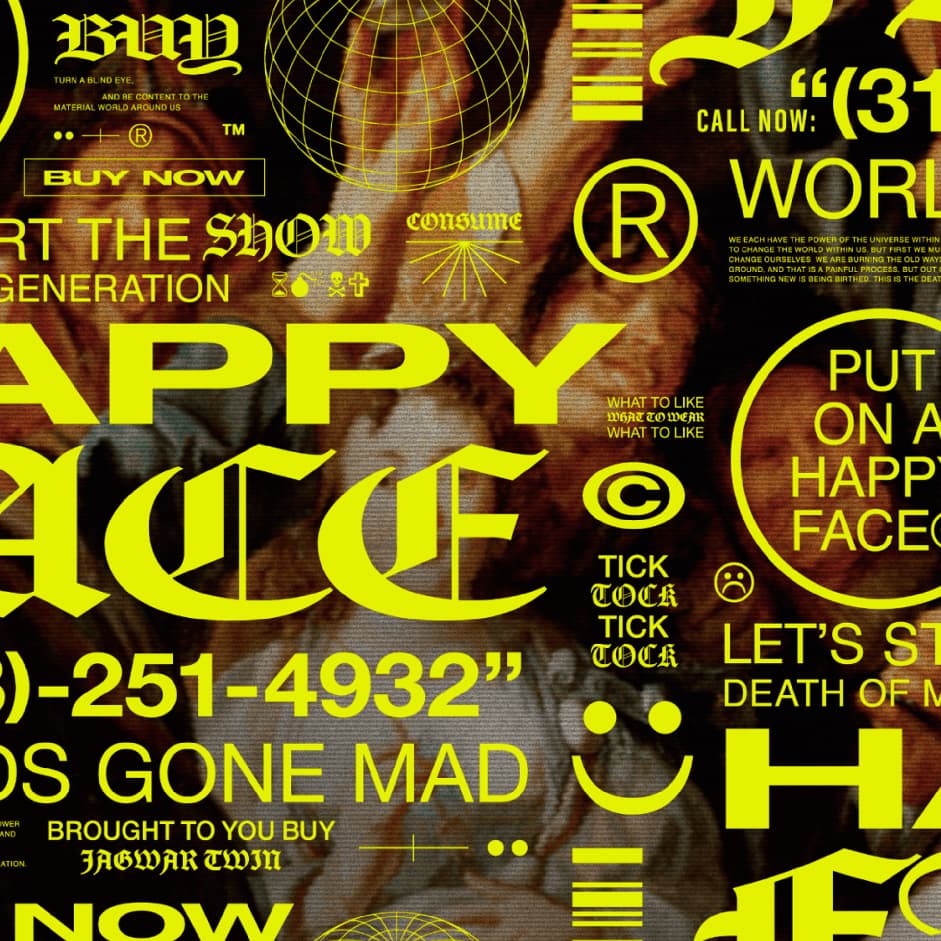
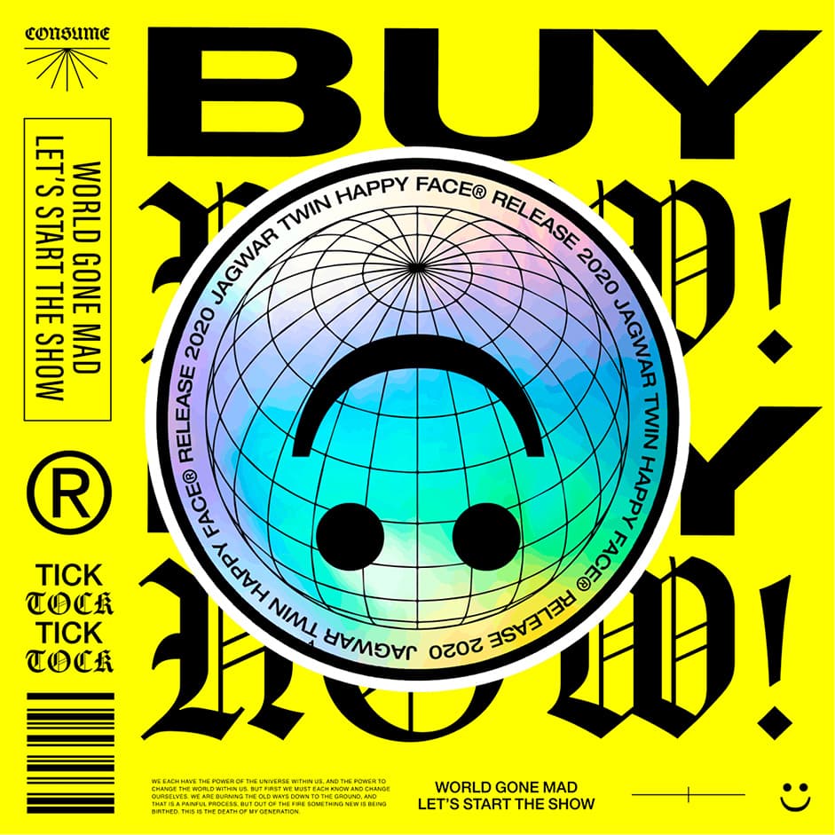
Even while the world is burning around us, we put on a happy face, hold a smile and continue going on with our normal lives. This contrasting dichotomy is at the root of the Jagwar Twin single and was our guiding principle in the Happy Face design system. As a whole, this system embodies the overwhelming onslaught of information and messaging that news and social media scream at us on a daily basis, while contrasting it with the warm familiar elements from the early internet.
The system is a mashup of contrasts, the old with the new, digital vs analog, happy vs horror. We took the ancient esoteric world of Jagwar Twin and turned it into a 3am 1995 infomercial. Using our digital hieroglyphics ~Wingdings~ as a base, we designed a logo that is warm and happy yet born out of the corporate world of consumerism. The san-serif Helvetica, has been squished and pulled, warping the forms and giving an uneasiness to the world, and we chose a black letter typeface as our contrasting accent to bridge the gap between the new world of the internet and the ancient world that Jagwar Twin roots his concepts in.
Technologies
We faced a unique challenge with this project in executing something that has a simple interface on the surface, but complex and nuanced technology underneath. Our foundation for the site is built on Nuxt.js, a powerful framework that we lean on for a lot of our work. We added Firebase on top of it which we’re using for authentication, database, and serverless functions to generate the shareable video.
Technical breakdown & architecture:
The most difficult piece was the smile recognition AI, and getting it to work cross-browser and on mobile. When the user gives access to their camera to start the song, we need to analyze each frame of their camera’s video and determine where their face is within the frame, and more importantly how “smiley” they are at that moment. We leveraged this incredible in-browser AI library called face-api.js to achieve both. It uses Google’s Tensorflow under the hood, and is surprisingly lightweight considering what it’s capable of. The problem though is that we were not able to get it to work consistently on mobile, and even times when it did work were choppy and inconsistent since mobile devices typically have such limited resources compared to desktop. Ultimately we ended up building a completely different strategy for mobile to get it to work, which leverages an external service called Face Plus Plus to analyze individual frames from the webcam video for face position and emotion detection. As a result, the frame-rate on mobile is a little slower, but otherwise pretty consistent with what you get on desktop.
Another interesting feature is the animated smiling face that follows your face position around and smiles/frowns when you do.
For that piece we leaned heavily on SVGs, and used a library called flubber to smoothly morph between the smile and frown. The background of the smile is a rotating globe wireframe on transparent that spins infinitely. We used a PNG sequence created in After Effects to make up the individual frames, and then loop through them on the frontend to get the infinite spinning effect.
There is also a lesser-known feature on the site where you can purchase a limited set of Happy Face-related merch, but only if you’ve successfully made it all the way through the song without losing your smile. For this, we used Stripe Checkout in order to create one-off product checkouts. Using Stripe allowed us to put logic in front of the purchase, so that only users who have truly made it all the way through the experience are able to make a purchase.
What we learned:
- When pushing boundaries in tech, figure out early what is and is not possible on mobile. This one seems obvious in hindsight, but we realized far too late in the game what needed to be done in order to get it working consistently across desktop and mobile. With our marketing strategy, we realized that most users would likely experience this on a phone, so it was imperative that the experience was just as fun and usable on those devices.
- Don’t reinvent the wheel. Using tools like Firebase and Face-API allowed us to take huge shortcuts on some of the most difficult challenges. If we had to build our own facial recognition AI, or hand roll an authentication infrastructure we would have never been able to build the experience. Finding and using the right tools allowed us to stay focused on making the experience really fun for the user which is our main goal.
- Design with limitations in mind. Part of what we’re most proud of in our process is our ability to speak fluently in both design and technical languages, which lets us blend the two in unique ways. Happy Face is a good example of that; it’s a simple idea that takes a few clever shortcuts to get a result. This project helped us learn to lean into that strategy, finding the break-even point between design aspirations and technical limitations in order to reach the end goal.
CTHDRL
CTHDRL is a digital design and experience agency focused on the intersection of community, culture, and commerce. We build experiences that push boundaries and aim to make the internet fun again.
