Congrats to Resn for winning Site of the Month December 2022 for KPR, take a deep dive into the making of this immersive world here, thanks if you voted and tweeted, the winner of the pro plan is at the end of the article.
KPR is a unique take on Web3 that combines art, community, and storytelling to create a new genre of media and entertainment. Our challenge was to build an online home for KPR—a living world with a rich story and digital collectibles that let visitors become active participants in the narrative. Leveraging layered interactive content and community engagement, we set out to create a captivating online universe that establishes KPR as a credible new brand in the Web3 space.
A Window to the Metaverse
From the outset, we knew that storytelling would be key to KPR’s success. We wanted visitors to understand that “the Keep” is a living, breathing world with a deep backstory and vibrant characters. The collectibles act as portals to the world, transporting visitors between imagination and reality. They invite us to journey further into the Keep and discover more about the world and its inhabitants.
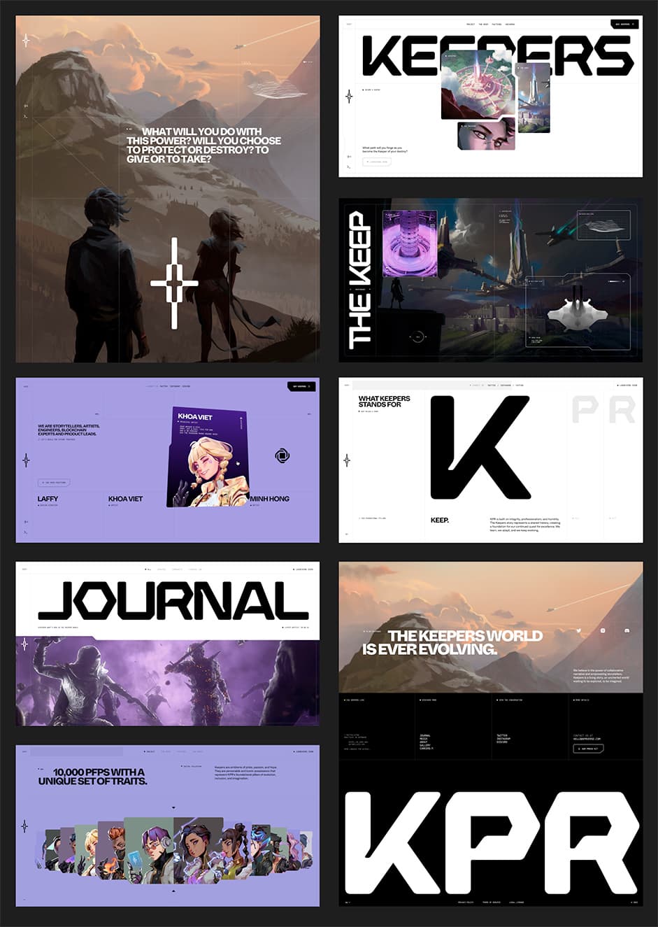
We took this idea further with the home page, which plays with notions of perception and perspective. We combined 3D characters with 2D design elements, the interactive motion revealing a hidden dimension.
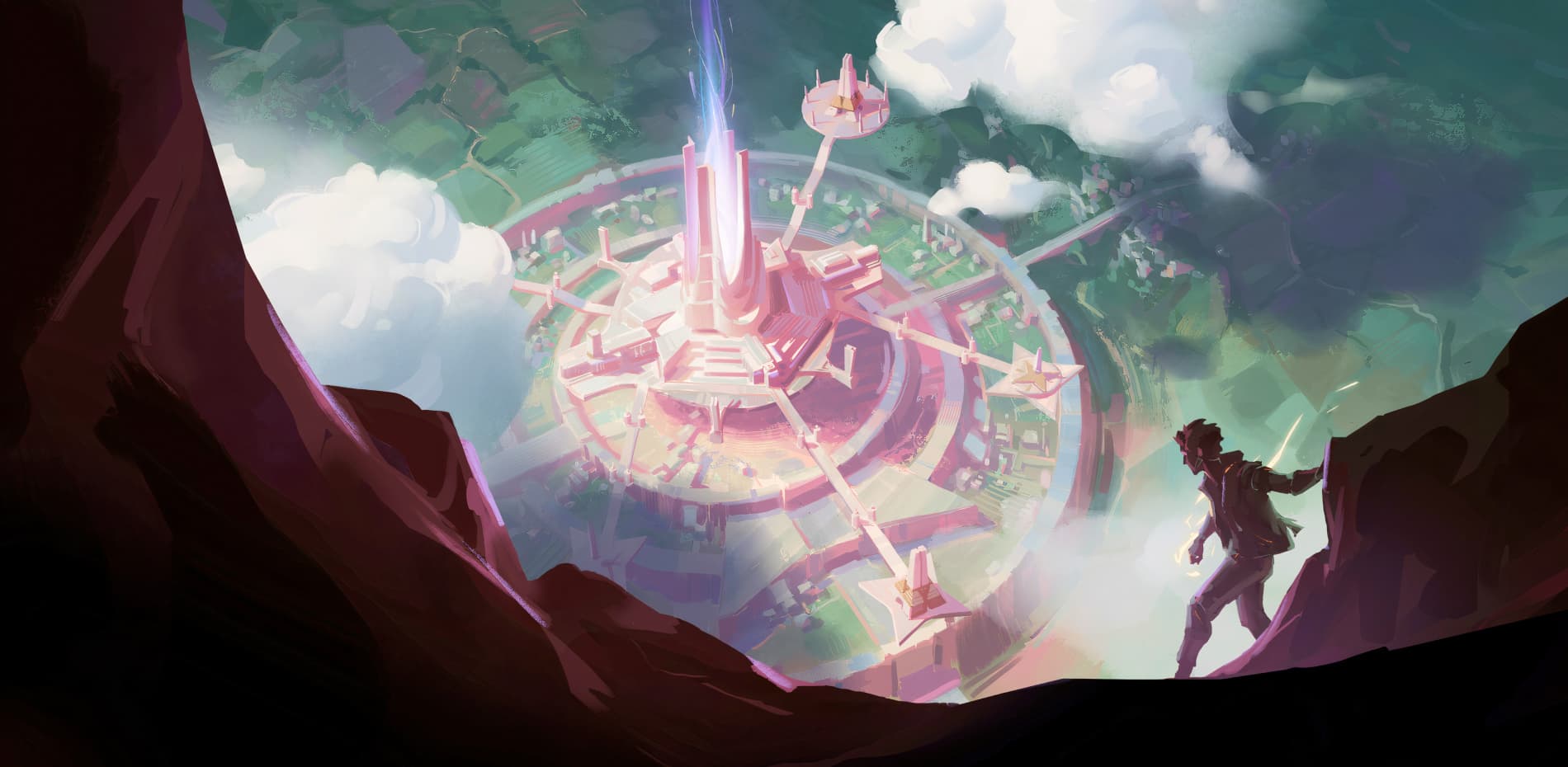
When scrolling through the site, visitors discover a series of immersive tableaux—the Keep, the Factions, and the World—depicted in a bold concept art style. The tableaux serve as a starting point, leaving room for the community to shape the story.
“The tableaux serve as a starting point, leaving room for the community to shape the story.”
Glimpses of a Rich World
New Eden is humanity’s final refuge. The Keep is its last stronghold. We show glimpses of this world using an interactive second layer, accessible through the click-and-hold interaction. With this technique, we can provide insights into the lives, interests and activites of the inhabitants of New Eden.
Sophisticated Design
The challenge in designing KPR was to raise the bar with a fresh approach while preserving the brand's existing identity. Inspired by futuristic poster design and manga/comic book layouts, we crafted high-impact compositions that seamlessly blended CG elements and storytelling. We emphasised the grid and a clean, futuristic aesthetic through the prominent use of white space and bold typography. The final result of the design and art direction was to enhance and elevate the brand’s foundation.

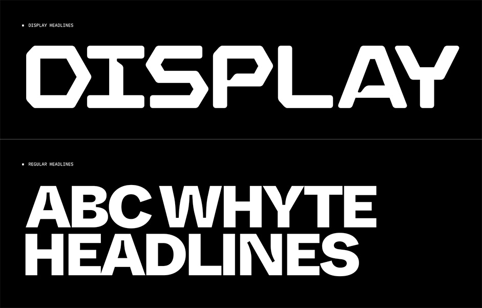
To have unique and ownable typography, we paired the logotype with Whyte—a typeface featuring variable width and ink trap settings. This strengthened the consistency and tied the typographic language into the site.

We blended high-energy animation with elegant movement to create a balanced and captivating motion language. This approach can be seen everywhere from the interactive tableaux and dynamic text to the hover effects and micro-interactions.
Technologies
Loader Reveal
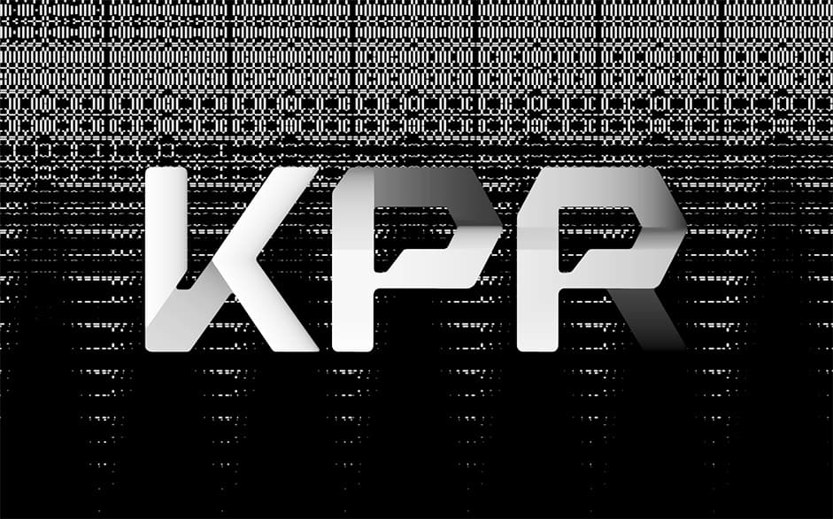
The KPR logo features a progressive gradient reveal created in After Effects by stacking frames with varying levels of opacity. The code reads the color value and selects the appropriate frame to display. We then used a sprite sheet and signed distance fields (SDFs) to create the morphing/bleeding effect of the elements around the logo.

Click-and-Hold:
We used After Effects Quick Exporter to quickly create sequences and layouts, then animated them in WebGL and HTML. The hold frames are flexible and the graphic elements position and scale themselves according to the frame layout. We accomplished this using only CSS transforms to keep the performance high.
Masking
We used a WebGL technique called Stencil Buffer in which one 3D scene masks another. This technique applies to all windows, including card flipping and between second-layer windows. In addition to the visual effect, Stencil Buffer optimizes performance. It does this by discarding pixels outside the mask, so hidden scenes don't have to be rendered.
Company Info
Resn is the world’s friendliest evil corporation. We work in tireless pursuit of our fiendish goal to bring joy to millions of people. Over the past two decades, Resn has plotted and schemed to become a leader in the field of interactive development and design. We are in cahoots with some of the world’s best-known brands and agencies and we will stop at nothing to bring a smile to your face.
Thank you for your vote and tweet @0xMorce, please DM us to collect your prize!
