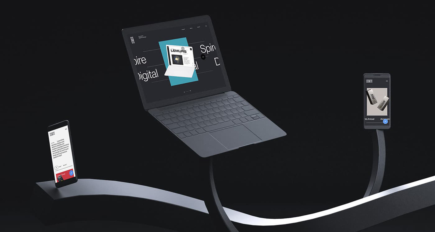
Locomotive win Site of the Month for their new studio website Locomotive. Thanks for all the votes and tweets, find the winner of the Pro Plan at the end of the article. Now the Montreal based studio delve into the making of their awesome digital showcase.
With more than a decade of experience, Locomotive has become a leader in digital experiences, web design and branding. That’s not a brag, it’s a promise: to deliver tomorrow’s creative solutions — today. Our philosophy is built on people who love creating, learning and growing together, a small studio of just 25 people who form a team with ties that transcend the workplace.
A new playground
The process of building Locomotive’s new website was a real playground for the team. Its main purpose was to educate potential clients on our work and DNA — in the most effective way possible — but it needed to be more than that. It needed to be a place where we push boundaries and put technologies we have an interest in to good use. A place for inspiration. But mostly, a place where we showcase our people first and their beautiful achievements.

Work: Explore the agency
The experience begins by showcasing the projects we are most proud of. While a lot of fun to work on, presenting the portfolio was one of the most challenging aspects of the project. We applied a uniform structure to create personalized rich-content for each case study.
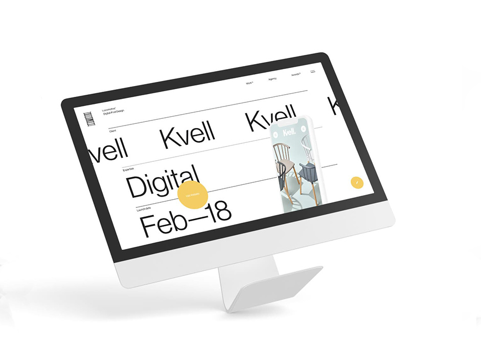
Users can browse our most exciting stories and find out about our best achievements and internal projects, using a drag navigation principle
Play: Explore the culture
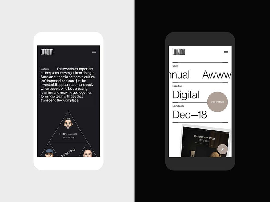
Everything related to our agency culture will be found in the Play grid. Users can browse our most exciting stories and find out about our best achievements and internal projects, using a drag navigation principle. A great way to add a discovery factor into the experience and incite the user to dig deeper into the content.

Front-end Technologies
- locomotive-boilerplate (using modularLoad for page transitions. It is directly included in the new boilerplate version)
- locomotive-scroll-v2 (we're working on v3)
- The GSAP suite (TweenMax, TimelineMax, etc) is a must-use in most of our projects and was critical throughout this website to manage all sorts of animations. One of their premium plugins ThrowProps greatly helped us to improve the drag & drop feeling (on the homepage & play grid) to achieve a smooth experience.
- We used Three.js on a lot of pages to enhance and highlight some of our content. We internally developed a tool allowing us to quickly & easily define a 3d model’s position, lightning and scroll-related animations. For that, dat.gui.js also helped us a lot.
- A lot of mathematical functions (such as lerp) to get a smooth feeling across the site.
- Hammer.js
- Management of touch & drag interactions
- Vimeo-player API
- Swiper
- Native canvas (for elastic lines on page headers, and for the background of the play grid)
Home page
We used a shader to make a fluid flag effect. It’s basically the use of an image with a gradient moving on touch and between slides. The brighter the pixel, the more the vertices position is affected.

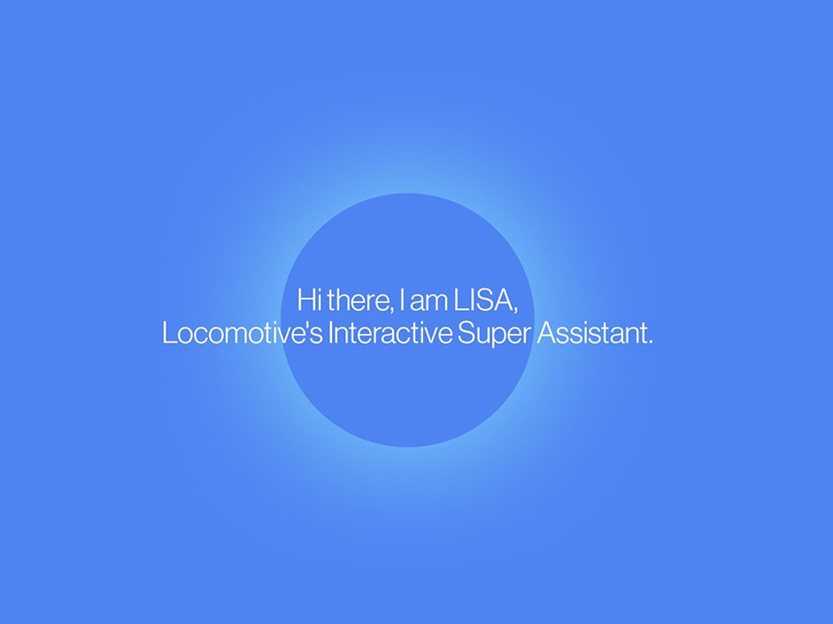
L.I.S.A.
We implemented Locomotive’s Interactive Super Assistant using simple technologies: Google Cloud Text to Speech API and AudioContext (Used to analyse LISA’s voice to visualize her speech in an expanding circle.
Agency Page
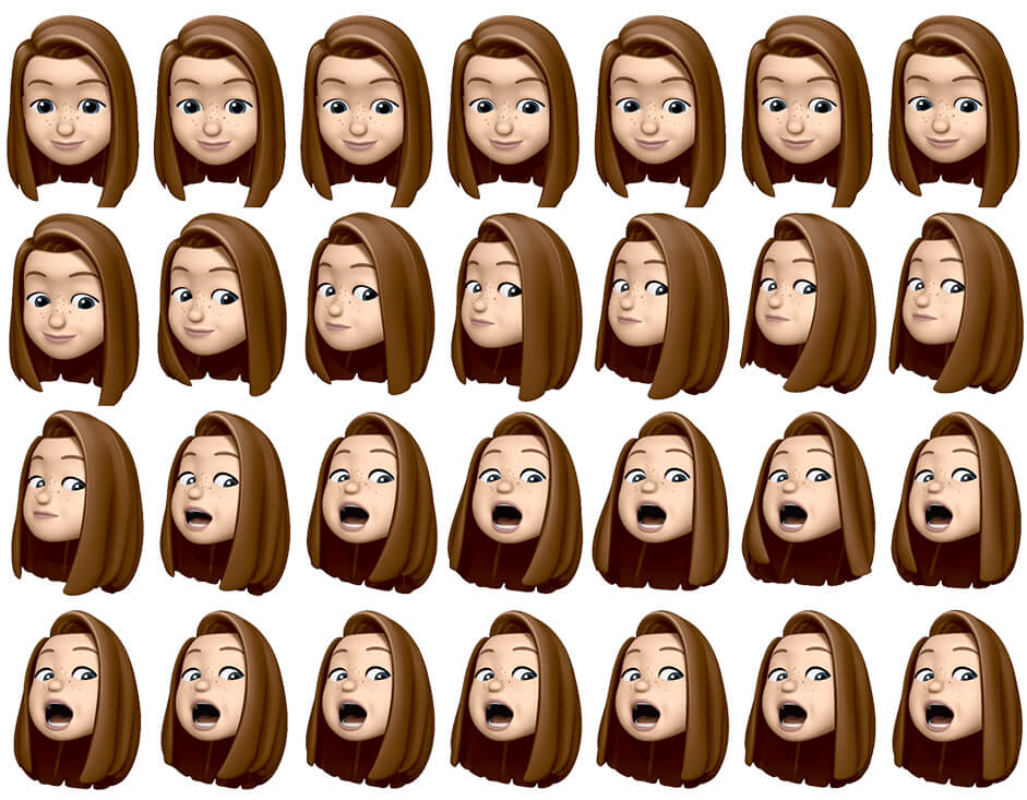
We used Sprite textures for animojis
Back-end Technologies
Our main guideline has always been a “build from scratch” approach. The technologies are reusable but the projects themselves should always start with a clean slate to ensure uniqueness. All our development is based on that philosophy. Like 90% of Locomotive’s projects, Locomotive.ca was developed with our in-house CMS / Framework: Charcoal. Built with modern PHP (on top of Slim and other great open source technologies), we started developing this tool around 10 years ago to create a leaner Content Management System that actually feels like it helps you build a fast and secure website, instead of “being in the way”. Custom models are easy to create and manage within the charcoal-admin powered interface, and the usage of a logicless templating engine (mustache) simplifies our front-end developers' job.
our designers we tasked with crafting a modular layout system composed of multiple types of content blocks, allowing for a custom layout on each case study
On our previous website, each project case study was coded by hand, each image positioned manually, and no content could be modified without the assistance of a developer… No way were we going to be doing that again! Therefore, our designers we tasked with crafting a modular layout system composed of multiple types of content blocks, allowing for a custom layout on each case study. With our charcoal-attachment package, we developed simple CMS forms for each type of content block, enabling us to create and update text, images, videos, parallax effects, background colors, 3D objects and device mockups.
Cloudflare and optimization
Considering what our analytics data said about our existing site’s visits, we obviously had to implement an aggressive caching strategy. Well, it turns out that, since our launch in June, Cloudflare saved us ~600GB of bandwidth. On top of that, we made use of our charcoal-cache package within our PHP framework for APC based caching. This allows us to easily load-once-and-reuse database data site-wide (projects, awards, job offers), or store sensitive rate-limited external API data (weather detection on L.I.S.A.).
New features for Charcoal
When we need a new Charcoal feature, we develop what we call a contrib package. For example, we used the charcoal-contrib-communicator package on Locomotive.ca to manage email communications in a standardized way. It helped out with sending notifications and confirmation emails originating from our L.I.S.A. forms. Our developers are encouraged to export any reusable functionality they create into a contrib package, thus keeping with our mentality of building things from scratch, reusing them and improving upon the previous versions.
Web stack, frameworks and tools

Website by Locomotive
We are a forward-thinking team of designers and developers driven by passion and fueled by curiosity. With more than a decade of experience, Locomotive has become a leader in digital experiences, web design and branding. That’s not a brag, it’s a promise: to deliver tomorrow’s creative solutions — today.
You can find out more at Locomotive and follow us on Behance, Facebook, Instagram, Twitter or Vimeo.
Cheers for all your votes and tweets, @KatiaSmet wins the Pro Plan, please DM us on Twitter to get your prize!