Introduction
After 5 years from my last award winning personal website (a daily life dashboard updated in real time with silly information) it was time for a new fun challenge. I needed a new portfolio that would stand out and inspire others. Nowadays the digital space is crowded more than ever; brands, products and personalities, all scream to be seen by their audiences like in a 4am yellowfin tuna auction.
When it comes to personal websites, differentiating yourself from the mass yet creating audience, is quite a challenge. Being ignored is just a swipe away. As tradition, I wanted to make something different, unconventional and unique. I wanted a space to portray my personality and my wide range of skills, be weather resistant to volatile digital design trends and fun, explorative, heavily interactive: a long-lasting platform to build and evolve upon.
I wanted a space to portray my personality and my wide range of skills, be weather resistant to volatile digital design trends and fun, explorative, heavily interactive: a long-lasting platform to build and evolve upon.
The Role
I am the Swiss Army Knife in my personal projects. A creative commando shooting bullets to each aspect of the production, from the idea and art direction to the UX, Design, Illustration, Animation, 3D modelling and programming.
The Vision
Core Idea
The idea was to create my own medium, a place to host experiments, mini apps and games as well as more conventional work case studies.
This medium took shape into an hyperbolic, caricatured personal computer.
Following an operating system anatomy with windows and folders, allowed me to depart from a traditional page based layout.
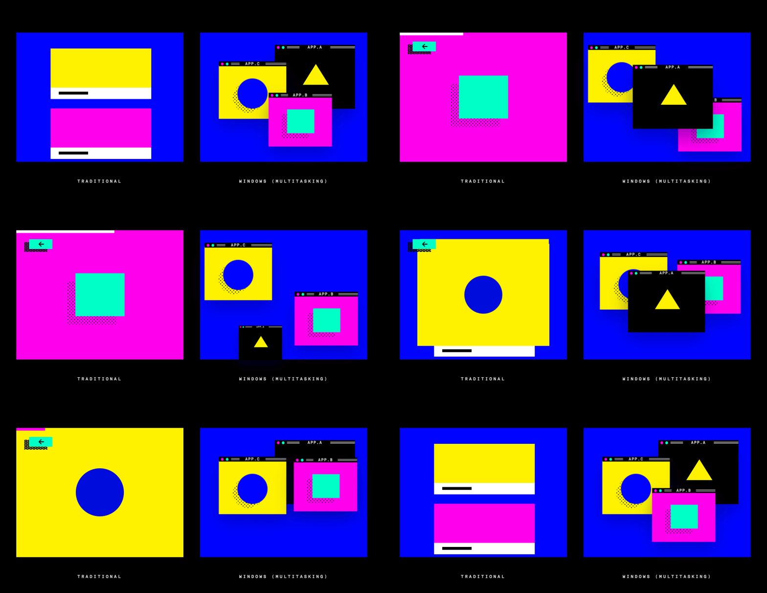
This approach brings one simple yet powerful benefit: multitasking. The user can adapt the interface to their own style, opening everything at once, minimizing for later, reading side by side or consuming one thing at a time. That’s why there isn’t one layout but many, many layouts as per many users. There is beauty in giving a clean canvas with tools and observe users creating their unique version of your art.
App Ideas
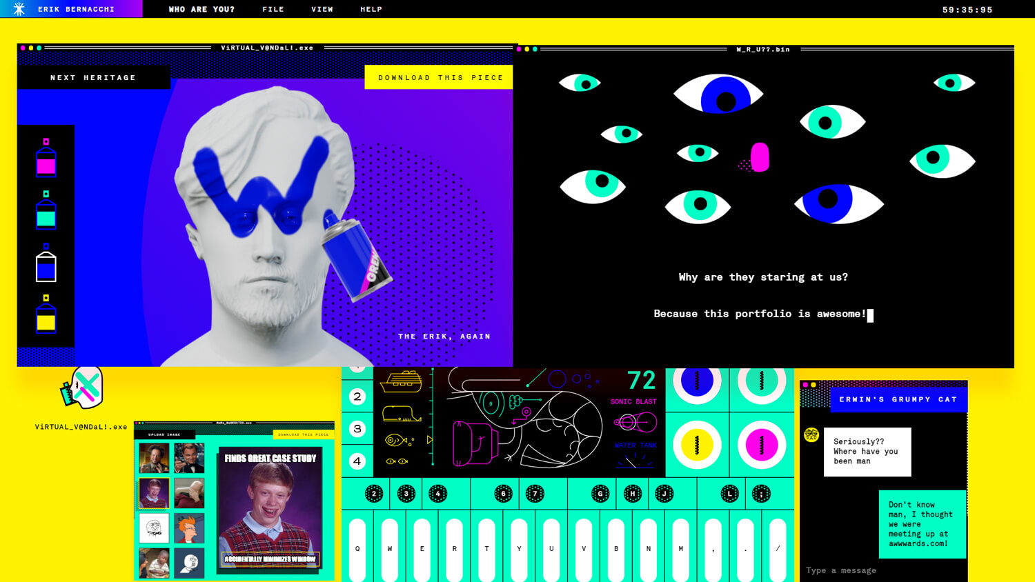
I wanted my apps to be a reflection of myself. They had to include art, music and personality. The selected ones were a set of synthesizer and drummer, a tool to vandalize statues, a meme generator, a grumpy cat bot and a personality game with no end.
The Visual Identity
The visual identity is where the fun begins. After identifying the core values in personal, satirical, hilarious, timeless, hacky and brave, I shaped a visual identity inspired by the “prehistoric computers era”, with elements inspired by the first Macintosh and Windows operating systems.
The color palette is deliberately rudimentary, with a primary bright yellow, magenta and blue, fluo-aqua, black and white. I also included shading through old school pixel art patterns, which were the actual reproduction of the ones found in MacPaint 1984.
The color palette is deliberately rudimentary, with a primary bright yellow, magenta and blue, fluo-aqua, black and white. I also included shading through old school pixel art patterns, which were the actual reproduction of the ones found in MacPaint 1984.
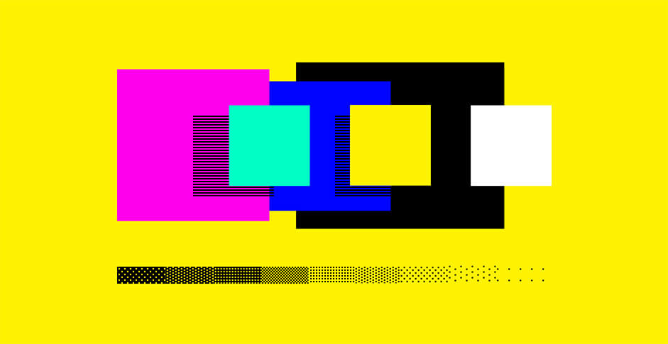
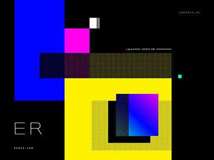
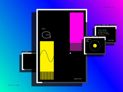
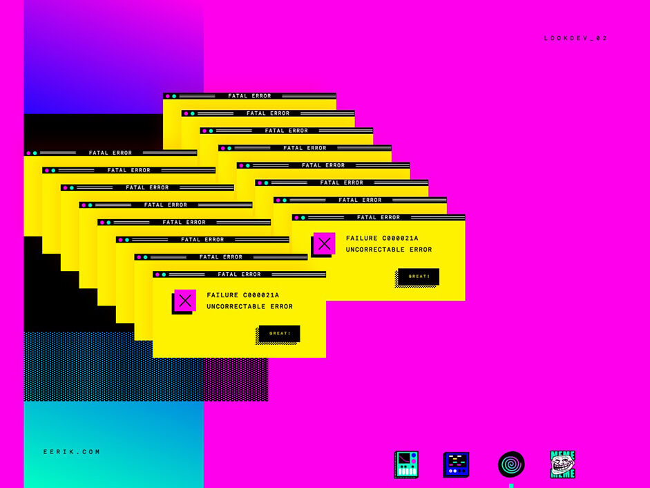
Once I nailed the style, I designed couple of lookdev visuals that acted as a visual identity manifesto. A very useful tool for consistency and inspiration during the design phase.
The development
How
With my high demanding full time position in one of the fastest paced agencies of Australia, I knew from the beginning that committing to a personal project of this size would be challenging. I had to come up with a realistic plan to aim to. 2 months prototype, 4 months MVP and 6 months V1 launch. This helped to keep the focus and prioritize the development.
System
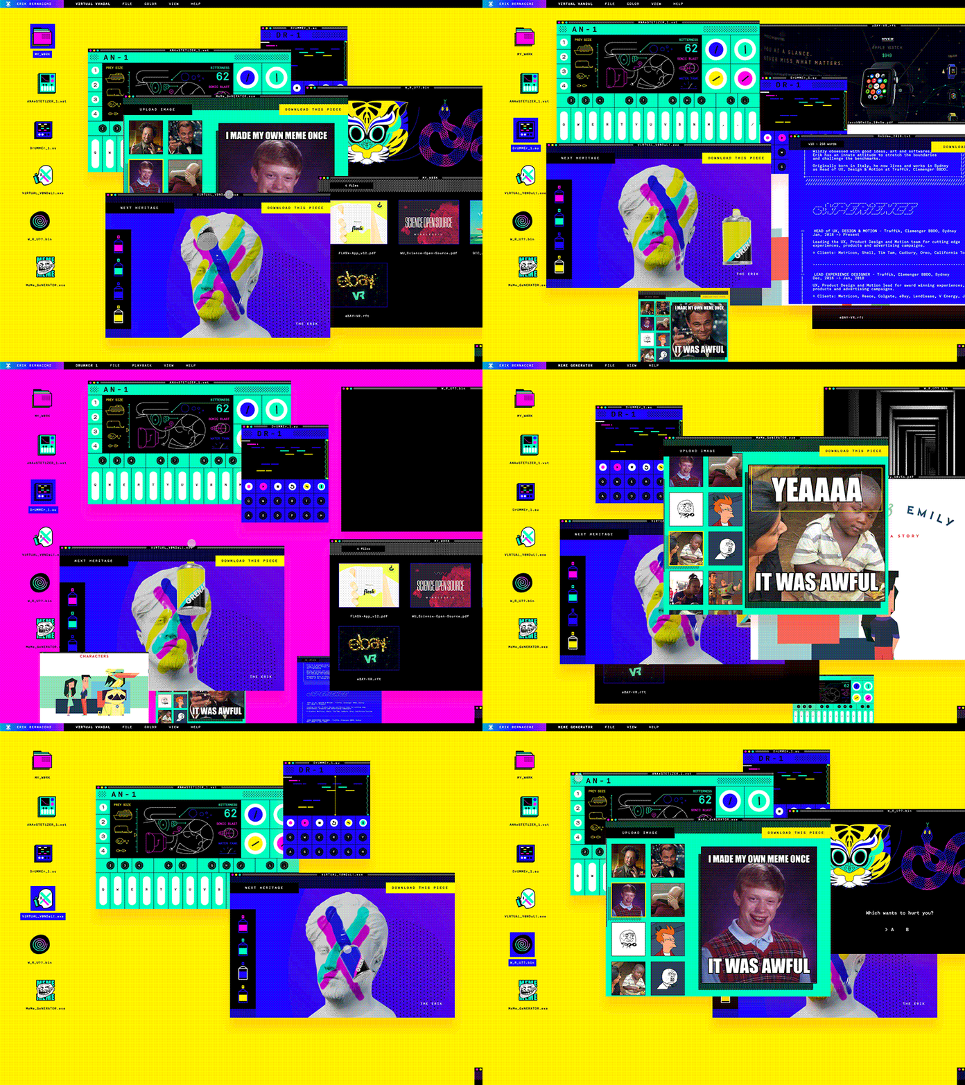
The design’s modularity helped sectioning the progress in quantifiable chunks. The first and most important area was the OS itself; it had to lay foundations for the apps to come and be solid enough to host all the functionalities planned.
Make it Scalable and Enjoyable:
I built the OS with an interactive component based (you could say “a la React”) principle in mind, where each component’s look and behavior are encapsulated together. However, I didn’t want to rely on existing frameworks. I wanted to focus on the project rather than the burden and overhead of adopting something that most likely would have been way too complex to build and maintain.
My framework is completely custom and grew in parallel with the other apps when more features are required.
Make it Quick:
Another challenge was to solve the loading time that could have affected the website. The solution was to develop the apps as standalone “Javascript executable”, mimicking how actual operating systems work. Only when opened, the app requests all the needed dependencies, scripts, images, fonts and stylesheets. This made a 50Mb website loading in 0.1 seconds and enabled an incredibly pleasing experience for such a content heavy site.
Make it Fast:
To ensure butter-smooth 60fps animations and 3D interactions, an Activity Monitor was built to keep track of each app and direct processing power usage wisely.
Apps
Keyboard & Drummer
The keyboard synthesizer uses Web Audio API. Its vintage sound was modeled with inspiration from the timeless Prophet 5. It has a track sequencer and pitch modulation built into each key. Through the display interface, the user creates the sound by adjusting the mood of a pistol shrimp, the loudest animal on earth. Using the same technology, the drummer allows the user to create a beat. It features quantization, trimming, looping, bmp modulation and live recording.
Virtual Vandal
Built on top of WebGL, Virtual Vandal it’s a fun tool where the user can vandalize a virtual statue like a bad boy. A good way of finishing off a daily meditation! The statue happened to be a caricatured bust of my face which I sculpted in ZBrush and prepared for real-time in Modo.
The 3D painting system works by wrapping a Canvas element as a texture map into the UVs of the model and then transferring the 3D mouse position to the canvas 2D coordinates.
Meme Generator
This little Canvas tool makes meme generation easy and quick. The user can choose between the most popular memes or import their own images, type in their hilarious (do not argue!) copy and export.
W R U
The next app is “W R U?” A fictitious role-playing game where the player needs to answer unsettling questions about his personality. It has been built with videos and gif animations in sequence.
Grumpy Chatbot
To complete the experience there is a chatbot named Erwin’s grumpy cat (yes, Erwin Schrödinger cat). The website keeper that greets you on login and replies to human insults. The bot AI (even if not that intelligent you would say!) is built with a rudimentary intention recognition algorithm to extract the user sentence grammar and answer accordingly. To make the bot even more believable I added realistic reading and writing timings that mimicked the average write and reading speed of a normal human being.
The results
The results have been very satisfying.
- 12000 unique users in the first 3 weeks.
- 40000 instances of apps and games opened to date.
- The Meme Generator has been the most popular app.
The project has also received amazing responses from the industry with an Awwward #SOTD win, a feature on BoredPanda and a couple of features in design book publications to be released next year.
Conclusion
Seven months of hard work that paid off and made me grew as an artist. During the process, I have improved drastically my programming skills which has brought me to improve every other skills in the arsenal. As you get comfortable with programming, your way to think, ideate and prototype interactions and interfaces changes. As a creative who codes, you have unlocked serious superpowers!
Author Info
Erik Bernacchi is a polymath mind whose areas of wizardry range from Product Design, UX, Art Direction, Illustration, Animation, 3D and Programming. Wildly obsessed with good ideas, art and softwares, Erik has an innate attitude to stretch the boundaries and challenge the benchmarks. Originally Born in Milan he has dedicated his last 10 years between Italy and Australia crafting products and experiences for the world’s biggest companies.

