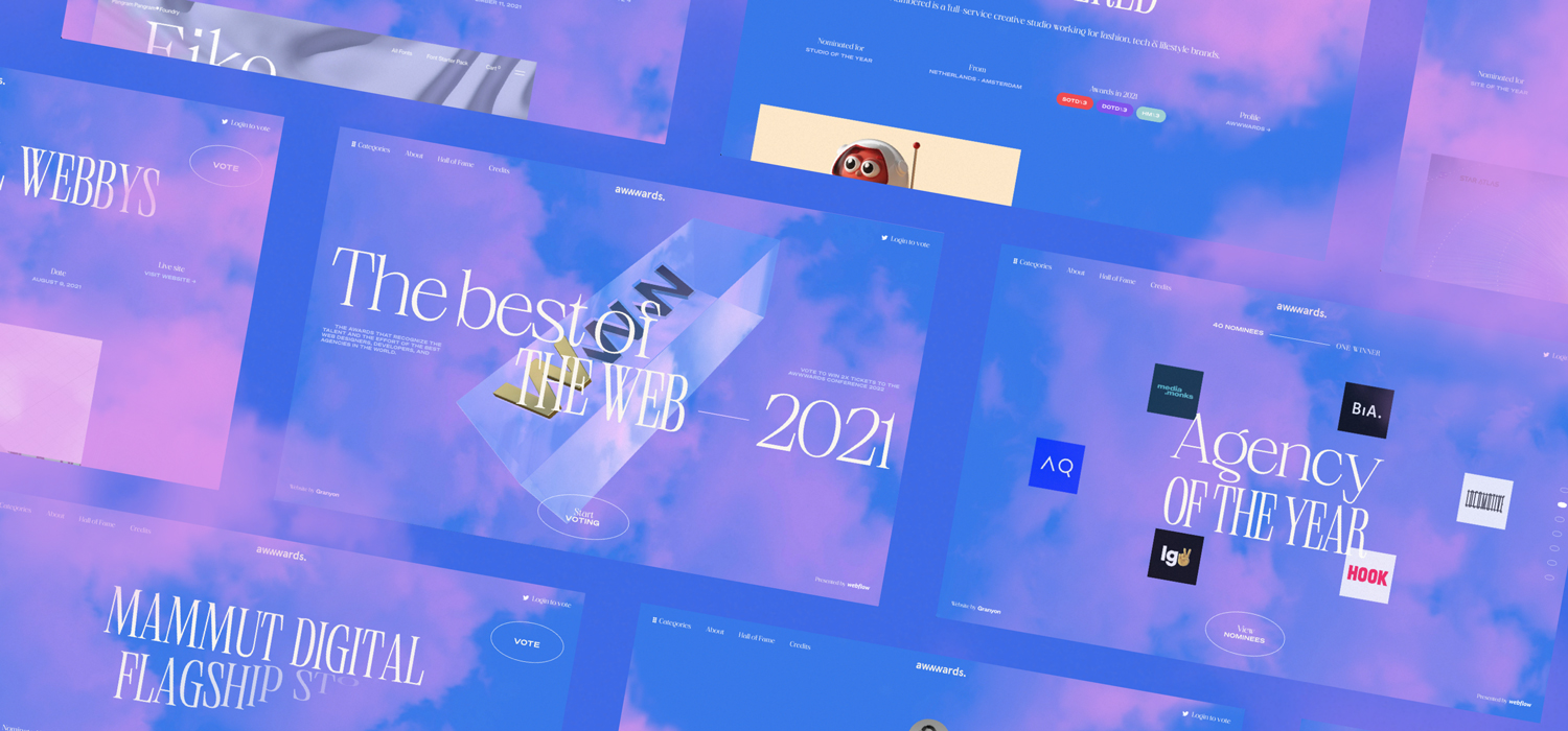
We want to use this space to thank the team behind Awwwards for trusting us with designing the voting platform for the Annual Awards 2021. It’s been quite the ride (or should we say flight?) to create the platform displaying the best and most beautiful web creations in the world.
The result is a floaty, bright, and minimalistic website – made in Webflow, celebrating the Awwwards community and all the beautiful, creative work from designers and developers worldwide.
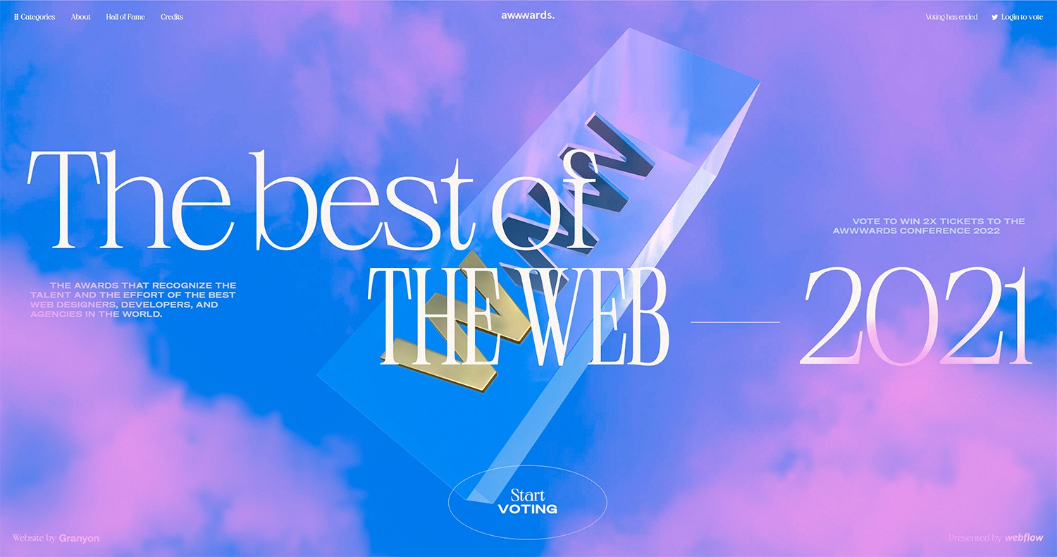
Awwwards recognizes the talent and effort of the world’s best designers, developers, and agencies in the world. It’s “a meeting point, where digital design professionals from across the globe find inspiration, impart knowledge and experience, connect, and share constructive, respectful critiques.”
We knew from the start that the Annual Awards website had to honor all the talented people out there. We wanted the website to celebrate the many hopes and aspirations connected to Awwwards and dreaming together as a community. But how to capture intangible emotions as dreams and aspirations?
Let’s dive into some initial thoughts, dreamy mood boards, technical tweaks, and a handful of nerdy details from the work behind the platform.
We wanted the website to celebrate the many hopes and aspirations connected to Awwwards and dreaming together as a community.
Designed & developed in Webflow
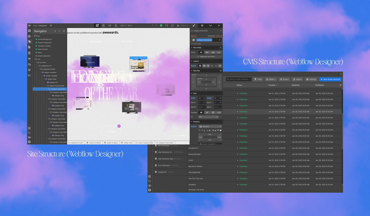
As a creative challenge, we designed the website in the no-code CMS system Webflow – the main sponsor of this year's Annual Awards. To create the desired effects, we took advantage of all the opportunities Webflow offers, combined with other technologies like WebGL and JavaScript code.
Being on ‘Cloud Nine’
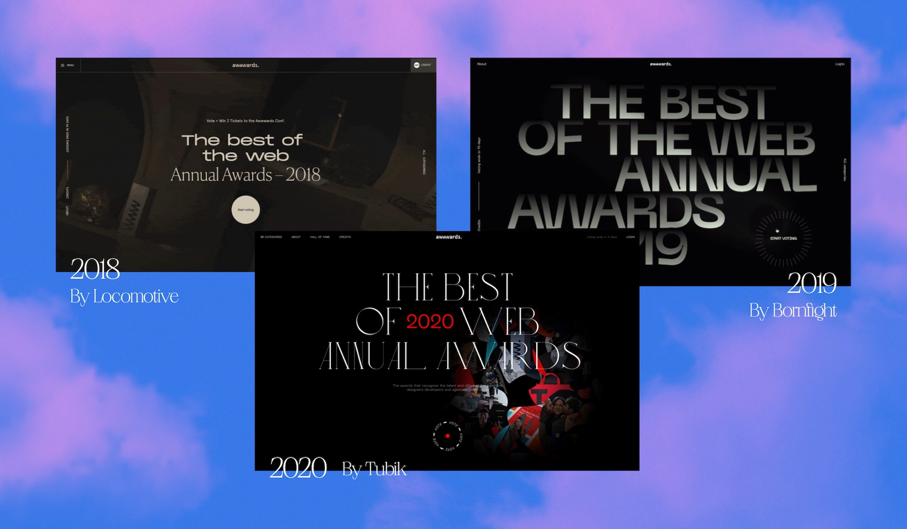
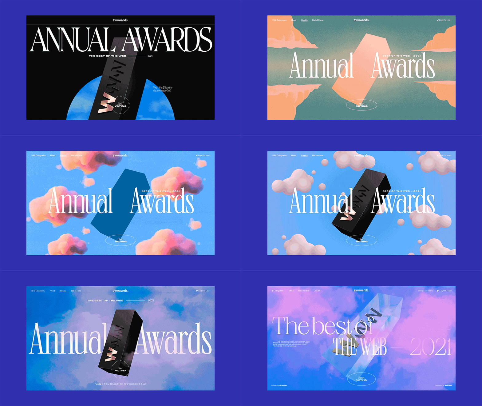
We started by looking at the design from the previous years. They all had a few things in common: typographic, interactive, and characterized by a dark look. We agreed that we would try going for something different – a more light and floating design.
We wanted the visual to be dreamy and have a heavenly feel to it. One image kept coming back to our minds and ended up being the moment we wanted the website to stage:
"Imagine the feeling when lying in the grass on top of a hill. You look up at a bright sky of floating, soft clouds. Your mind starts to wander, and you dream about being nominated or even winning one of the most prestigious prizes in the world of web design – an Annual Award."
With this in mind, we started creating a few mood boards to reach the feeling we were looking for. We ended up with the idea of being on ‘Cloud Nine’ – the feeling you get as a designer when being nominated or even winning an Annual Award. We think many in the Awwwards community can relate to this feeling
We ended up with the idea of being on ‘Cloud Nine’ – the feeling you get as a designer when being nominated or even winning an Annual Award.
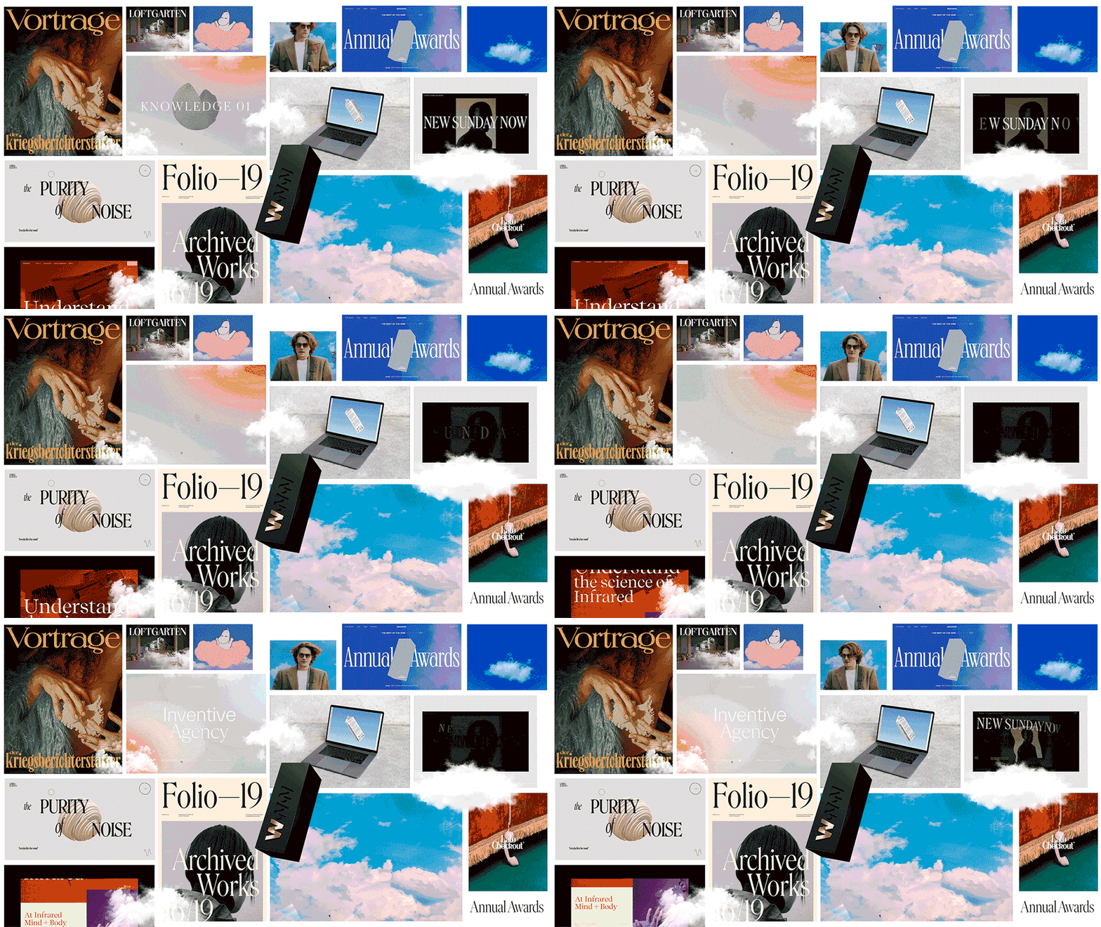
Clouds raise many questions: How do they look? How do they behave? What do they mean?
Playing around with clouds
We were happy with the idea but as we moved on we realized that clouds are not just clouds. They are in fact surrounded by a lot of mystery. Clouds raise many questions: How do they look? How do they behave? What do they mean?
One of the things we discovered was: “Pink Sky At Night, Sailors Delight,” meaning that if there’s a pink sky at night, it means good weather tomorrow. With that in mind, we tried different clouds and ways to create clouds.
We tested a mix of naturalistic-, 3D- and more painted-looking clouds. They all had something special about them, but what caught our attention the most was the true-to-life look. The contrast between dreams and realism gave an exciting dimension to the design. We wanted the user to feel they were looking up at the sky when entering the website. The naturalistic-looking clouds gave that feeling the best.
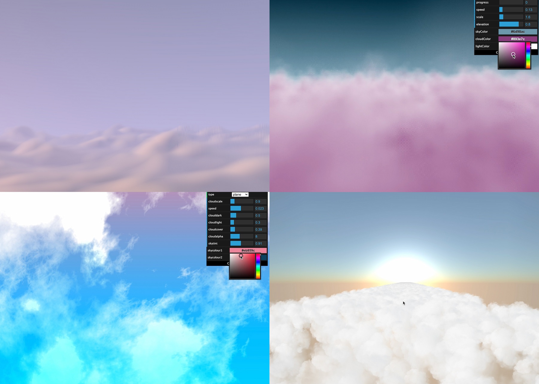
We also did some different tests with the cloud background. Rendering clouds in WebGL is not easy as it quickly ends up in many loops since it usually requires noise and fractional brownian motion or FBM. We figured out that simple images would look better.
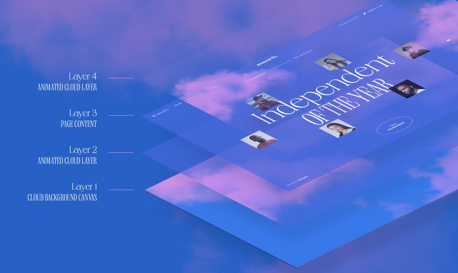
Now that we knew how the clouds looked and what they meant, we needed to figure out how to make them behave the right way. We build up the website in four layers to create a feeling of clouds moving at different speeds. It helped give the sense of randomness that clouds usually have.
Creating the Awwwards trophy
On top of the layers of skies, the website has a 3D visualization of the Awwwards Trophy. We used Blender to create the trophy 3D model based on SVG images of the actual trophy. The 3D model was then exported as a GLTF with Draco compression, giving us a lower file size (162 kB) and imported into the browser using Three.js.
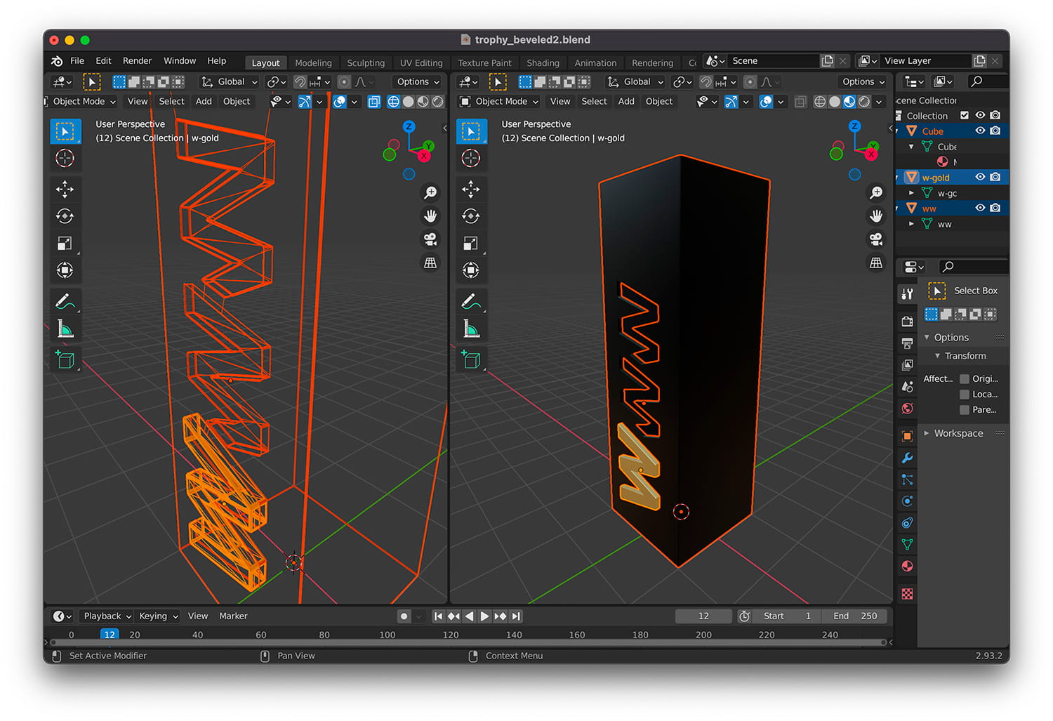
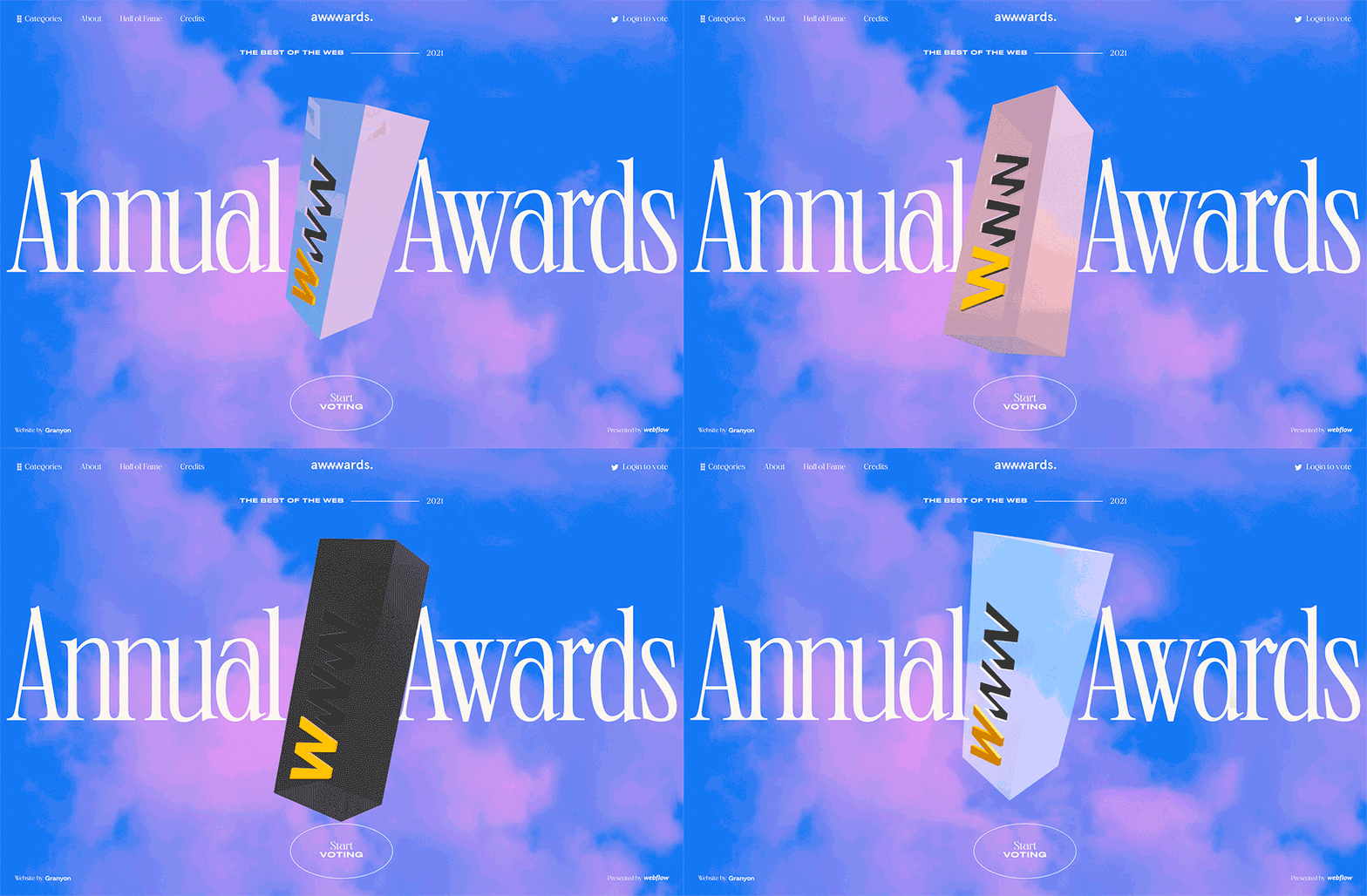
While deciding on the clouds and design for the website, we explored different styles for the trophy and ways to make the trophy stand out – a simple matcap with the nominees’ reflection, a black and stone material, and a phong reflective. We eventually ended up with the ‘glass effect’ using refraction since the concept was evolving in the sky.
We eventually ended up with the ‘glass effect’ using refraction since the concept was evolving in the sky.
We could go with MeshPhysicalMaterial from Three.js, but decided to go with the multisite refraction technique from the talented Jesper Vos. Find tutorial by Jesper Vos here. This technique allowed us to add some barrel distortion and chromatic aberration to the custom ShaderMaterial and it offered better control of the refraction.
As a final touch, we used simple MatCap Materials for the golden and dark ‘WWW’ to simulate light reflection.
The Backend – Voting
One of the important elements of the Annual Awards website was the voting platform. On the backend side, the Webflow CMS had to be synchronized with the data from the Awwwards API.
We used the Webflow API to create and update the nominees and different projects. Because the voting process was made through the Awwwards API, we didn't have to take care of anything else than providing data. The votes and score updates were updated every hour with a node js script running on an heroku server with a CronJob scheduler.
Cloud community
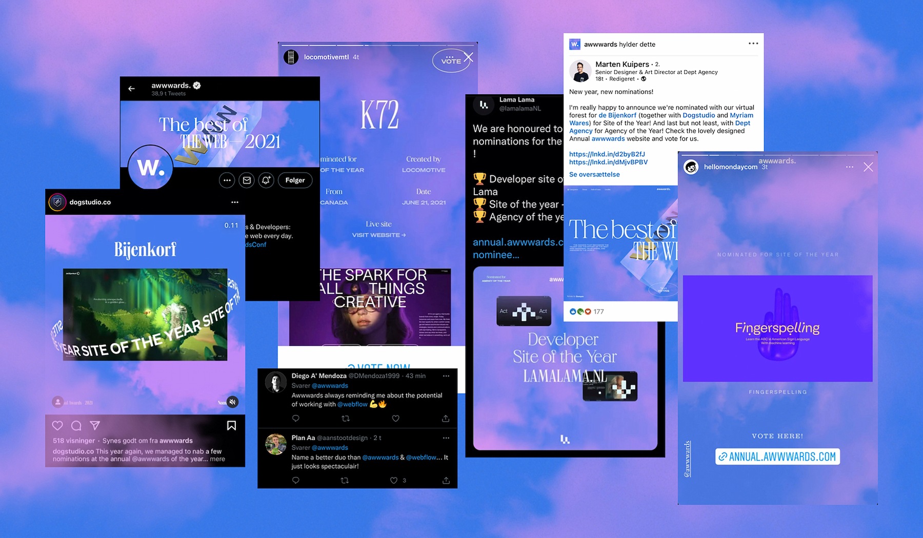
The website finally went live on January 10th, 2022. The Awwwwards community embraced the cloud universe – just like we hoped – and we were thrilled to see how many agencies and independent designers posted clouds on their social media. Thank you for the support and congratulations to all nominees and winners!
Technologies
Company Info
Granyon is a Copenhagen-based branding- and design agency with a team of strategists, copywriters, and designers. We deliver campaigns, strategies, content, and digital/analog solutions to Danish and international clients. Read more about us here or connect with us on Instagram, LinkedIn, Facebook or Twitter.
