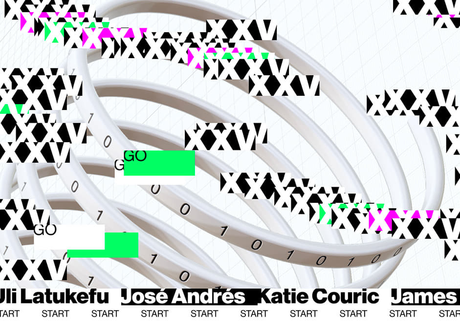
A big congratulations to Media.Monks for winning Site of the Month August with The 25th Annual Webbys, thanks to everyone who voted, the winner of the free year in our Design Directory is at the end of the article.
A comedic host, trophies, A-list celebrities, industry leading companies, 5-word speeches–all parts of The Annual Webby Awards Ceremony, usually held in a luxurious venue in New York.
The 2020 ceremony should have been one like any other year. However, like many award shows, for the first time since 1995 the ceremony could not take place. In the earliest months of the pandemic, the Webbys team pivoted quickly, pulling off a “Webbys From Home” edition during a time of great uncertainty when the whole world was on lockdown.
The Webby Awards set out to put on a fully web-based show––equal parts the live-show and digital experience.
Looking ahead to 2021, assuming the challenges of putting on an in-person event would remain, the Webbys team decided to approach their blockbuster event as, well, a Webby-winning event. To celebrate the 25th annual event celebrating the very best of the internet, the Webby Awards set out to put on a fully web-based show––equal parts the live-show and digital experience. Who better to ask but Media.Monks: the soon-to-be crowned Production Company of the Year 2020.

Branding based concept
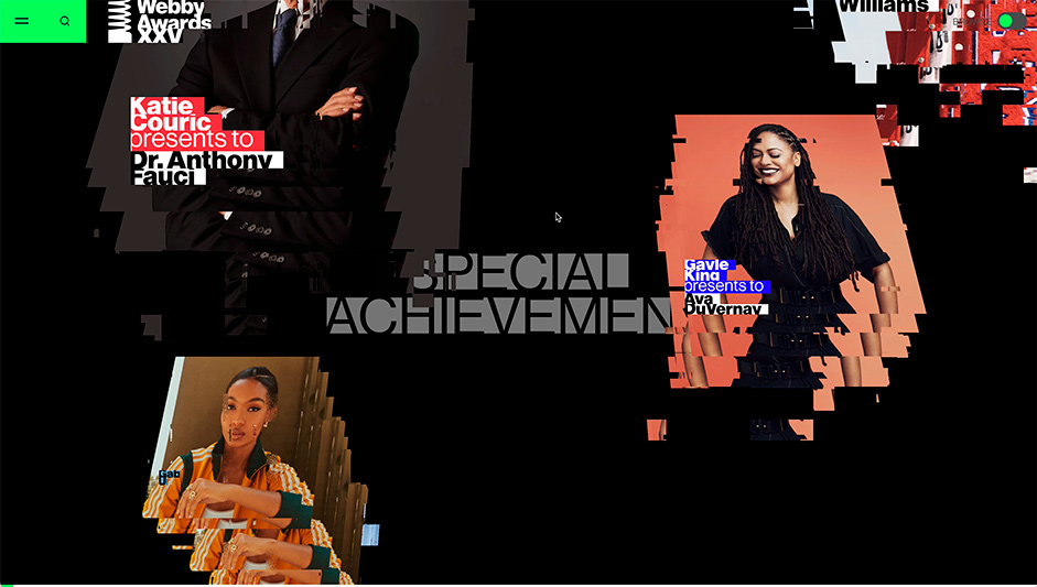
When the Webbys team came to us with this challenge, the branding style, developed by Kamp Grizzly, was set. The distorted style was non-linear and disruptive, rooted in celebrating systems, structures, and architectures of the web.
We were incredibly inspired by the design and animation style, so rather than creating a straightforward UX design for the platform and applying that style, we flipped the approach on its head and first explored how we could use this style to create a website that feels and behaves like an extension of the branding.
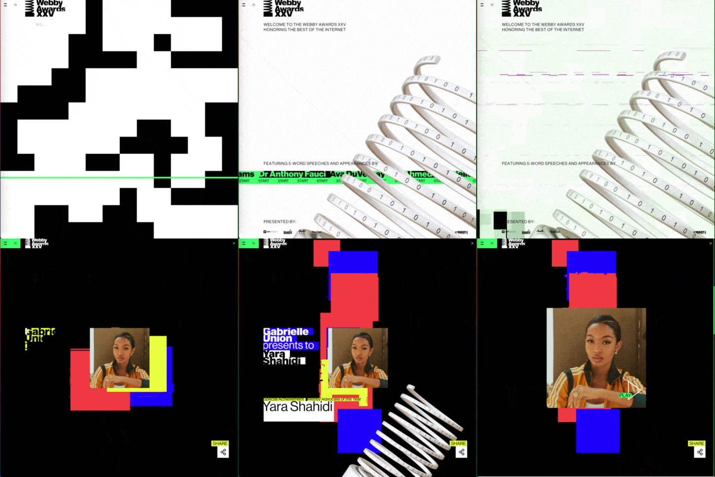
To give the user that “equal parts” feeling, they were given two options by host Jameela Jamil when opening the website: experience a 45-minute PLAY-flow similar to how a user would experience the show in other years, or go on a “pick-your-own-adventure” BROWSE-flow.
For the PLAY flow, we devised a way to allow users to kick back, relax and enjoy the show with a simple click on the "PLAY" button. Users are auto-piloted through the entire show taking them to the pages of the featured winners accompanied by our lovely host Jameela Jamil. The BROWSE flow gives the user the ability to explore all 593 winners in a more straightforward scroll-through manner, allowing them to hear all the 2965 words in their 5-word speeches.

From submission to celebration
All 593 winners received the news of their win only 4 days before the launch of the website via email, asking them to record and submit a 5-word acceptance speech. Although asset management for 593 winners in 4 days would be an interesting task to sink our teeth into, we decided to use our existing self-built automation tools to our benefit. We built a portal that winners would get access to via a uniquely generated URL and password, that instructed them to upload their speeches and photos. The submitted videos were sent into our “MMogon”-pipeline to be cropped, resized, transcoded and compressed. The pipeline also added bumpers and slates showing the Award categories, based on data fetched from the Webbys’ API. Different edits of the videos were sent back to the winner to be able to share on their social media, and sent to our database accompanied by metadata to be used on the frontend.
Example of a MMogon-generated video, for the winners to share on social media
The art of distortion // Technical breakdown
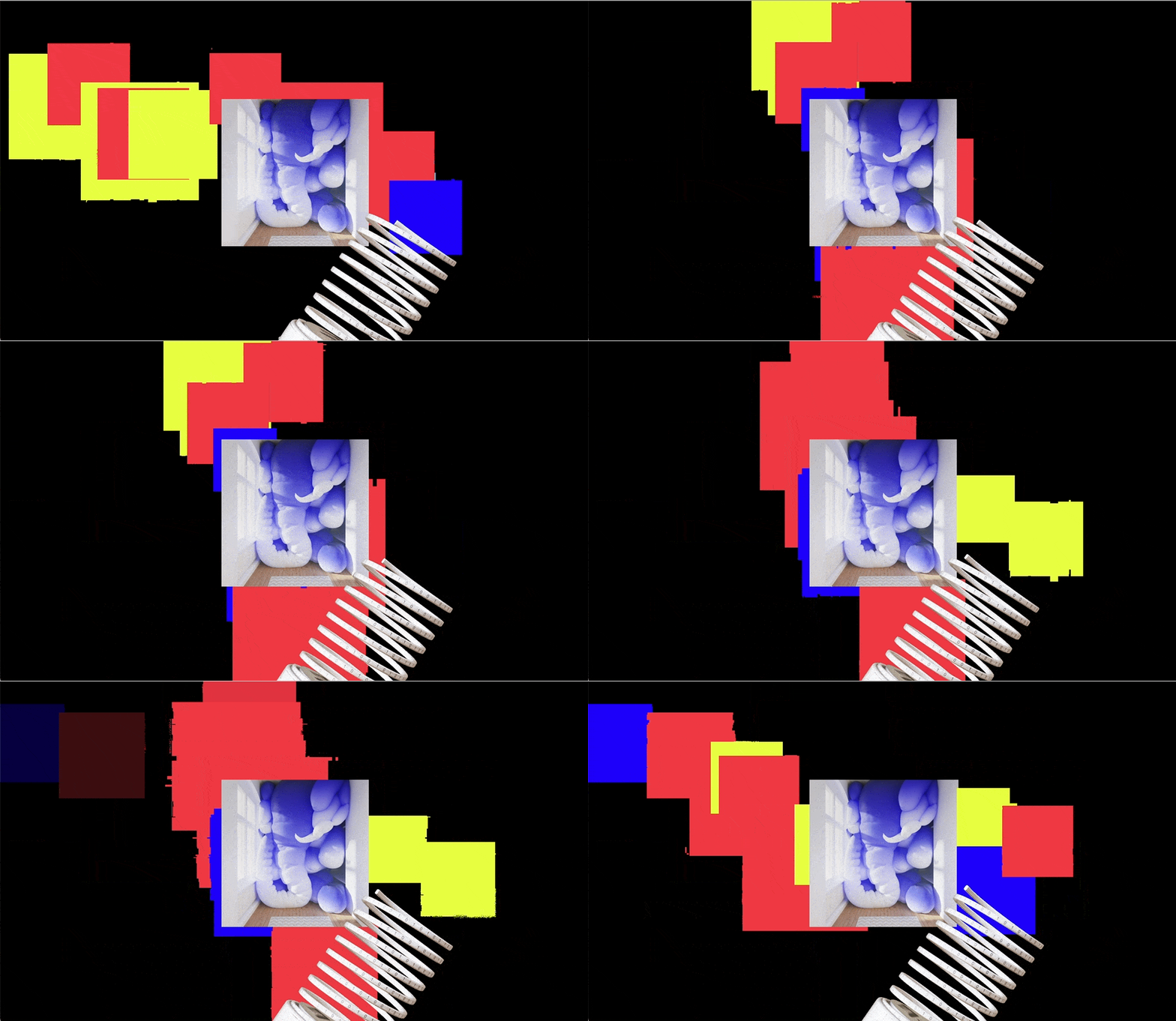
To create the numerous glitch effects on the elements on the website we created a method that allows us to register HTML elements and pass them to the webGL context along with an image or a video asset. A registered element's position and dimensions are then tracked on each animation frame which allowed us to apply graphic effects on the image or video at the correct position and size at any one time. This formed the basis of making the responsive layouts, keeping the positioning logic on the CSS end, just like your standard website, while retaining the powerful graphic effects webGL can offer us.

To get to our desired effect for certain elements we added additional parameters such as glitchStrength, xRotation and opacity which were mostly affected by the user's scrolling speed; translating velocity into a trailing effect making the cards appear to traversing the space at an angle.
The glitch effect in WebGL is composed of three parts:
- A temporal backbuffer: For each new frame, the previous frame is used as the background. When copying the previous frame to the background of the new frame, parts are deleted and small parts of the image are moved.
- Each element has a number of copies, whose position on the screen lags slightly behind the position of the original element. This causes the motion trails that you see when scrolling. The offset of the positions of these copies can also be adjusted manually, which happens, for example, during a mouseover.
- Finally, each element (and its copies) is distorted with a shader when rendered to the screen. The shade moves parts of the image and adds noise to create a really glitchy and distorted final image. The strength of the applied distortion can be set for each element separately, so we were able, for example, to increase the distortion of elements on mouse over.
Sound further brought the glitchy experience to life; we set out to compliment the visuals with equally distorting sound.
Sound further brought the glitchy experience to life; we set out to compliment the visuals with equally distorting sound. It was important to not become too screechy or invasive while the user is browsing so we found a middle ground between retro beeps, dying computers and sci-fi chimes. The music went through similar iterations, aiming for a lounge-esque vibe and through the use of a stinger to build up to the introduction by Jameela and back to a more relaxed version while browsing.
The future of events
As we look ahead to the new era of live, interactive events, The 25th Annual Webby Awards serves as another proof point that web-based entertainment can be done in a creative and inspiring way. As the future unfolds before us, and in-person events return in varying degrees around the globe, we won’t forget what we’ve learned in a completely virtual world. A new era of virtualization is upon us, as the way consumers live, work, and play online has fundamentally changed. With a firm understanding of the ways technology and creativity converge to engage both in-person and virtual audiences, Media.Monks is ready to help brands navigate uncharted territory.
About MediaMonks
MediaMonks is a global creative production company that partners with clients across industries and markets to craft amazing work for leading businesses and brands. Its integrated production capabilities span the entire creative spectrum, covering anything you could possibly want from a production partner, and probably more.
Thanks for getting involved with the votes and sharing it on social media - @sergeyioffe_ you have won the pro plan, please send us a DM to collect your prize!


