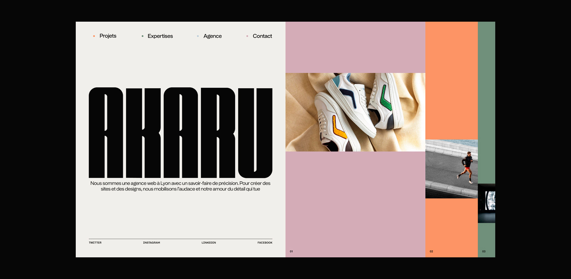
Massive congratulations to AKARU for winning Site of the Month April 2024 with AKARU, thanks for all the votes and tweets.
Here we are.
After nurturing the desire to redesign our website for some time, we have finally managed to bring it to life this year. In fact, we've been working on it since the end of 2023, but it's important to mention that there were several attempts before arriving at this version. Our fellow designers and developers will surely understand this, as creating and designing a website for oneself is arguably one of the most complex challenges to tackle.
Despite this, we have still managed to achieve this project, a collaborative effort of which we are extremely proud and which is now rewarded. We certainly couldn't have hoped for better.

New identity, new website
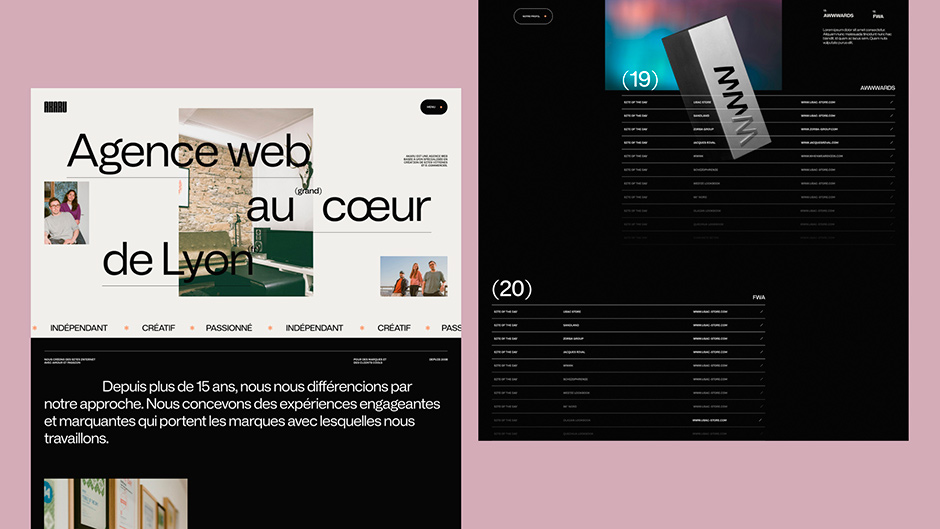
Undoubtedly, an agency’s website must reflect its identity and achievements. We sought to convey this directly through our site, carefully crafting both the choice of words, design, and development. After accumulating 15 years of experience in our field, our portfolio was well-stocked. However, despite these years of experience, we had not yet had the opportunity to present it properly, often being absorbed by the daily grind. For once, we took the necessary time. We moved forward, reflected, and sometimes took a step back, but always with the goal in mind of bringing this beautiful project to fruition, without the pressure of deadlines and budget constraints. We were our own clients. And what a sensation of freedom it was to be able to act in this way.
Moreover, the client couldn't tell us to "make the logo bigger". So, we were able to do it for our own site.

We wanted a website that reflected our identity. For us, no black and white. We wanted to use color to showcase the personalities of our team. We wanted to play with movement and the bold typography of our logo. It's on this basis that the idea of the introduction animation emerged.
If we had to share one piece of advice, it would surely be to try to be different in your approach without copying. It's complicated because many websites are launched every day.
Like many agencies, we have had quite a few ideas that came out to us while we were working on them. In such cases, you need to be very reactive as soon as you find the little thing that will make your site different and impactful.
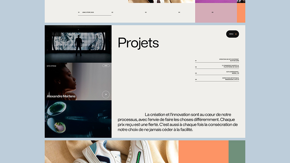
“Creativity and innovation drive our process. We joyfully reject the ordinary, the familiar, and the commonplace, always striving to chart new territories in our work."
Our lesson
To facilitate the creative process and exchanges between designers and developers, we created a lot of motion design in the animation intentions to give the clearest vision between the teams.
Every transition, UI element, and appearance was prepared in advance to facilitate the developers' work. This notably helped to circumvent some issues that can arise during development.
Many animation intentions designed statically do not necessarily work during development.
Technologies
We wanted a website with smooth animations that don't compromise the site's usability, but enhance it instead. A fast and efficient site was our goal.
Framework: Nuxt3
CMS: Sanity
WebGL: Three.js
3D Assets: Blender
Akaru was developed using Nuxt 3 for the front-end and Sanity for the back-end. We recently migrated our tools from Nuxt 2 to Nuxt 3, and the development of Akaru allowed us to finalize and test all our latest developments.
For the back-end, we usually work with Prismic. We were curious to test Sanity because its studio part is in React, allowing us to develop our own components, add validations to certain fields, and create our sketches with a bit more freedom. We also tested Mux Video, which works quite well with Sanity. It simplifies video integration, optimizes delivery for all devices, and offers detailed analytics to improve the user experience.
The trophy is integrated with Three.js and our internally developed tool named Corgi, which allows us to quickly set up 3D integration on our web pages. The animations were created using GSAP, mostly inspired by motion designs provided by our Art Director Jérémy. We tested Lenis for smooth scrolling.
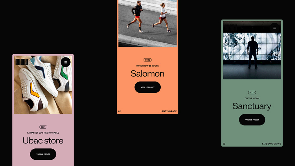
Regarding the animations, the technical challenge was mainly on the home page, which has a complex scroll navigation system. We could have chosen to animate this page with ScrollTrigger, but we preferred to maintain total control over what we were doing. All screens needed to transition smoothly without losing the user, despite the horizontal navigation.

Company Info
We are Akaru, a creative web agency. We specialize in creating graphic identities, showcase websites, and custom e-commerce experiences with real personalities. Since 2008, we've been working on cool clients and projects.
Our ambition has always been to continue to evolve, to learn, to surpass ourselves. Our team, united, and proud, is made up of true creative personalities. Or so we're told.
Come say hello to us!
IN : https://www.linkedin.com/company/agence-akaru/
X : https://twitter.com/Akaru_agency
IG : https://www.instagram.com/akaru_agency/
Our website : https://akaru.fr/en/
Crédits
Cyril Amouroux, Photography - Hocus Pocus, 3D - Julie Barthélemy, Copywriter.
