Congratulations to Immersive Garden for winning Site of the Month November with Orano! Discover the making of this 3D storytelling experience that feels more like an adventure than a product description. Thanks for all the tweets, find the winner of the Pro Plan at the end of the article.
Introduction
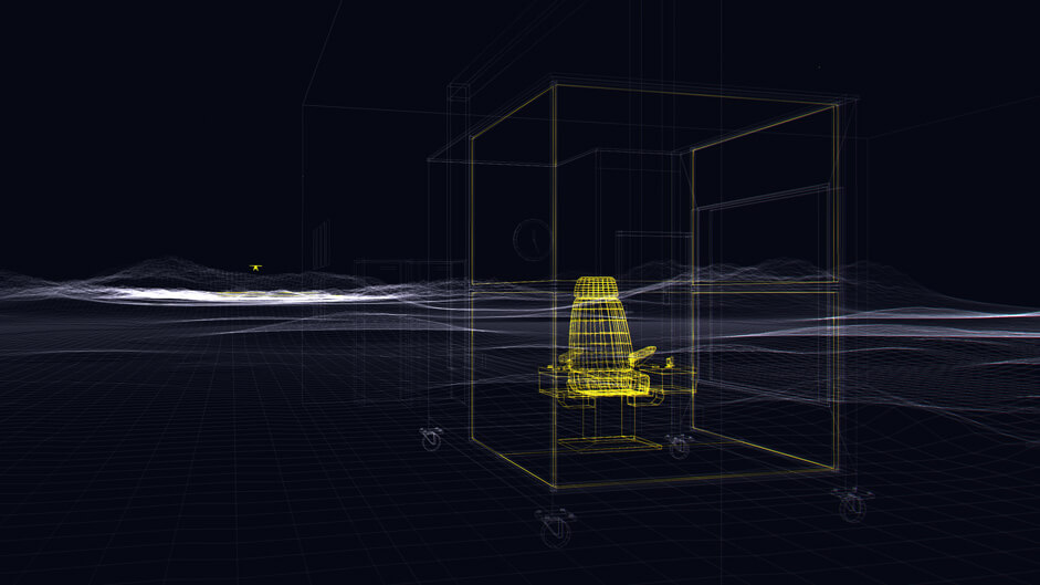
We were contacted by the agency Grenade & Sparks to create a digital experience for Orano in the context of the company’s rebranding, Orano develops innovative products to guarantee the safety of their collaborators during nuclear interventions. The objective was to explain the overall value proposition under a set of themes representing individual products and their use cases, for which we wanted to create interesting and engaging interactions that encourage us to explore further. Each vertical scroll ends with a small gameplay that fully illustrates each product’s purpose.
We spent a great amount of time and effort trying to create a digital universe, for each product we travel to a new location where something different happens. With this approach the website felt more like an adventure than a product description.
We, humans created nuclear power, yet it is not accessible for us. This virtual universe allows users to explore it, thanks to the innovative navigation and immersive experience.
On the technical side of things...
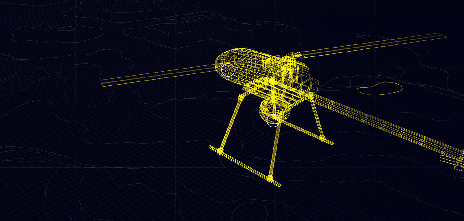
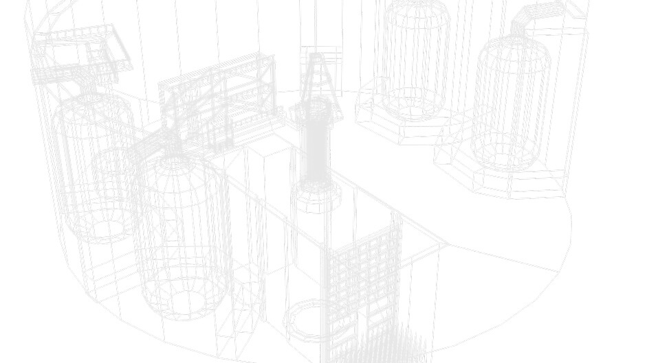
The 3D environment was created in WebGL with Three.js. We built the majority of the assets ourselves in Blender to simplify the process and optimize weight and compatibility of the various objects, while rapidly improving visuals.
Unfortunately we weren’t able to use the wireframe property of Three.js as it displays triangles where we were hoping to see rectangles. As a solution we set up an export system with OBJ in Blender, we only exported the edges while maintaining the order of the vertices. We subsequently developed our own parser to read the export correctly and create a geometry in which only the edges would be contained. Once the parser was built, we applied our own materials to a LineSegments from Three.js.
Another advantage of this technique was the overall weight of the assets. We had 30 3D models, weighing 3.7Mo or 901Ko when gzipped.

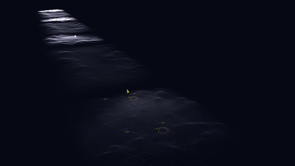
The terrain environments were created from images whose red and green color channels enabled us to define elevation and opacity. We wanted to ensure the user felt like they were entering a large universe, but in order to optimise the website’s performance we used the same terrain repeatedly - under different angles to create the illusion of new mapping.

The same technique was used for the flyover landscapes during transitions, with a smaller and less detailed mesh, again to optimise the website’s performance. The camera movement is large enough to make it impossible to notice. On mobile the meshes are slightly more degraded to make the site more accessible.
Multiple shaders were added onto the render to make the experience more immersive :
- The introduction animation combines a tile offset in tandem with an RGB offset, varying slightly according to cursor movement.
- The menu open/close animations combine saturation, gradient, tile offset and color variation effects to create the intended outcome
- An RGB offset with intensity variations according to a focus point that exists within the scene’s principal UI element
- An SMAA to reduce the aliasing on screens having a pixel ratio inferior to 2

For DOM management and routing, as per usual we used Vue.js which enables us to develop applications rapidly without sacrificing simplicity, weight, maintenance and reusability.
We generated the CSS with Stylus and used Webpack as the task runner.
We had very little documentation and material to create the content or the 3D models, a significant portion of the production involved proactive proposals on solutions that would enable us to meet the original ambitions despite this, as well as recommendations on staging and gameplay. The collaboration with Grenade & Sparks and client was wonderful, both parties trusted us to strive towards the best possible outcome. We worked with Mooders for the audio design.
The winner of the year Professional Plan in our Directory is @EinsKomma618, please PM us on twitter to activate your prize!
