Massive congratulations to ADORATORIO STUDIO for winning Site of the Month June with PASQUA WINES, thanks for all the votes and tweets, check the end of the article to see if you've won the free year's Pro Plan
When Pasqua Wines reached out, it initially felt like any other wine producer in need of a new website.
It was only by getting to know them, that we learned how they worked in complete opposition to the mostly motionless wine industry.
While true to their heritage and the tradition of wine-making, Pasqua embraces a modern, design and innovation-oriented communication approach, creating a refreshing richness in their labels, digital campaigns and photoshoots.
In a world entangled by heritage, paralyzed by tradition, Pasqua is “The House of the Unconventional”.
Foundation
The journey through this world of Icons and timeless classics started by evolving and defining the digital image of a shimmering Brand to make it robust and contemporary, yet flexible to the creative and visionary whims of its people and the artistic collaborations that often sprout from such a dynamic group.
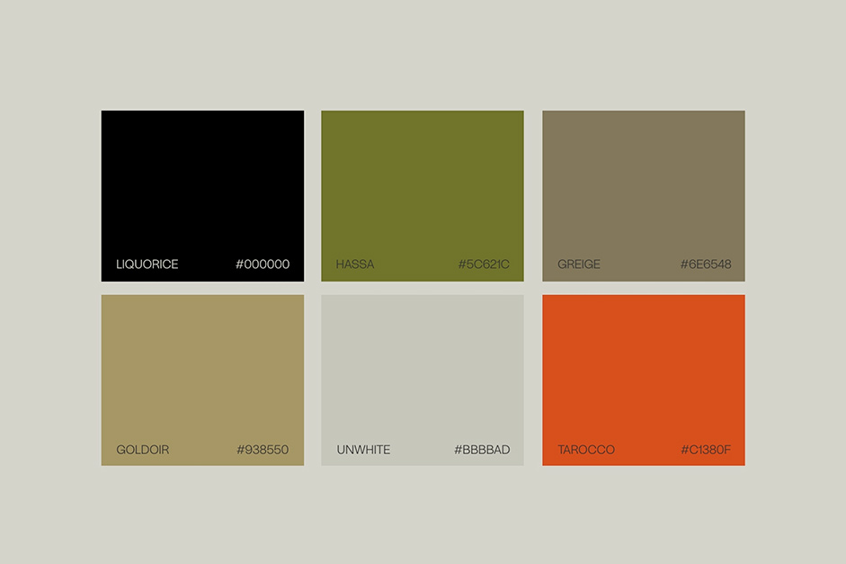
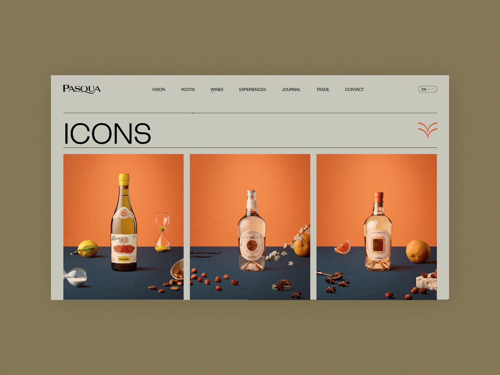
The palette of neutral and earthy tones, so dear to the Wine industry standards, was interpreted with careful (and sometimes unexpected!) color choices, desaturated to be the perfect canvas for future content while standing bold and inspiring in its own right.
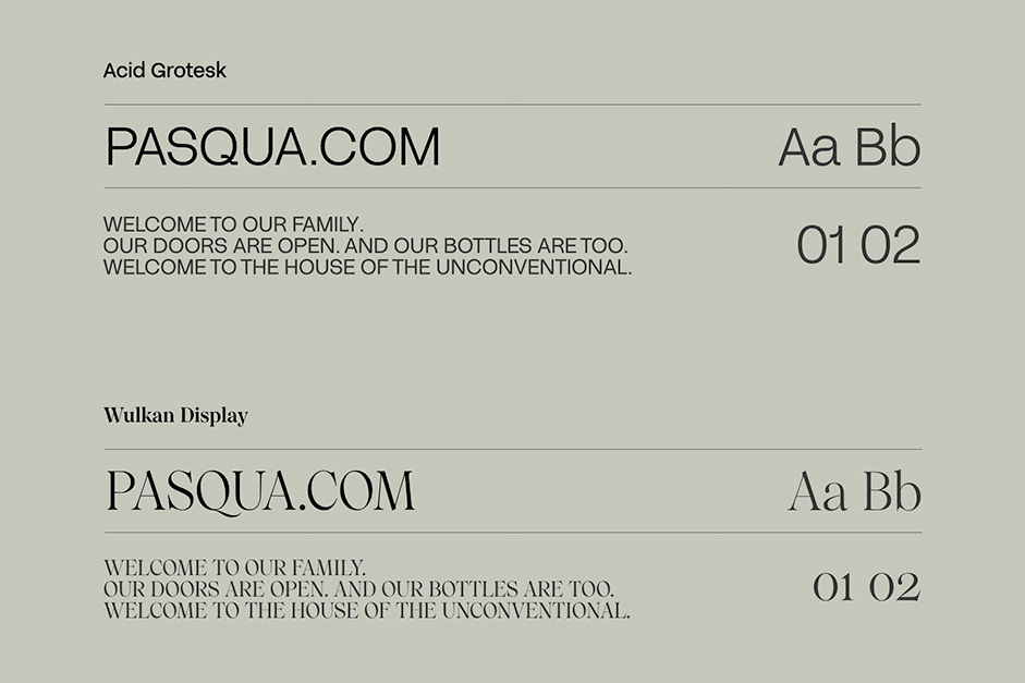
To provide an additional push to the editorial design of the website, the font pairing of Acid Grotesk and Wulkan Display makes the Bold statements, so intimate to Pasqua’s true essence and Vision, stand out even more.
Rationalizing Chaos
When working with established Brands and Companies, a strategic task that often goes unnoticed is the rationalization of content — aka defining clear navigation paths for different users — within the website, culminating in a renewed, efficient SiteMap.
The kaleidoscopic nature of the Brand and its team had brought Pasqua to a chaotic constellation of subdomains, topics and pages that truly made navigating their universe… impossible.
And it wasn’t at all surprising, given that the website had to satisfy both communication purposes (and very creatively do so) as well as more ordinary, market/sales specific requests (easy access to downloadable tech sheets, bottle shots, case cards).
The broad categories we strategized and designed for were:
- General Public: HomePage, Vision, Roots, Contact
- Wine Tasters / Spenders: Wine, Experiences
- Sales People: Trade, Portfolio
House of the Unconventional
From their extraordinary events, artistic collaborations and creative approach to labels and staples of the wine industry in general, Pasqua truly is the House of the Unconventional. And to be Unconventional often means to be unexpected.
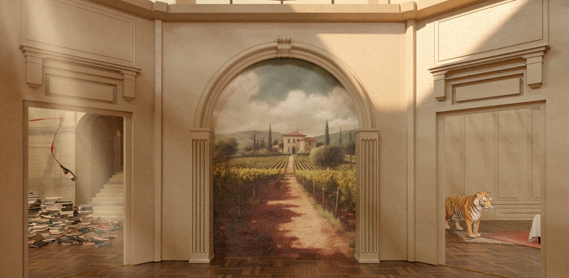
That’s where the idea for a Tromple l’oeil to start the experience was born: an illustration of an XVIII century villa that, upon clicking, reveals itself as an AI-generated fresco within that same WebGL setting.
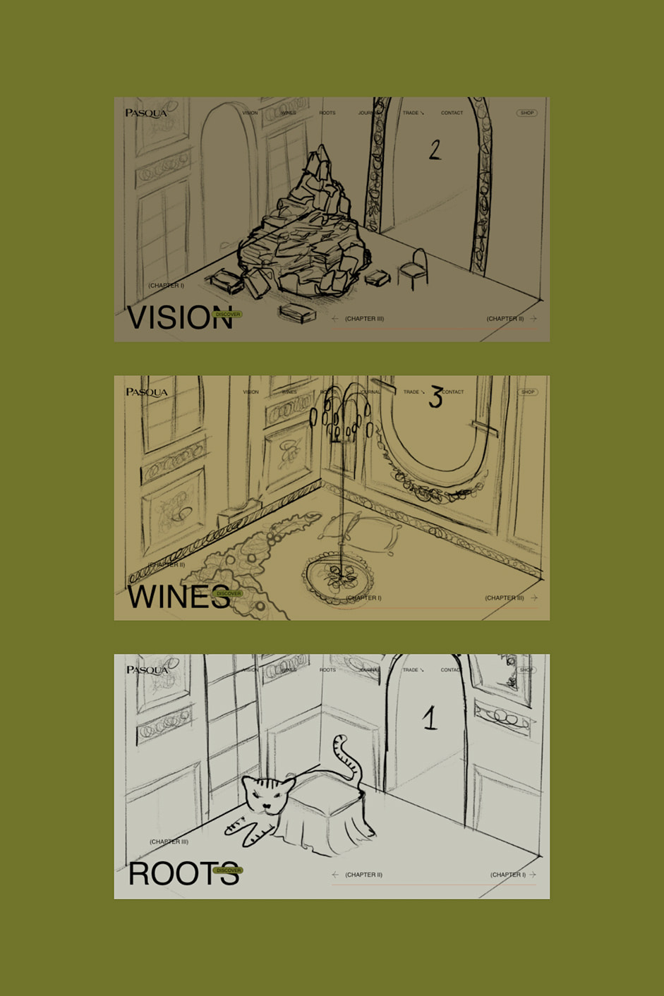
Three majestic rooms connected by smooth camera movements, each acting as the gateway to one of the website’s main sections.
We applied a variety of attention to improve the visual appeal of each room: from God Rays and windows to the Dust effect and butterflies to help increase the perceived tridimensionality of the rooms.
“The client really wanted a tiger so we found a way to slip one in there too."
From this sumptuous introduction, we then dive into the bulk of Pasqua’s website: an incredibly rich, well-structured and clear editorial site built for the general public, wine enthusiasts and salespeople alike.
Climbing a Pile of Books
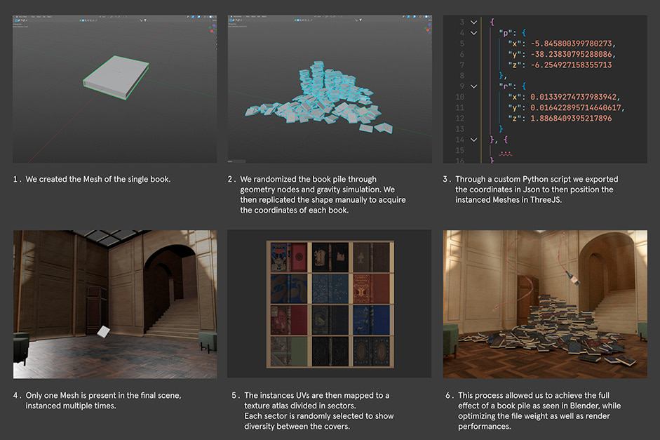
Being Pasqua the largest and richest WebGL environment we ever built for a client, deep optimization of our assets was of the utmost importance. And among the many challenges (lighting, meshes, carpets), who would’ve known a pile of books would’ve doubled as an unclimbable mountain. Yet, years of typing made our Devs fingers stronger than we thought.
So here’s the climb:
Technologies
Frontend Framework: Vue.js/Nuxt.js
Styles: Sass preprocessor + BEM naming convention
WebGL: Three.js
3D Assets: Blender
Motion: GSAP
AI: MidJourney, Stable Diffusion
CMS: Custom Wordpress Theme and API
Server Architecture: AWS e Firebase
Company Info
Adoratorio® is a multidisciplinary, independent Design Studio based in Italy. Strategy, creative direction and technical skills are the foundation of our work. We design meaningful products and digital experiences that can’t be ignored.
