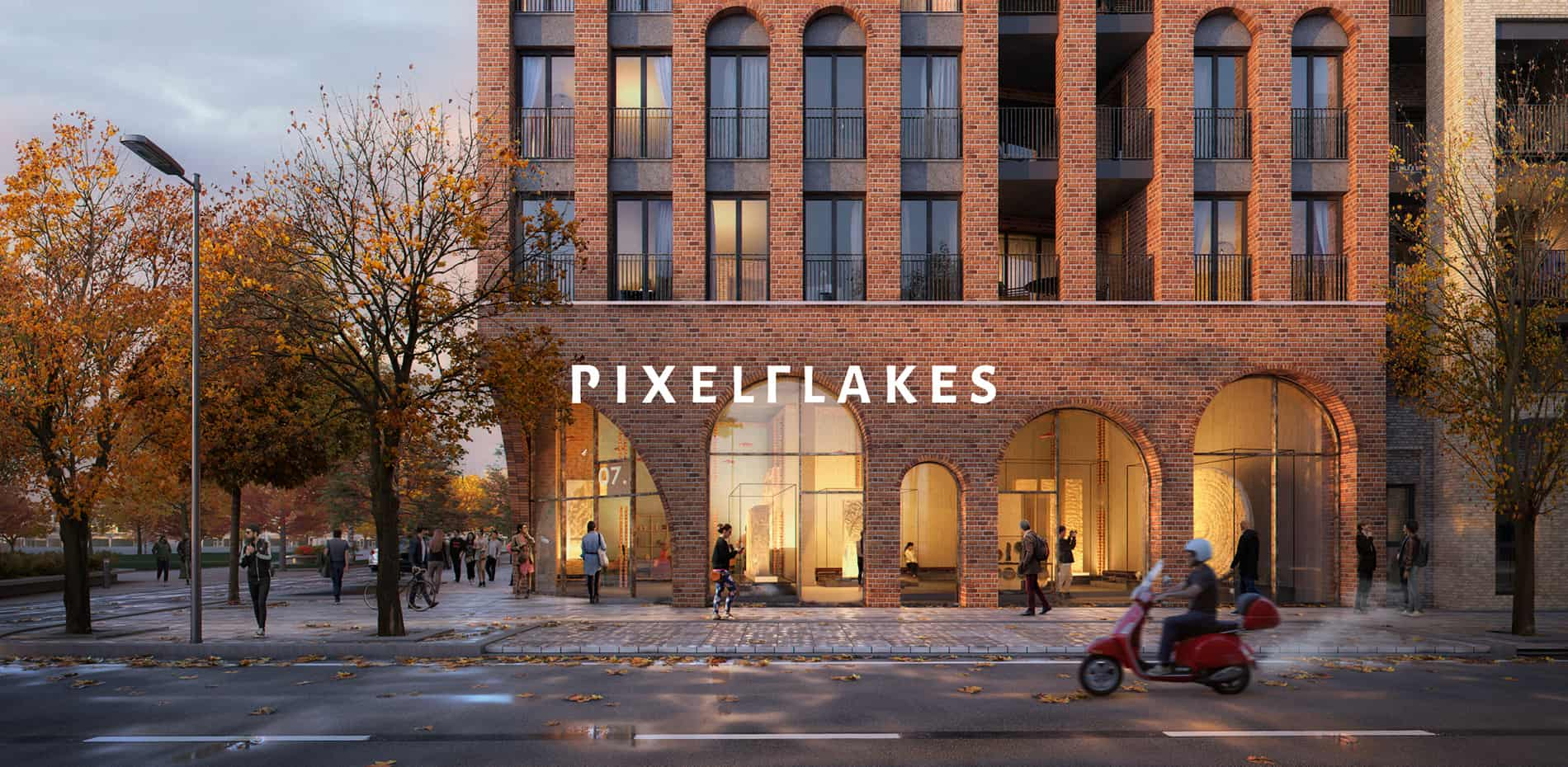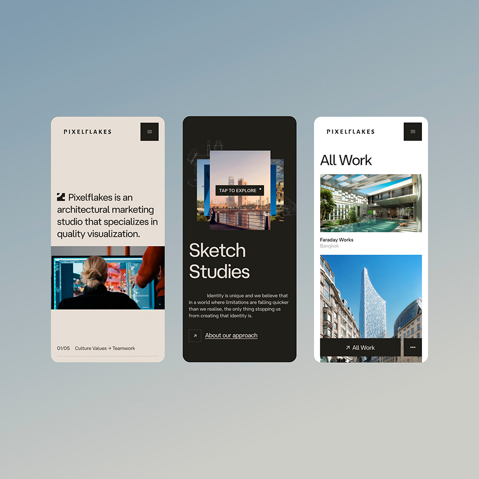
Pixelflakes, a specialized architectural marketing studio excelling in high-quality visualization, entrusted us with creating an impactful online platform that narrates their journey, attracts fresh talent, and effectively positions them as innovators in an online world cluttered with repetitive competition.
Pixelflakes strives to establish itself as an innovator in a saturated online world, separating its brand from the repetitive competition by curating a top-tier digital journey. This journey not only presents their one-of-a-kind sketch studies process and inspiring culture but also aims to attract talent for their team.
“Pixelflakes wants to establish itself as an innovator in the digital space to create competitive differentiation, attract attention, and actively encourage the attraction of top-tier talent."
Solution
By subtly weaving pixel-inspired design components into the online platform, we cultivate a premium and standout style, while custom motion design elements bring their unique sketch studies process to life. Through skilful copywriting, mixed media integration, and in-depth team profiles, the platform holistically underscores their cultural values, playing a vital role in inspiring and motivating prospective talent.
“Distinctive typography, surprising details, and branded motion come together to form a standout online experience. This fusion creates a memorable user experience that sets the website apart and reinforces the brand's distinctiveness and emphasis on high quality."
Early concepts and user experience design
During the UX design phase, we validate our concepts through rough motion studies. This approach helps us identify and address potential bottlenecks early on, allowing us to determine the content we will be working with. We explore numerous variations before settling on the definite concept for further development.
“During the UX design phase, we validate concepts through rough motion studies, identifying and addressing potential bottlenecks early on."
Immerse & Engage
In order to make the experience feel distinct and unique to Pixelfakes, we have created a custom full-screen image gallery where visitors can engage with Pixelflakes' Sketch Studies in a whole new way. Navigate a full-screen canvas by dragging, becoming an active part of their creative narrative, while simultaneously, getting a sneak peek into the behind-the-scenes magic that shapes their creative work.
“Engaging website interactions enhance user experience, build lasting connections and trust, ultimately increasing visitor retention."
Informative side-panels
We added side-panels for easy access to relevant content, enhancing user engagement without clutter. Users could explore additional information while others stayed focused on the main content, ensuring an organized, user-friendly experience based on user preferences.
Building trust and connections
By featuring the team's culture and values prominently on the website, we established trust, attracted like-minded partners and talent, and distinguished the Pixelflakes brand. This transparent approach resonated with our audience and fostered meaningful connections.
“By featuring the team's culture and values in a unique way on the website, we established trust, attract like-minded partners and talent, and distinguish the Pixelflakes brand."

Optimizing the mobile experience
With the limitations of smaller screens in mind, we conscientiously brought vital components to the forefront, ensuring a smooth and authentic brand encounter for those on mobile. We struck a harmonious blend between the new identity and an optimal user journey, resulting in an engaging website experience accessible across devices.
Technologies
Backend
Leveraging the client's favourable familiarity with WordPress, the Pixelflakes website has been developed in a headless architecture. Employing bespoke layouts and components, the client enjoys the flexibility to construct pages according to their preferences.
Frontend
For the frontend, Nuxt.js was employed to enable route-based page transitions, enhancing the website's resemblance to a native app. Managing a substantial volume of media assets required meticulous attention to load times and performance. Consequently, we implemented a hybrid approach utilising nuxt/image to deliver next-gen image formats tailored for various devices and platforms.
Deployments
For the deployment pipeline, we opted for Vercel, leveraging its capability for swift deployment with minimal configuration overhead. The process involves an automated trigger from a WordPress webhook upon publishing a new page. This webhook initiates the generation of a fresh static build, subsequently deploying it seamlessly to the live site.
Animations
Incorporating animations involved a blend of conventional CSS keyframes and intricate GSAP animations. Every interaction, slider, and transition underwent meticulous attention to detail, drawing inspiration from motion studies crafted in After Effects.
Development
Visual Studio Code, GitHub, BrowserStack
Design
Figma, Photoshop, After Effects
Other
Spotify, Slack, Notion
About Exo Ape
We explore and push the boundaries of digital for brands and businesses that strive to enhance people's lives through exceptional experiences. Over the years, we have worked with an array of clients ranging from Interior Design to Hospitality, Travel & Tourism.
It's our philosophy that digital experiences should be captivating and focus on the essential elements that make a brand unique. We help experience-driven companies thrive by making their audience feel the refined intricacies of their brand and product in the digital space. Our data-driven approach aims to create brand advocates, resulting in increased brand loyalty, engagement, and conversions.
Unforgettable journeys start with a click.
Credits
Robbert Schefman, Digital Art Director & Visual Design Ronald Gijezen, Motion & User Experience Design Rob Smittenaar, Front-end & Creative Development
