Jul 8, 2021
Pop it till you make it: how to create an educational web game from archaic web gimmicks

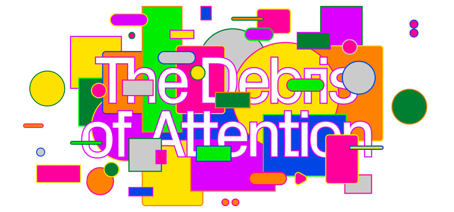
Web design has come a long way, yet we all occasionally see archaic sites that make us cringe. Visual gimmicks, unwanted audio, navigation hell—all these will chase away visitors. The team of Readymag design tool decided to collect all these annoying artifacts and turn them into an educational Pop It under the name Debris of Attention.
We started out with the desire to create a playful web project dedicated to the internet debris—all these goofy gimmicks that now look like remnants of a time that we moved past. The idea was very simple: we show such elements on a page and enable viewers to remove them by click or mouseover. Under the debris lies clean uncluttered design.
Readymag editor Tsvetelina Miteva
A play on forms
We created a list of such archaic features to ditch so you can serve your audience properly:
- Intrusive pop-ups and sidebars
- Floating menu bars
- Splash pages
- Social engagement elements on each page
- Complicated backgrounds under text
- Breaking bad layouts
- Font hostility
- Animation horrors
- Complicated click targets

Then we united them into semantic blocks, explaining why exactly they are bad and should be removed from the page. The structured text was handed to Readymag designer Tanya Egoshina.
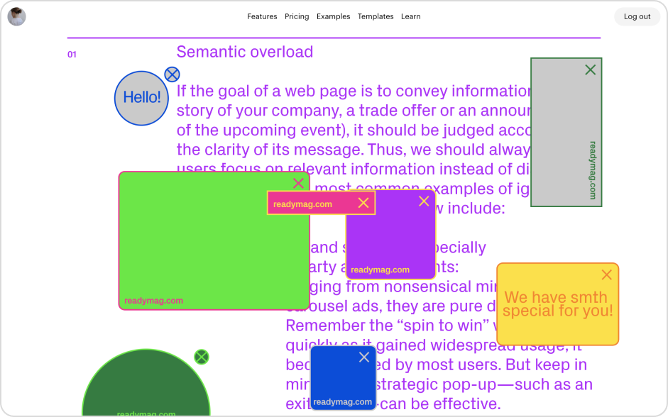
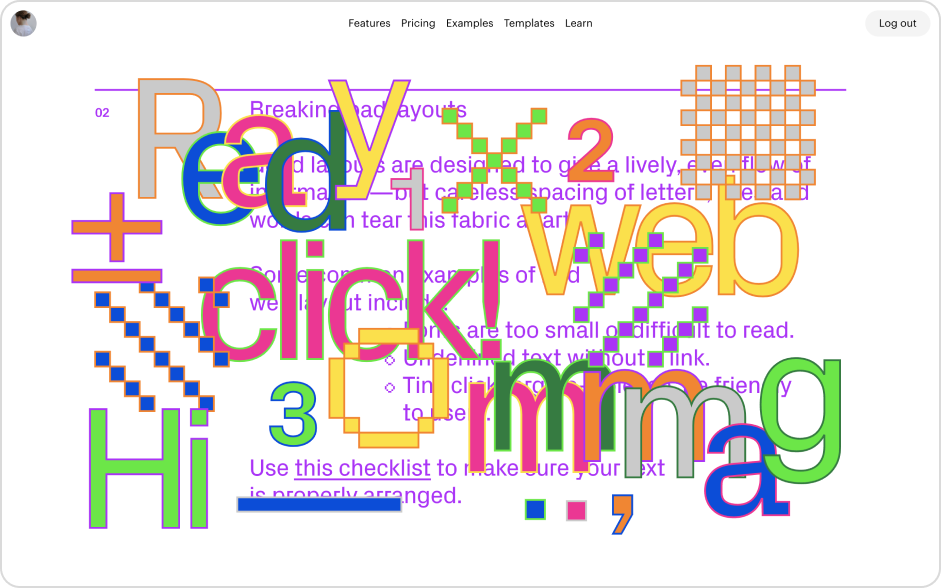
I made the style utmost bright and light, to avoid any possible feeling of ‘moralizing’. The visuals align with the text, but do not depict all of the listed gimmicks. In each block, I took only one or two elements and played with them.
Tanya Egosgina, Readymag designer

This was technically possible with the Animation feature of Readymag: with it you can animate everything in your project and add up to three animation triggers for each at once.
Most objects disappear by mouse hover (their opacity changes from 100 to zero), then there’s a delay of a minute or two, and the graphic object comes back. In several blocks (especially the one dedicated to animation) I combined several types of animation: an object starts rotating or twinkling on load, and on hover it gets removed. In the ‘Semantic overload’ block the objects get removed by click, and the page gets flooded on load.
Explore the Debris of Attention here.
Who we are
Readymag is a design tool that helps create websites and multimedia web projects without the help of developers. Its clients include Amazon, Airbnb, Esquire, Conde Nast and Forbes.
