Are you prepared for an auditory adventure that you’ve never experienced before? Press Play On Tape is a sound design studio working with prestigious brands, where stories are brought to life and unique sound universes are created.
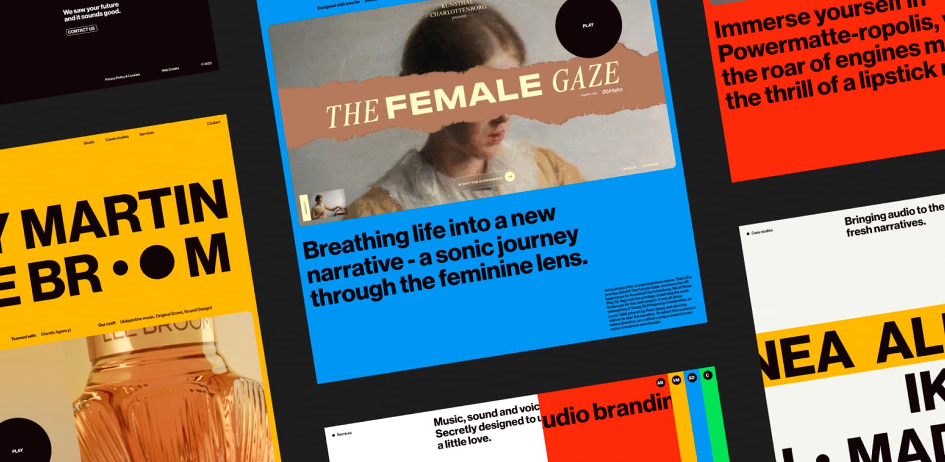
The website we developed for them transcends a mere showcase of projects; an immersion into the creativity and technological excellence of the studio, unveiling every nuance of sound design. Check out the behind-the-scenes, where a funky interface meets the neo-retro aesthetics of the 80s, and dive right into a wildly colorful experience. Each interaction resonates within a meticulously crafted soundscape.
Retro Revival in Digital Design: A Nostalgic Journey from VHS to Modern Web
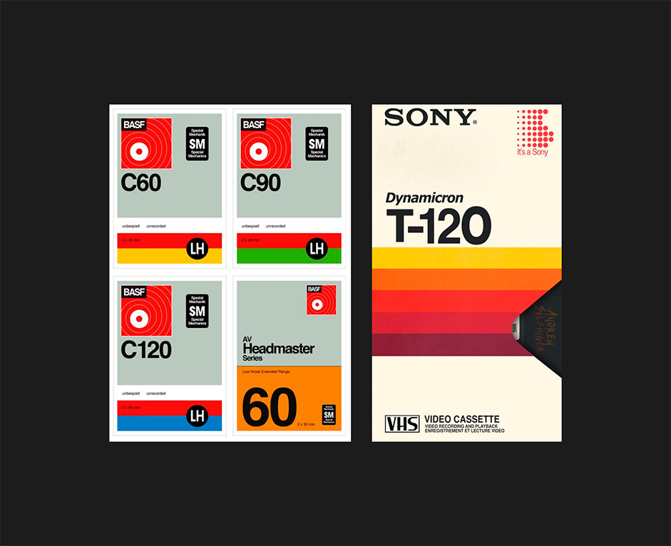
Our design draws inspiration from the nostalgic aesthetics of VHS and audio cassette packaging, infusing a retro touch into modern design. We've chosen uppercase Sans-serif typography, reminiscent of the bold titles on VHS covers. The project’s categories are indicated by acronyms (VM, AB, S, SD) to echo symbols found on cassettes.

“We've incorporated graphic stripes into the page layouts and title animations, mimicking the movement of magnetic tapes."
The website’s mechanical animations reflect the A and B sides of cassettes, with mechanical sounds for full immersion. The sleek and stationary navigation menu subtly reflects the ergonomic cut of VHS packaging and provides smooth and instinctive navigation. The arrangement of the services section is inspired by patterns created when cassettes are lined up side by side, forming a harmonious graphic motif.
Lastly, our 404-error page pays tribute to worn-out cassettes, reminiscent of the nostalgic quirks of analog technology.
The Essence of Audio Reactivity
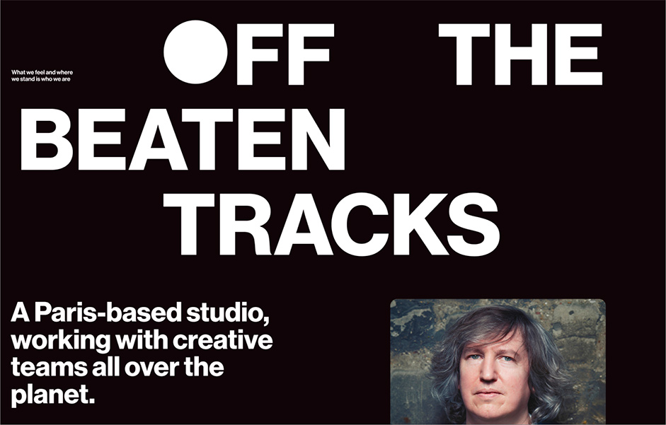
The strength of the website lies in its pervasive audiovisual interaction. Every sound is a cornerstone of Press Play On Tape's identity and triggers a unique visual animation, enhancing interactivity. Just look at how elements such as the “O’s” are animated and how they change into dynamic circles to mime sounds. The animation offers a playful invitation to explore and interact. Here, sound transcends its role as a mere background element to become a key and interactive component of the interface. The sound identity, created by the client, is based on recordings from old Walkmans.
Innovative Navigation
The website reinvents user engagement with navigation that is both intuitive and immersive. You experience the fluidity of infinite scrolling through case studies, discovering various projects, with striking visual and sound transitions. This design approach, beyond facilitating navigation, captures the essence of our story. Users are immersed in the limitless creativity of the Press Play On Tape studio. Each case study is accompanied by a soundtrack, showcasing the studio's expertise. As users are often more drawn to visuals than sounds on the web, we found an innovative way to highlight listening.
Technologies
This project was the perfect opportunity to use the then-newly-released Nuxt 3. Nuxt allowed us to generate a static version of the website, which is more performant than fetching the data each time a user goes to the website. All of the data is fetched from a headless WordPress. For motions and animations, no specific framework was used; a combination of CSS variables and internal tools animated every aspect of this website. Lenis (by Studio Freight) was very useful for all scroll-related animations. The seamless scrolling between the case studies was achieved by making sure the scroll reached the end of a case study. Subsequently, all scroll-related interactions are prevented, and the system programmatically navigates to the next case study, disabling the usual loader and swiftly swapping pages.
This method works effectively because we employ the same component at the end and start of the page, matching the state of scale and color to create the illusion that we are still on the same page and have seamlessly continued scrolling. One of the core features of the website is the reactive audio. Using Howler & Web Audio API context, we listen to five ranges of frequencies to animate the scaling of the filled “O” in the text. The last touch was the 404 page with a simple WebGL effect used. The WebGL context is created and handled by Curtains.js and allows us to attach shaders to a plane.

Conclusion
The development of this website has been an enriching journey, oscillating between creativity and technical constraints. In close partnership with our client, we have constantly sought to innovate while navigating the challenges of interactive design. After more than a year of sustained efforts, we have refined every detail, from the brand identity to the web development. By carefully managing all aspects of the brand, we have achieved a result that meets our client's expectations and reflects our commitment to quality and innovation.
“In shaping Press Play On Tape, we blended nostalgia with innovation. Each design element from typography to animations is an homage to the analog and is re-envisioned for today's digital realm. Our goal was to elevate web design into an emotive and sensory journey, where the past and future intertwine seamlessly.” - Raffael Velluti - Creative Director @VendrediSociety
About
Syncing fast-moving brands with fast-moving audiences.
Being visible is just no longer enough. It’s all about leveraging attention. And then moving forward together. Synced.
We deliver to brands with high objectives the strategy and the creativity it takes to have that impact by teaming up with some of the best talents out there. Without ever compromising on keeping their teams happy and sane.
Credits
Raffael Velluti, Founder & Creative Director - Nicolas Bonté, Digital Art Director - Thomas Lacroix, Front-end & Creative Development.
