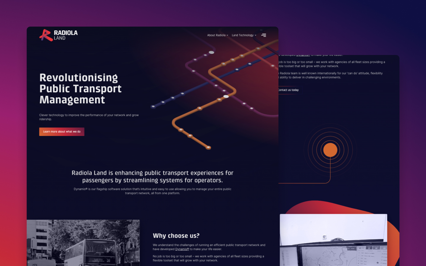
Radiola - Aerospace & Land Technology Website
A defining project focusing on world-class aerospace and land transportation technology
Radiola is split up into two different sectors; aerospace and land. This involved designing and developing for two different markets, under the same brand. To do this, we've created a core landing page that directs their clients to their desired service. Radiolas clients don't make quick one off decisions about what they need from Radiola, so the websites core goal wasn't to drive immediate conversion; but to set them up as a world-class service with a strong reputation in the industry.
Design & strategy
After the initial concepts, we determined that a dark-themed look would help to portray Radiola as a premium and unique service. This also complemented their brand colours allowing for the vibrancy to come out and draw the users attention.
The navigation has been kept compact to drive users in the right direction, while utilising a drop-down style 'mega menu' to accomodate for pages that are of equal importance but don't serve to the key user pathways.
We focused on delivering their key messaging through visual aids such as interactive maps, associative icons and partner logos. Social proof is a big on for Radiola. As their industry is tight-nit, they need to showcase what they've done elsewhere effectively.
Interaction & animation
We created unique animations that help to represent the Land and Aerospace sectors independently while maintaining their cohesiveness within the Radiola brand. These can be viewed on their respective landing pages.
The interactions have been used as a buffer to reinforce the world-class feeling of Radiola and the direction of the design - without overwhelming the user or distracting from the core messaging of the website.
Utilising an animated map to annotate their bases helps users immediately recognise the scale of Radiolas operation over the globe. It also establishes whether Radiola is in a location that works for them or not.
"Working with Grow My Business to revamp our website was a great experience. Their team collaborated with us to achieve a fresh and cohesive look that built upon our existing logo and unified our brands. The outcome was a modern and tidy website that we are genuinely proud to present to prospective clients." - Keri Howlett, Radiola
Project Details


