What qualities help a modern website break through and push the boundaries of the web? A combination of functionality, aesthetics, social impact and humanistic values, believes the team of Readymag, a tool for designing websites without coding.
Holding their annual contest for user projects, Readymag Websites of the Year, for nine years in a row and reviewing thousands of submissions, the team has developed a set of criteria that help them select the true gems. Below, the Readymag team share their stance and offer some tips on how to create a website that makes an impact.
“Launched in 2013, the Websites of the Year levels the playing field to ensure that solo designers, studios and agencies all have a chance to be recognized. This year, both professional portfolios, client websites, digital editorials, event landing pages, and even a font specimen website are running in the contest. It encourages creators to polish their skills by mastering our ever-expanding creative arsenal, and make innovative, visually impactful websites that overcome old tropes”, says Alya Datiy, Head of Marketing at Readymag.
In 2022, we used a dual judging system: first, all submissions were reviewed by Readymag designers and editors; then we drew up a shortlist—projects from it will be upvoted by the public till December 15, 2022. You are very welcome to give your voice for the projects you like.
These were the aspects we paid attention to when choosing nominees. We believe they are quite universal and can be applied when measuring the potential of any website.
Craftsmanship in design
Easy to guess, the level of craftsmanship in design is crucial. The most important skill for a designer is the ability to build visual hierarchy: purposefully ranking design elements, you can capture people’s attention and pull their focus in the right direction.
Design has many tools for creating visual hierarchies. Here are a few of them:
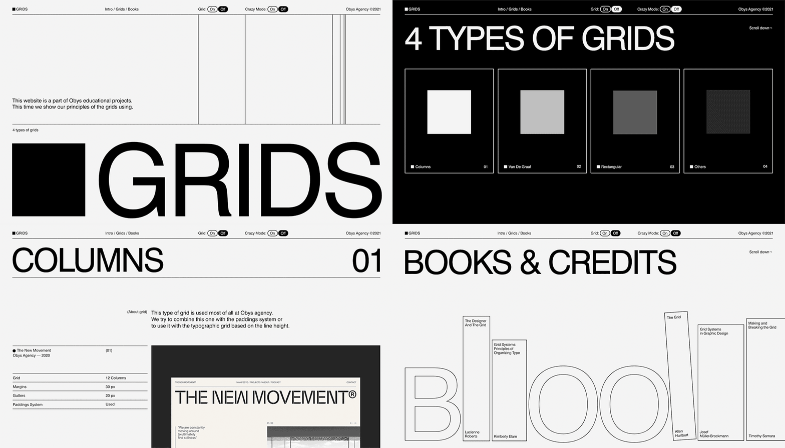
- Composition: The flow of composition determines how the eye is led through a design: where it looks first, where it looks next, where the eye pauses, and how long it stays. Readymag Design Almanac explains the basics of the grid—any designer’s core tool for organizing visual space. As always, remember that rules are meant to be broken.
- Rhythm: By alternating design elements with negative space, a designer creates movement, which then repeats and varies to create rhythm, activate space and create mood. Rhythm can lead visitors through a website.
- Sizing: By increasing the scale of an element, you can immediately attract the viewer’s attention. By playing with perspective, you can create the illusion of distance and separation in your elements to bring focus to the important areas in your designs.
- Typography: Good typography should guide and inform your viewers, optimize readability and accessibility, and ensure an excellent user experience.
Visual storytelling
‘Show, don’t tell’ is probably the most common piece of storytelling advice. But what makes an effective story? These are the key ingredients:
- Authenticity: This means connecting with the audience and fully depends on your knowledge of its preferences, values and mindset.
- Setting: The location where your narrative takes place. A well-established setting creates the mood you intend and provides the backdrop and environment for your story.
- Plot: This is the sequence of events that connects the audience and their ultimate goal.
- Theme: This is what the story is really about, the main idea or underlying meaning.
Readymag provides a degree of interactivity to tell next-level visual stories. Users can embed videos and audio to bring content to life through sight and sound, add infographics and Illustrations.
Speed & performance
Features are not the ultimate factor in determining a website’s value: features on a website that takes more than a few seconds to load will most likely go unseen. A project that aspires to reach and impact must load fast and be optimized for all types of devices. Optimizing websites for different platforms is a common courtesy in web design; moreover, it betters user experience, SEO rankings, traffic and conversions. See our recommendations on how to improve SEO in a project, plus our ultimate pre-launch checklist.
Interactivity and innovation
The means of visual expression on the web are constantly evolving, and using the most cutting-edge technologies brings a website to the most avant-garde league. Some of the most fresh such ingredients are:
- Animations: For sure, they are a key to interactive visual storytelling.
- Video backgrounds: These can bake some much-needed depth into your visual storytelling by converting an entire page into a story and immediately setting the tone.
- Custom cursors: By transforming the classic cursor into an offbeat and unique visual device you can add a nice aesthetic twist, enrich user experience and even make the project friendlier to people with poor eyesight.
This said, take these features as a source of inspiration, not a necessary requirement.
Text content
If you use writing in your project, do it meaningfully: every word must contribute to the story you’re telling. We firmly believe that ideas conveyed in the project must be original and coherent. In terms of tone of voice, ideas and text must resonate and boost the overall project impression.
Impact
Impact is the positive change that your website has or creates over time. We appreciate both websites that challenge global issues (eg. peace, ecology, inequality, human rights, and others) as well as those that aim to boost development in the design community. Promote your values and connect to the world agendas.
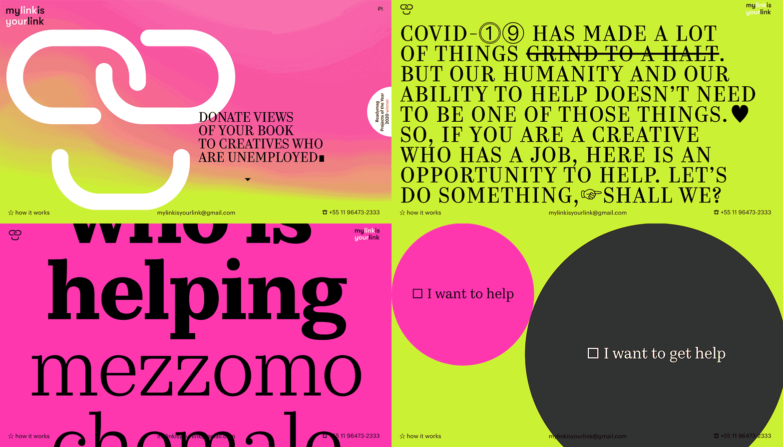
“There is always space for impact, especially in design work. It’s more obvious, of course, in socially oriented projects. But commercial designs can be impactful, too, and it’s not only what you sell that counts, but how you present it”, says Alya Datiy.
The website of the contest is now ready to vote for on awwwards, you’re welcome to assess it.
