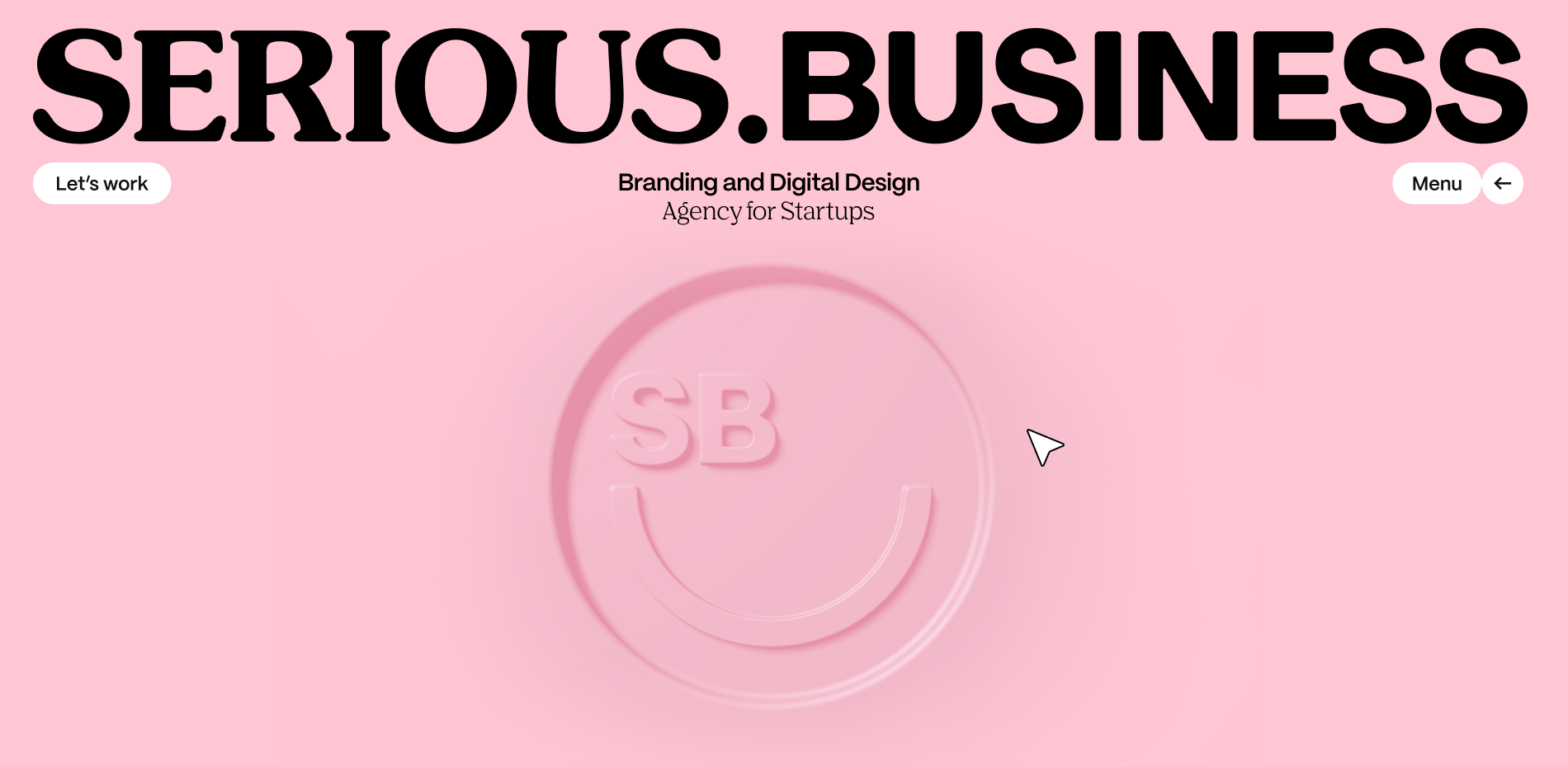
Rebranding Serious.Business
The rebranding of Serious Business wasn’t just a project—it was an act of love and deep collaboration. As a fully remote agency, this project became a celebration of everything that defines us: our bold creativity, our tight-knit team, and that unmistakable "pink-ness" that flows through everything we do.
“We wanted a brand that reflected the humans behind it, and how fun branding can be.”
The Who
Serious Business began in 2015 as a passion project between friends at Hyper Island, Stockholm. A diverse group of creatives, we set out to redefine what it means to run a "serious" business—one rooted in kindness and creativity. Our founding belief was that branding should bring people together, and that’s why we craft our future with that same spirit of collaboration.
Today, we’re a tight-knit, fully-remote team of 15 creatives, working from around the world. Our culture is what drives us—team over profit, collaboration over competition, and always inspiring one another to push creative boundaries. Over the past eight years, we’ve partnered with over 100 change-making startups across Europe and the Americas, proving that the right culture is at the heart of any successful business.
We stay connected through team trips, shared experiences, and a collective love for the work we do. The "pink-ness" that defines our culture keeps us grounded, human, and always ready to laugh—even when the work gets tough. For us, an enjoyable experience is always in the details.
The How
Rebranding your own agency is a humbling experience. It puts you in the shoes of your clients and makes you truly empathize with the emotional rollercoaster they go through. For us, this rebrand was an opportunity to use our own process—something we’ve refined over years of working with clients—on the brand we hold closest to our hearts.
We started where we always start: refining our internal strategy. We asked ourselves the tough questions—what are our strengths? Our weaknesses? What do we stand for? From there, we reworked our visual identity to truly reflect who we’ve become.
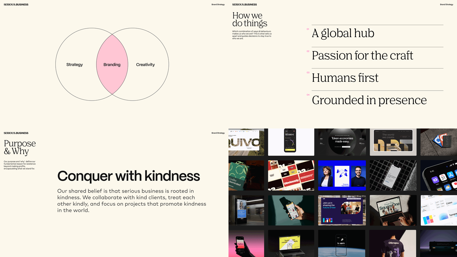
The challenge? Time. With ongoing client projects and a big team, finding the space to focus on our own brand was tough. So, we treated the rebrand just like any client project. We created an internal budget, set milestones, and established deadlines to keep everything on track. This structure allowed us to give the rebrand the attention it deserved while ensuring client work never missed a beat.
"The whole team contributed in amazing ways, and after some iterations, we hit the sweet spot,” said Amadeus, our Art Director. "A brand that represents our values, our fun and light-hearted spirit, and our attention to detail and commitment to delivering the best that branding and design can offer."
SB Tip: When rebranding your company, treat it like a client project. Set deadlines, create accountability, and, most importantly, give your team the freedom to have ownership over the process.
“Rebranding your own agency is one of the most humbling creative challenges because it forces you to reflect on who you are, what you do, and why it matters.”
The Wow (our webhome)
Our website is where our brand shines for the out-world. From the very first click, the new Serious Business website was designed to wow, keep our visitors entertained and properly informed. Whether it’s the playful smile that follows your cursor or the smooth transitions between pages, the site is filled with little moments of delight that reflect our brand’s fun-loving spirit. But beyond the animations and dynamic elements, there’s something deeper at play—our website embodies the clear, human-focused value proposition at the heart of our work: "Crafting premium brands for startups that make people smile."
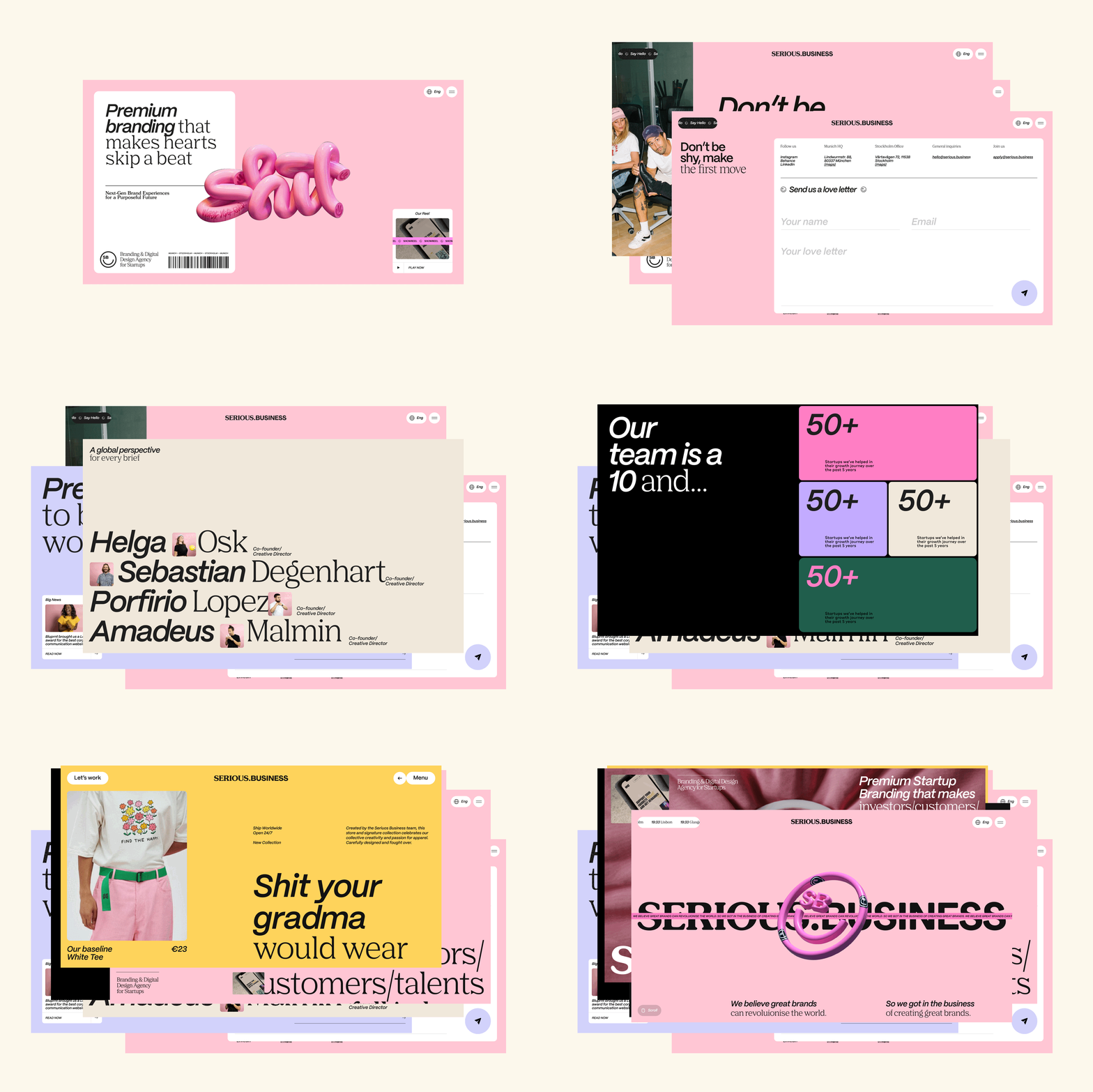
“For our visual identity, we wanted something that looked so good, you’d want to ‘lick it...”
The What
When it came to reimagining our visual identity, every design choice was intentional. Here’s a closer look at the design elements that define the new Serious Business brand:
Design Choices
Our design approach was rooted in our personality and business goals. We take fun seriously. We redefined a premium aesthetic but with playful, unexpected elements that reflected our team’s personality. This balance allowed us to maintain a professional look while still injecting moments of joy throughout the site.
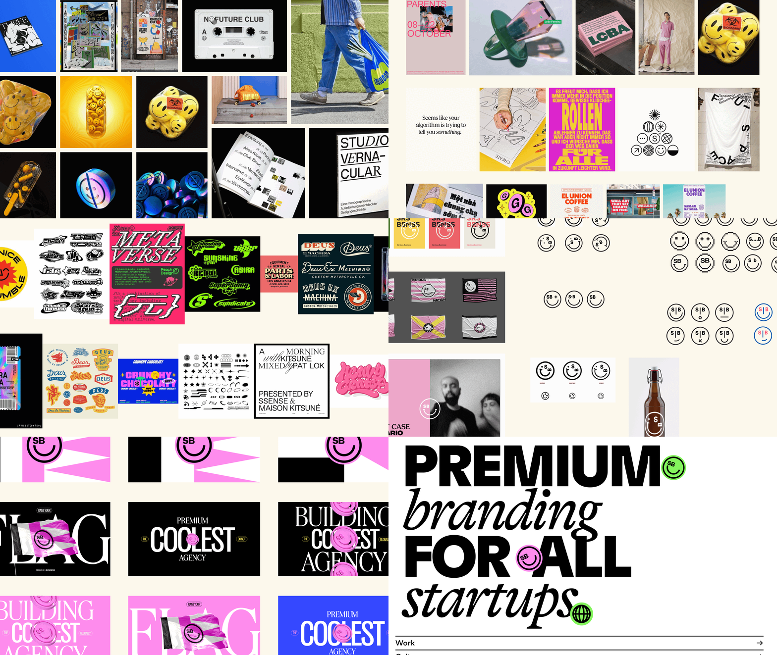
Logo & Smiley
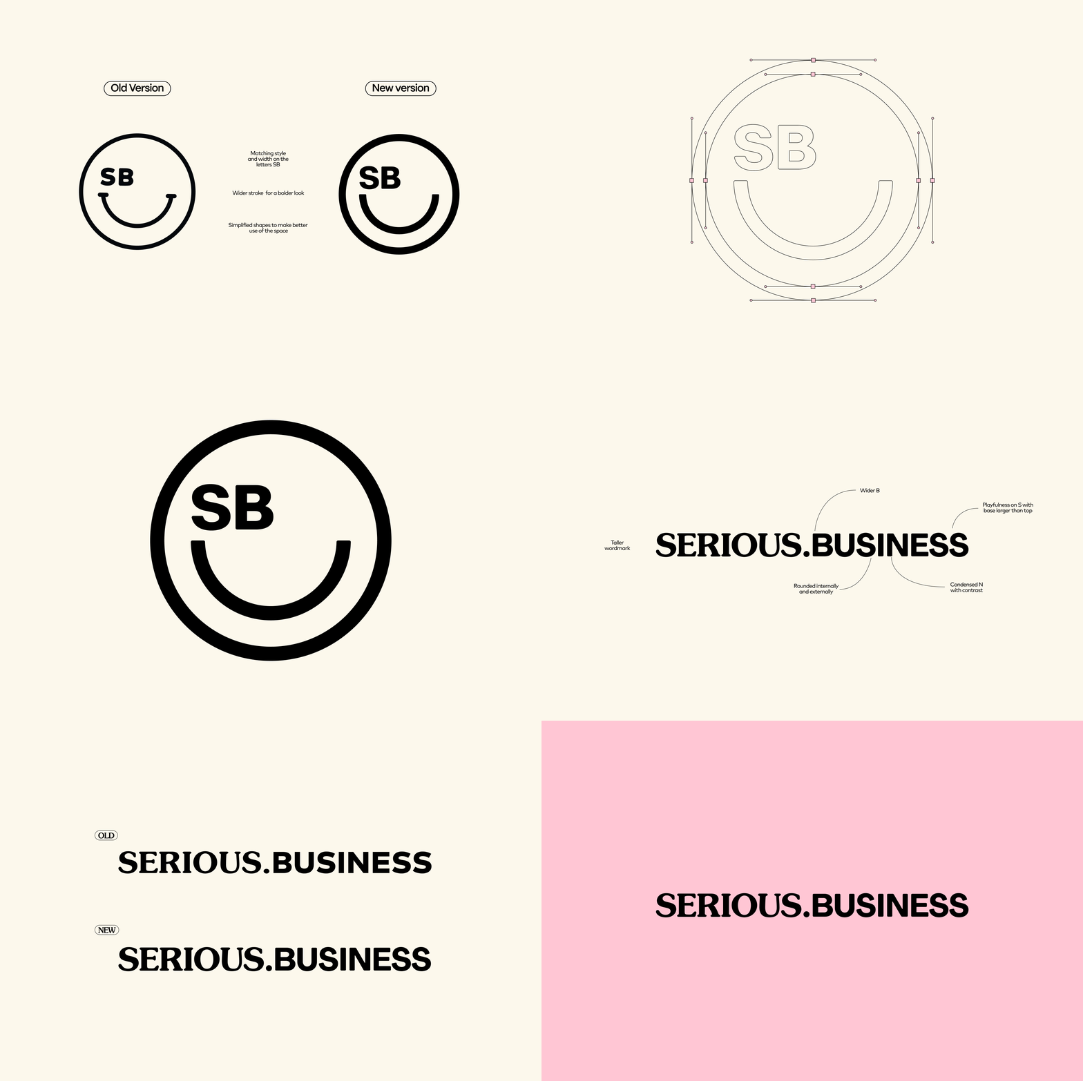
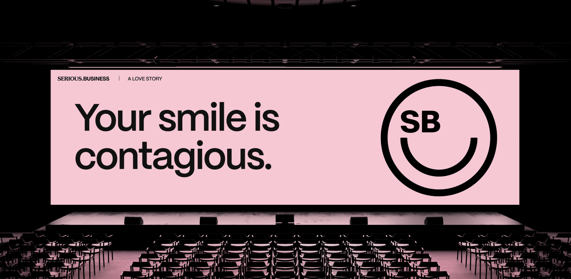
Our logotype balances seriousness with playfulness, reflecting our identity. The wordmark combines a clean, professional typeface with a playful twist, offering a glimpse into our creative process. The smiley element adds light-heartedness, symbolizing the joy we’ve infused into our work over the past eight years. Smiling is contagious, and it mirrors our core ideals: to bring a smile to your face, both through the brands we build and every interaction we have. This rebrand refines what we’ve always stood for, and refined it to be even more us.
Typography
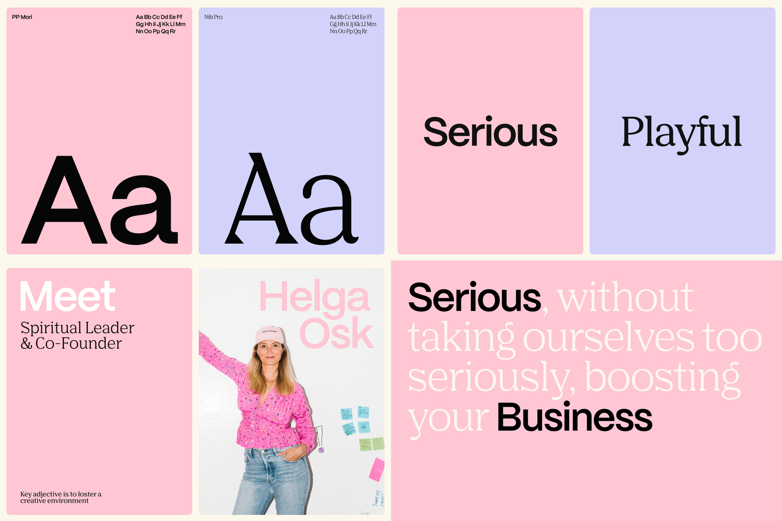
Typography was a key focus for us. We wanted something bold yet approachable, modern yet timeless. We settled on a mix of sans-serif fonts that are clean and crisp, allowing the text to feel both serious and fun depending on application.
Dynamic Elements
To bring the brand to life, we incorporated dynamic elements to enhanced the user experience. Subtle animations, like transitions and hover effects, give the site an interactive, playful feel, keeping users engaged as they explore. These interactions don’t just look good—they create a memorable experience that makes users want to keep clicking.
Color Palette
The color palette is one of the defining features of the new Serious Business brand. We embraced shades of pink and complementary tones that feel fresh, vibrant, and unmistakably us.The palette is meant to evoke feelings of joy, warmth, and creativity, all while maintaining a sense of sophistication.
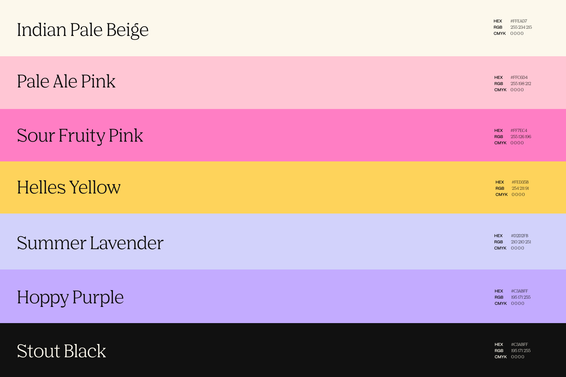
Together, these design elements come together to create a cohesive, engaging, and memorable digital experience that embodies everything Serious Business stands for: fun, creativity, and a relentless pursuit of excellence.
Company Info
Serious Business is a creative agency that specialises in crafting premium, smile-inducing brands for startups. As a fully remote team, we embrace the freedom of flexible work while maintaining a tight-knit, collaborative culture. Our passion lies in helping startups find their voice and identity, we take pride in delivering exceptional results that reflect both creativity and precision.
Learn more about Serious Business at www.serious.business.
LinkedIn: https://www.linkedin.com/company/seriousbusiness
IG: https://www.instagram.com/seriousbusiness.agency/
