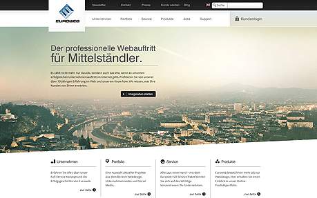
Euroweb Corporate Website
The timeless design of the new website of the young company Euroweb stands for durable trends in design, moreover it is distinctive for the necessary flexibility in a global market: A property that is valued by our customers, owners of medium-sized companies in all industries. The new Euroweb website takes into account the distinctive pragmatism of our customers: All products are illustrated implicitly and sensory, so the visitor can get an idea of the possibilities of web design. In this concept focus is put on the visitor by a high usability and a vibrant customer dialogue. All major areas of the site can be called up at the top in horizontal navigation bars, whereas selected important key areas are hinted at below. Our visitors will be guided easily and comprehensively through the various contents of our website, but with a particular focus on the most relevant topics. As an example: The main area of "service - in 4 steps to your website" can be easily called up three times on the homepage. Hence the customer can easily understand the process of website making –this property is also an important aspect of the website: The clear and simple structure of our customer communication during the creation of a customer websites corresponds to the clarity and unambiguousness of our website in all respects. During the last ten years, the Euroweb group has made over 20,000 websites for small and mid-sized companies in Germany, Switzerland and Austria: Under "portfolio" entrepreneurs can get an overview of the diversity of our customer sites. By the industry-related sites they can be inspired so that they feel well prepared for the upcoming step of creating their new website. Our new site combines the guiding criteria usability, design and targeting in a consistent and harmonious way.
This website was built with...

