LO Colors
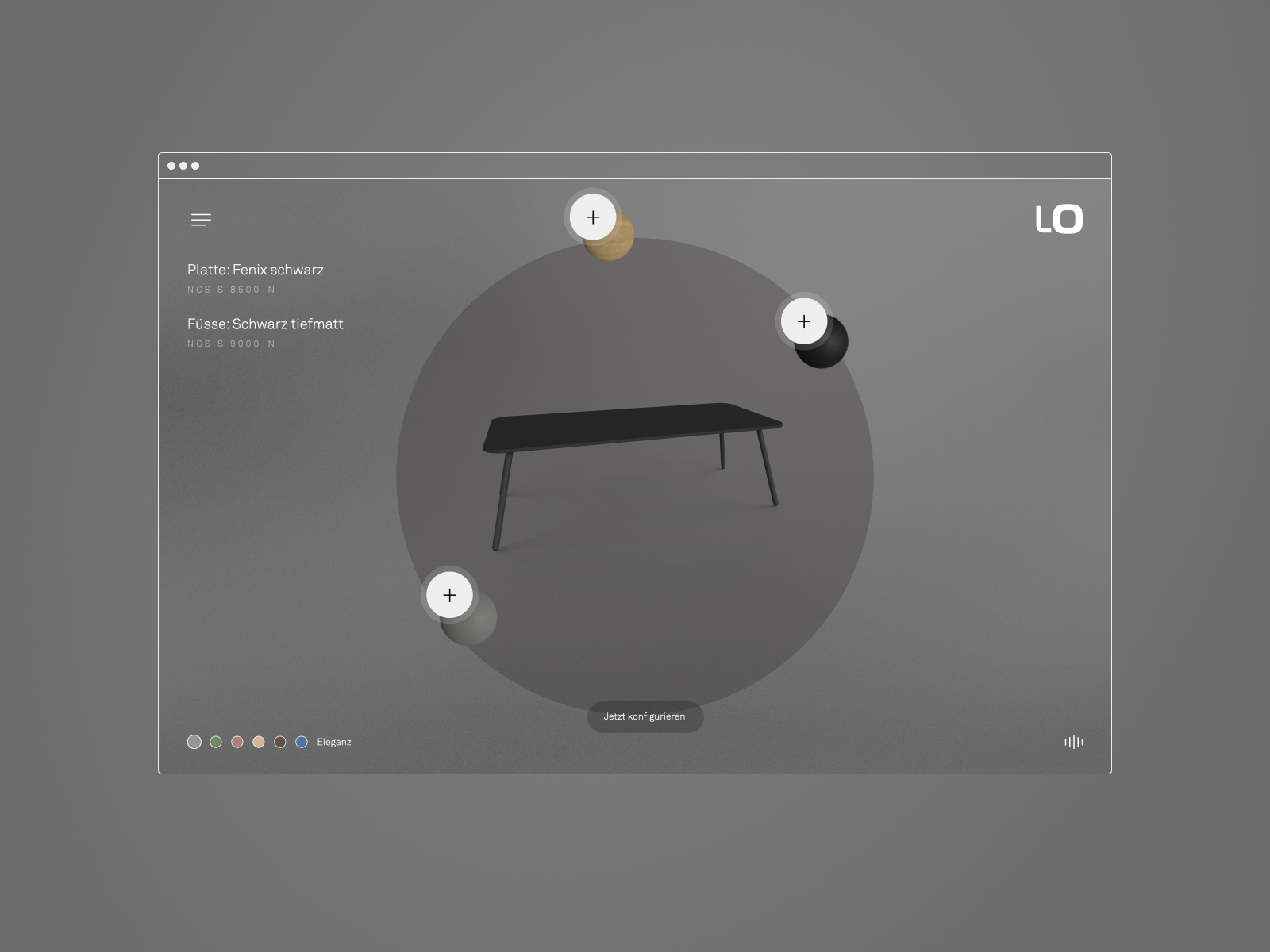
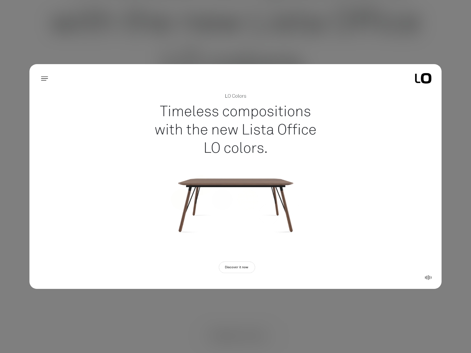
For our client Lista Office LO, a leading provider of business and home furniture solutions in Switzerland, we developed the Lista Office Colors microsite. It is part of a marketing campaign to promote Lista Office LO's new colours and materials. At the end of last year, our client Lista Office LO was planning a major marketing campaign to launch their new materials and colours for office furniture. With these new finishes and the desire to effectively communicate and market their launch, they turned to us to come up with a suitable idea. The goal was to create a digital strategy that would showcase the new materials and colours in an innovative and engaging way that would reach potential customers. Our task was to develop a concept that not only highlighted the new materials, but also emphasised the elegance, individuality and adaptability of the furniture.
This website was built with...
Votes (15/31)
Design
Usability
Creativity
Content
Overall
-
78777.30
-
75766.30
-
77766.90
-
76676.50
-
98888.40
-
88988.20
-
88888.00
-
78787.40
-
55555.00
-
77777.00
-
66676.10
-
88888.00
-
10101099.90
-
981088.80
-
99999.00


