Raffles Institution – The Gold Standard
Technologies & Tools
Description
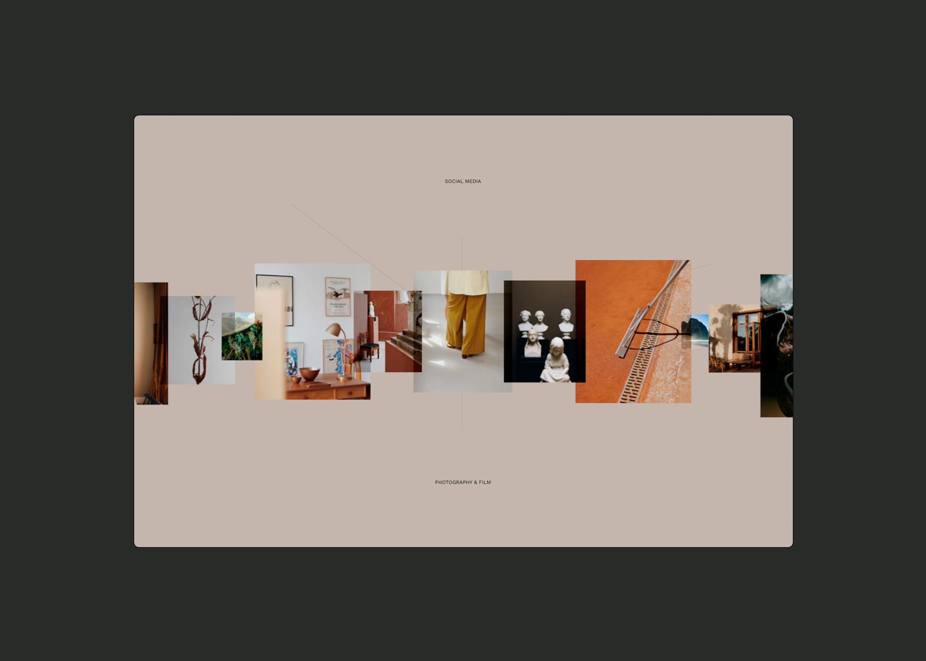
School admission sites are usually uninspiring and unnecessarily messy, so we created a new navigation where each section leads seamlessly and logically to the next. The user simply scrolls down to access each section sequentially, and to right for the various options available in a particular section. This approach allows us to bring the user on a journey, which reflects the theme of 'exploring one's potential'.
SOTD / SCORE → 7.5/ 10
Design40%
Usability30%
Creativity20%
Content10%
7.75 / 10
7.13 / 10
7.63 / 10
7.38 / 10
Votes
Design
Usability
Creativity
Content
Overall
-
 Carl Rosekilly from United KingdomGraphic Designer86777.40
 -
 Mike Lane from United StatesUX Design87877.75
 -
 Pablo Zarate from ArgentinaDesigner999109.15
 -
 Goksel Eryigit from FinlandSenior Front-end Developer at Udemy88998.40
 -
 Mark Hirst from United Arab EmiratesEntrepreneur77887.40
 -
 Nikola Arežina from SerbiaGraphic and Web designer98878.35
 -
 Paul Mosig from AustraliaCo-Founder Racket78877.35
Design
Usability
Creativity
Content
Overall
