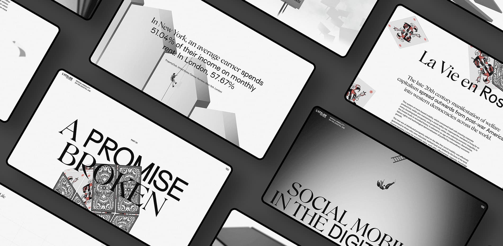
‘Social Mobility in the Digital Age’ is the culmination of a year-long research project by Paris-based insights agency, L’Atelier BNP Paribas. The design was produced by Gladeye in Aotearoa New Zealand, and includes illustrations by Victor Antonelli.
“Technology is neither good nor bad; nor is it neutral”
– Melvin Kranzberg
Social mobility — moving up in the world through education, ideas and hard work — took great strides during the 20th century, especially in Western democracies. Incomes became more equitable and more people enjoyed the expectation that they could grow wealth during their lifetimes and make better lives for themselves and their children. But something began to change this century, and the future is increasingly uncertain.
Told in two chapters, this project explores the causes of widening wealth gaps and the potential impact of near-future technologies on the economic prospects for the world’s poor and middle class.
Chapter One, “A Promise Broken”
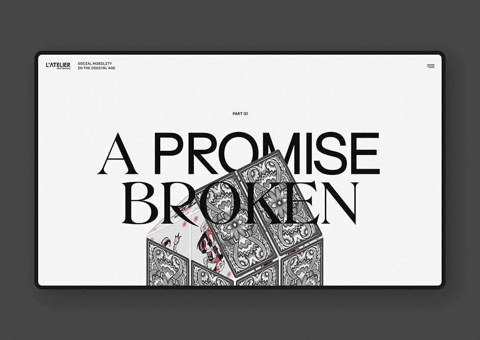
Chapter one tells the story to the present day, from the traditional expectations of the 20th century bourgeoisie to the rise of the vast modern Western middle class, exploring how and why the economic playing field of the past few decades has been so uneven.
A key theme of this chapter is chance. Random events actually have a greater impact on a person’s economic potential than any other factor. The creative insight for us was that life is like a game where chance plays a far more critical role than we like to believe. Some people get to play with dice weighted in their favour, while others are dealt a bad hand from the get go. Social mobility is now a soothing myth.
Games feature through simulations and illustrations throughout the chapter. On the title page for example, a house of cards topples and falls. At the story’s conclusion, giant dominoes loom ominously over the reader.
CSS and WebGL animations of hand-drawn characters and allegorical scenes lend a hand-made, illustrative character to the work. We wanted this page to feel a little historical, like an archived document. The grain itself is its own animated layer that sits above copy, charts and illustrations. This effect took some prototyping and a lot of optimization; early versions based on filters performed poorly and created stuttering in animations that really needed to be smooth and silky. Ultimately the simplest solution - placing low opacity tiled images over the page - worked the best.
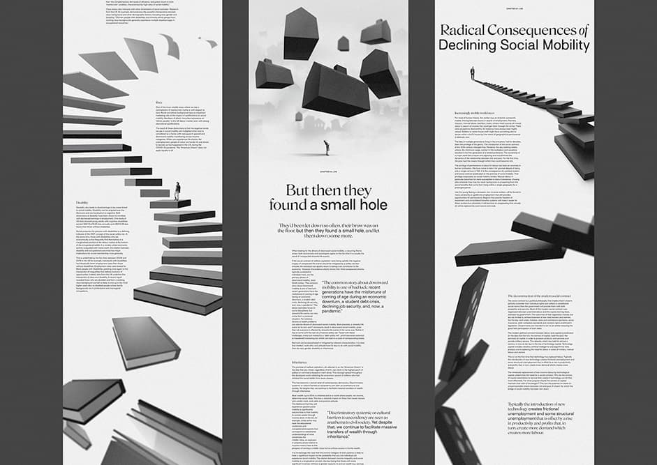
Headline typography is a mix of two fonts, a dichotomy alluding to the competing economic forces of labour and capital. Surt is a rigid, sharp, machine-like typeface. Its stiffness and regular line weights suggest factory-line mass production. Roslindale on the other hand is a delicately crafted serif typeface with more extreme line contrast and exaggerated serif flourishes, suggesting a more human, eccentric character. Together the fonts contrast and complement.
Humans in this chapter are tiny, helpless individuals in a world of massive economic forces that they cannot control. A bar chart representing social classes expands into a towering edifice that workers struggle to cling on. A tiny person climbs a giant white picket fence like an insurmountable cliff face. The most vulnerable are threatened by dice falling like enormous boulders. This, for us, captures the disenfranchising reality of modern social mobility - or its absence.
Every experience of the game generates a different life story.
The anchor experience of this chapter is a programmatic animation that is never the same twice, a real “Game of Life” developed specifically for the project. The simulation is designed to show how the chances of birth and life events impact an individual’s ultimate economic potential. As the user scrolls, the game runs an algorithm based on research data, generating a “life” that unfolds on the fly (scroll-driven interaction being deliberately chosen for its intuitive accessibility). The game features what we came to call “chance cards” after popular board games. Chance cards are drawn at random, and each card affects the player’s accumulated wealth during their simulated lifetime.
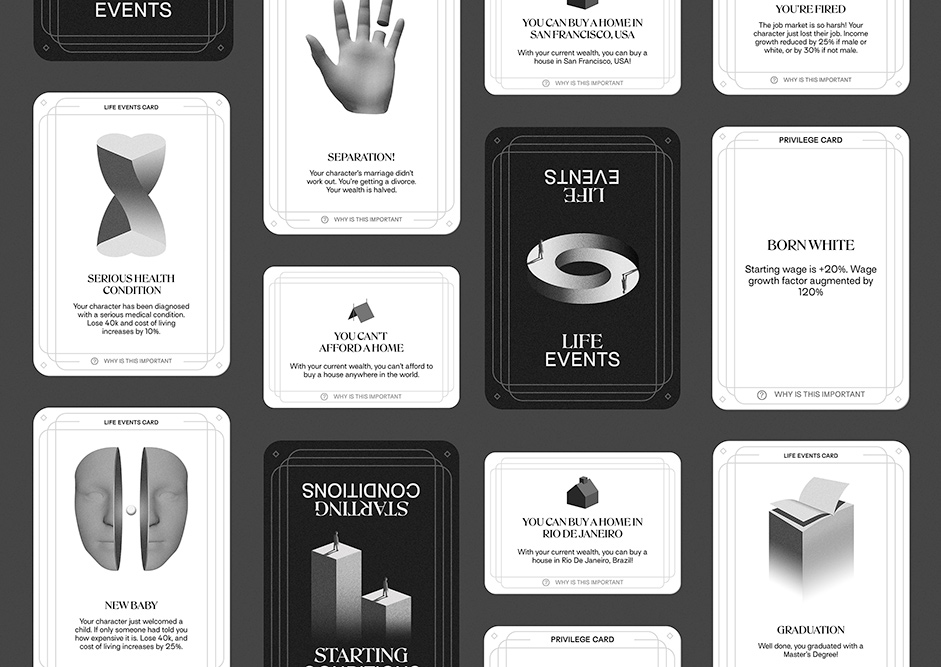
The game logic had to be simple and manageable — our timeline was defined based on an editorial story, not the development of a complicated game — but also needed to approximate a simulated life based on a reality that is infinitely more complex. We started designing gameplay in spreadsheets, referring to research from L’Atelier to estimate the starting conditions for each player and the effects of each life event. Finding a balance between accuracy of data and the inevitable assumptions and generalizations required for the simulation was a collaborative effort between design and development leads at Gladeye and the research team at L’Atelier.
A particularly dramatic moment in the chapter is a list of societal disruptions and protests since 2008. Working with the theme, our lead designer created mock ups placing each protest on a placard. Then, in a perfect example of why it’s a great idea to involve developers in the creative process, our lead developer came up with the idea to animate these placards attacking the reader aggressively out of z-depth (for almost too long, a deliberate point we believe helps to bring the message home).
Chapter Two, “Economic Opportunities for Our Avatars”
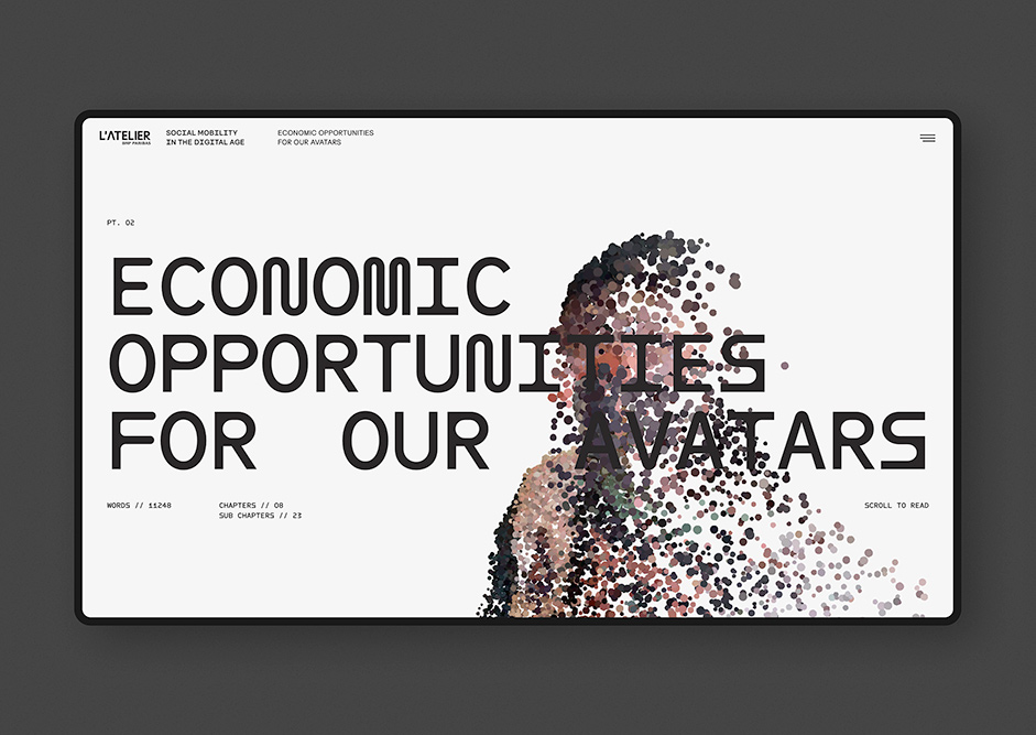
Chapter two explores the shocking possibilities of future technologies on human economic potential. Our brief was to make the page feel uneasy and a little anxious, echoing the themes of the content. We wanted to evoke an exciting but potentially scary future coming slowly into focus but not yet fully revealed.
To find this style, we used LiDAR 3D scans of real world people and objects. The models, which were rendered as point clouds, create an effect that’s ephemeral and half-formed, like ghosts from the future. Many of the LiDAR models were scanned specifically for the story, including all the human models.
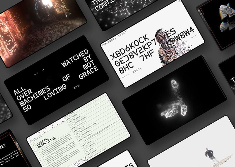
This 3D shoot proved challenging. It had to take place during full lockdown conditions in Aotearoa New Zealand, so family isolating together with our creative director bravely stepped up to the challenge. They were scanned stepping up steps in motion, producing streaky 3D particle clouds with stretched out bodies and multiple limbs. The effect suggests the many potential future pathways for these characters, condensed into one multiversal static model.
The models create an effect that’s ephemeral and half formed, like ghosts from the future.
Typography for the titles and pull quotes is a mono font called ABC Maxi Round. It suggests a world where computers are in control. We added a glitchy typing effect, deliberately cycling through the wrong characters, as if the computer is hunting for meaning - or perhaps deliberately trying to obscure it. The jittery, anxious effect suggests uncertainty, incompleteness and change.
The structure of this chapter was unusually complex. Subchapters and sidebar details made a nested structure that we wanted to make into an scrollable experience that didn’t require a lot of opening and closing of concertina-style UI. This was solved through a combination of methods, including text panels that stick on scroll while nested information scrolls alongside them, and others that animate to modals as if lifted off the page, with inner scrolling for more information.
The overall structure of this chapter was built in Blender, where camera moves for the entire scroll journey were prototyped before the scene was exported for WebGL. Here shaders and subtle scroll animation effects were applied to the point clouds.
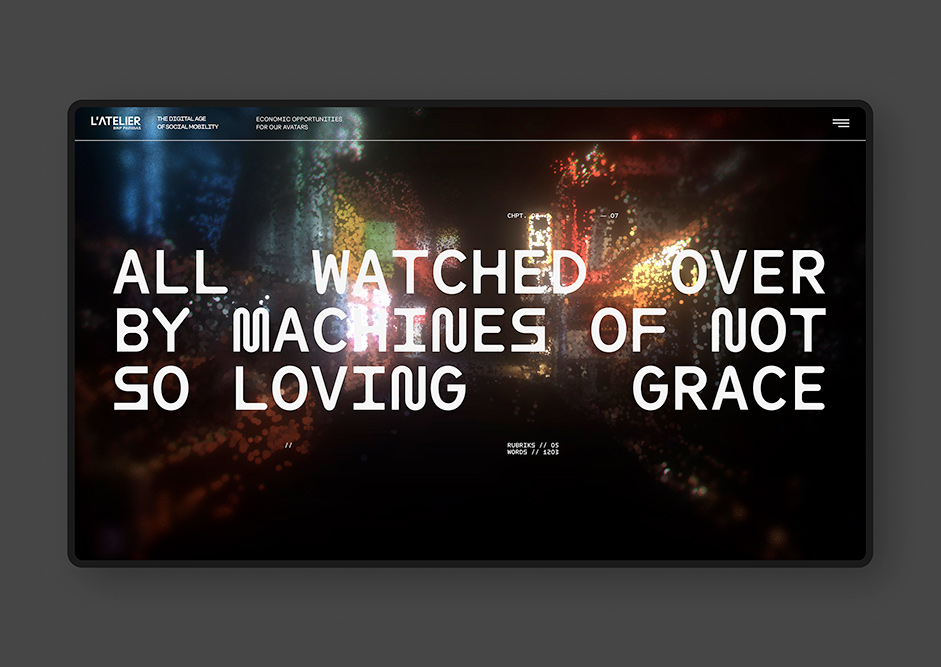
The story ends on a note of uncertainty. It asks the question: will we navigate the many interconnected possibilities of the future to a world that’s equitable and just, or will we fall into the traps of increasing wealth inequalities or freedom-restricting techno-authoritarianism?
As digital designers, in a significant way we design the future. We help to guide the role of new technologies via the work we choose to do and the way we choose to do it. This responsibility has never been more urgent, and it’s one we take very seriously indeed. Technology is both the problem and the solution.
Technologies
CSS, WebGL, Blender, LiDAR scanning with iPhone.
Studio
Gladeye is a digital design studio based in Aotearoa New Zealand. We use creative technology to make real life more beautiful.
