Sol’ace features timeless furniture, natural fabrics, curved lines, which can be incorporated into any environment, and we had three primary purposes for the website:
First: Engaging Sol’ace's clients in an immersive and contemporary environment, allowing them to embrace the brand's philosophy, history, and products.
Second: Generate a website that they feel at home, mixing simplicity, emotion, and modernism through a good balance between the typography, color pallet, and animations.
Third: Create an unquestionable authority in the Furniture industry to match the price, quality, and technologies applied to their products.
Furniture that offers intelligent solutions, integrating sustainability, quality, design, better cost and, most importantly, well-being.

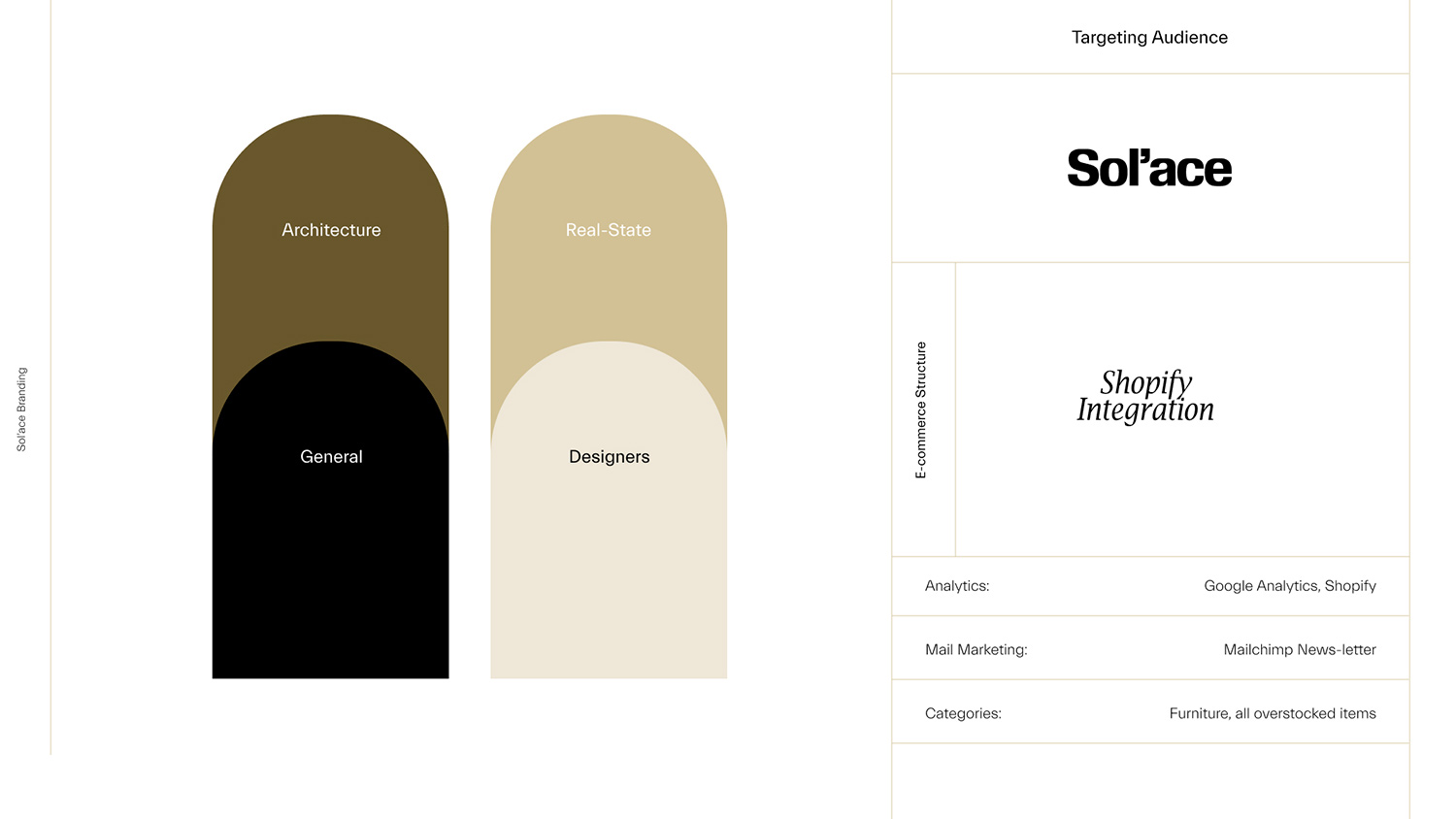
For the website's target, we are focused on the public in general because we believe everyone should have access to seamless and natural fabric made furniture. We want to break the paradigm of this conceptual niche that should be exclusive only to the financially successful public. Natural and recyclable furniture must be standard in our environment-friendly ecosystem.
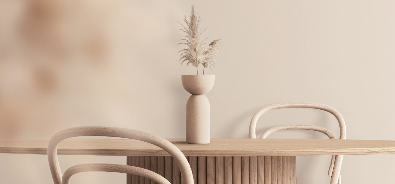
Sol’ace Hero
The Content and Features
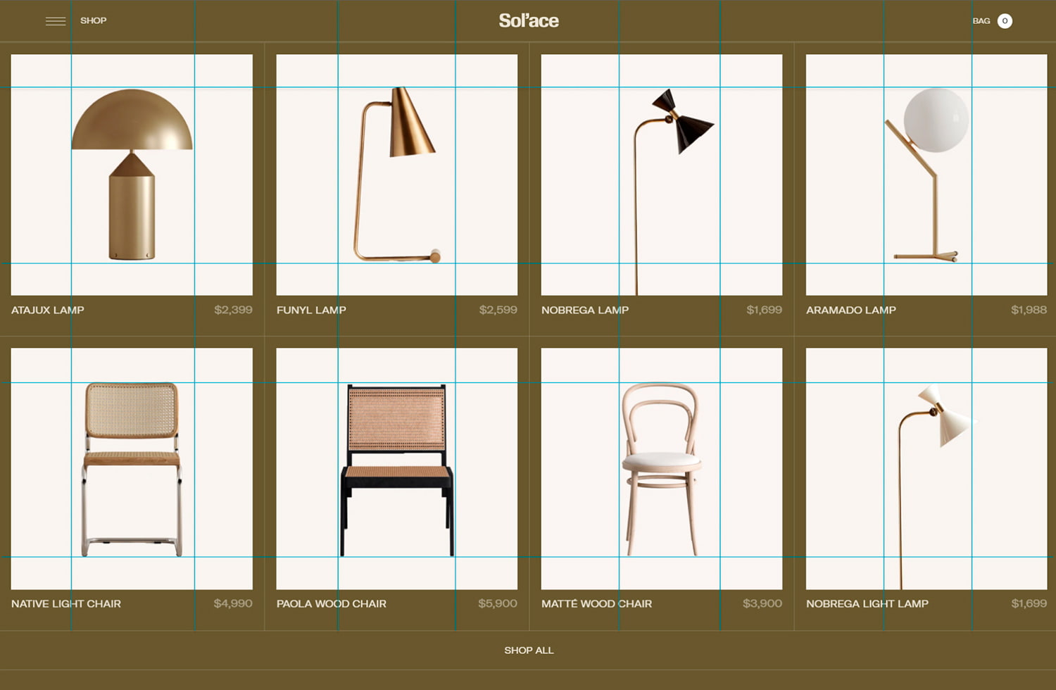
We invested a considerable amount of energy and time in creating the most consistent website possible, which led us to build the right images, suitable videos, and the right colors and display them efficiently. Those are the primary keys to getting the aesthetic feeling we aimed to achieve. As you can see in the video below, all product images matched in a perfect aspect ratio, giving them proper space to breathe inside of the website.
All product images matched in a perfect aspect ratio
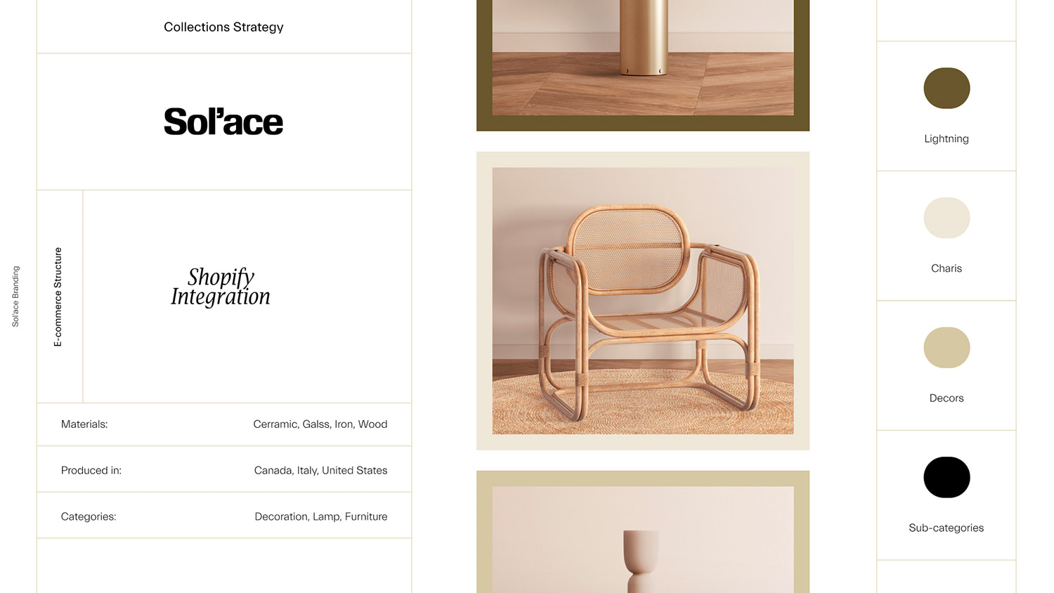
The core of the website is to feature elegance, minimalism, and peace and still highlight our eco-friendly materials. That's why we used a mix of colors that we can easily find in nature:
Beige is dependable, conservative, and flexible. The color beige is neutral, calm, and relaxing—the attributes and meanings associated with beige change based on its accompanying colors.
Green is everywhere. It’s the most common color in the natural world, and it’s the color we associate with the environment, being the color of revitalization and rebirth.


The Process and Challenges
Sol'ace was definitely one of the most enjoyable projects I had the opportunity to produce. They supported me in every single request during the entire process, which made me feel more comfortable trying different approaches in the design and development stage.
We started with various meetings to figure out what it would feel like for our customers, preparing, researching, and testing components visuals. After settling in colors, typography, art direction, and atmosphere, we started producing the website assets and content like images, videos, copywriting, and finally, the most complicated part of the process: The website development.

That brings us to the most challenging part of creating a website that relies on a reasonable amount of visuals without losing performance and speed. This task required a lot of time and strategy because our goal was to create a modern and creative environment without sacrificing the shop experience.
We invested hours and hours optimizing every single bit of images, videos, fonts, and coding to afford a memorable experience and not lose conversion on loading visual components.
Sol’ace full experience
Technologies
I used Shopify's standard process to build the website, with liquid, meta fields, and section components that allowed the client to have an entire dynamic website. Sol'ace's team can interact and change any composition on the website without any effort, and an aspect of the development tools, I used:
- PugJs: HTML template engine
- Webpack: Javascript module bundler
- BarbaJs: Javascript library to build SPA
- Greensock: Javascript library to handle Animations and Interactions
Company Info
Victor Work is a design and developer who has achieved a place in the international market in less than two years of his career, becoming a world-renowned professional. Focused on emphasizing the statics model into a memorable and interactive experience, perfectly aligning the sense between effects and animations, I usually rely on advancing and improving browsers to break barriers and make the web a place.
