It's the penultimate SOTM of the year and we'd like to thank everyone who has voted and made themselves heard on social media. From a selection of notable projects Sons of Gallipoli by Jam3 has been chosen as SOTM for November!
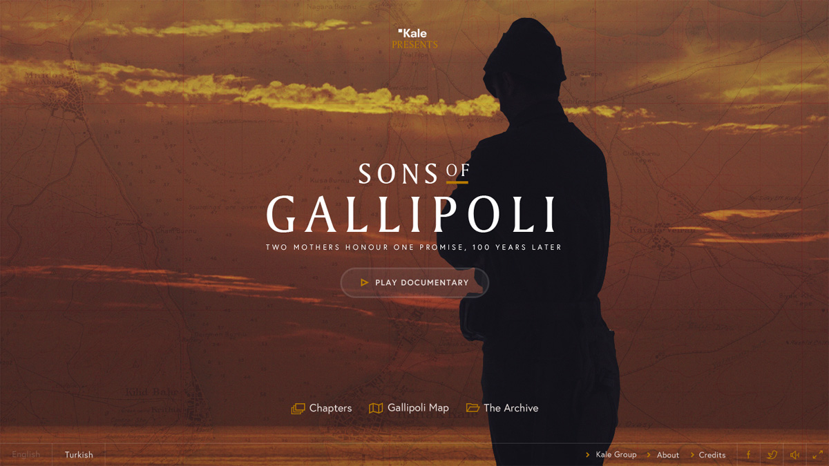
SONS OF GALLIPOLI is an interactive documentary about the Gallipoli Campaign: one of WWI’s most brutal battles, with nearly 400 thousand killed or wounded in just a couple of months, over a tiny stretch of land and sea in present-day Turkey.
With all the attention being focused on the Western Front, very little is known about the battle. That is, outside of Turkey, Australia and New Zealand -- for whom Gallipoli helped birth their national identities.
Sons of Gallipoli was created to commemorate the 100th anniversary of the Gallipoli campaign, and promote the message of peace it has come to symbolize, especially for Turkey, Australia and New Zealand.
The documentary is narrated by an Australian and a Turkish mother, and features interviews with historians, descendants and experts dedicated to preserving the memory of the fallen 100 years later.
THE PRODUCTION
Some 80 people were involved in the production, including top English- and Turkish-speaking Gallipoli scholars, as well as an international documentary production team. Research and film production took place in Turkey, the UK and Australia.
Jam3 enhanced the linear documentary with a nonlinear approach to storytelling, using advanced design and technology. From concept to completion, development took 8 months.
Sons of Gallipoli project will be expanded into a digital installation set to open in Gallipoli in 2016. Tens of thousands of visitors from around the world will have access to the experience -- from historians, history buffs, students, locals and descendants paying tribute to those who fell in battle 100 over a years ago.

Production was a major challenge, working with a half dozen English and Turkish speaking scholars meant boiling down an enormous amount content in two languages from multiple viewpoints into a coherent dual-language narrative.
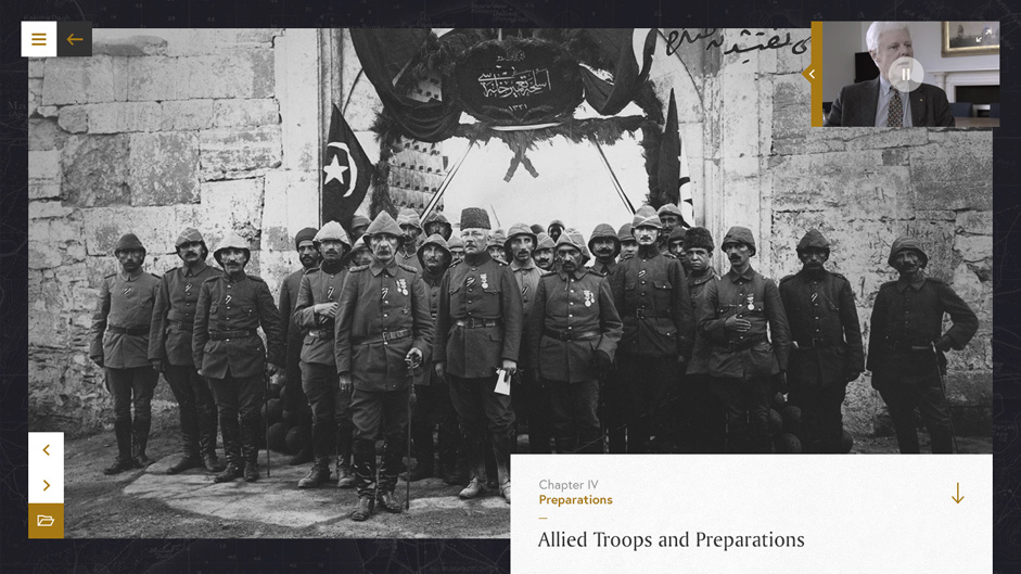
Besides the core documentary on which the experience is built, the website houses a huge archive of historical documents, some never before released. While viewing the documentary, viewers can access to this material via hotspots that pop up in context to create an interactive “picture in picture mode”. This allows users to explore the secondary content as they continue to watch the documentary. It’s a unique way to create a more interactive and immersive experience without detracting from the main linear experience.
The most challenging part of the project was logistics. While the Jam3 team is based in Toronto, most of the project had to happen elsewhere. Producer/director Booker Sim travelled to to Turkey and the UK for casting, principal photography, and most importantly, to consult with historians and find and curate the site’s extensive collection of secondary content (including photos, letters, diary entries, news articles, military documents, and photos of battlefield artifacts). While it would have been more convenient to do post-production in Toronto, the documentary had to be edited in Turkey in case we needed any additional footage, as well as to edit in Turkish. That created some challenges, but nothing we couldn’t handle in the long run.

While we’ve worked on many interactive documentaries before, this is the first one where the traditional documentary experience was produced by Jam3.
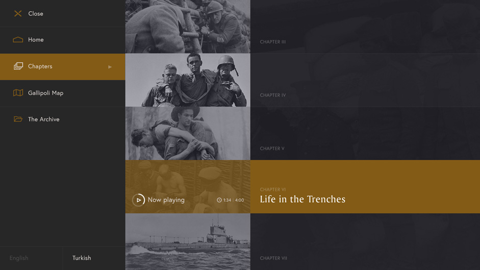
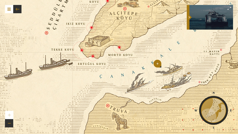
Interactive features include picture-in-picture mode, interactive chapters UI, illustrated interactive map (with an interactive timeline soon to launch).
For navigation, we wanted to keep the learning curve low. We took a modern approach with a simple structure. The vast library of secondary content was stored in the archive section, but deep-links from the main experience meant it could be accessed exactly when needed.
We have two ways for users to change chapters: one standard where the user opens the menu to get a full-screen overlay with all the chapters listed and a visually driven exploratory piece of UI, where we display all the chapters in a circular UI. Though innovative and unconventional, it’s extremely intuitive.

IN TERMS OF TECHNOLOGY, it was built using HTML 5, CSS, JavaScript, Pixi.JS, WebGL, DOM / Canvas, Cockpit CMS.
Development was implemented on the front and back end -- and using a geo-location, IP address, cookies and browser preferences, the site was designed to self-optimize to user behavior and preferences.
In terms of traffic, has received over 335 thousand visitors. But more importantly to its creators, metrics suggests high engagement with stakeholders from core user communities.
Winners!
Each month we give away exclusive design prizes just for voting for your Site of the Month and sharing them on social media. The lucky winners of 3 One year Webydo Pro Plan licenses are:
- @kofijoy
- @eugeneobrien
- @XpreSion
Congratulations and thanks for sharing your vote!
