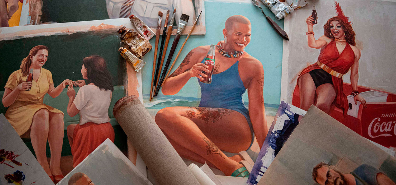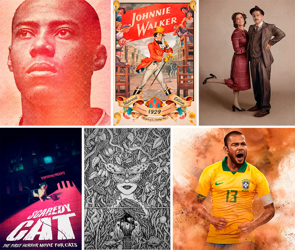
Black Madre is an illustration and art studio that, since 2009, produces projects for various segments, such as advertising, design, music, fashion, editorial and motion.
André Maciel, Founder and Director of Black Madre believes that handcraft has the power to inspire people, build relationships and enhance ideas.
We met André Maciel in 2011, at an event called PixelShow, in São Paulo. Since then, a lot has happened and changed, but we have always maintained a relationship of mutual admiration. Although we operate in different areas, we share a passion for graphic design and the desire to develop customized and handcraft projects, with extreme care.
In handcraft we trust.
André Maciel, Founder and Director of Black Madre
André and his team's work stands out for the quality and diversity of styles. The portfolio and the reach of the Atelier in the world market already impresses on its own. This idea guided our work from the beginning: “Let the portfolio speak for itself”.

Project Scope: Simplicity
Based on the idea that the main part of the website should be the portfolio, we defined that the interface should be as neutral as possible. Light and uncomplicated navigation, simple typography aligned with branding, white and black colors, objective compositions, short paragraphs, large images and videos, and light galleries.
The challenge then was to build something that was both simple and smart/creative. Something clean and objective, but that would bring a special experience and live up to the artistic potential of Black Madre. There was a great expectation about the final result. The website should have a global digital presence, taking the Ateliê to new heights within the internet.
Creativity x Neutrality
Even though it is a portfolio containing very common elements in this type of website, an About page, Project gallery, and vertical presentation of Cases, we tried to create some unique features, elements and functionalities that enrich the navigation and visualization experience of the illustrations.
For the Home, we defined an opening animation, based on the branding of Black Madre.
Home opening animation.
The idea is for the logo to blend in some way with the random illustrations at the top of the site, something that was already present in Ateliê's identity. After this animation, we created a small interaction between the elements and the movement of the mouse. For the presentation/visualization of projects and images, we saught different forms of navigation.
We understand this site as a simple interface between the user and the incredible work created by Black Madre.
Firstly, the user can navigate vertically through the home and view most outstanding works among other features (such as the video reel). In the CMS we created the possibility of inserting different compositions and formats, where some projects gain more relevance than others and this makes navigation more dynamic.
The user can also simply access the project page via the menu (the most usual way). The menu is presented in two ways depending on the navigation point: At the top of the pages it is viewed in composition with other elements and, during navigation, it is accessed with a click in the area on the left of the screen.
Portfolio - Project List
In addition to these paths, we created a second way of viewing projects, through the list format, which can be accessed from the fixed button in the upper left corner of the screen. This would be the quick view, always at 1 click from the user.
Project Portfolio: Freedom and Autonomy
As Black Madre is always creating new projects and needs to release them quickly, we created an exclusive CMS, from scratch, which allows the portfolio to be updated with a lot of freedom and autonomy. This CMS also allows updates in other areas of the site.
Within each new project created it is possible to insert videos, gifs and images (with the possibility of zooming), create differentiated compositions and image sliders, in addition to inserting relevant information, technical data and awards.
Project Presentation
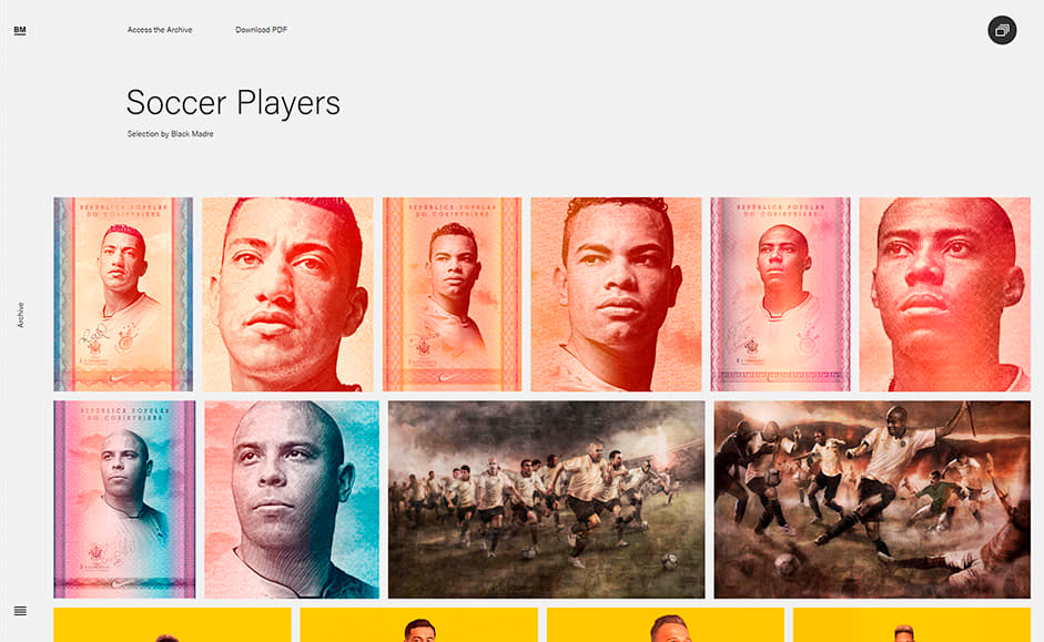
The projects can also be featured on the website's home page, when necessary, and their images can be added to the Archive gallery, with tags for searches.
The transition between projects is also a subtle differentiator. At the end of each project, the user has access to the next one and the page transition is done in a subtle and intelligent way.
Archive: Create your own selection of images
This is perhaps the biggest differentiator of this project and is one of the highlights of the site. The idea came from André himself, founder of Black Madre, who wanted to be free to add any kind of illustration and often authorial illustrations created by the studio, without necessarily being linked to a project.

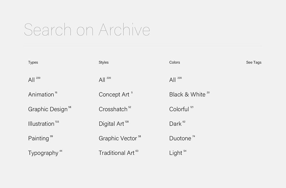
In addition, these images could be freely selected by any user to create an exclusive PDF or Link, which can be used in several ways, either as a reference selection for an illustration or a style definition for a particular meeting or pitch.
In the Archive, the images are categorized by style, colors, technique used, in addition to the tags, and can be filtered in this way. All of this is also managed within the CMS we have developed.

Results
We considered it extremely satisfactory to develop this project and see its result. It took us a few months to complete the entire creation and development stage, and this was essential to find a balance between creativity and simplicity, highlighting the incredible designs and illustrations created by Black Madre, on a website relevant to the Atelier. It is great to see that the portfolio continues to grow with the use of the CMS that we delivered.
We are extremely happy and proud that this site was selected by the Awwwards judges as SOTD.
Technologies
Like any project, we always learn a lot. Speaking in terms of development, the main learning was how to make the transitions between pages in a fluid way, customizing the output and input animations according to the navigation route.
I would also like to highlight all the learning in the development of the CMS, which required many studies for the implementation of a tool with the possibility of assembling the compositions of the projects in an intelligent way.
A technology that we had never worked on before was the generation of PDFs. After research and some studies, we decided to implement a solution to the frontend, using the JavaScript library jsPDF by MrRio.
We use simple, yet very powerful technologies such as PHP, MySQL and HTML5. We do not use frameworks or platforms and we develop everything from scratch, to meet the needs of each project.
In terms of structure, the site is hosted on a shared server, as it meets the performance requirements of server-side programming. Regarding the tools, we used Sketch for interface design and Sublime Text for programming.
Company Info
Bloquo is a Brazilian digital design studio, formed by 2 professionals: the designer Rafael Botti and the designer/developer Ed Semprebon. The two have worked together to create more than 50 websites over 16 years, always seeking to align creative digital experiences with functional responses to their clients' needs.
