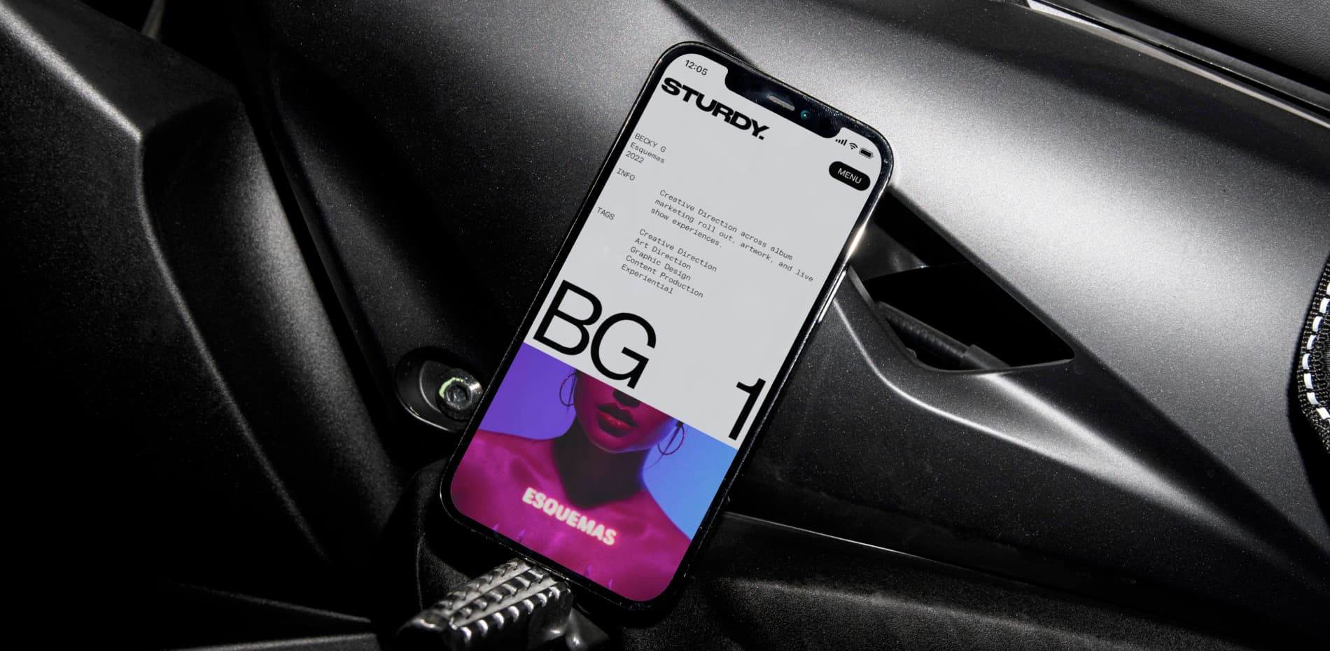
Based in Los Angeles, Sturdy is a prestigious creative house and digital delve known for their expertise in crafting captivating visual narratives that deeply resonate with audiences.
With a multidisciplinary approach, their team is driven by the mission of creating unforgettable moments of connection. Their remarkable client roster includes industry luminaries such as Drake, Bad Bunny, Kendrick Lamar, Baby Keem, Giveon, Travis Scott, Rosalía, and Rauw Alejandro, among others, highlighting their exceptional reputation in the field.
We collaborated with Sturdy to develop a comprehensive digital brand system, enhanced by a web design extension that allows Sturdy to elegantly showcase their work while effectively documenting their projects. Additionally, we integrated an inspiration board-style interface and tool to the site to help foster seamless collaboration between Sturdy and their clients. The outcome was a cutting-edge, visually stunning, and user-friendly platform that solidified Sturdy's leadership position in their industry.
Discovery
During our extensive discovery process with Sturdy, a significant finding emerged concerning their previous website. Despite Sturdy's position as industry pioneers, where their work serves as a prominent source of inspiration for others, their website fell short in effectively conveying this essence. There was a notable absence of clarity regarding the nature of their collaborative and multifaceted work. While Sturdy expressed a clear preference for a "Show, don't tell" approach, they were also interested in incorporating moments of invitation. They wanted the site to have bold mechanics that would facilitate exploration and discovery, capturing the attention and curiosity of their audience.
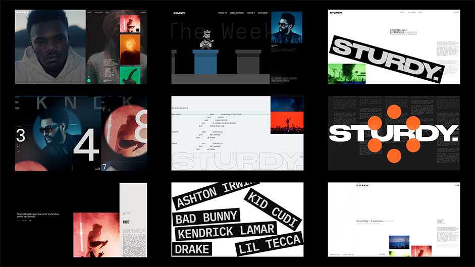
“We iterated on mechanics and interaction paradigms taking inspiration from everything from video games to editorial publications.”
Throughout our process, we explored a multitude of captivating concepts, immersing ourselves in various approaches. We iterated on mechanics and interaction paradigms taking inspiration from everything from video games to editorial publications. As we explored, we kept coming back to a sentiment said during an early stakeholder interview that resonated with us: "We are your mood-board." This profound statement served as our conceptual hook in the creation of a distinctive and innovative portfolio experience that truly embodies Sturdy's work and brand position.
Look & Feel
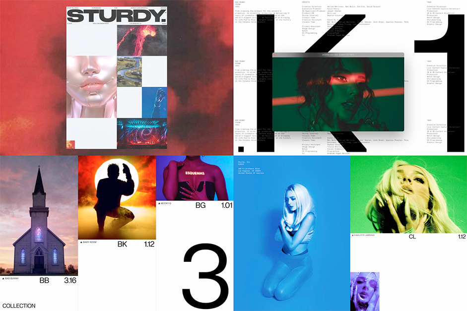
Building upon our findings, our primary focus was to create a platform that showcased Sturdy's impressive body of work. We ensured that every visual and textual element on the website served the purpose of enhancing and complementing the featured assets. To maintain an air of mystery and allure, our aim was to achieve a design that exuded simplicity, coolness, and collectedness. As a result, we developed a visual approach that strikes a delicate balance between edge and elegance. Through the skillful utilization of textures and white space, we crafted a sense of depth and equilibrium within the design. Dynamic and lively elements, including bold typography and subtle animations, were incorporated strategically to accentuate Sturdy's strengths and unique qualities. The overall outcome is a display of sophistication and refinement, infused with a captivating contemporary grit.
Layout and Systems
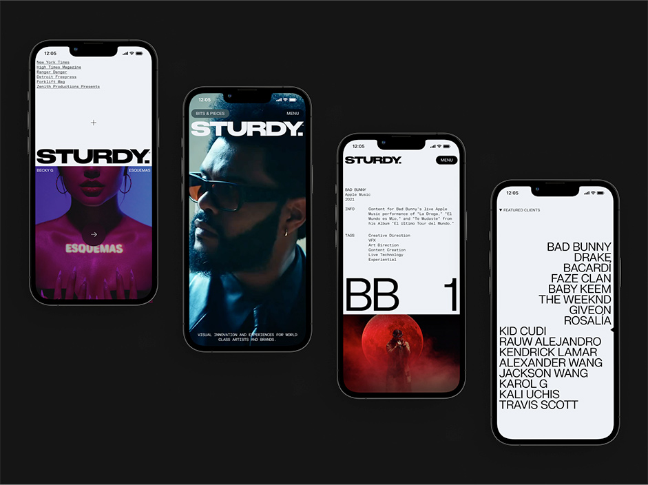
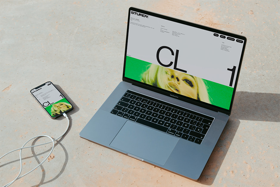
We crafted Sturdy's website with responsiveness in mind, aiming for visual consistency across all devices. This approach guarantees a seamless and unified brand experience, regardless of whether users access the site from a mobile device, desktop, or any other screen size. A key priority was to establish design principles that not only guided the on-brand layout but also facilitated the creation of flexible and well-structured components. These components seamlessly integrate into a custom CMS (Content Management System) tailored for the Sturdy team. As a result, anyone from their team can easily build compelling case studies without hassle.
Collaborative Tools
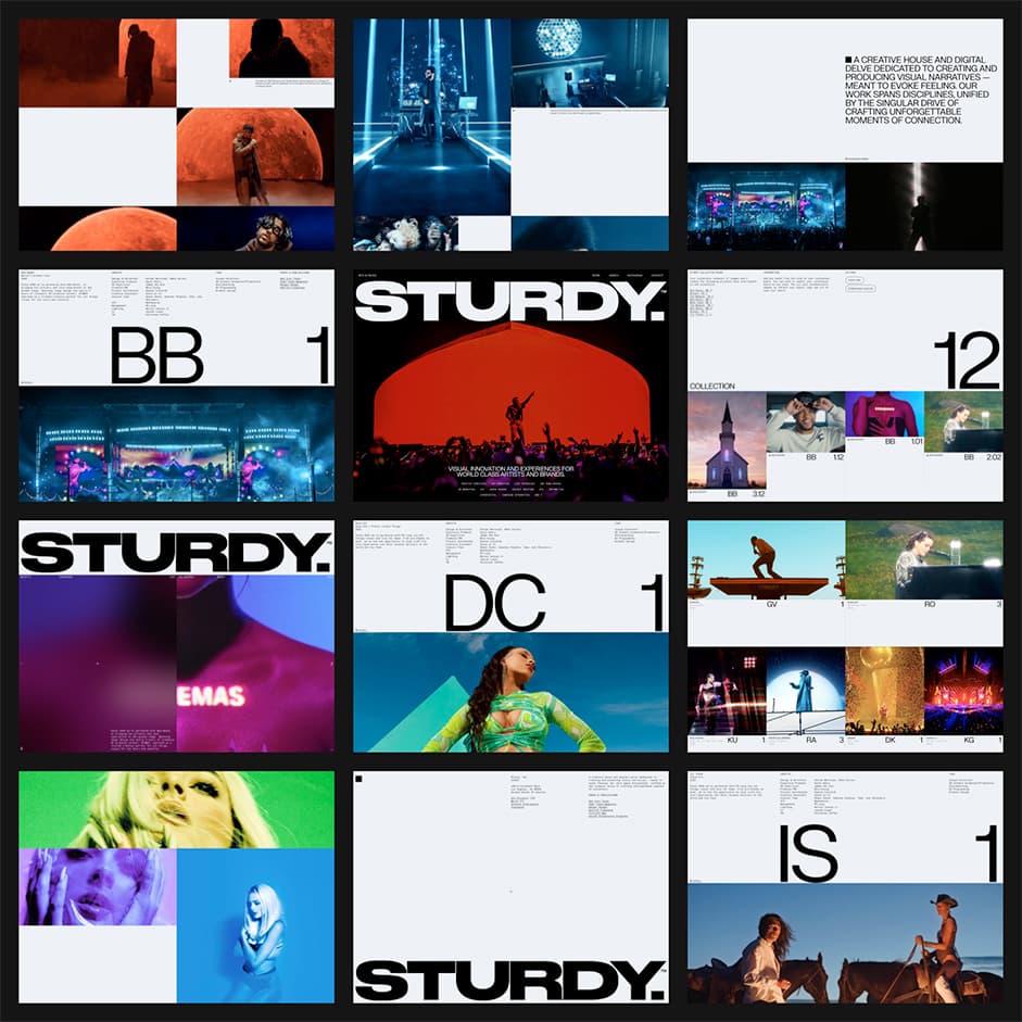
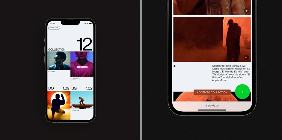
Sturdy's work has become deeply embedded in their industry, to the extent that prospective clients and creatives often come to them with moodboards predominantly featuring Sturdy's work. With this insight in mind, we implemented a set of collaborative tools that allow users to easily add any asset from the website to their personal collection, which can be effortlessly shared or downloaded. This enhancement enables Sturdy to actively encourage their collaborators to explore the site and effortlessly curate their own collections. By doing so, it fosters seamless creative alignment and provides a valuable reference point, aligning with the needs and preferences of their target audience.
“We implemented a set of collaborative tools that allow users to easily add any asset from the website to their personal collection.”
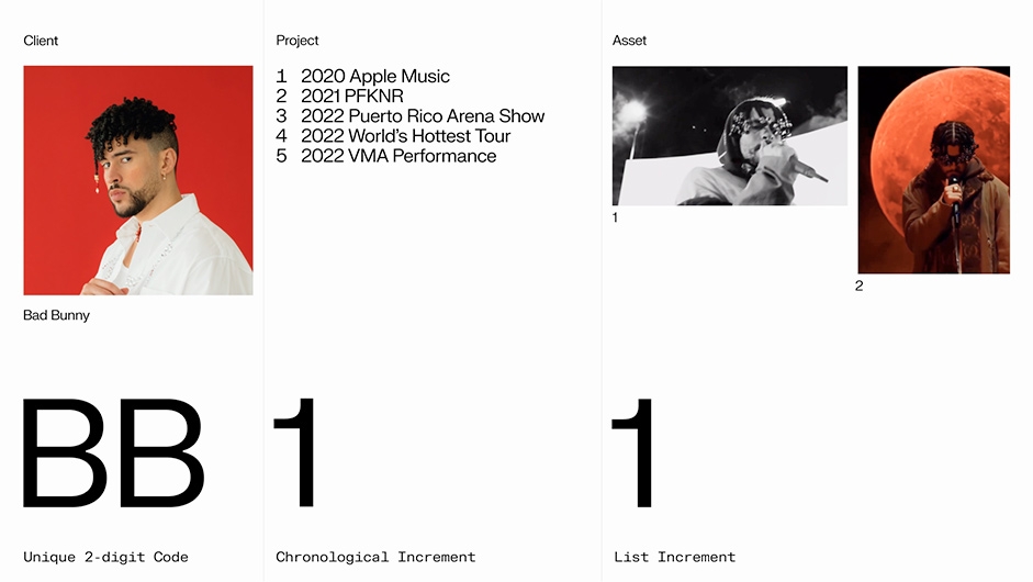
To optimize the user experience in the process of creating collections, we implemented a comprehensive naming index for projects and assets. Sturdy's frequent collaborations with a single client benefits from this index, ensuring clarity and differentiation between multiple projects. Additionally, the naming index serves as a visual tool, providing a typographic hook that accentuates Sturdy's brand identity, allowing it to truly shine. Moreover, this indexing system enhances organization within the CMS, streamlining workflows and facilitating efficient management of Sturdy's projects and assets.
Easter Eggs
Drawing inspiration from the aesthetics of the late 90s and early 2000s web, the design incorporated pop-up screens into the website to offer a delightful interruption in the user experience and bring attention to the hidden gems from the vast Sturdy archive. Users can intentionally activate these pop-ups from the nav or encounter them through time-triggered inactivity. Upon revisiting the site, users will be pleasantly surprised to find their window filled with captivating pop-up easter eggs.
Technologies
Sturdy’s new site was developed using Nuxt, the best Vue framework out there. Styles are written in Sass using BEM naming convention to allow for easier collaboration between developers. Animations (whether they be on load, scroll-bound or reveal) are powered mostly by GSAP and CSS. The experience is made complete with the use of Lenis, the most reliable smooth scroll library. Lenis enables the best performances while bringing to life complex elements such as the clients wheel. Thanks to our Jamstack, we are leveraging Netlify's powerful continuous integration and serve a statically generated site to ensure optimal performances and the best load times. Finally, the content is managed through Contentful, and we use Vimeo as 3rd party hosting for videos.
Company
Fix Studio is a collective of creative thinkers making things smarter, newer, and more memorable. They firmly believe that function is the substance of aesthetic experience. This guiding principle directs them in creating clearer user interfaces, stronger branding devices and more cohesive design systems. Whether they are engaged in designing multi-platform experiences or developing enterprise applications, their primary goal is to solve problems.
This project was developed in collaboration with Ingamana and Thomas Aufresne.
Sizzle Reel was made in collaboration with Diego Funken and Nico Funken from Funken Studio.
All assets provided by Sturdy.
