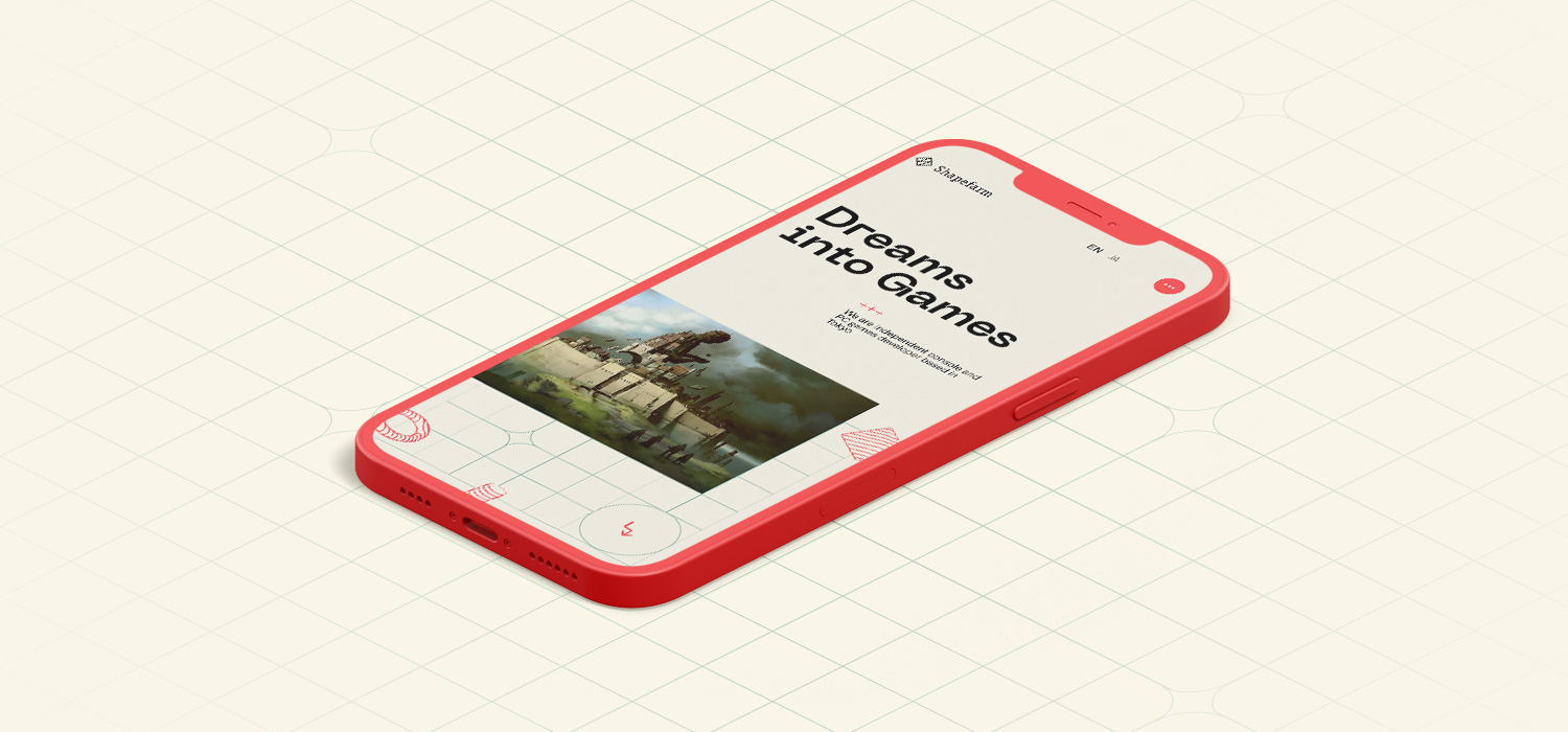
Shapefarm is an independent creative game studio set up in Japan by Swedish game developers. They needed a site to present a unique impression, to reflect the creativity of their games, which differentiates them from other game studios.
Design
Approach
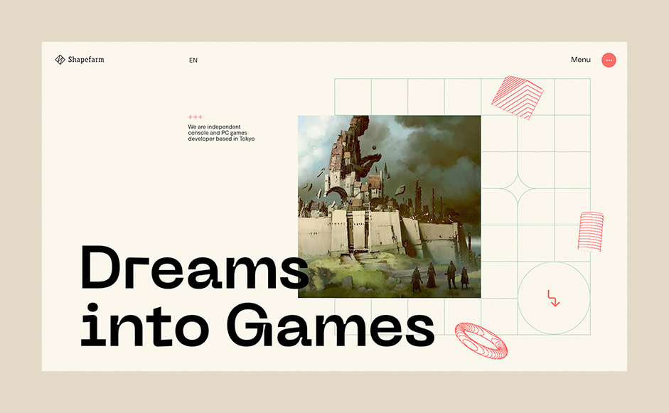
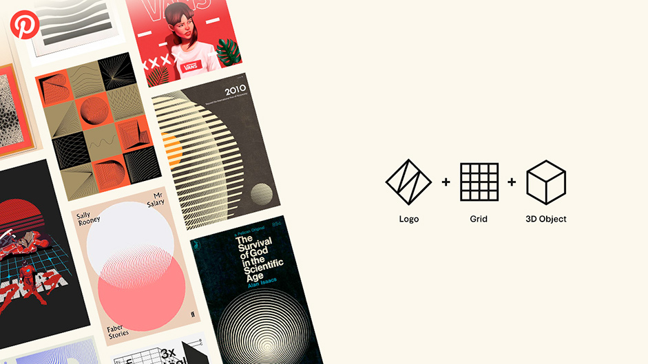
First, we made mood boards on Pinterest to get an idea of the client’s preferences before starting the design. We Collectively gathered our inspiration and tried to find a way to incorporate it into the website. We focused on the logo shape as a motif to be used on the entire website, and we found a good combination of 2D grids and 3D objects to give the logo a fun and unique look, while still being cool and different from other game studios.
Tool Production
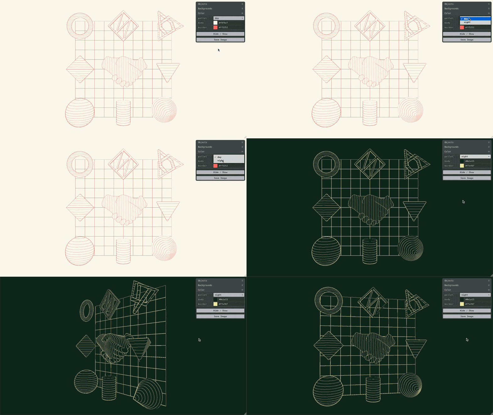
When using 3D objects in the design process, it was necessary to consider their motion too. So we created a tool using Three.js which allows us to save 3D parts as PNG images at any angle and size. Using this tool to generate ideas for the design comp, the client and ourselves got a clearer picture of the final visuals, including motion.
Color
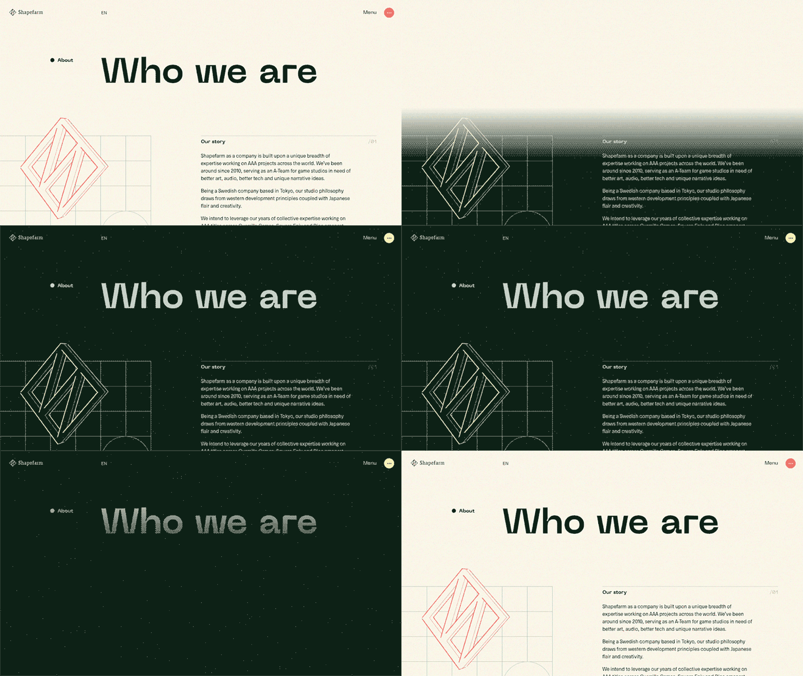
Considering the warm vibes that the team members exude and their outputs' cool side, we decided to combine warm shades of colors with an iconic vivid red. Since we already had a color switch during the design phase, we made the base color scheme look like day and the post-switching look like night. The goal was to create a site that can be enjoyed in some ways by scrolling, hovering, and clicking. The function to change the theme color is part of the above; we chose a dark green color scheme instead of the more common “dark mode” based on the image of “night.” The color scheme represents a studio whose games can be enjoyed all day long. We cared about the details, such as the color of the favicon.
The goal was to create a site that can be enjoyed in some ways by scrolling, hovering, and clicking.
Development
Loading
Since the 3D objects' font data needed to be loaded before the site display, there was the problem that loading took a more time depending on the internet speed. To solve the issues, we did the following:
- Reduce image size (WebP)
- Reduce 3D objects size (glTF)
- Global content delivery using Amazon S3 and CloudFront
- Lazy loading using the Intersection Observer API
- Custom builds to reduce Three.js size
- Static content delivery using Netlify and Nuxt.js (SSG)
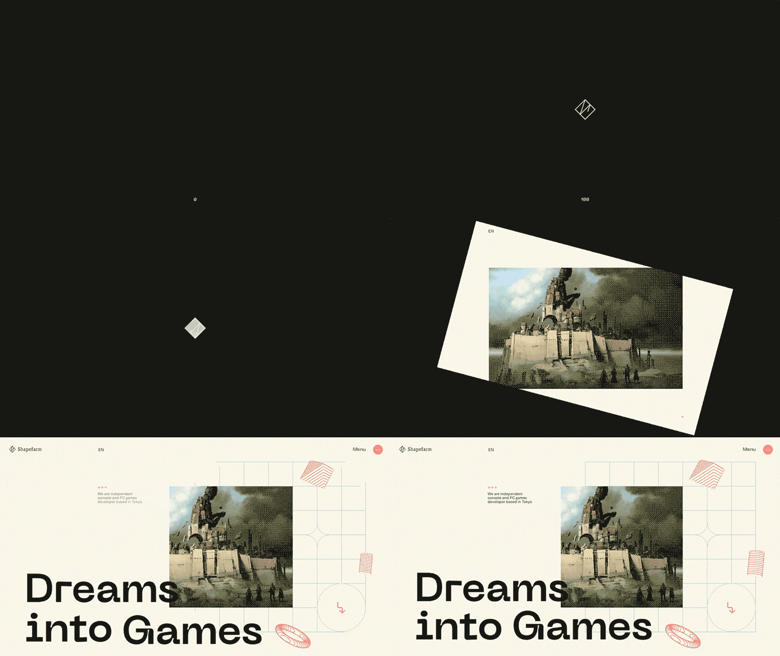
For the loading animation, a unique clip animation was developed in which the logo's outline is linked to the loading progress. After loading, the user enters the world of Shapefarm. We used Canvas 2D for this clip animation, and it fully disappears after loading so as not to affect the performance.
Technologies
Frontend
For the front-end tool, we chose Nuxt.js As the site itself does not need to be updated often, developing it as a Static Site Generator (SSG) in combination with Netlify was a good idea for a better experience.
We decided to use the WordPress Rest API for the Headless CMS to be combined since the client was initially using WordPress. It allows the client to edit the Games, Teams, and Careers pages. We structured a system that detects changes on the WordPress side called "Jamstack".
Animation
We wanted to use animation libraries on Canvas and Three.js, so we mainly used Gsap, with some parts using CSS animation. Scrolling, mouse stalking, and other controls were developed by creating an original class function instead of using a library. In the code, smoothness was achieved by combining the Lerp function with the Request Animation Frame.
Smoothness was achieved by combining the Lerp function with the Request Animation Frame.
Interaction
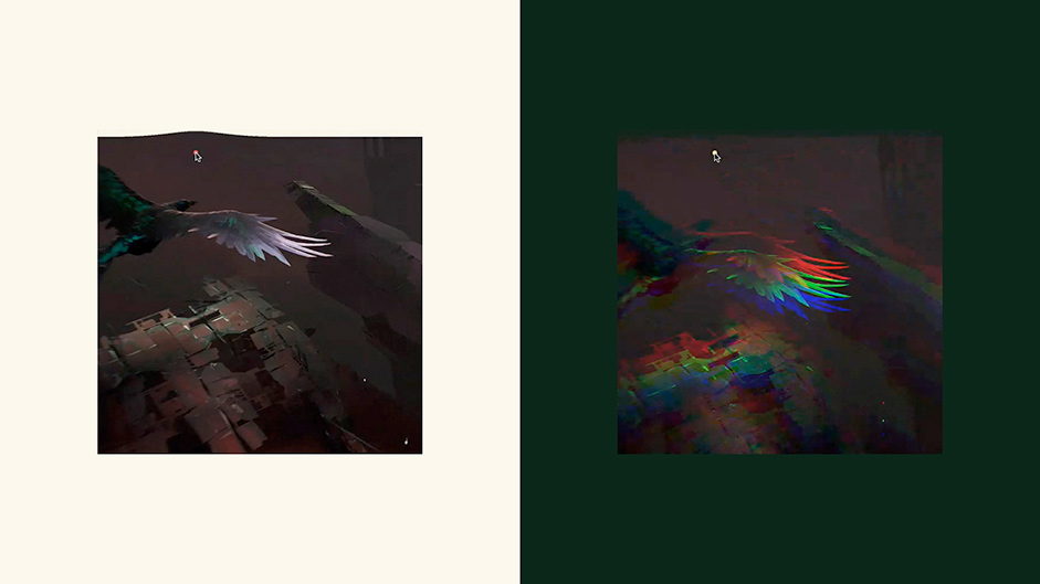
To show the creativity of their games as much as possible, we included more interactions and animations than other corporate websites. One of the most distinctive features is the change of effects according to the theme color. The light mode’s color and effects give a clean feeling in the daytime, while the dark mode’s noises and RGB shifts give a nighttime feel.
These post-effects were achieved using different shader values for each theme on objects, images, and videos drawn in Three.js. They also change depending on the mouse position and scroll speed. Check them out!
Tools
Frontend: Nuxt.js, Gsap, Three.js
Backend: Nuxt.js, WordPress Rest API
Server Architecture: Netlify, Amazon S3
Design: Photoshop, Illustrator
Credits
Nobuaki Honma (Design/Development) and Natsuko Sakai (Communication)
Company Info
Garden Eight is a global digital design studio based in Tokyo and Copenhagen.
Check out more of our work here.
