Congratulations to dogstudio for winning Site of the Month January for The Hall of Zero Limits. Thanks to everyone who voted and tweeted, the winner of the Pro Plan is at the end of the article.
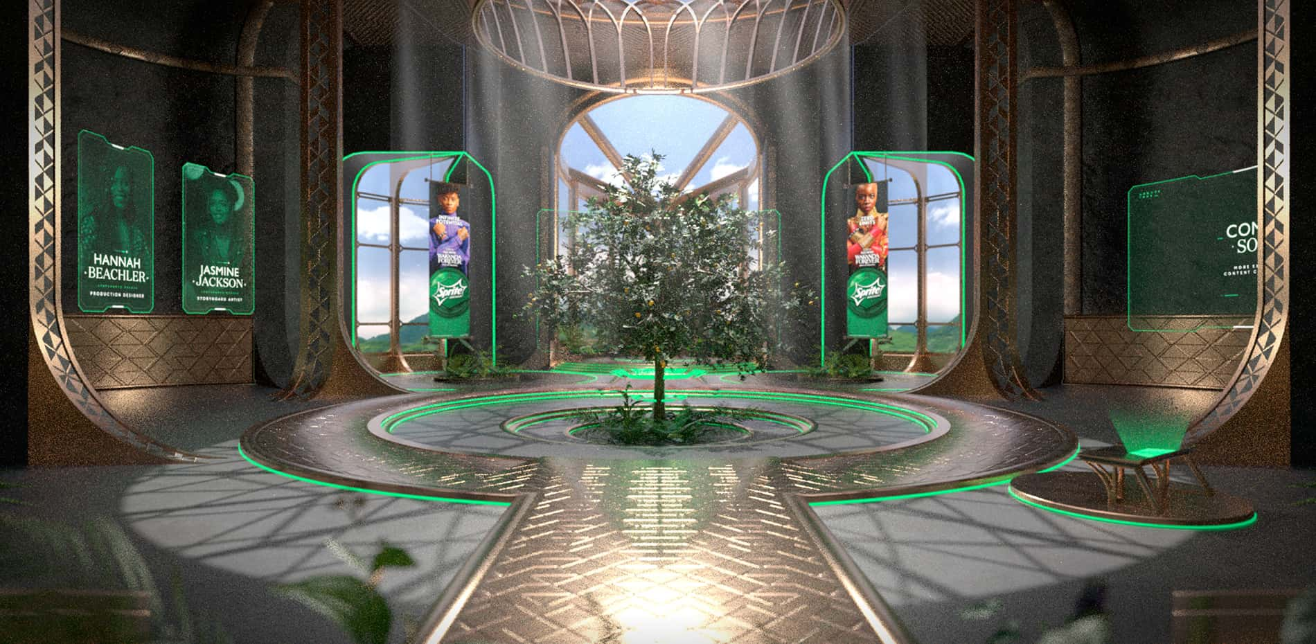
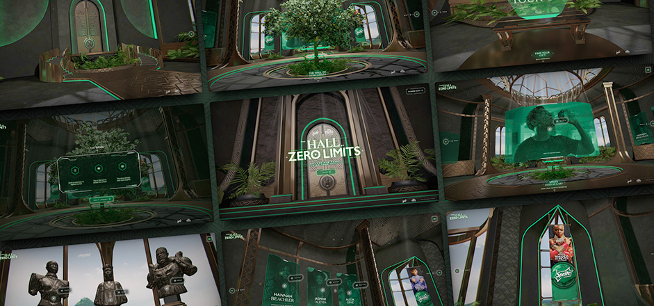
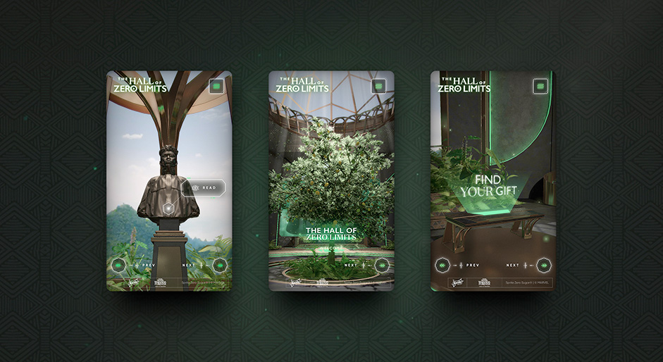
Having backed creators of color since the 1980s, it only made sense for Sprite to take a giant leap into Hollywood by sponsoring Marvel Studios Black Panther: Wakanda Forever. They came to us with the idea of a 3D experience unlocking behind-the-scenes videos highlighting the multicultural women behind the film, so the “Hall of Zero Limits” was born.
Non-Canon
The experience aimed to reveal an exclusive behind-the-curtain look at the new film while at the same time immersing people in the Wakanda universe without being a blatant copy.
Helpful AI
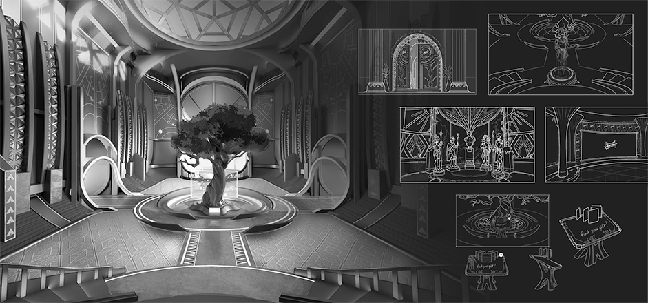
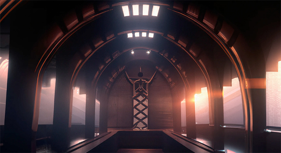
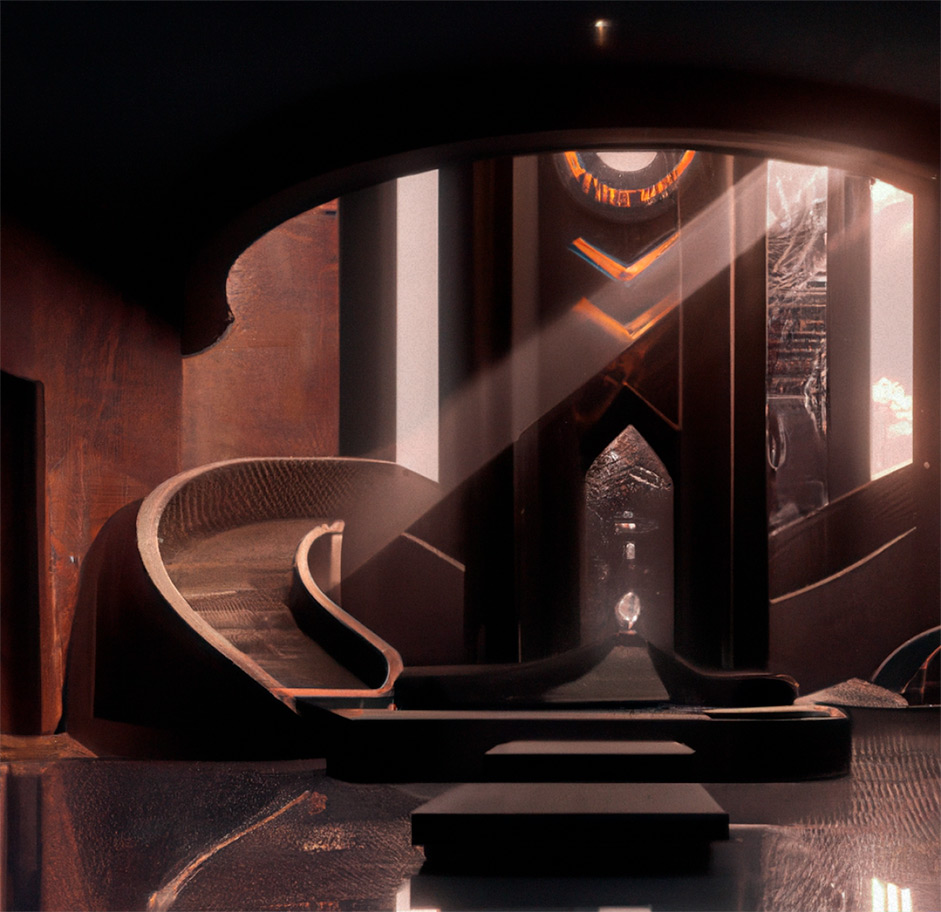
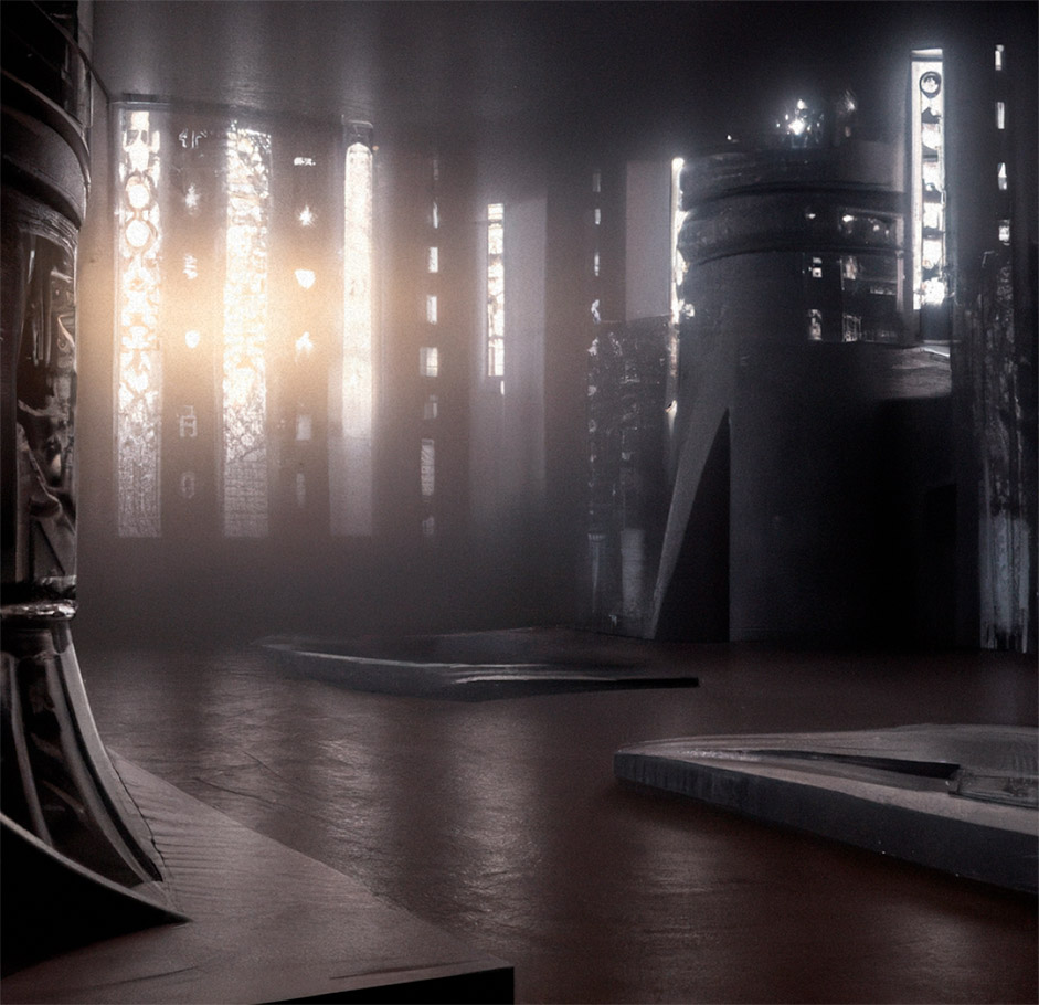
We started with our fair share of research and testing to bring all of this into one vision. Cinematic fantasy architecture has designs, shapes, and colors that all have meaning. So we went crazy with it and used a combination of sketches and new technologies such as DALL-E as the first step towards conception. “A beautiful matte painting of the hallways of Wakanda University, dark, light from a window, church-like light, futuristic African, 30mm, concept art” Anyone.
We went crazy with it and used a combination of sketches and new technologies such as DALL-E as the first step towards conception.
We took those sketches, DALL-E rendered visuals and moved on to 3D. From plants, god rays, patterns, statues, and a lemon-and-lime tree, we once again gave it those extra details that make you want to come back.
Welcome to the future
As the world’s most technologically advanced nation, we couldn’t help but associate it with luxury and modernity. With this vision, we built the entire graphic language on the idea of minimal outlines, GUI shapes, and holographic backdrops—mixing Afrofuturism and Art Deco like it was our special love child. Fittingly, typography choices were all made to fit our approach of exquisite craftsmanship in modernistic forms.
We kept tweaking and adding small elements to make the experience more immersive and delightful to explore. From the custom motion graphics, Wakandan typeface transitions, and wisdom guide, our designers stayed on the project until the end to push this to the next level.
Hiding in Plain Sight or, Behind the scenes for those inclined
This experience was created with a combination of AstroGL, VueJS, and various 3D software depending on the specific requirements of each component. The languages utilized in the development process were Javascript, GLSL, HTML, and CSS. We leveraged the power of AstroGL (our custom WebGL stack and built on OGL) to deliver a high-performance and immersive experience that showcases our 3D assets. VueJS helped us create a modular and scalable application, which was crucial in handling the diverse content of the experience. We also employed various 3D software like Blender, Maya, Zbrush, and Substance Painter+Designer to create and optimize the 3D assets for the web. The combined efforts of these tools and the expertise of our creative and technical artists enabled us to deliver a seamless and interactive experience that exceeded expectations.
By merging meshes and using Draco compression, we managed to keep the 3D files' weight low.
Creating a rich and dense 360 scene presented us with several challenges, namely how to compact numerous items and visual effects into a single scene designed to be viewed from all angles. We collaborated with our 3D designers to optimize assets, which required a significant amount of time and effort. By merging meshes and using Draco compression, we managed to keep the 3D files' weight low. Furthermore, we manually optimized each texture, reducing their weight to a minimum while maintaining excellent visual fidelity at close range.
Achieving realistic yet performant reflections was another challenge we faced. As we used many metallic materials, reflections played a crucial role in the overall visual experience. Our 3D designers created lightweight, custom PBR materials, which we continually tweaked to achieve a realistic and majestic look. Real-time reflections were not a viable option due to their high performance cost, particularly on less powerful devices. To address this, we came up with a solution that involved using multiple 360 renders of the scene as environment maps for lighting and reflections. Transitioning between these maps using the camera position as an input gave us the illusion of real-time reflections, but at a significantly lower cost.
Getting the camera movements right was essential to the overall feel of the experience, and it presented its own set of challenges. We wanted an organic movement but were constrained by specific stops in the scene. To achieve this, we created two curves, one for the camera position and another for the focus point. These curves were first dynamically smoothed in code based on the device and screen resolution. We then animated the camera on these curves using custom animation timelines to achieve a better cinematic feel. Using a single spline curve to track the camera's movement would not have been sufficient in this case.
Company Info
Client: Sprite / The Coca-Cola Company
Agency: Wunderman Thompson
Studio: Dogstudio
Multidisciplinary creative studio at the intersection of art, design and technology. Making Good Shit like it's 1996.
Thank you for your vote and tweet @kevinrig_, please DM us to collect your prize!
