Imagine walking into one of your favorite stores. You’re expecting a quality visit as always, but this time you find it hard to locate the products you’re most interested in. The customer service associate is sitting behind the counter playing a game on his phone and you can see open boxes with merchandise scattered on the ground, as if the stock person didn’t finish their job.
First, and second, and thousandth impressions are important. Even more so for online businesses.
Conversion rate optimization goes well with the ecommerce world, considering the whole point of having an online shop is to bring in more visitors and convert those people into paying customers. Therefore, UX tips for conversion apply rather well.
The primary reason people still go to physical shops is because customers don’t have the ability to touch and feel the items they want to buy. This is a huge disadvantage for online retailers.
It’s definitely important to have an online shop built with solid ecommerce software, but only with properly implemented UX elements, your store can close the gap and make customers feel more confident in their purchases.
For example, avoiding information overload is a must, and complicated text, more often than not, makes your company look silly.
This ties into the user experience for all ecommerce shops. Let’s take a look at some of the other more important elements for UX in e-commerce:
The First Impression

First impressions are critical for online stores, because it’s so darn easy for customers to click on the “x” and go find another alternative company that sells the same products.
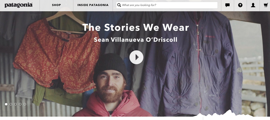
Therefore, your homepage needs focus. For example, Patagonia sticks to inspiring videos and stories that represent exactly the type of people Patagonia caters to.
A value proposition is required on that homepage, and it’s wise to share how your company is different from the hundreds of others online. Combined with simplicity and call to action items, your first impression is bound to improve.
Collections of Filterable Items with Product Selection Tools

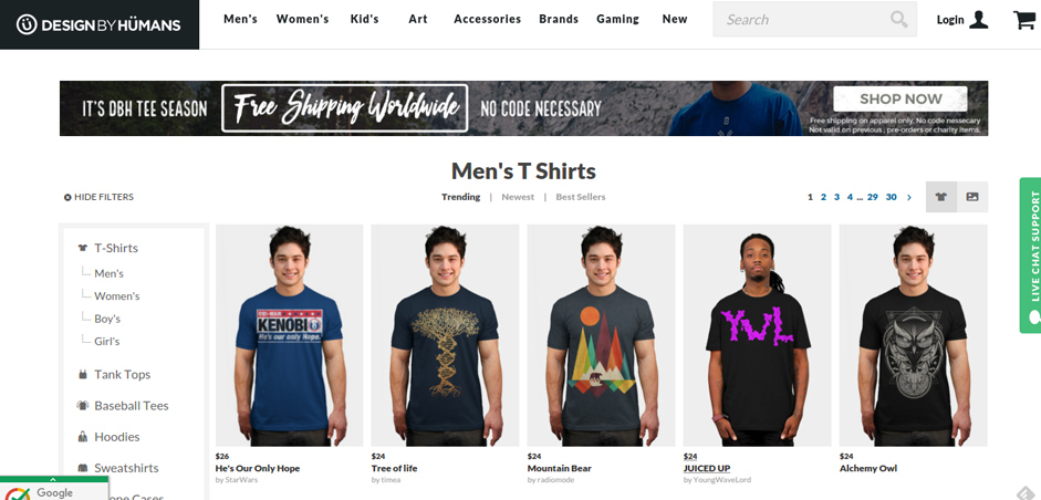
Top ecommerce shops generally offer collections of items to guide user tendencies. For example, they may feature a grid with all of the most popular men’s shirts, or they may offer recommended products based on past customer experiences.
The goal here is to allow for filtering and comparing when users look at these grids. Why? Because the galleries and collections of products are mere suggestions. Once the user decides they would like to continue past your preset galleries, the filtering and comparison tools come into play.
Having a System in Place to Bring Users Back

The average documented online shopping cart abandonment rate currently sits at 68.63%. This is rather high, and it shows that the most successful companies are not those that rely on first time visitors.
Nope. Customers need to be groomed before they start purchasing from your company, so a system is required to bring back abandoned cart users, bounced customers and even those who have paid for items in the past.
Some tactics for this include:
- Email marketing software
- Receipts with specials
- New offers
- Social media promotions
- Contests
- Sales with countdown timers
- Free shipping for a certain amount of product bought
Showing Credibility and Customer Satisfaction
Does your homepage feature any testimonials? If not, how are you going to build credibility with your customers?
Do your product pages have ratings and reviews? If not, how are your customers going to see which of the items are best?
Offering Quick Customer Service Tabs That are Impossible to Miss
First impressions are nice, but these are soon challenged when a question arises. Considering that most customers are going to have some sort of question, it’s wise to have customer service tabs that are impossible to miss.
Companies are prone to leaving customer service links in the footers, or in little links crammed into the sidebar. This is no good, because the customer doesn’t have time to be scrambling all over your site. Live chat boxes come in handy, and clear support modules are essential in the navigational menus, or anywhere besides the footer.
The Fastest Checkout Process Imaginable

Along with a secure checkout, a fast one is the second highest priority on your list. To start, you need a solid host and ecommerce building platform, along with fewer redirects and caching to ensure that the actual speed of your site is up to par.
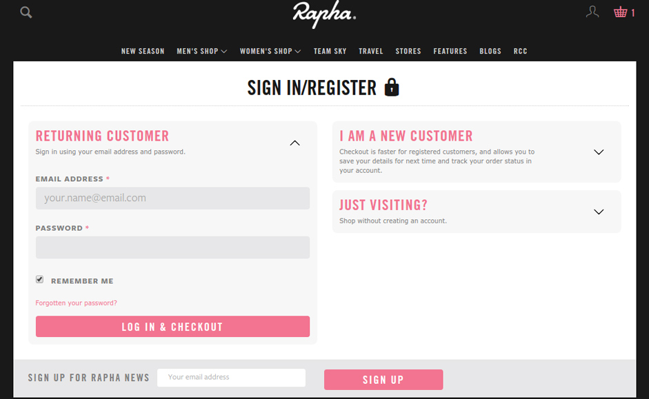
After that, testing with customers is the ideal way to structure how your checkout process goes. The ideal situation would be to have a one-click checkout, so aim for this. However, other elements are involved, such as guest accounts, which are shown to improve the amount of purchases on a site.
A Pleasant User Experience after Purchasing Has Been Made
This part ties into establishing a system to bring users back to your store, but it’s more about how people feel after they buy from you. For example, do they have links in the receipt to contact your customer service team? Is there a quick module for returning items and printing out a return label without any problems? Can a modification be made to an order before shipping?
It’s common for companies to forget about UX after a sale has been made, but it becomes all the more essential.
Clear, Beautiful Images with Quick Loading

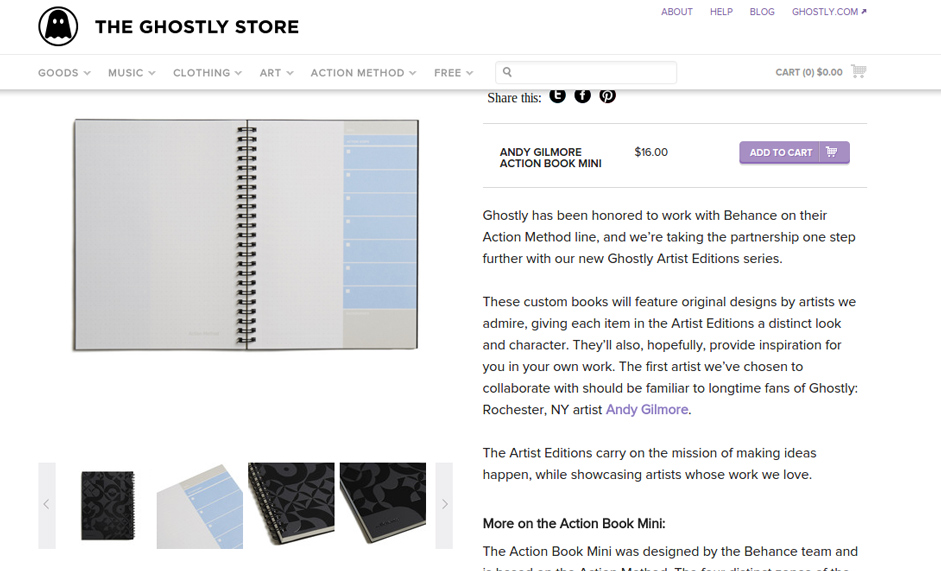
It doesn’t matter how dull your products may seem. Even if you’re selling notepads or matcha tea, people still want to see dozens of photos. From close-ups of the pages to more panoramic shots of the book completely open, you can’t skimp on the amount of high resolution images, because they further close the sensory gap between walking into a store and shopping online.
Conclusion
From a grand first impression to stunning product images, the most important parts of UX for e-commerce are sometimes complex, while other times easy. We recommend choosing one or two user experience changes you can make to your online shop, and moving forward after you see that they have worked effectively.
△ △ △ △
Every day Awwwards collects great examples for your inspiration. If you liked this topic, check our category Best E-Commerce Websites Designs and our special collection E-Commerce.
