Firstborn was founded in 1997. Our mission - to make rad sh*t for rad people. This year, at 22 years of age and entering our young adulthood, we began to ask ourselves the kinds of questions that all twenty-something year-olds ask themselves.
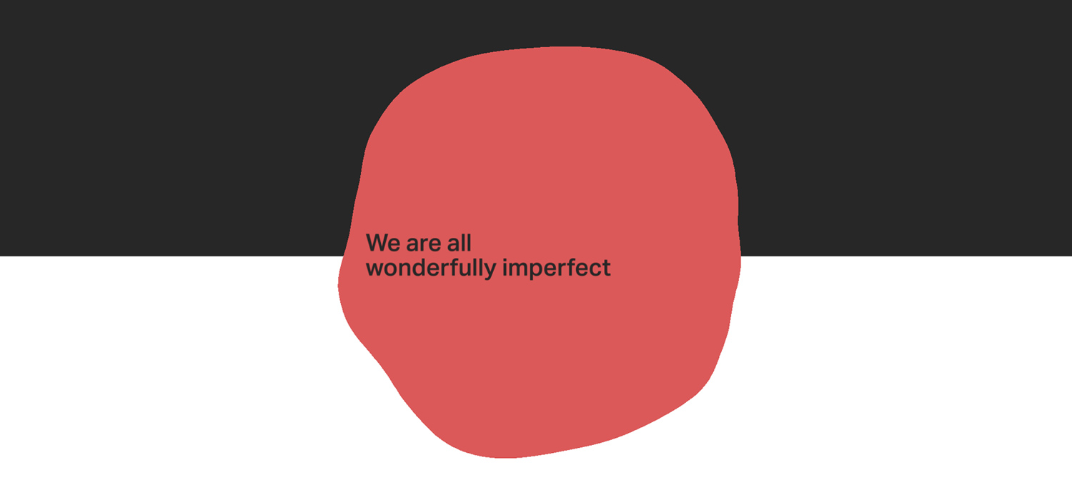
Who are we? What are we best at? What’s our purpose? Why the f**k are we so red? It’s not that we ever stopped making great work, or that we deviated too far from our core purpose and path; but it was a time of post-adolescent introspection - and from that introspection we emerged with a renewed and unyielding focus on doing the kind of work that we do best. Better than anyone else. To celebrate this new focus and reintroduce ourselves to the industry at large, we designed a fresh, modern new brand, and launched a new website befitting an agency that knows its true calling: to make rad sh*t, for rad people.

Less Talk. More Rock.
One of our mantras at Firstborn is “Less talk. More rock.” We love to get right into designing and building things, instead of, y’know, talking about designing and building things. While this has always been evident in the way that we approach client briefs, for a hot minute this principle wasn’t reflected in our website, where our work was a little hard to find. In building our new site, the most important thing was to bring our work to the fore - brazen and unabashed, the core purpose of the new site is to show off our work to clients, the wider industry, and prospective new hires. Our new homepage is a reflection of this, serving as a jumping off point for visitors to explore a number of our latest & greatest projects.
In building our new site, the most important thing was to bring our work to the fore.
Let the work shine, and have some fun.
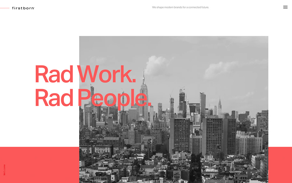
Our website is the first thing that many people will see as they’re getting to know us, and deciding if they want to work with us. Therefore, we needed it to work really hard in terms of showing off our culture, our sense of humor, and that little bit of je ne sais quoi. Every transition, interaction, and page build needed to be an intentional and considered articulation of who we are: from the flourishes of color in the rollover animations, to the warped and glitchy scroll effects; from the subtle New York skyline timelapse, to the easter-eggs that our developers buried throughout the site. Yes we wanted to let the work shine, but we also wanted to have some fun doing it.
Every transition, interaction, and page build needed to be an intentional and considered articulation of who we are.
Technologies
Our goals heading into this project were pretty straight forward. We wanted to create a new website experience that was performant - snappy, fast loads, fast interactions and fast animations were key; accessible to everyone; native - no scroll jacking, no matter what; subtle - every animation, build, or interaction needed to be intentional; and finally easy to update - we needed a new CMS to allow us to quickly get our awesome work out there for the world to see without calling in a developer.
Snappy, fast loads, fast interactions and fast animations were key.
We checked against this list of principles at every step of the way through the development process, as we tested features, transitions, interactions and animations. We also kept these objectives front of mind as we built out our tech stack.
Often the trade off for a stunning WebGL site is accessibility and the need for a pre-loader (what year is it again!?) We chose to use Gatsby, as a static generator that uses React. Gatsby is a great platform to work in, with a ton of helpers out of the box in terms of accessibility. Because Gatby is static, it’s about as fast as your connection is.
For the CMS we used Contentful, a headless CMS. We created flexible content blocks for Contentful, allowing our creative team to quickly stand up new case studies without requiring development resources. Gatsby has a great package that hooks into Contentful for GraphQL queries.
For deployments and hosting we are using Netlify, which not only makes project deployments quick and easy, but it also has a bunch of useful features that make the overall development process really nice.
One of the best features is preview branches. When you create a PR Netlify will build a preview of that branch and give you a link to review. This made iterations on prototypes and fine-tuning much quicker as we were able to in real time review with creative and share links with each other to be able to review ideas and experiments.
Frontend Frameworks and Libraries: React, Three.js, WebGL, Gatsby
Server Architecture: Netlify
Tools: Chrome DevTools Audit Tab, WAVE Chrome Extension.
