Congratulations to Garden Eight for winning Site of the Month October 2021 for The Shift, thanks for all your votes, the winner of the Pro Plan in the Directory can be found at the end of the article.
The Shift is a design platform based in Tokyo, Japan. They provide users with new perspectives, designs, and solutions to their problems. I first started working on The Shift website in early 2018. The first site released in April 2018 directly visualized the change at the heart of what The Shift represents.
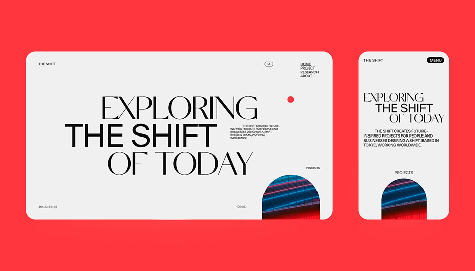
Their symbolic logo and the system which is restructured every midnight is the one we have inherited since 2018. The logo encapsulates their concept that focuses on the things and people that are ever-shifting. A short time later, in mid-2021, we began redesigning the site for the full-scale launch of The Shift. For this full launch, we needed a more global and comprehensive design than ever before.
The logo encapsulates their concept that focuses on the things and people that are ever-shifting.
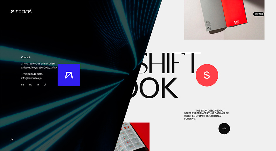
Before going into the design details, it is necessary to explain the relationship between The Shift and aircord. Like The Shift, aircord is a technology-driven creative collective based in Tokyo. The Shift is the counterpart and parent of aircord as well as responsible for creative work in a broader sense. Because of the relationship between the two, it was necessary for the design of The Shift to contrast with aircord, while at the same time keeping a connection.
Direction
The Shift's design is set to focus on 2D. This does not mean to only focus on typography or layout. It is the best way to show the contrast with aircord, which uses 3D elements.
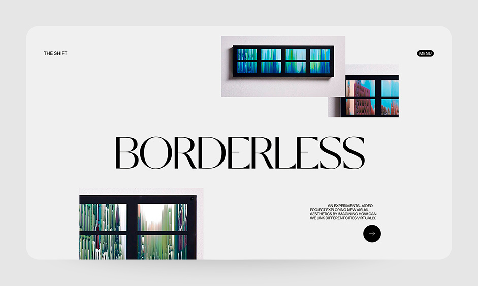
Following this guideline, each page is given an optimal theme and clear role in order to enrich the design. This is divided into 3 types: the static main page, with its emphasis on typography; the product page, with interactive 2D animation; and the research page, where free ideas are put into visual form. As an extra feature, you can see the past week's logos on the 404 page, so please check if you are interested.
Contrast
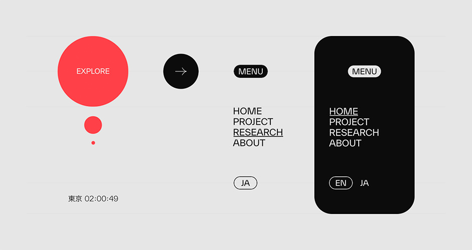
In terms of color schemes, black & blue contrast with white & orange; in typeface, unique & originality contrasts with historical sans-serif; in animation and expression, 3D contrasts with 2D.
Technologies
Frontend
There were 2 conditions in building the site: first, to prepare an experience that is both quick to respond and pleasant to use to take advantage of the design, and second, a CMS that would support multiple languages and be scalable enough to be updated by non-web professionals.
Animation
Regarding the first condition, I tried to solve it with slide animations and a minimalistic UI, which are the keys to The Shift. These animations are divided into CSS animations and WebGL animations using OGL in order to control the load smoothly. There are always debates about inertial scrolling and mouse tracking, but for The Shift, the lingering movement and the mouse pointer are an important part of the presentation. For the speed and convenience of development, I used Locomotive Scroll to control the desktop scrolling and Alpine.js to control the events.
The lingering movement and the mouse pointer are an important part of the presentation
Project archive
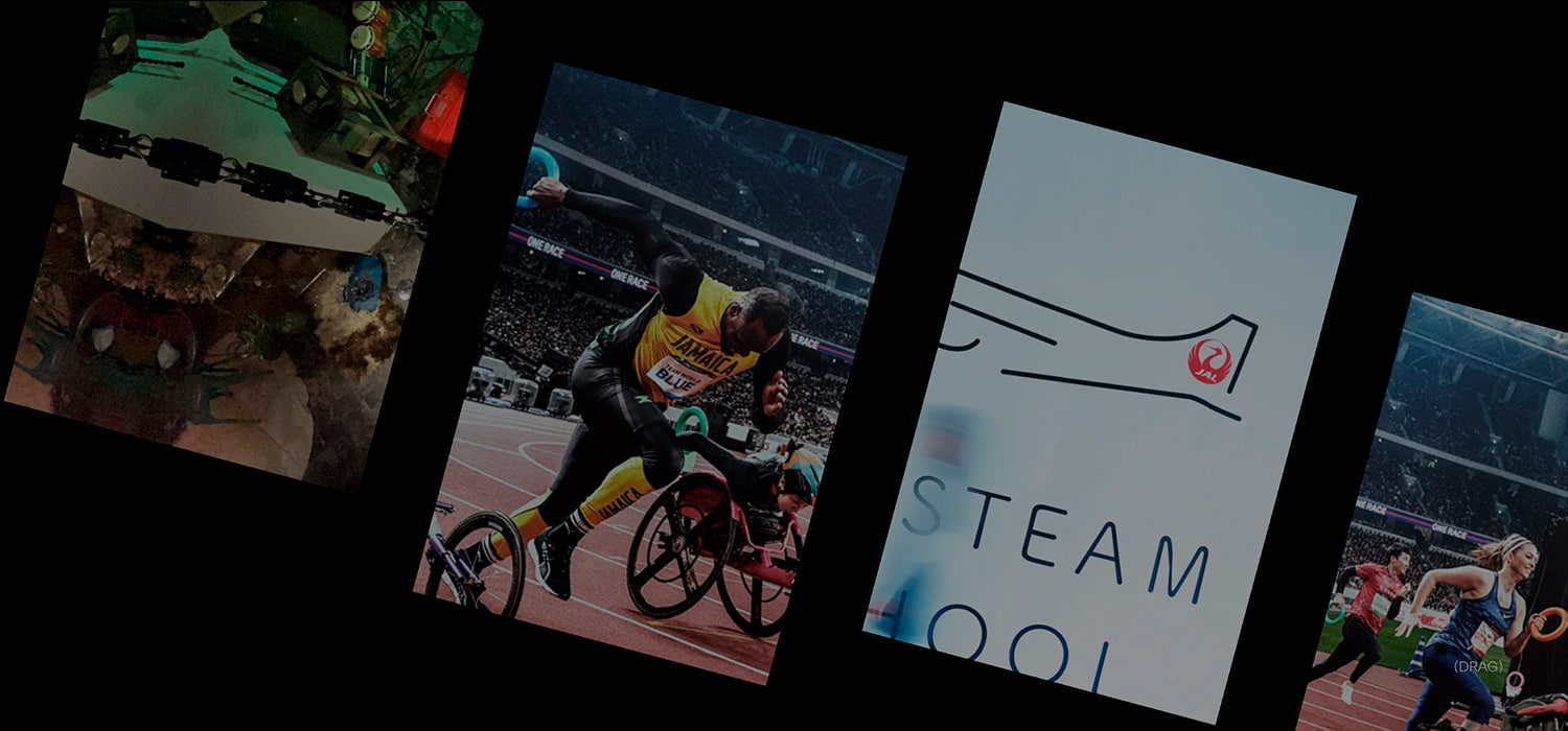
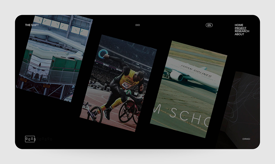
On the project page, I incorporated infinite scroll with an emphasis on usability. This scroll supports touch, scroll, and drag. It is also designed to handle changes in inertia and direction. Although it is a sub-page, it has the most The Shift-like design and animation.
Infinite Scroll
CMS
Among various CMS, I chose Wordpress based on the attributes of updatersand the update frequency. Wordpress has the advantage of being extensible and relatively easy to find documentation due to its high market share.
In addition to language switching, this specification is expected to be updated in all major areas such as Project, Research, and About pages. Choices were needed on each article to accommodate different types of projects. As a result, about 30% of the development time was spent building a CMS.
Mobile
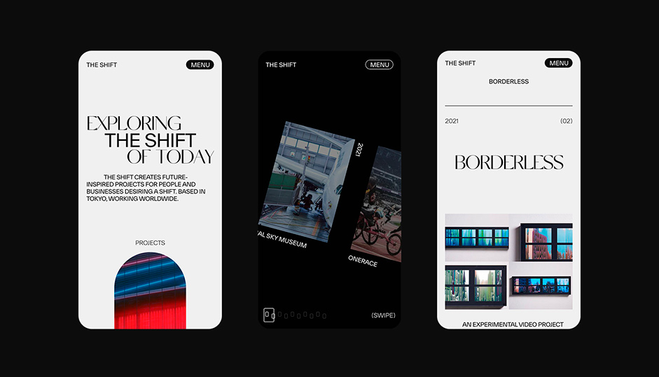
In order to deliver The Shift in the best state globally, the mobile environment needed to be made more comfortable. The Mobile itself has smooth scrolling and advanced rendering capabilities, but with a small mistake, the website may not display for a long time, which can inadvertently take up a lot of the user's resources. Efforts have been made to avoid this.
- Separation of javascript files for desktop and mobile (20% load reduction)
- Loading only in-screen resources using the Intersection Observer API
- Exporting static HTML from Wordpress
- Resource delivery using S3/CloudFront
- Delivery in the most appropriate media type and size, such as webp
Tools
FrontEnd
OGL, GSAP, Locomotive Scroll, Alpine.js, Barba.js.
BackEnd
Wordpress and AWS
Design
Credits
- Kenta Toshikura / Garden Eight
- Toshiyuki Hashimoto / The Shift
- Jiyu Park / The Shift
- Mika Hirata / The Shift
Company Info
Garden Eight is a digital design studio based in Tokyo and Copenhagen.
Thank you for your support, the winner of the free Pro Plan in our Professional Directory is varetti96, please DM us for us to upgrade your profile!
