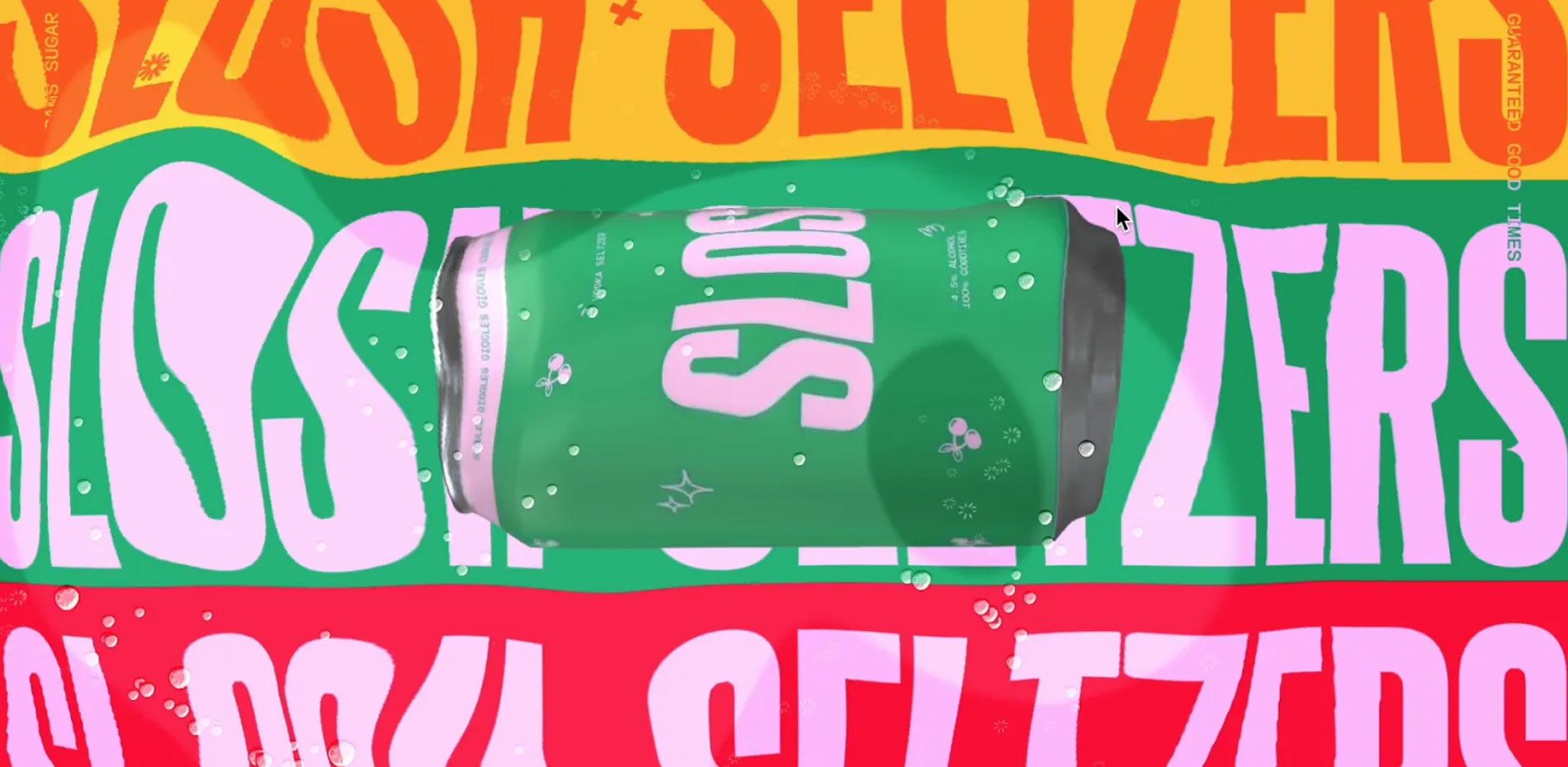
What happens when you design a website for a fictional seltzer brand you created? We found out with Slosh, a vibrant, immersive experience.
The first hurdle? Inventing a brand we’d want to do work for.
From Brainstorm to Beverage: Inventing Slosh
With the opportunity to create anything we brainstormed product ideas spanning from sleek cars and moving historical pieces, to elegant high end perfumes.
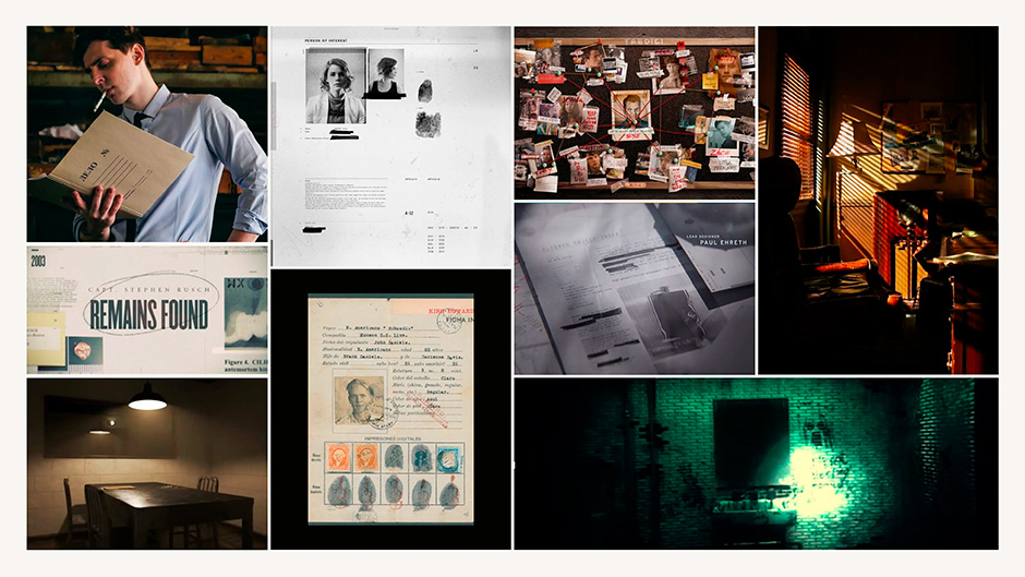
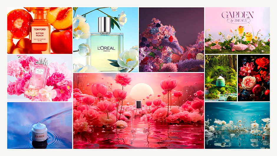
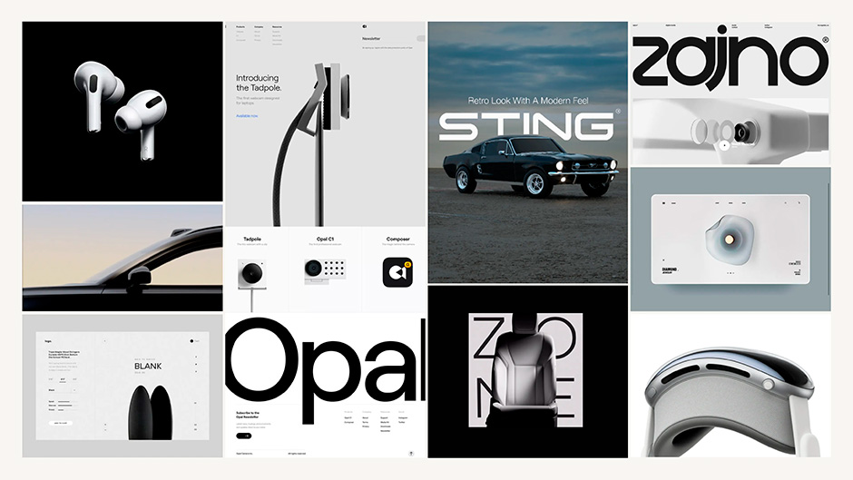
However, we found ourselves most drawn to the food and drink market with a trending vibrant and maximalist design aesthetic. This combination promised a playful and creative brand style we could really have fun with while simultaneously opening doors for similar projects in the future.
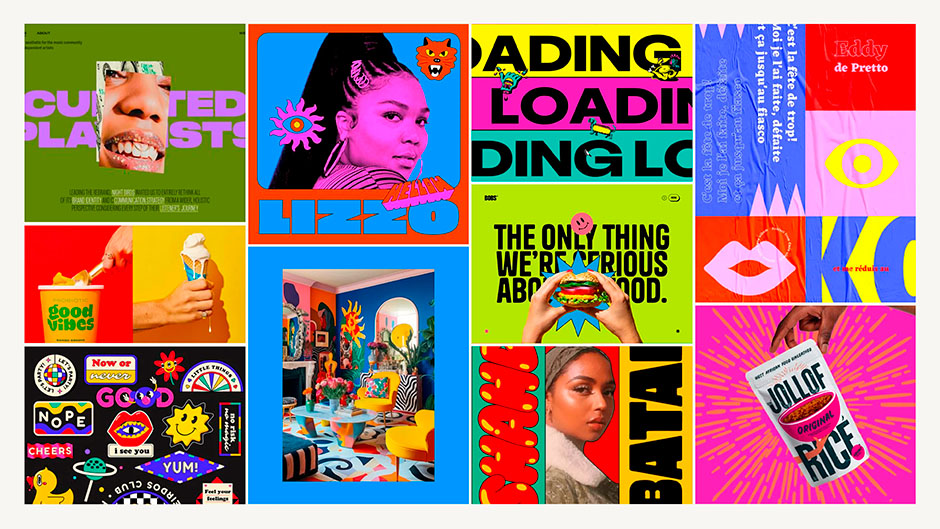
Brand Identity: Life of the party
Alcohol, inherently tied to celebration, fun, and adult humor, provided the perfect canvas. The Slosh brand identity quickly took shape as the life of the party — the person who dances on tables and makes friends in line for the bathroom. It captured the essence of letting loose and embracing a childlike sense of fun, something we love to do at Buttermax.
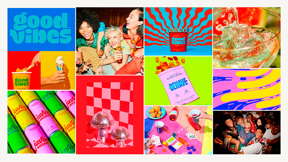
Most importantly it created an interesting website storytelling opportunity: How do you sell a beverage online, when taste is a crucial factor?
We thought, if they can’t taste it, what if they could experience it? Our goal was to bring the party to the user by immersing them in the pop of bubbles and the hiss of a freshly opened slosh, bursting with flavor and good times. Helping users imagine that fun buzz feeling of drinking a slosh through a screen.


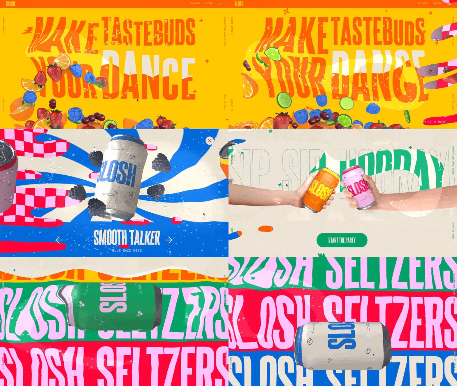
Users enter the site by popping open a can of Slosh. As you scroll down the page your screen fills with Slosh and you’re instantly transported into the party. Gone are the dry marketing sites filled with filler words, replaced by a brand strategy of pure enjoyment from flying fruit, dancing text, pong games, and cheers. It was a UI/UX experience with the primary goal to delight.
Our visual design choices followed our brand identity — loud typeface and colors, playful hand drawn elements and transitions, vibrant patterns, and undeniably liquid motion effects; the perfect party mix for an adult in age but child at heart.
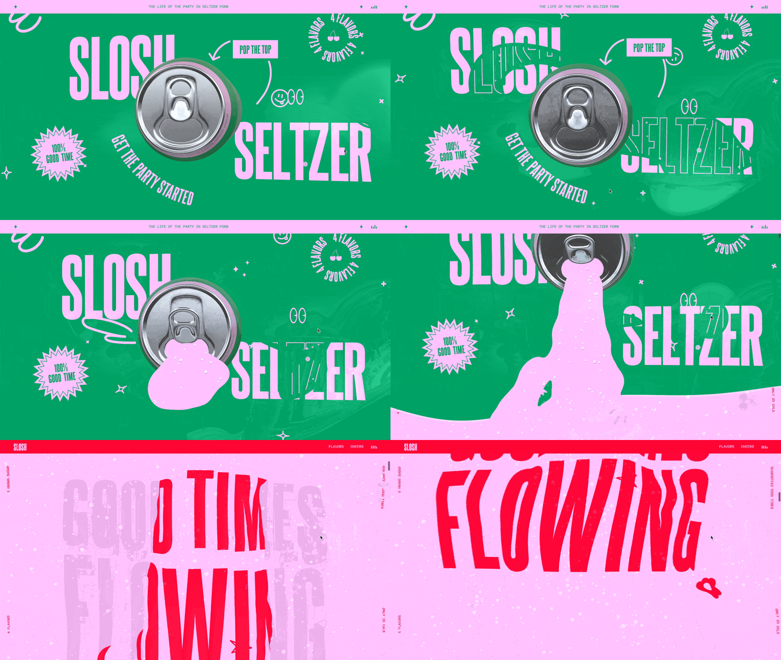
One of the biggest factors in the website development was creating a mouse fluid cursor effect with carbonation bubbles to really sell the idea of being immersed in the Slosh seltzer. We added several areas with cursor effects to add a sense of surprise and delight as your explore the site and slosh around.
Lessons Learned: The Art of Adaptation
This internal project offered a wealth of learning experiences:
- Sketch the outline but let others color it in: Without a client to pitch to, our initial designs weren’t fully fleshed out or detailed. This lead to a lack of clarity in certain areas during the build, particularly with motion. What we found is that this gap allowed our team (particularly developers) to experiment and bring fresh ideas. Many cool effects seen on the site like the liquid cursor trails and text animations emerged from this freedom to explore. So, while it’s important to set a clear direction, we found it’s equally crucial to leave room for creative discoveries and team contributions to push the experience even further.
- Prioritize Internal Projects Too: We wanted the project to feel like a real client engagement with a defined deadline but, faced the ever-present challenge of team members being pulled into other priorities. This meant team members were sometimes reassigned leaving aspects on hold, including one period without design oversight. Despite the resources issues at times, prioritizing this project and the initial deadline helped us remained focused and stay on track.
- Play to your strengths: While the initial brand vision leaned towards a playful, illustrative design aesthetic, the team quickly realized we lacked both illustrators and a desire to illustrate so we quickly pivoted to play on our 3D design expertise instead. As a result, we created flat and vibrant patterned backdrop with bold colors that allowed the can product to literally pop off the page and shine.
The Ripple Effect: Inspiration for the Design Community
While the project’s impact within the agency is still unfolding, the Slosh website design and brand serves as a testament to the power of creative freedom. The opportunity allowed our team to create a site in the way they think a product site should look, grow and develop skills especially in terms of branding and visual identity, and created a case study piece to attract future clients in the food and drink market, but most importantly allowed us to have fun while doing it.
