Content placeholders were, most likely back in the 1960s, when Letraset started to put “Lorem Ipsum” on their dry sheets. What were dry sheets (also called transfer papers or transfer sheets)? They were sheets of graphic design assets (mostly type) that you would rub off to place letters on any surface (If it’s hard to imagine check out this video demo). The perfect way to test different typefaces before involving the full-blown, expensive, professional process.
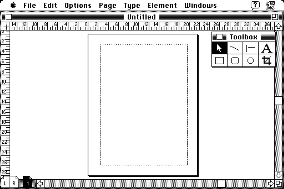
In the 80s, text setting and layout work moved to the digital space and the cost of prototyping for print stopped being an issue. Somehow though, “Lorem ipsum” placeholders survived the digital revolution and found their way to the first popular “digital publishing” software – Aldus Pagemaker (later Adobe Pagemaker).

Pagemaker is among the most important ancestors of today’s image–based design tools (Sketch & co). Its approach to replacing content with temporary placeholders on static pages made sense (some sense, at least) in the age of print, where content was static. However, it doesn’t make any sense in digital interfaces where 3 difference dynamics constantly affect content:
- Other design elements – for example: what happens if content pulled from the database can’t fit the dimensions of the container that designer has created?
- Users’ actions – for instance: what happens when a user filters a list of items and there’s less (or zero) content available?
- Devices that display content – for example: what happens when a user opens content on their smart TV browser; how is it different than the mobile experience?
Vector design tools ignore those three dimensions. They trap designers in the world of static representations similar to the print design process from the 80s. Unfortunately, this is not just a cool retro reference (come on, who doesn’t love the 80s?). The old, static approach to design and content is causing a lot of headaches in the digital product development process.
Data to the rescue!
I spent years working in eCommerce (until 2011). One of the biggest issues in the design process was that real data was always surprising us with the length of headers (we had to design for 3 million different products and offers!) and quality of images (well… lack of quality). Back then, there was no way to connect prototypes to real data sources, so we were trying our best to mock up different scenarios. Massive costs and lots of risks of missing some important scenarios.
On top of that it was impossible (as it is today for vectors tools!) to simulate the filtering and sorting of product lists, so we couldn’t properly prototype the entire experience.
Combined, all of those problems led to:
- Constant misunderstandings between designers and developers
- Designs that were frequently breaking after launch
- Poor quality of user research (limited ability to reflect real experiences)
Tools were really limiting our ability to do a good job. And after all these years, most tools still hold us back!
All those problems from years ago inspired us to create a tool fundamentally different to all the image–based tools that output vectors (Sketch, Figma, Studio, Xd…). UXPin is based on a code–based paradigm and uses the full power of web technologies. It outputs code (aimed at keeping designers within the constraints of realistic process, not export production code).
Our fundamentally different approach to design tooling lets us approach the problem of using real data in the design process in a unique and highly advanced way. We’ve recently launched 4 features that, I’d argue, push real data usage further than anybody else:
– Connection to data sources (JSON/CSV/Google Sheets)
– Variables
– Conditional interactions
– JavaScript expressions
This package resulted in a much easier process for building with real data and defining all the interactions between pieces of content. Let me show you how it works!
Content–breaking design.
The first part is pretty straightforward. To test designs with real data, you don’t have to manually enter it anymore. You can define it in a JSON (consider sampling from a real database), CSV or just place it in a Google Sheet. UXPin automatically recognizes (by matching, e.g. keys, from your JSON with names of layers in the editor) where to place what content. Feels like magic!
Now, in all fairness, Sketch also offers (through plugins) connectivity to data sources, so you could argue that this not pushing the concept that much further.
The key is what happens next. As you can see in the video above, long description breaks the container. In UXPin, you can plan what’s going to happen with longer content. You can simply use the following expression to cut text after 150 characters and add an ellipsis at the end:
```concat(substring(‘string’, 0, 150), ”...”)```
Now your design knows how to react when content is going to get applied!
And that’s not all. This whole eCommerce prototype is actually interactive. Thanks to variables and simple math expressions, you can simulate the entire experience of adding items to the cart. If product data changes, this prototype is going to automatically “know” how to behave and the entire experience will continue to work just fine.
In my opinion, this is the closest one can get to the actual experience of a digital product without investing into building one.
Content reactivity. Show how data affects your design.
Now, what happens if data has to change states of other design components on the screen? This is possible as well!
In the example below, you can see that uploaded from JSON data triggers conditional rendering of icons on the side of the table. This is done with conditional interactions that check what is being passed to the element “type” and render the appropriate state of the element “icon”. For example, if type is equal to “shopping”, then the icon is changed to “a shopping cart”.
And to simulate filtering of this list of transaction, you can simply create three states of the list and link them to the tabbed navigation. Now users’ actions are shaping the content and you can observe the whole experience.
Sayonara, 80s Design Process
Design is not static. Content placeholders, separation of users’ input from the design and limited interactivity are not going to cut it anymore. Design is much too important to our everyday lives and businesses to close it in the static, over 30 years, old paradigm. Out with the old, in with the new.
If you want to recreate my examples – sign-up for a free UXPin trial, have fun!
