The "Web Design" category of general interest covers its fair share of ground. Informative articles on everything from UX to client management, to conversion psychology, and even A/B testing can be found with a simple search for "web design." In the first half of 2014 at least, we've seen a lot of the same tags popping up.
Responsive is a buzzword bandied about like no other. Everyone is obsessed with making their sites appear perfectly across a variety of viewports. At the same time, various scroll site iterations have seen a big uptrend in popularity, and don’t get me started on the proclivity of "Flat."
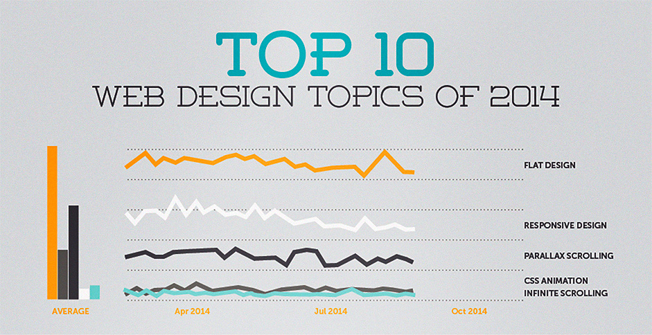
The point I’m trying to make here is that it’s a lively field. There’s a ton of discussion, but some topics see more light than others. Even so, it can be easy to miss some of the wittier back-and-forth banter if you aren’t constantly plugged into the best resources for topical web design headlines. Never fear and no worries, let this article be your guide to the hottest topics in web design so far in 2014.
1. Typography
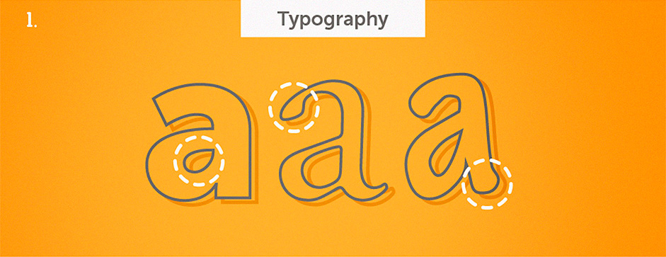
This first one is so basic, that it’s almost strange it’s taken this long for it to take center stage. Typography is often criminally overlooked in terms of its featured position within various web designs. The font face used within your designs determines readability, legibility, and from there: the relevance of content as a whole. You can convey mood, emotion, credibility, and creativity with the way your text appears. It’s therefore, pretty damn important to make sure your text conveys the correct message.
Here are just a few of the articles authored in 2014 that highlight typography:
- KissMetrics
- Sitepoint
- WebDesignLedger
- Webydo (Probably the most important one, since I wrote it. :D)
2. Minimalism/Flat Design
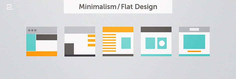
The flat/minimalist revolution continues its dominant presence in the minds of designers everywhere this year, and little wonder as it ties into two of the other three most popular topics under discussion.
Flat design emphasizes typography and plays well with RWD. It’s the centerpiece in the holy trinity of hot 2014 web design topics. Giving the clean, white-space-filled veneer with which to showcase only the most important elements of a web page. Flat and minimalist elements far and away comprise the most requested, discussed, and imitated designs in the world today.
Skeuomorphism has taken a back seat for the foreseeable future, in favor of immaterial and more imaginative artistic sensibilities. Curves, shadows, and realism are no longer as sexy as 2 dimensional lines and shapes. To get an idea of the continually unfolding impact of flat, check out these articles:
Responsive Design

If you haven't heard anything about how important RWD is this year, you clearly weren't paying much attention. Ensuring perfect legibility, and attractive rendering regardless of screen size has been one of the biggest talking points of 2014. With typographic elements (like ems rather than pixels) being used to create responsive sites at ever more frequent intervals, the degree to which web content can be displayed without sacrificing much in the way of aesthetics is likewise rabidly increasing.
It’s even becoming en vogue to make images, animations, and other on screen effects responsive in their own right. The major benefit to designing responsively is that you don’t have to create multiple versions of a website, nor do you have to spend extra marketing dollars convincing your audience to download a native app.
All that said, there’s still plenty of trouble accompanying RWD. Just because it’s hot right now, does not mean it’s easy to do. Although, since it’s so highly requested at the moment, many designers might not sing that tune if their client’s ask for it to be included in their next project. Still, 2014 is the first year in which mobile browsing surpassed that of desktop. That means RWD isn’t likely to disappear from common vernacular anytime soon. For a better understanding of RWD’s implications and origins, take a look at any of the following:
4. Browser compatibility
Right behind responsiveness is browser compatibility. These topics are so closely related, they’re often spoken of in the same breath. Probably because part of being responsive, is making sure your designs display across not only devices, but also across different technologies, which of course includes different browsers.
Everyone is concerned about being able to have their designs appear for even the most ancient of browsers, because many older users never update their browsers. Luckily, the number of IE7 users is dwindling away to nothing, and some of the newer IE browsers are actually bordering on decent.
Even so, it won’t do to ignore the outliers, so testing your websites browser compatibility is still a hot topic in the world of web design.
5. Parallax Scrolling
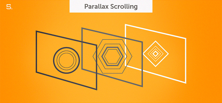
Ah Parallax scrolling, my old friend. This topic has seen plenty of mileage this year. This interesting design technique and prevalent web trend saw a massive resurgence in 2011, and has since enjoyed regular rotation in a number of authoritative web design circles. Even three years later it’s still a hot topic of discussion.
Much of this discussion revolves around what it adds to a website, whether or not it’s a superfluous addition, or an interesting and engaging animated effect which adds depth and intrigue to your website. I fall into the latter camp, because I’m easily distracted by anything even slightly out of the ordinary. And quite frankly, I’m just a big fan of pretty things.
Parallax scrolling is undoubtedly a visually attractive element on any web page, but like most guilty pleasures it must be enjoyed in moderation. The differing speeds of on page elements in the foreground and background combine to give the impression of movement, but too much movement makes for an uncomfortably bumpy ride. See what the authorities on the subject have to say:
6. Infinite Scrolling
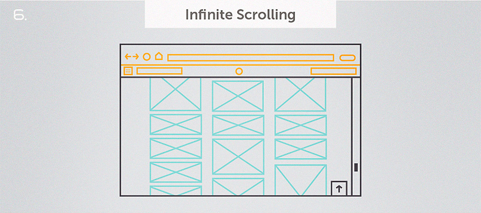
Between Infinity and Parallax, scrolling has had some loftily titled preambles lately. Infinite scrolling (and its relationship with SEO) have been another common issue of interest for designers in 2014. Part of this could be due to the ongoing ambiguity between infinite and parallax scrolling sites. They’re not one in the same, but they often come up concurrently because they’re frequently combined in different web designs, and maybe also because they share the same last name.
Either way, infinite scrolling is another thing entirely. Its name implicates an ever increasing page length due to a continuously updated content feed that loads up every time a visitor reaches the bottom of a web page. For an example of what this looks like, venture no farther than your Twitter or Facebook feeds.
See what all the hubub’s about in the following articles:
7. CSS Animations
This is a topic that’s discussed a plenty, and still not getting as much attention as I think it should. CSS animations are one of the most interesting, innovative, and enthralling web design techniques to really gain steam in recent years. Though the CSS animations have been around since the 90s, widespread support for them is only now becoming a reality.
The animations being implemented today are one more example of how much mobile UIs are effecting the web at large. I say this because transitions between pages on sites are becoming more and more android/iOS-like. It’s a trend I hope to see continue. As I said before, I’m a sucker for anything that prettifies my browsing.
8. Ambient Video Backgrounds
Here’s one for inflammatory purposes. Ambient video in the background of a website has become an increasingly popular design trend in 2014. It adds a lot of pizazz to a design, and can be implemented with relative ease. It’s also fairly polarizing.
According to a bit of research I performed on Quora.com recently, the majority of developers can’t stand video backgrounds. They asserted that it added nothing to content, slowed down load times, and distracted from a website’s primary goals.
Seeing how violently reactionary the topic made the developers made me giggle, especially since the majority of the press behind video backgrounds is so overwhelmingly positive.
9. The (Attempted?) Usurpation of Content’s Throne

This one’s a heartbreaker for me, but apparently there’s a ton of folks claiming that content is…gasp…no longer “king.” As a constant creator and curator of high quality content, this naturally concerns the hell out of me.
There’s a veritable game of thrones going on in the vying for the title left vacant by content with major players like: distribution, marketing, packaging, and my personal favorite, anything useful. The basis of this argument is that content can’t accomplish anything without an audience, and that most of the good stuff gets lost in the shuffle.
How does this effect design? Well, if your designs aren’t emphasizing content at this point, you’re quite the rebel. Singling out the most important elements of a web page to users should be a high priority for any web designer worth their salt. If the most important element is no longer content, it’s in everybody’s best interest to find out what exactly is.
10. SEO isn’t getting any easier
So here’s a newsflash: SEO is ruled by random Google pronouncements from on high, usually delivered nonchalantly by Matt Cutts in offhanded video blogs for the masses to devoutly devour. Here’s another tidbit of rueful familiarity: the rules change, a lot.
Hummingbirds, Penguins, and Pandas aren’t just adorable animals, they’re earthshaking algorithm changes. They effect everything from page structure to keyword optimization. The basic point being that in its ongoing effort to nullify blackhat SEO tactics, Google has completely revamped the science and art of SEO repeatedly throughout the years.
And it continues to do so. Just this year, we’ve seen guest bloggers get thrown under the bus, the abandonment of authorship markup, and secure searching has taken extremely valuable analytics data from our greedy grasps. The game keeps changing, and that means the players have to change with it. As such, it’s lead to plenty of discussion throughout the web design community.
That’s all the required reading you’ll get from me today. Do you think I covered everything? Missed some important stuff? What have you and your buddies been talking about? Add your hot topics in the comment section.
