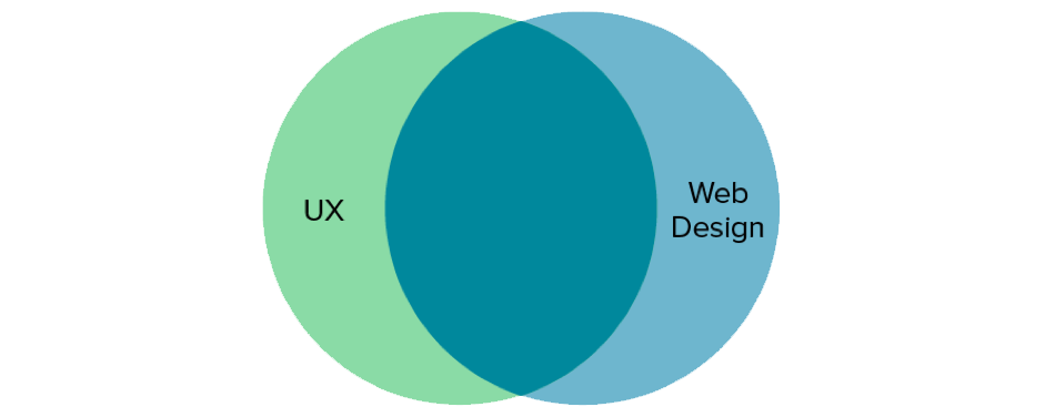
Does it make them happy or agitated? Do they use it because they want to or have to? What the user experiences, the UX, should be the ultimate goal of your design — which is to say, satisfying the user is the ultimate goal.
The past year, the influence of UX design has changed the way users interact with sites, and how they expect to interact. The following 5 UX trends continue to influence web design, and every designer should be aware of how to use them if they hope to stay competitive.
1. Web Service Design
A website is more than a series of pages – it’s a part of a customer experience that spans offline and online channels.
For example, users will interact with multiple sites when purchasing tickets for a concert. If you’re designing the ticket-purchasing site, you must consider all touchpoints in the customer journey. Users may visit one site to learn more about the venue, another site to learn about the artist, a third site to check friends schedules, and finally your site to purchase the ticket.
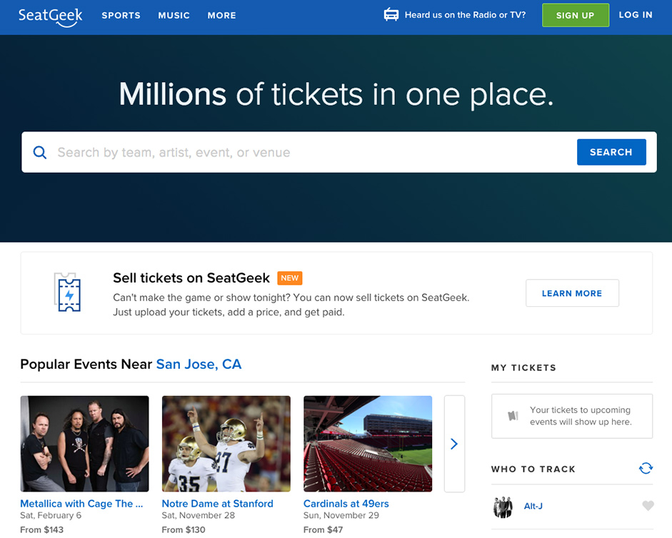
Your site doesn’t live in a vacuum. You need to design a site architecture and page flow that considers the user’s mindset based upon their previous experiences with related sites. To the user, your site is just another part of the service they interpret as “getting a concert ticket”.
As service design overlaps more with web design, all designers must understand UX fundamentals. And now, more than ever, UX design is taking priority over more UI-centric approaches, for a variety of reasons:
- More templates. Services like WordPress, high quality templates, popular frameworks and website builders will increase and evolve.
- Reliable UI patterns. The point of UI patterns is to simplify usage so the user doesn’t have to learn new controls. More reliance on patterns means opens up more room for experimenting with UX design.
- Mobile browsing. Now that mobile browsing has overtaken desktop, more designers are switching over to the mobile-first approach. This means having a better grasp of the UX fundamentals since you need to design sites appropriate for devices with multiple user contexts.
Best Practices
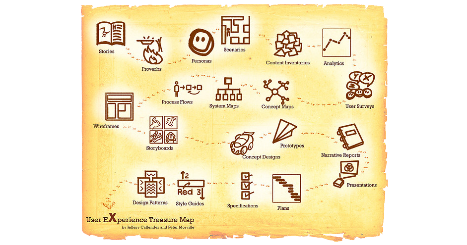
- Minimize friction — Remove any unnecessary steps, clicks, visuals, or text. This streamlines your user flow and allows them to accomplish their goals faster, which provides a much better service. Draw up a user flow chart to visual their process and reveal what stays and what can go.
- Prototype early and often — Prototyping is not something done once at the end. Testing with prototypes reveals concretely how your users respond to the design without any guesswork. Conduct tests before and during the design process — at least once every iteration. In UXPin, you can even add interactions to wireframes (lo-fi prototypes), which allows testing your basic structure right away before moving forward.
- Avoid the waterfall approach — Don’t hand off designs from one team-member to another. UX design is a abstract discipline. It’s not one person’s responsibility, but the entire team’s. Aside from developers, you also need input from marketing, sales, and product management to ensure you understand the whole customer journey.
2. Personalization
Everyone wants to feel special.
Not to be confused with customization, personalization is giving the users what they want without them having to ask for it. The depth of personalization varies, but everyday examples include related content, recommendations (products, articles, social media connections), and push notifications for events like birthdays.

Best Practices
- User testing — The first step in personalization should be about getting to know your user. Interviews, surveys, and field studies reveal your target users preferences so you can build them right into the design.
- UX documentation — Personas, user scenarios, and customer journey maps are native tools for personalization, compiled by actual testing data. User segments can also help organize who you’re designing for and what they want: Colin Eagen explains how to build them out of customer journey maps.
- Ask at signup — If research finds one piece of user information is essential for better personalization, ask for it outright during signup. Just be advised that each “extra” question at signup will increase friction.
- Use both rules and algorithms — Rules present content based on preset requirements, while algorithms “learn” as the user interacts. Combine them both for the most accurate results.
3. Microinteractions
The more competitive the industry gets, the more designers are drawn into the minutiae of designs. Microinteractions, like the <ding sound of a new chat or an animation in the cart icon to confirm an addition, are becoming more and more important to the user experience.
Microinteractions grease the entire machine. They provide vital feedback, explain function, prevent user error, and even entertain. Microinteractions are now so ingrained in web design, a site appears bland without them.

For example, let’s explore the micro-interaction of triggering a modal upon scroll. In the below prototype created in UXPin with the no-code animations editor, the transluscent modal naturally appears over the content. From a responsive standpoint, this micro-interaction makes much more sense than a modal that takes over the entire screen.

By paying attention to these tiny moments, we’ve created a modal experience that doesn’t disrupt users on mobile devices but still provides value to the business.
Best Practices
- Immediate response — Microinteractions should activate immediately on interaction — within 0.1 seconds. This is necessary for the user to feel in control: anything longer, and the microinteraction becomes disassociated with the initial action.
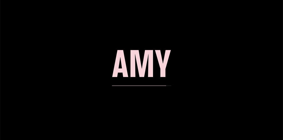
- Unify with a common theme — A universal theme, like a repeated color or the same animation for different icons, promotes your brand’s identity and can instantly show a related function between two dissimilar elements. For example, the site for Amy repeatedly uses a growing and shrinking pink line.

- Design for repetition — The same microinteraction will appear over and over again, so design with longevity in mind. A cute sound effect might become annoying after 50 times.
- Use with hover — If the user is unsure about an element, they will most often hover over it. Microinteractions — or a lack-thereof — communicate information about certain elements, like whether or not it’s interactive.
4. Designing for Any Device
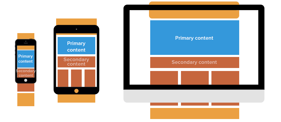
With mobile browsing being the new norm, it’s more important than ever to a consistent site experience over multiple devices — especially because most users switch between devices when completing the same task. This puts power in the hands of UX design, since the UI design changes based on the device.
The two dominant strategies are responsive design (RWD) and adaptive design (AWD). RWD involves a single site that “responds” and alters itself based on the device, while AWD involves designing different site layouts for different devices.
As recommended in the free ebook Responsive Design Best Practices, a mobile-first approach is best. This means planning the layout for the smallest screen first, and then scaling up. This urges designers to isolate the key UX components at the start and then add, compared to designing all the elements first and then figuring out which ones to “degrade”.
Best Practices
- Visual consistency — Retain common visual elements across all devices, such as icons and color scheme. The placement of elements is also important, since users get used to looking in certain places. Obviously the layout will have to change for different screen sizes, so maintain consistency where you can.
- Flexible images — Images will almost always appear differently on different devices, so take an active role in sizing and cropping them. If you don’t, it will be up to chance what your user sees.
- Account for device differences — Different devices have their own advantages and disadvantages. Take features like hover reveals or gesture controls into account — these make certain UIs more fun and shouldn’t be neglected for the sake of conformity.
5. Gamification Redefined
Some may consider gamification overused or gimmicky, but aspects of it are effective — which is why it came to be overused in the first place. The new frontier of gamification keeps only the beneficial parts, so long as you know where to look.
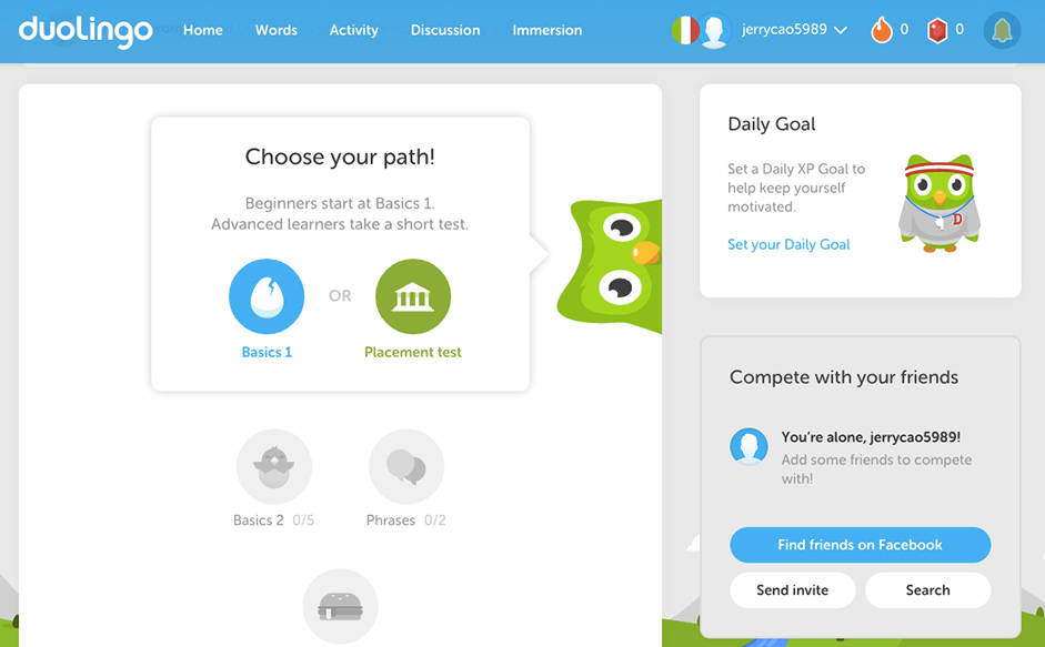
The best gamification takes advantage of what Nir Eyal’s Hooked calls the “hook model.”
- A user first sees a visual cue (1.) that triggers a habit, or else has an internal urge.
- This instigates a habitual action (2.) that the user thinks will satisfy their goal.
- On completing the action, the user receives their reward (3.), the reason they acted in the first place, and the entire model is reinforced (4.), promoting future usage.
Best Practices
- Don’t condescend — One of the reasons gamification went awry is that it talked down to users. Good gamification should empower users and make them feel smarter — that means no unwarranted praise and less hands-on guidance.
- Show users their progress — If users see how far they’ve come — literally, with visuals like a progress bar or statistics — it will reinforce their investment in the product, strengthening the hook model.
- Don’t default to currencies — Much like real currencies, virtual currencies are difficult to design and can fluctuate rapidly. If it’s not valuable enough, it becomes just an unnecessary annoyance; too valuable, and people will trade it or try to corrupt the system.
This piece is just a quick overview. If you’d like to learn more about how to design better UX with your websites, check out the free ebook UX Design Trends 2015 & 2016.
