Are words the unsung heroes of design? A mighty tool that can guide users around your website, stir up emotions, be universally understood, are available for everybody to use, and you don’t even need to create them. UX writing is the discipline of how words are used in your digital projects, and although it’s not a new concept, its importance is steadily gaining more recognition.
Writing is designing too - UX writing goes way further than microcopy, (although yes we do love cute tidbits of copy that surprise and delight us along our journey), and it’s fundamental to the user experience as a whole. Words guide users’ interactions, can help them complete tasks quickly, and can build brand loyalty and conversions for your company - amazing! UX writing can take many forms on your website or app, on call to action buttons (CTAs), longer contents, conversations, forms, cookies, notifications, error messages, content architecture, accessibility, localization, and much more.
But it’s not a “one vibe fits all” practice, brands need to also consider voice & tone - which does not just depend on the personality of the brand, but must also be sensitive to where the user is in their part of the journey - i.e frustrating moments related to password errors or payments being declined is not the appropriate time to 'get the cheeky LOLS in' with wacky error messages, but maybe when someone has completed a sale, or successfully signed up to something, kerching, you could ride the wave of the good feels with some irreverence in the written tone of your notifications.
Although UX writing is finally taking its place at the design table, it’s still a developing field, and themes like inclusivity, accessibility, and AI language models are all areas it will need to evolve alongside as we move forward on the web.
Coming up, some handpicked examples of UX writing from the awwwards team that jumped out at us when we were browsing the latest nominees.
-

Lunchbox - UX writing marquee animation on hover cookie message by Cookie Policy So let's get this over with. Cookies are annoying and they distract us from the experience, here Lunchbox takes our hand and shares our pain, we’re all in this together.
-
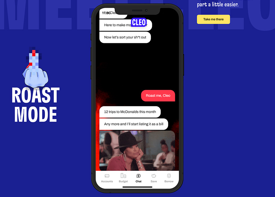
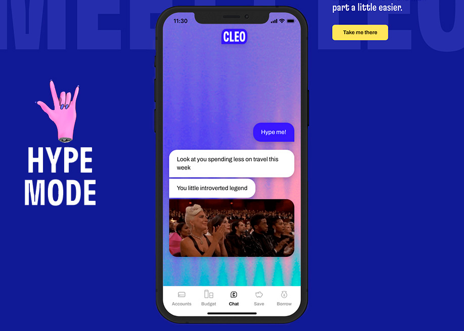
Cleo - hype or roast money app chatbot by Microcopy and UX writing The goal is to save, and this money-saving app will either shame you or praise you for your behavior, depending on if you choose “Hype mode” or “Roast Mode”. Our phones are now our moral guardians, who know more about our dirty habits than anyone else.
-
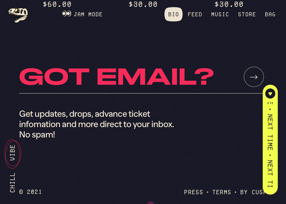
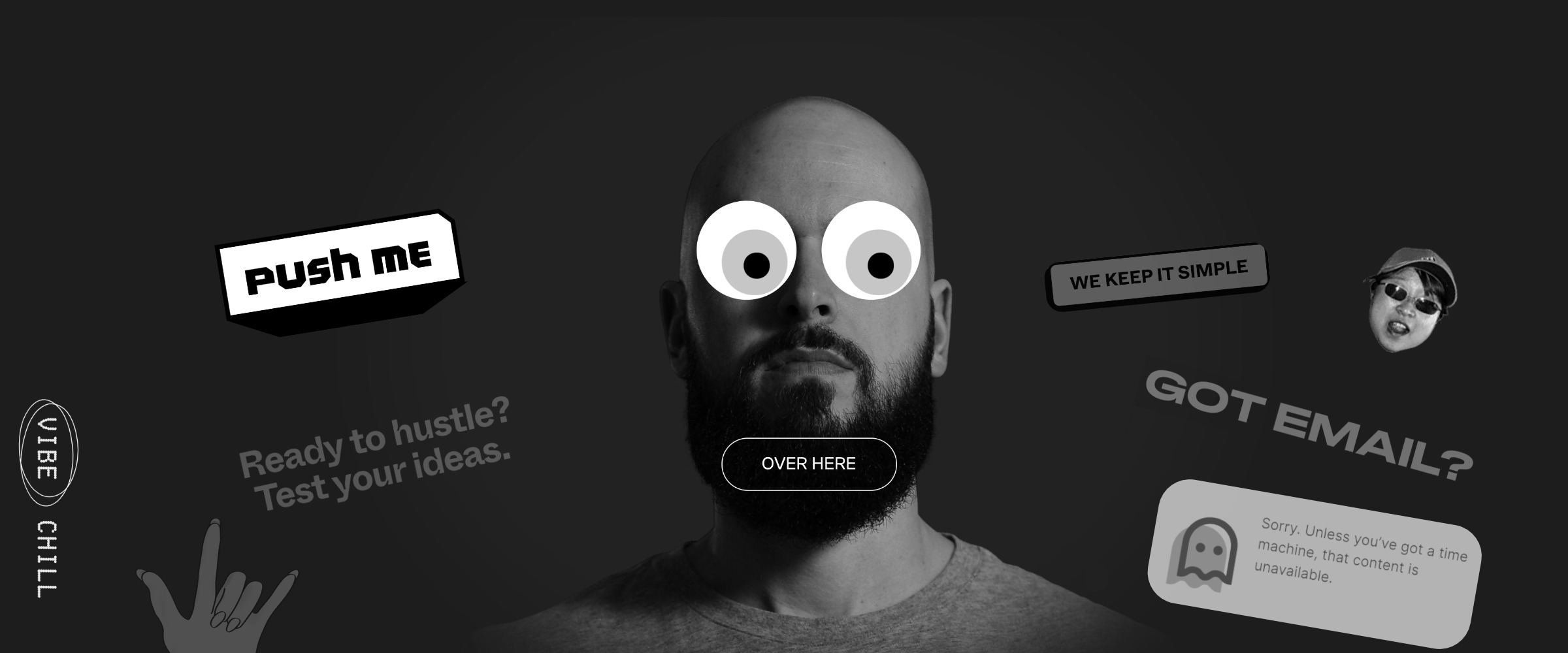
Imreallyatrex - chill or vibe dark mode selector / got email? sign up by Microcopy and UX writing Navigating imreallyatrex feels like hanging out with T-Ray Armstrong, the modes are named “chlll” or “vibe”, instead of “subscribe to our newsletter” it’s “got email?” this website speaks like a human.
-

Miranda paper portfolio - navigation tip! by Microcopy and UX writing Fully submerging his portfolio in Editorial style, Niccolò Miranda’s navigational cues for the user are reimagined as exciting life hacks from magazines - thanks for the TIPS!
-
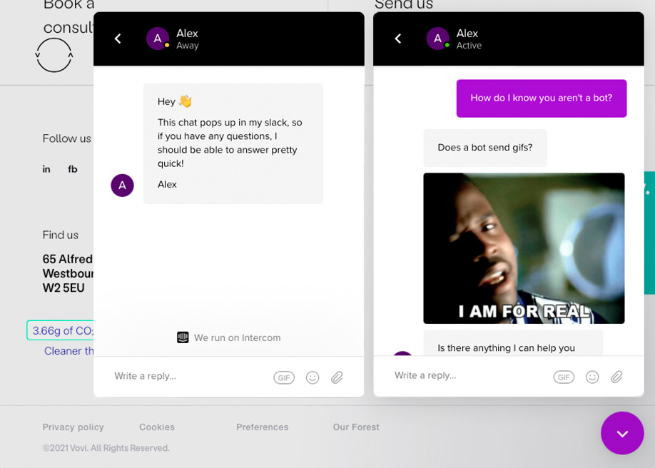
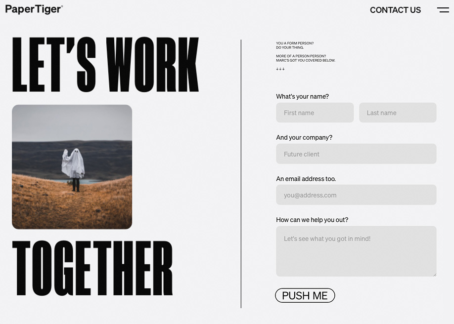
Vovi Studio - Co-founders slack chatbox by Microcopy and UX writing It’s not a contact form (yawn), it’s not a chatbot, it’s a direct line to the co-founder’s Slack, it’s difficult to resist checking that it really works, and suddenly, you’re having a live conversation.
If you have any more examples of UX writing that stand out, we'd love to see them, so please post them in the comments section below.
👉 Enjoy more examples in our Microcopy and UX Writing collection.

