Sep 17, 2015
Understanding The Process to Selecting The Right UI Design Patterns For a Website

As designers, we often need inspiration for better creative thinking. Design patterns could help us get the ideas that we need to make our creative juices flow and to design something unique and amazing. Additionally, the established design patterns even provide solutions to some of the common usability problems.
UI design patterns, for instance, provide solutions for recurring user interface problems. This post is intended to help you learn about the 3 best approaches to selecting the right UI design patterns for your site.
What Does UI Design Patterns Mean?
In layman's terms, a UI design pattern is a solution that can be reused to solve a common problem that you are likely to encounter every day.
Remember a UI pattern is not a feature that can be added to your website design, and it isn't a finished design that can be coded.
Instead, it can be referred to as the best practice or a guide that can help designers as well as developers solve recurring problems when designing a website.
Although a UI design pattern needs to be utilized in the correct scenario, you don't have to worry much about the implementation of a UI pattern since it is platform agnostic. However, there could be some technological limitations based on how your designs are being implemented.
Of course, implementing a UI design pattern in the wrong context can do more harm than good.
Approaches to Choosing the Right UI Design Pattern For Your Website.
Now, let us talk about a few effective approaches that will help you choose the right UI pattern for designing your website:
- Lazy Sign-up Design Pattern.
- Allow Users To Login Through Their Existing Social Accounts.
- Allow Users to Quickly Jump to Specific Website Sections
Keep in mind that the majority of users want to try out your site first – to see if it meets their expectations – without having to become a registered member. Simply put, users prefer browsing the site prior to completing a formal account registration.
And so, it is important that your website lets users interact and use the site in the manner they deem perfect – even without signing up/logging in. This is where the “Lazy Registration (or Sign-up) design pattern comes in handy.
The above mentioned UI design pattern will enable a user to access your site, whilst leaving the need to submit information for account registration for later time.
One great example of a website that utilizes the lazy registration UI pattern is wordtracker.com. After allowing users to conduct a couple of keyword searches, the site asks them to sign-up to continue with their search process.

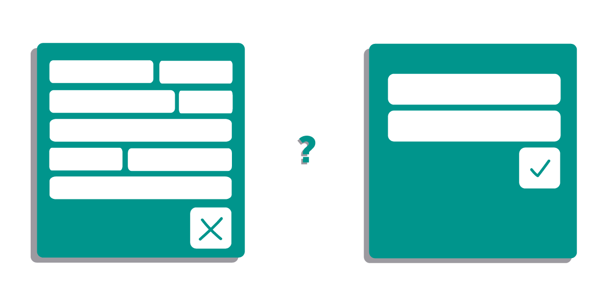
Despite providing your visitors with immediate immersion using the lazy sign-up design pattern, you still might fail to encourage visitors to create an account. One possible reason could be that your registration process requires filling in more form fields than necessary.
Basically, users want the sign-up or login process to be easier and don't want to be forced to create a new account. One possible way to deal with such an issue is to integrate sign-up methods in your website that give your users the ability to sign-up using their existing accounts.
Through the most commonly used and popular social media accounts such as Facebook, Twitter and others, you can let users login into your site using any of their existing social media accounts.
Using the existing sign-up and login UI design pattern will save your users from having to remember several password combinations, and makes it easier for them to login without having to create additional accounts. This pattern can help in improving the user experience (UX) to a great extent, and will encourage users to revisit your site time and again.
For example: Spotify makes use of the pattern that allows users to sign-up with the site using their existing Facebook account.

Nowadays, almost every user wants quick access to some specific piece of content or a particular section of a website. In fact, users want to directly access the content or functionality they're seeking in a website.
Chances are that your website lets your visitors hit a tab or scroll up and down the page regardless of their location on your page. You may be using the infinite scroll pattern to add the scrolling effect. However, adding such an effect can result in making the page too long to load. And returning back to a certain page after scrolling down to several pages can give your users a hard time. This might frustrate your users causing them to abandon your site.
However, you can make your users jump a whole section of a site without having to navigate through the hierarchical structure of the site. You can achieve such an objective, by creating a shortcut button on your site that takes users to a certain specific part (or area) of your site.
For example: Pinterest displays a “jump-to-top” button that enables users to scroll back instantly.
Wrapping Up
Remember that to create an immersive user experience (UX), you need to ensure that you're utilizing the right UI design pattern while designing your website. I hope that this post will provide you with a better understanding of the process of choosing the right UI design pattern for your website.
