Congrats to Unseen Studio® by Unseen Studio for winning Site of the Month February 2023, thanks for voting and tweeting, find the winner of the Pro Plan at the end of the article.
Last year was a particularly special year for us. We turned 10 years old, we won Awwwards’ Studio of the Year, our first Webby, received 5 Sites of the Month; we said hello to new faces and new clients, and we loved every minute! So why change a thing?
For a long time we’ve felt a disconnect between our name and our brand’s personality. We value originality; it drives us, yet our name didn’t measure up. We don’t see the change from GC to Unseen Studio as a rebrand; we see it as an evolution. A metamorphosis into the studio we have always been.
We’ve always challenged our clients to push their brands to bold and daring places, to take themselves outside their comfort zone in order to set themselves apart. How could we ask our clients to do this if we were not willing to do the same? Standing still would have been easy, but for us Unseen was the next chapter in our story.

Art Direction
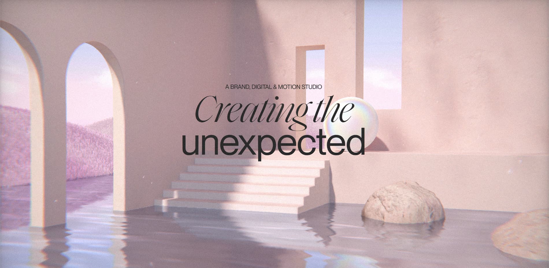
Our vision for the new website was to build a surreal digital world for our brand to call home. We wanted the experience to feel relaxing and like a real home; somewhere you’d want to come back to time and time again. To achieve this, we designed the scene with calming pink tones and simple architectural structures; blending surreal and dreamy visuals with more realistic elements.
“We’re big believers in the power of audio to elevate an experience and create a stronger emotional connection; for an additional layer of immersion we added calming ambient audio, with the main track being entirely custom written for the use on site.”
To further encourage the concept of the user being in a virtual home, the transitions between pages have all been designed to feel as though you are travelling to different areas of a physical space. We created smooth camera movements between rooms and even a diving under the water effect to reach the projects page.

A Labour of Love
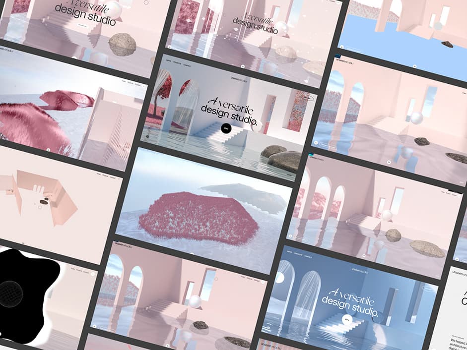
As with any internal project, the challenge of actually finishing this was a big one! We started the process of rebranding over 4 years ago, and during that time we’ve worked on numerous iterations of the website. A little known fact is that we actually got to about 85% complete of a full new website before scrapping it and starting again (but we try not to think about that). As you can see in the screenshots above, the look of the final site evolved over time, but we stayed true to our initial vision; working closely between design and dev to push not only the aesthetic but our teams' knowledge of creating a WebGL environment like this, acting as a bit of a playground to try out new ideas. This approach was a catalyst in enabling us to level our skills in this area and has had a huge impact on the projects following.
Unseen World
The Unseen World page actually holds a particular significance for our studio. Historically it’s a page we have always included on our portfolio site as a place to showcase our work in progress, side projects, experiments and studio culture. It’s a place without briefs or restrictions, and it was this page that inspired the new name for our studio.
Inspired by Retro-Brutalism we decided to create a modern yet nostalgic interface consisting of an infinite draggable grid to encourage users to explore the content, we felt the relaxed layout and interactive navigation fit the essence of the content perfectly. The interface uses pixelated 90’s cursors re-created in 3D and at its center sits a wireframe interactive globe; these features all help to add a playful edge to the page.
Home Scene Breakdown
There are many layers that make up the final composition of the home scene as seen in this video. We baked the lighting into each texture used for the environment to save on performance as well as give a better-looking end result. The grass is made up of some instanced custom geometry with random noise applied over the colour to give the illusion of wind. A planar reflection is then used and combined with a basic fluid simulation to influence the mapping of the reflection to provide some mouse interaction. Particles in the form of falling cherry blossoms help to bring the scene to life, with the final pass applying some subtle noise, chromatic aberration and vignette.
This is only one half of the environment as you move through the archway behind the camera in order to visit the contact page. The contact scene is all loaded with the home scene and the camera moves along a custom curve created in Blender whenever page navigation between the two occurs.
Scene Transitions
The main pages of the site exist as WebGL scenes and so we needed a way to move between them seamlessly whilst navigating. Rather than create one huge scene that you move around, we decided to separate them as different Three.js “Scene” instances. This made it easier to manage things like camera state and screen post effects since each scene or page had its own requirements.
Rather than create one huge scene that you move around, we decided to separate them as different Three.js “Scene” instances.
During a transition we would render both scenes to two separate render targets and read both of these in a “transition pass” which would blend the two in whichever way we liked, as long as it was possible within a single fragment shader. We could then sync up some camera movement in both scenes to give the illusion that they were connected somehow, like during the Homepage to Projects page transition.
Loops (To infinity and beyond)
The Projects and Unseen World pages required some trickery in order to create the infinite looping the user sees when navigating them.
The content in the Projects page sits outside of the fog and camera frustum range until it is ready to be displayed and is then translated on the Z axis based on scroll position. The length of each project’s z-axis is calculated during build and used to determine when to show or hide the content, depending on a virtual “scroll” value.
The Unseen World page’s grid uses a similar concept where a virtual X and Y position is updated based on drag coordinates and a row-column layout is updated according to the virtual X and Y position.
Technologies
This experience was built using our in-house frontend framework which is driven by a customised version of WordPress on the backend. Some notable WebGL technologies used include Three.js, troika-three-text to handle WebGL text rendering as well as KTX2 textures and DRACO compression for glTF files.
Company Info
Unseen Studio® is a world-class creative production company, specialising in Brand, Digital and Motion. We create refreshingly unexpected ideas and striking visuals that help bold brands shrug off conventions, cut through the noise and truly become different.
Thank you for your vote and tweet @MargheritaCuc, please DM us to collect your prize!
