Being visible is just no longer enough. It’s all about leveraging attention. And then moving forward together. Synced.
With the hyper-growth phase our studio has undergone, it was crucial that our website reflected our values and our distinctive model.
"We deliver brands with high objectives the strategy and the creativity it takes to have that impact, by teaming up with some of the best talents out there. Without ever compromising on keeping your teams happy and sane."
We aspired to create an experience that matched our ambitions. The goal was to generate visual impact, incorporate captivating details, and highlight our culture.
Today, our website is much more than just a showcase. It has become the cornerstone of our brand strategy and embodies all our initiatives. It's about more than just following the trend; it’s about taking the lead and providing immersive experiences that serve our long-term objectives.
To achieve this, we adopted a strategy inspired by product marketing and SaaS startups, an unconventional approach for a design studio, yet more engaging than a traditional portfolio. The idea was to articulate a value proposition centered around the benefits and features of our business model.
We also took this opportunity to transform the branding of Vendredi Society while staying true to our DNA. Every element of the website contributes to communicating our vision and strives to convey the culture of Vendredi Society.
Process
From the start, we accumulated numerous visual references, creating several mood boards that integrated 3D, UI, motion design, photography, and even copywriting.
All creatives worked closely together to explore these different areas in synergy. We iterated extensively to arrive at the final design, with each person bringing their perspective and aiming to push the boundaries of creativity. This led to epic weekly design sessions, where everyone built upon each other's ideas.
We proceeded step by step, with the goal of defining a new design language. Alongside UI production, a studio shoot and the creation of a showreel with 3D elements were carried out. These components enrich the website's content, creating a visually rich and harmonious universe that extends across all the pages.
We also created a digital style guide to ensure consistency and facilitate the hand-off and development phase.
Beyond the website alone, this was a comprehensive artistic direction effort for our brand throughout this redesign.
Copywriting & Tone of Voice
In website case studies, copywriting and tone of voice are rarely emphasized, but they are essential to capture users' attention and enhance the experience. For Vendredi Society, having the final copy deck before starting work on the UI was crucial. This allowed us to refine the layout, evaluate the text volume, optimize content hierarchy, and avoid surprises along the way.
At Vendredi Society, we’ve chosen an approach that reflects both rigor and a taste for challenge, while embodying the accessibility and friendly nature of the teams. We opted for a very straightforward style, with rhythmic and impactful expressions.
Borrowing the vocabulary of startups and centered on the notion of "Growth," our language adopts an analytical posture, with precise and sharp observations. We advocate for a culture of excellence, with messages focused on performance, ambition, and a realistic understanding of business needs.
3D assets
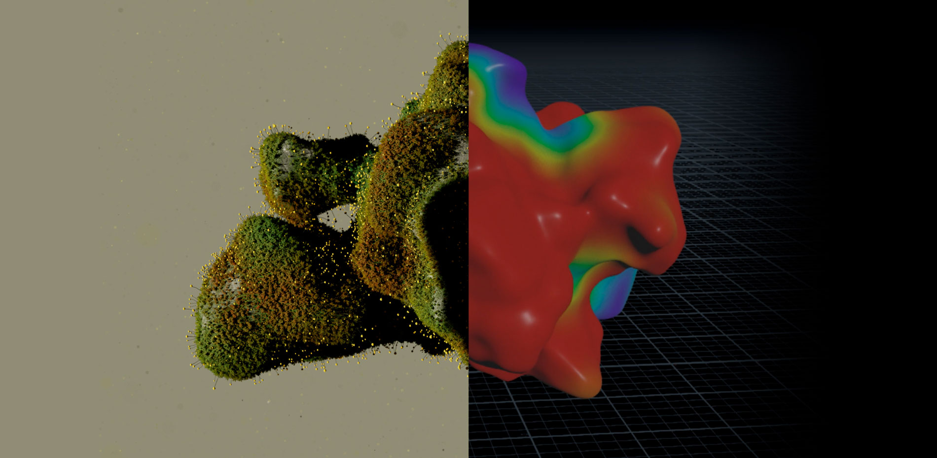
The integration of distinctive 3D elements plays a key role in the website design. The visual content lies at the heart of our approach to distinguish our website and make it unique.
The 3D organic form represents the constant evolution of our studio and the continuous changes in our industry. The image of grass growing symbolizes our commitment to fostering growth and success for the brands we collaborate with. Finally, the idea of integrating a laser reinforces our dedication to the highest quality standards, symbolizing the precision in which we operate.
We used Houdini to create an organic form with variations using a procedural generator, and Redshift to craft a procedural shader, allowing simultaneous exploration of shapes and shading.
For vegetation, we created a flower in the shape of an HDA with different occurrences of a Seed parameter (noise amplitude, wiggle intensity, etc.) to allow variation during instantiation, as well as a Growth parameter for animation.
Once the shape was finalized, we set up animation for a propagation attribute with two purposes:
- Animation of a vertex map that will be used in C4D on a clone matrix and in the final shader
- Serve as a driver for the Growth attribute of the flowers which are transferred from Houdini to C4D in Alembic format
The scenes were then assembled and rendered in C4D.
Motion Design
We invested significant time in motion design to bring a dynamic dimension to the website. This approach touched several aspects of the website, including typography, UI components, transitions, and content.
Typographic animation was a central element of our design considerations. We developed subtle and consistent text animations across all pages, reinforcing our visual identity. Most of these animations rely on a "scramble" technique, adding rhythm while maintaining a fast execution speed (to avoid hindering navigation), with a slight random delay between characters.
Some of these animations were meticulously synchronized with the scrolling of the page, creating moments of surprise throughout the navigation.
In parallel, we integrated transitions between different pages of the website. The old pages blend harmoniously into the new ones, ensuring smooth and seamless navigation through CSS animation.
Finally, animated visual elements were integrated to enrich each page, notably in case studies where we recreated numerous contents.
Photography
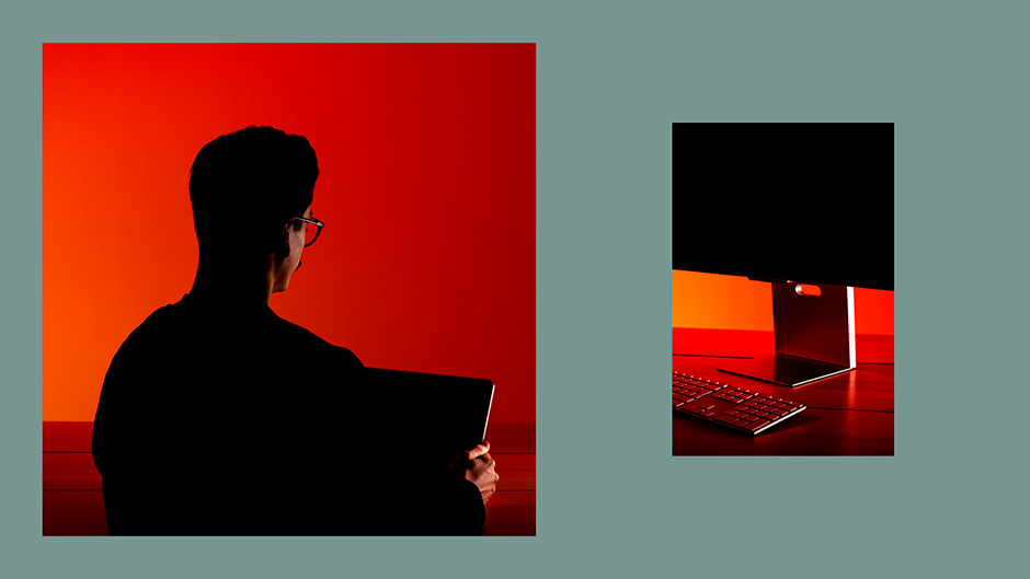
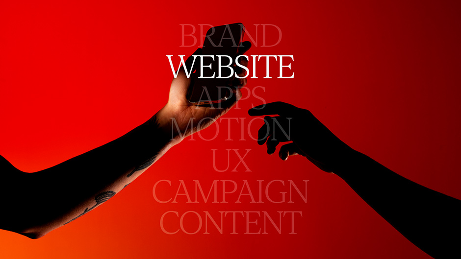
Photography plays a crucial role in the aesthetics of our website. We opted for a studio shoot with a minimalist setting, aiming to capture the essence of our brand and infuse our website with a touch of humanity to offset the predominant tech aesthetics. Our approach was characterized by a bold choice: saturated, high-contrast photos with a sharp aesthetic. In collaboration with the talented photographer Alice Lévêque, we captured inspiring moments and perspectives, showcasing our team and culture. From composition to post-production, every detail of the photography was meticulously planned to amplify the visual impact of our website.
User Interface
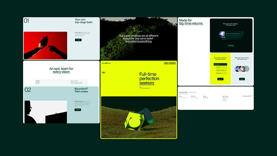
We designed a website that is both creative and interactive, ensuring that this did not come at the expense of the user experience. The navigation is smooth; we are convinced that animations should not hinder the user in any way. The clean interface aims to be a true showcase of the content, where every detail matters. Subtlety and clarity were our guiding principles, ensuring pleasant and attractive readability.
Our objective was to emphasize the "product" aspect. To do this, we integrated visual codes borrowed from software and iOS. The intuitive and innovative video player is inspired by video editing tools and your favorite photo gallery.
The menu, designed for performance, makes everything accessible with a single click without distracting from the main content. Inspired by Apple's operating system.
Unlike traditional portfolio websites with intrusive menus, we opted for an alternative menu that adopts a product-oriented design approach, facilitating fast and efficient navigation aligned with our conversion objectives.
We also animated various elements to enrich the interface with micro-interactions, using Lottie, in particular, to add dynamism to the whole. These animations allowed us to condense information while enhancing the visual appeal of the designs.
Development
The website was designed with each block functioning autonomously. A preliminary UX analysis allowed us to identify and categorize the different blocks and their variants, resulting in the creation of a detailed style guide including variables, colors, fonts, etc.
The main challenge lies in creating this modular system, which provides the flexibility to intuitively compose page templates while allowing for great diversity.
This system strengthens the durability of the website through its extreme flexibility. It allows us to quickly generate landing pages for our acquisition campaigns while ensuring smooth interactions and a high level of design quality.
Video Management
We optimized the loading of videos by integrating short and lightweight clips that only load when they become visible or on mouse hover, depending on the context. Larger videos, on the other hand, load on demand upon a click, via a custom player that allows for full immersion. This strategy ensures optimal use of resources and significantly improves the website's responsiveness.
The video player was developed in JavaScript with the native video API. The progress bar is a styled , allowing the use of native events and behavior.
Optimizations
We also implemented advanced image optimization from upload through the CMS. This optimization is complemented by advanced management of responsive images, using the
Additionally, our minimal use of JavaScript libraries enhances our control over the code and ensures that only the necessary JavaScript is loaded, thereby optimizing website performance without any superfluous elements.
Animations
The animations were created with GSAP, the SplitText plugin, and staggered delays for timing management.
Stack
- PostCSS and Vanilla JS using ModularJS
- Swup for page transitions
- GSAP for animations
- Lenis for scroll management, plugged with a custom JS module
- Timber as PHP Framework, and Wordpress
About Vendredi Society
Syncing fast-moving brands with fast-moving audiences. Being visible is just no longer enough. It’s all about leveraging attention. And then moving forward together. Synced.
We deliver to brands with high objectives the strategy and the creativity it takes to have that impact by teaming up with some of the best talents out there. Without ever compromising on keeping their teams happy and sane.
X:
VendrediSociety
IG: @vendredi_society
IN: vendredi-society
W: www.vendredi-society.com
Credits
Raffael Velluti Founder & Creative Director - Philipp Thelen, Digital Art Director - Quentin Hocdé, Creative Development - Théo Favereau, 3D artist - Julie Barthélemy, Copywriter.
