Apr 11, 2019
Web Design Trends 2019: Voice Interfaces, Image Search, Alexa and other crazy things that are rocking our world.
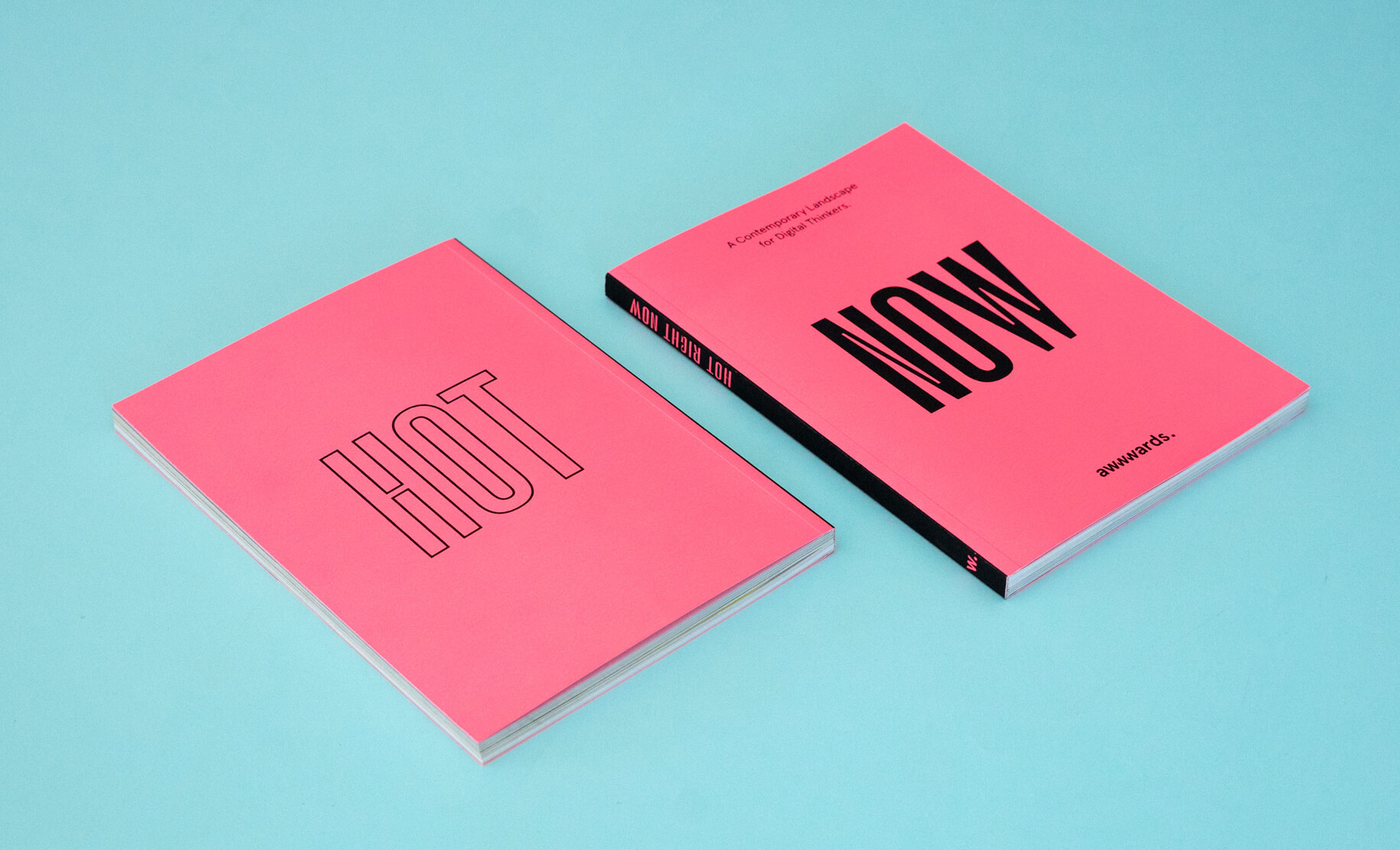
Hello user ?, we are delighted to present this article rounding up 2019’s web design trends in a very special way. You can read more about all the following trends in our new book “NOW. A Contemporary Landscape for Digital Thinkers 2”. The book is like waking up after a futuristic dream, we’ve collected everything that’s surprised us over the last year and summarized it, analysing trends in Web Design, UX writing, visual search, AI bots, 5G, Furbys, Fortnite, and of course - sausages ? that use machine learning to work out how to put a shirt on.
In this article, we’ll primarily focus on the tendencies that we’ve observed in the visual and interaction fields, which are useful to our users in terms of providing inspiration for their daily projects. However, in our book (also available in a gorgeous digital version ?for $7.95 ◉◞౪◟◉ ) we have gathered many themes of a social and technological nature, such as social mobility, the sharing economy, voice interfaces, image search, and machine learning with web technologies, etc.
The concept of “Trends” can often be taken as less than complimentary. However, knowing and experimenting with the latest advancements leads to learning new techniques, acquiring more skills and using different styles in a playful way as they appear and evolve.
We love dreaming up a weird and funny future, as mere spectators we have analysed the following imaginative websites with amazement, and feel really lucky to live in such an age where brilliant technology leaves us speechless nearly every day.
It’s time to get to the action, so here’s our “List of Fundamental Web Design Trends for 2019”.
?️ VISUAL DESIGN & INTERACTION
1. Crafting A Singular Voice With Illustration
Illustration is used as an element of difference because it culturally reminds us of the exclusive nature of art. In the recent age of illustration flourishing in the tech industry, we have examples from Slack, Airbnb, Mailchimp, Dropbox and WeTransfer that showcase work from different designers and artists as a way of making the waiting process more pleasant for the user and to communicate emotions and brand values.
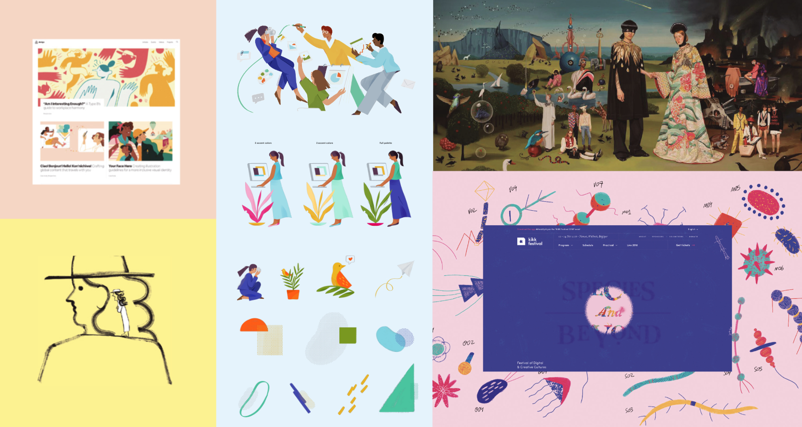
Nowadays, collaborations with well-known illustrators is a common occurrence, with Illustrations often being used in Design Systems as an extra expressive way to communicate messages, as we can see in the cases of Slack and Glitch.
2. Typography-based Layouts
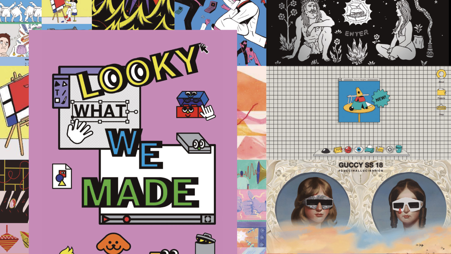
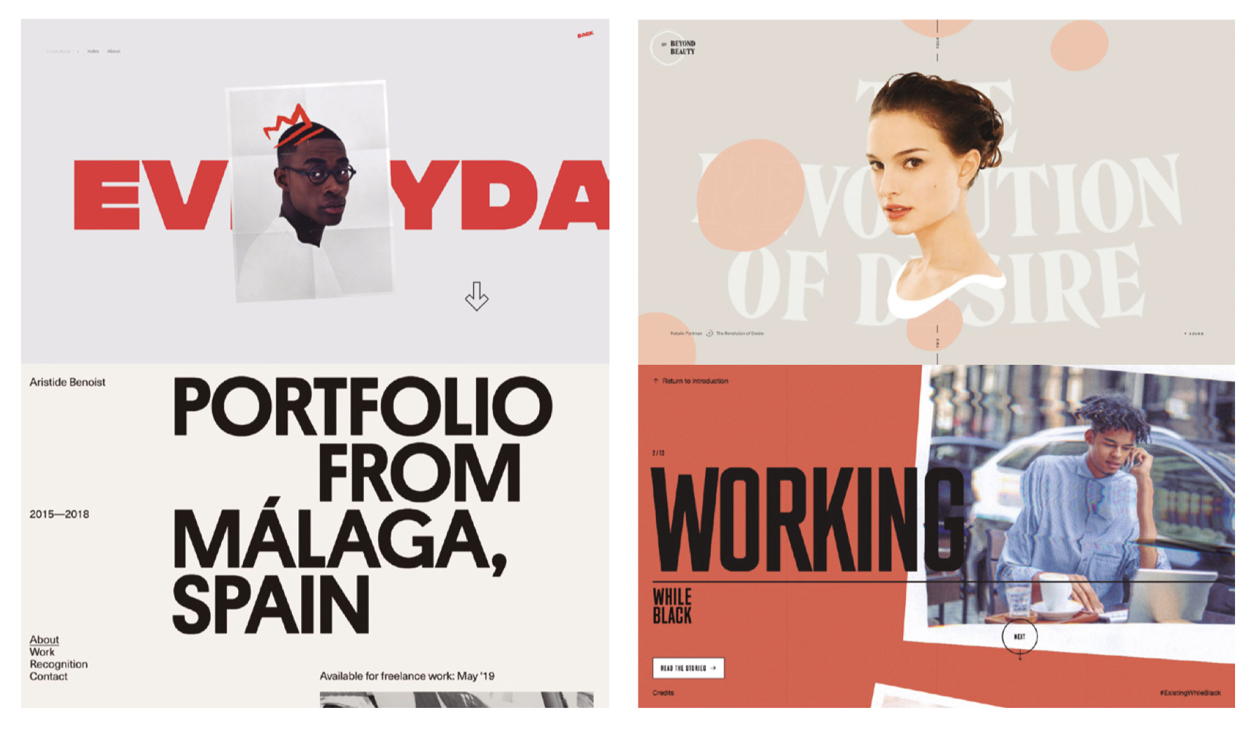
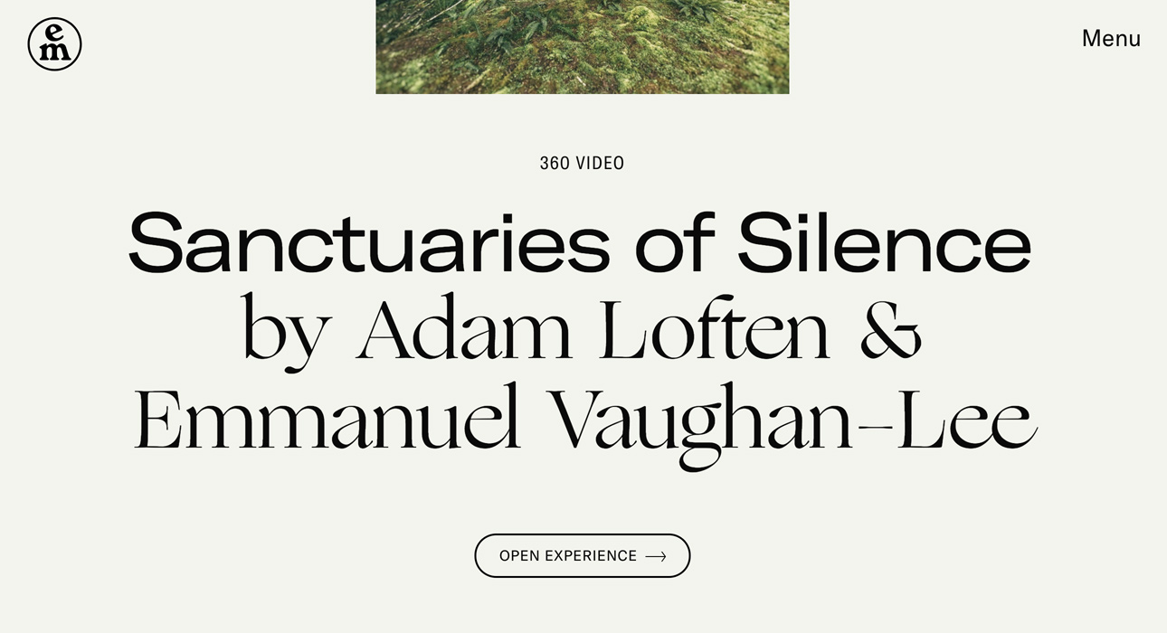
Typography has always been fundamental in design, (not so much when the technology didn’t permit it) but now we have a high level of freedom, expression and experimentation, typography is taking its rightful place. In a dominant way as if joyfully getting its own back for years of suffering due to the scarcity of fonts and problems with legibility and compatibility in the primitive days of web design.
Currently, there are font trends with lots of personality, but it’s not so much about choosing fonts or their combinations, it’s the very use of “words” as the main element of the aesthetic, as well as the semantics. Words now have a physical presence in design, a structural element around which the rest of the composition flows.
it’s not so much about choosing fonts or their combinations, it’s the very use of “words” as the main element of the aesthetic, as well as the semantics.
One of the uses and effects of typography to highlight is the treatment of Letterforms as graphic elements, applying deformations, effects and animations as well as the combining of different styles and weights with BOLD, Italic, Serif, San-serif, and outlined all existing together happily in the same paragraph.
3. Variable Fonts
Variable Fonts currently doesn't have enough browser support but should be on our list of skills to learn. Variable Fonts are the evolution of the OpenType font specification. One font file can contain multiple variations of the typeface. Using CSS it is possible to access these variations and animate transitions between styles.
In this example we can see a variable font which we can modify the parameters of for weight and serif, allowing us to not only create animations but multiple variations of the font.
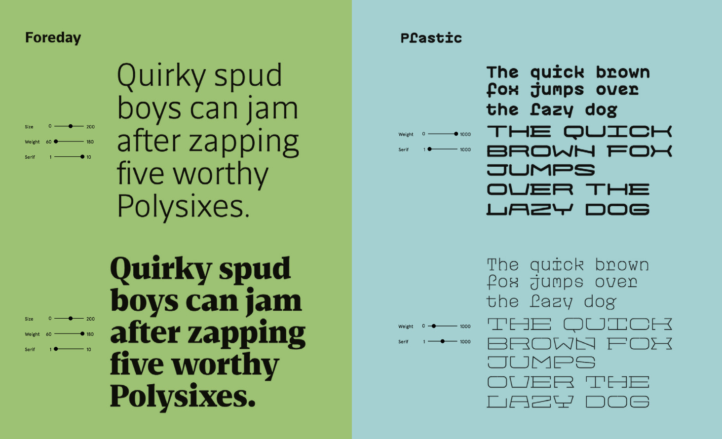
We can generically animate the font axes in CSS, by compressing or expanding it, but its other properties (those which refer to its morphology) will be decided by the font designer. A good example is Decovar a multi-style decorative variable font by David Berlow, which is designed to parametrize multiple properties.
4. Decorated, Augmented And Big Paragraphs
Paragraphs are no longer regulated to simple column distributions or wrapping geometric forms. Paragraphs of now and the future are bigger, full of hovers, emojis?, images, style changes, , and strange distributions, where expression is king!
The size has increased considerably and we’re not shy when it comes to combining fonts and decorative styles, Big Paragraphs are one of the key terms in trends.
5. Animation: Secondary Elements & Organic Motion
Animating secondary elements is a great way to visually enrich a site without using up excessive resources, which can lead to increased loading times. These animations often form part of the microinteractions, creating fluid user experiences.
With tools like Lottie and Bodymovin, fluid, organic and more complex animations come to life. Of course, CSS and Javascript offer many possibilities for animating interfaces, they offer a lot of control of parameters, easing curves, blending modes, filters, svg morphing, etc, but require a lot of skill.
We often find vectorial elements animated with organic morphing, imitating liquid or gooey effects in interfaces and microinteractions, and of course typography is not exempt from these types of animations and transformations!
6. Cute Microinteractions & Minigames
As we have previously mentioned, the need for expression in a more colloquial way is part of the voice and tone of many brands. This need manifests itself in the general text, in the microcopy and the small details in the animated microinteractions.
Taking a step further and adding a touch of humour and playfulness we find mini-games, a resource used to make waiting times more pleasant for the user while the content is loading, whilst at the same time showing the skills of the designer or developer and their intention to establish a close and entertaining connection with the user.
7. Brutalism and Maximalism - Wild Forces Tamed at Last
In the last few months we have lived through a strong influence of Brutalism in web design, it was flowing through our layouts, texts, and interactions, but the style has progressively refined itself, to the point of being tamed for the good of the usability of our interfaces.
8. Image Effects, The Curse Of Distortion And Wave Effects
The Curse of the GLSL Shaders meant that all pages created in 2018 had to contain some type of distortion or effect on them somewhere. That’s how it was, the last year has left us with numerous examples of shader effects over images, texts or videos. We’ll keep seeing them in the following months, but due to their overuse, as a trend, they have been exhausted.
“The Curse of the GLSL Shaders meant that all pages created in 2018 had to contain some type of distortion or effect on them somewhere.”
9. Press & Hold And Go Straight To Hell
This is the most hidden navigation ever. There will never be a more uncomfortable interaction, when you see it for the first time it can seem intriguing but when the novelty runs out it’s not funny anymore. Press & Hold in terms of discoverability is a bad decision. In summary, although it has featured on some of the most experimental sites, it should not be welcomed as a common trend.
10. The Era Of Independent Designers + Creative Developers
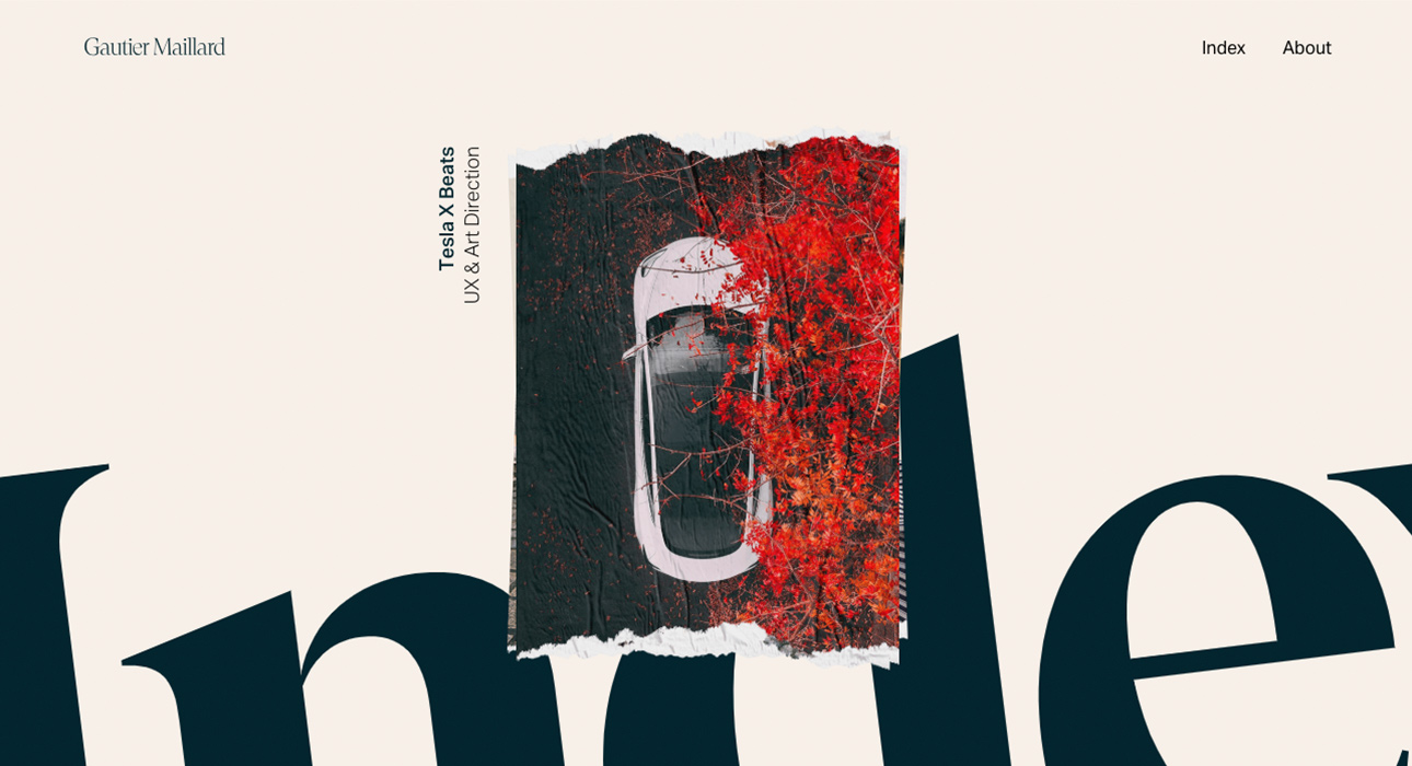
Recently we have observed the proliferation of independent profiles that are commissioned for projects by big agencies and studios. In general, among these independent designers or creative developers, we find minimal portfolios based on careful images, typography and small details in the way of microinteractions.
11. Custom Cursors & ? Mouse Effects
Custom cursors have evolved since the famous old trail effects and are used as a novelty, often blending effects to modify the color and opacity of the cursor according to the elements they are overlapping. These “reactive cursors” change shape, size, opacity, color or animation in response to other elements or the actions of the user. The Organic motion is another common characteristic seen in the comeback of the cursor.
12. Hero Menus
Much like paragraphs, menus have also increased considerably in size, do you remember those tiny menus with pixel fonts from 2005? It seems incredible that in the space of a few years we have arrived at such an opposite end of the scale, fashion is so fickle!
In this case, the size of the menus is also influenced by mobile patterns. In designs for mobile interfaces, the use of full-screen overlay menus is common, as interfaces are touch-based, and smaller touch targets would be harder for users to hit than larger ones.
But following in the footsteps of paragraphs, it’s not only about the size, but also decorative elements, hovers and all types of micro-interactions and effects.
13. Mixing Scrolling
The most common thing that we keep on seeing is the use of layouts with long scrolling, but with divided sections, as in, not a pure “one-page layout” (they do have similar navigation) but certain parts of the content are separated. They’ve also kept subtle effects such as parallax and of course, lots of use of scroll triggered animations and scroll-revealed content.
In badass.shoes-up.com we see an illustrative example of a scroll in different orientations. Its navigation combines vertical scroll and horizontal scroll in a one-page layout.
14. Color Schemes With Personality
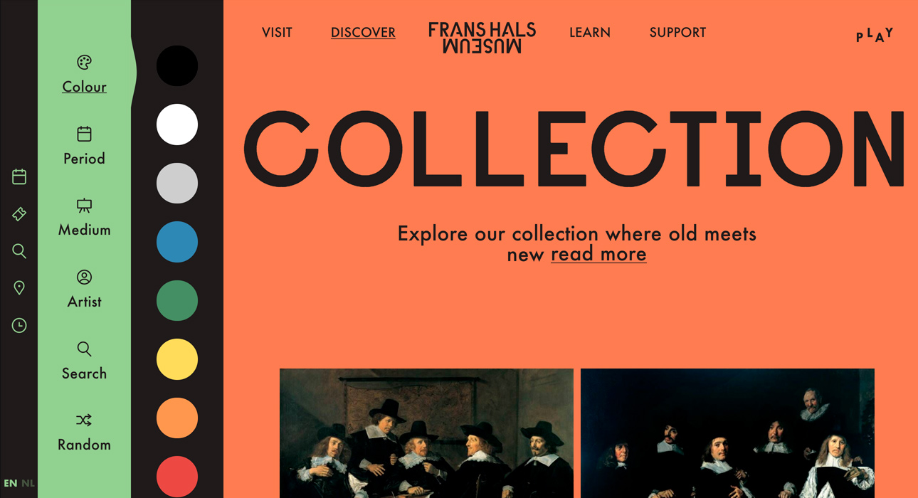
This trend is the color scheme itself and the way in which it is used as a principal design element - we’re talking about color schemes with a personality that are consistently applied throughout the whole product experience.
In general, we’re seeing schemes with two or three primary colors and various secondary colors. Saturated and pastel colors are combined, making way for striking high contrast effects. There are many examples of plain bold colors in the background combined with photography, typography and illustration.
15. Mixing 2d & 3d Elements
3D animation has had a big influence on design over the last few years. Software like Blender or Cinema 4D has made it accessible to a large number of creatives. VR, AR and 3D printing are reactivating the production of 3D digital content.
The legendary parallax effect used a fake 3D constructed by 2D planes in different Z-axis. It’s very common in CSS animation to imitate this three-dimensional effect. The basic idea of this trend is the search for contrast, 3D elements above flat colors or 2D planes creating a 3D fake scenario, giving place to an almost oneiric image.
16. Editorial Styled Layouts
Thanks to the progressive standardization of CSS grid and flexbox we are implementing layouts which are more “free”, that aren’t constrained to a grid that has to be restructured in different columns for its responsive breakpoints. We should abandon the fantasy of responsive web design, nobody expects that one single design can respond in a flexible way to 10 devices.
⚡️?AI, PWA, UX Writing, Voice Interfaces and Much More...
17. UX Writing, Microcopy & Brand Personality
Over the last few years, we’ve witnessed a big change in the message and communicative style of corporations and businesses, voice and tone have become fundamental. Brands are trying to use a more human, colloquial tone - more reminiscent of a conversation with a friend than dealing with a client.
Microcopies, which were previously invisible, now feature a voice and tone that has been designed especially for the brand and are carefully created to maintain the style and coherence throughout the whole user experience.
It’s very gratifying to get a cheeky “Thanks Babe!” when you interact with a shopping basket, and who could resist this message from Medium: “Do you believe in destiny?” it’s impossible not to click on this “call to action”.
How was this discipline brushed aside for so many years, with us opting for the same old standardized messaged in our interfaces again and again?
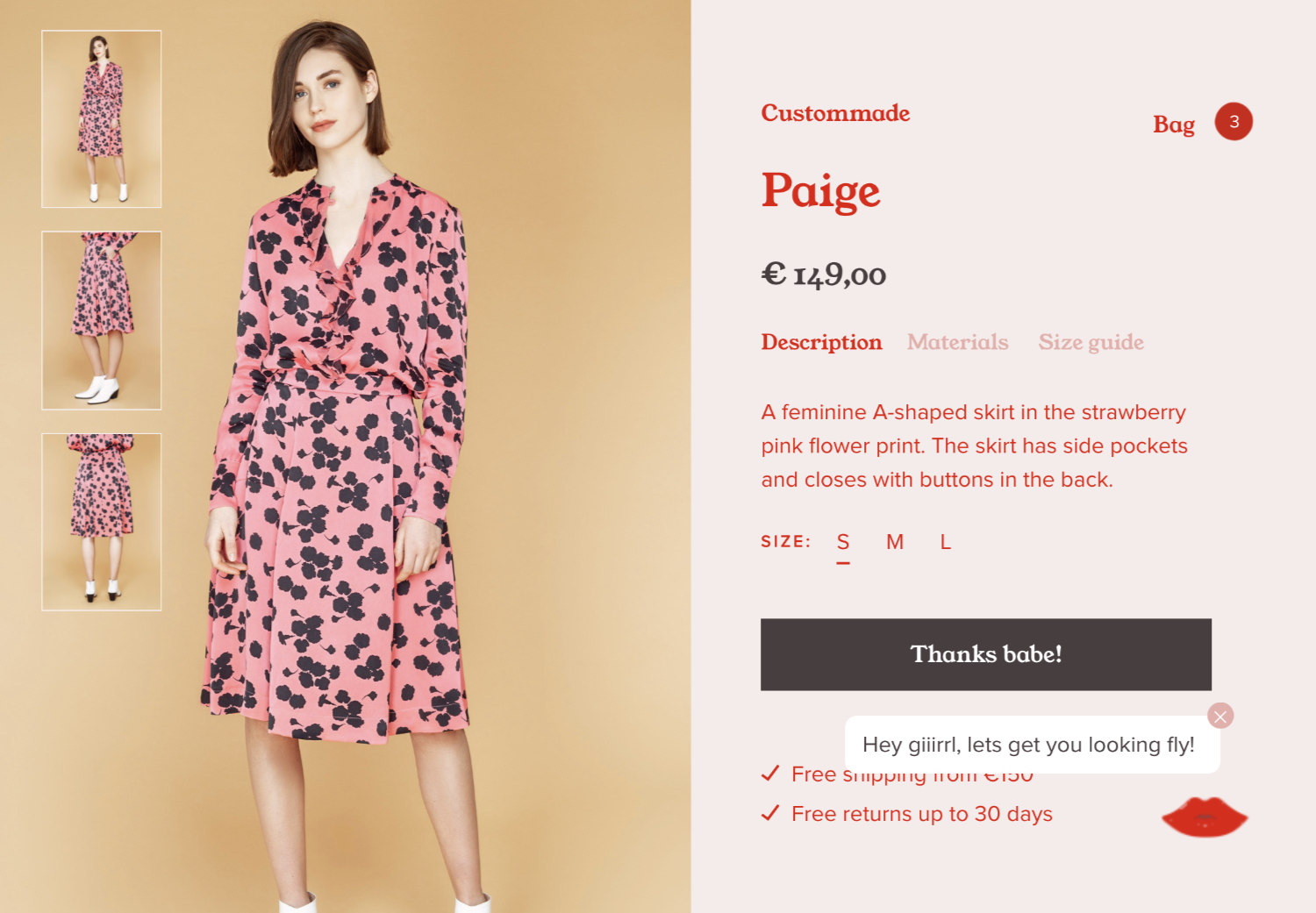
Humour is key here because it's an exceptional way of empathizing with the user and making time spent on the site as pleasant as possible.
UX writers play a very important role, the responsibility of making the site understandable, helping the user in their task to discover the interface, content and everything else that they come across while trying to achieve their main objective, which is generally the consumption of a product or service.
18. PWA is the new responsive web design
We can officially say that PWAs are the new standard, something like the new responsive web design, due to the advances that they represent. Mobile versions aren’t reduced versions, it’s a different experience which can and should be optimized to have good performance, indexation and conversions.
Progressive web apps allow developers and designers to create applications based on web technologies typical of native app-like experiences with the fullscreen and custom navigation bar, automatic updates, transitions between sections without loading other URLs, access icon in home screen as well as the ability to work offline and receive notifications.
But the best thing is that they keep the positive characteristics of web apps like SEO and indexation by search engines and, most importantly, avoid the effort of cloning the app with different technologies. Read our book in collaboration with Google Developers Team "Progressive Web Apps - The future of the Mobile Web".
19. Design Systems
Design systems will continue their climb in popularity with more and more companies realising the benefits of making every single digital manifestation of the brand scalable and cohesive. They are fundamental tools for the design team and allow communication between developers.
A Design System is a manifesto of all the aspects of the design, and the processes implied in the creation of new content reusing elements and iterating tasks. It deals with points like the writing style of the copy, voice and tone, motion, etc. Design systems are accompanied by style guides and a pattern or components library.
Pattern libraries collect all the elements of a graphical user interface (GUI), like buttons, form fields, alerts, the hover states of every element, etc.
The style guide collects all the uses of typography, weights and scales, margins, paddings, grids, icons, and color palettes. These definitions include the CSS styles applied to each element, so that there is direct communication with front-enders and future changes are easier to make.
20. AI Everywhere, Designing for Privacy and Safety
AI algorithms only need 100 likes to be as accurate as your mother in predicting your personality. Chinese artificial intelligence company SenseTime has been scanning and categorizing the population on a massive scale, they even managed to detain a delinquent at a concert thanks to a real-time facial recognition system. AI is already everywhere, so we really need to design for Privacy, Safety and transparency in all uses of artificial intelligence.
We’ve seen cases of Dark patterns in which we could be talking with a bot or have an AI assistant carrying out our personal tasks without realising it. Big companies are patenting systems to optimize their returns from publicity, using our personal details in indiscriminate and unsafe ways, while bots are also being used to influence public opinion, by manipulating elections, etc.
As you can read in our eBook “AI Driven Design”, there are plenty of examples of AI going wrong and being racist, sexist and so on. But, on the other hand, we have numerous positive examples, such as LYNA, which uses Google Computer Vision to detect breast cancer, correctly identifying metastasis patterns in 99% of cases compared to the 62% found by human pathologists.
21. Machine Learning Through Web Technologies
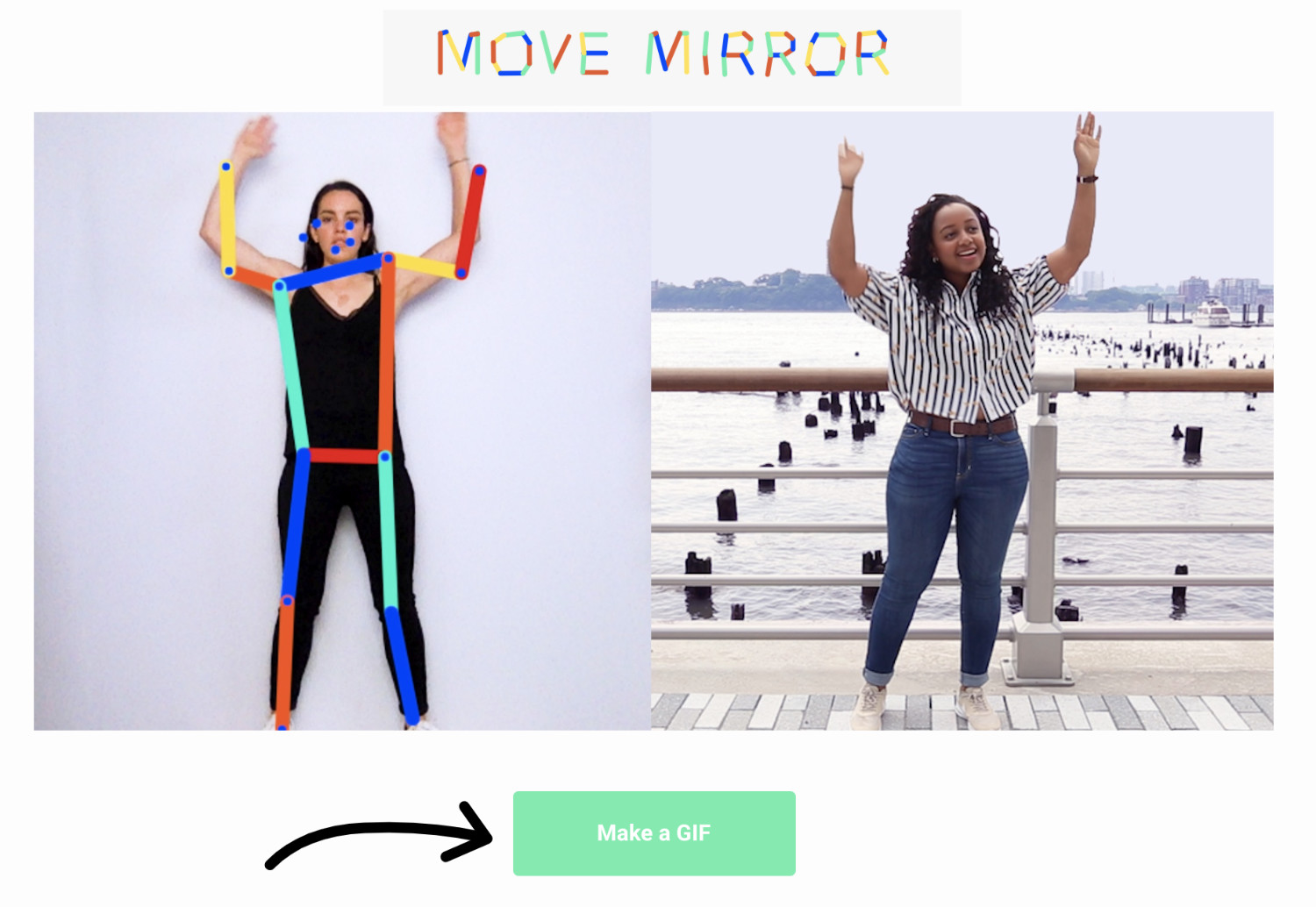
What do we understand by machine learning, what is a model? How do we start with ML? How is it trained, and how can we implement it? Luckily for us, this year has been full of examples of AI-powered web experiments. Many of them can be used easily in our projects or to prototype other experiments as they are based on JS libraries like TensorFlow.js, it doesn’t require a particularly complex server architecture. TensorFlow.js is a very powerful tool based in Node.js. which we can use with existing javascript ML models or even create our own, by training them or retraining existing models using data coming from sensors connected directly to the browser. We only interact with the client side, meaning the response is very quick.
22. The Year Of The Virtual Assistants
This year virtual assistants have arrived to the masses and established themselves as a consumer product. Siri and Google Assistant are already widely used on mobile devices, and have transformed into, soon to be essential electrical appliances. Google Home and especially Alexa are developing enormous ecosystems that allow us to interact with them and integrate them into our products and services.
According to this Amazon report, from September 1st, 2018, over 50,000 Alexa Skills have been developed.
Due to mobiles being the main device we use to access the internet, the evolution to voice command interfaces will be an easy and natural next step. Introducing text on mobile keyboards is complicated, tedious and generates many mistakes.
23. Less apps & more multi-platform integration
Virtual assistants reduce the number of apps and platforms that we have to manage. Soon we’ll have “skills” and more comprehensive tasks that will save us lots of time. We’ll communicate with all these platforms through APIs, and navigate towards a future where content will be even more independent from design.
24. Command Voice Interfaces
Voice-command interfaces or conversational devices are relevant because they reduce the time and effort of the interaction. With voice command we can log in to a platform, saving us the bother of remembering and typing passwords, navigating the application, understanding its interface, content structure, etc, soon we will be able to configure hundreds of actions and use a simple word as a trigger.
The famous Gartner report into emerging technologies predicts that 30% of webpage visits will be by voice in 2020 and ComScore estimates that in the same year voice will account for 50% of all searches.
25. Visual Search
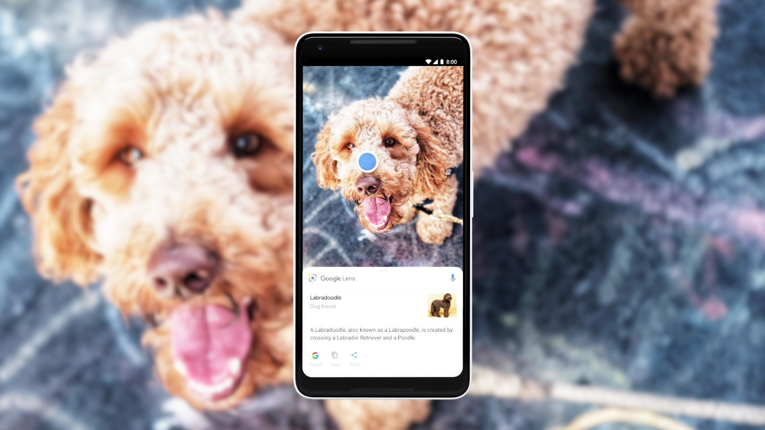
The camera is the new search box, many applications will eventually introduce the search system that’s already found in Snapchat, Pinterest Lens, AliExpress and Google Lens.
Amazon was a pioneer in visual search with its Flow feature in 2014. Flow, which is currently inactive, used image recognition to look for products.
Snapchat, as an AR early adopter, wasn’t going to miss out on the visual search. In September 2018 it announced a new feature in a strategic collaboration with Amazon. This new Snapchat feature allows the user to “scan” barcodes using the camera. When the result is positive, additional product information is shown or “augmented” in the form of an Amazon card with other similar products and a purchase button.
26. The Future is 3D
In the last few years, the stocks and communities of 3D resources have grown enormously, and their future is even brighter. This has been due to the creation of games for the mobile apps market, made easy by tools such as Cinema 4D, Blender and Unity, with the advent of 3D printing being another trigger of its growth. Today there are numerous communities, such as Sketchfab offering great resources to download, buy and sell models that can be used in any media, WebGL, games and 3D printing. There are unlimited scenes created with VR tools such as Tilt Brush and Google Blocks. Another community of note is Poly from Google, an excellent resource to download low poly 3D resources perfect for WebGL, VR and AR. There are also many 3D design tools like Vectary or communities oriented towards open source 3D printing, including MyMinifactory, Thingiverse, and CGTrader.
27. The Augmented Reality Transformation & A Content Creators' Paradise
Now we have an important challenge, to supply our new augmented worlds with quality content. For us, as digital creatives, it’s a fabulous situation.“The future is augmented”, every element in our surroundings will have a huge variety of information, we are replicating the world with different Layers of Information and interaction.
We are replicating the world with different Layers of Information and Interaction. A golden opportunity for creators.
Technologies such as AR, VR and their fusion Mixed reality (MR) and Extended Reality (XR) will add more layers of information that will require a lot of work in terms of designing interfaces and content. In short, a golden opportunity for creators.
*. Fortnite
For everyone asking why Fortnite is in the title, there is a short chapter in our book where we describe the changes that technology and the digital sphere are making on our social interactions. Fornite is a paradigmatic game due to the enormous influence it has on millions of users, both in and out of the digital world.
How Can I Get This Amazing Book That Is Gonna Change My Life?
We imagine that after all this you are dying to see our new book, right? Unfortunately, the printed version has totally SOLD OUT. If you do want to get a copy, you’ll have to come to one of our next conferences in 2019 in San Francisco or New York, as we’ll be giving them away as part of the welcome pack. But fear not, you can also get your hands on a digital version RIGHT HERE.
