Jul 1, 2022
Website Elements Kit: Readymag plays with the limits to encourage invention
We at Readymag believe that everybody has the basic right to present themselves to the world. As a digital product, we appeared on the market just for one purpose: to empower people’s strive for visibility and give everybody voice on the internet.
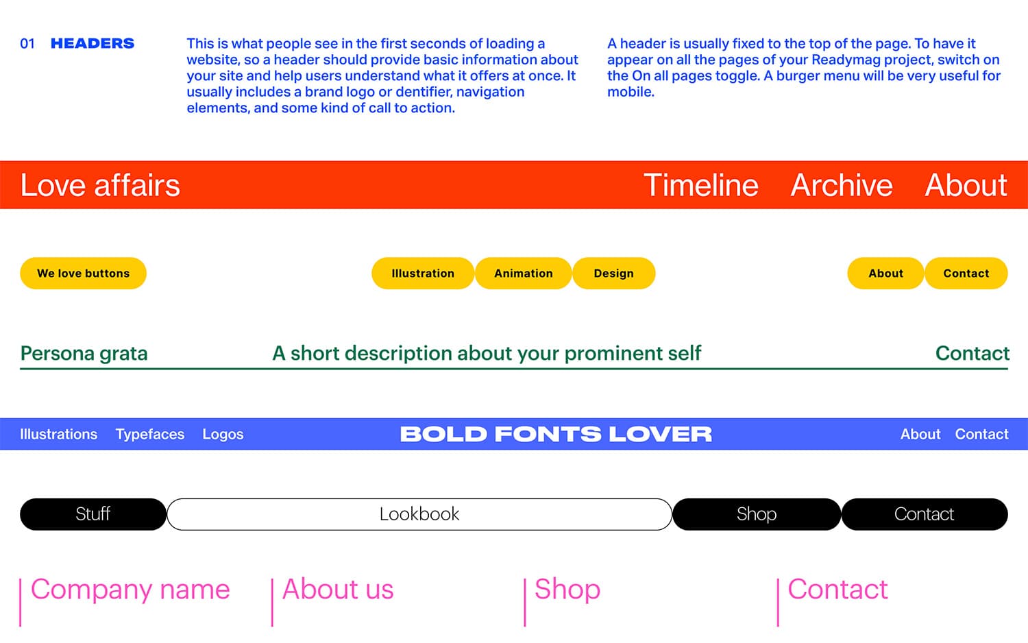
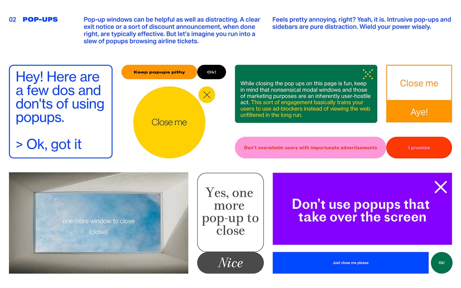
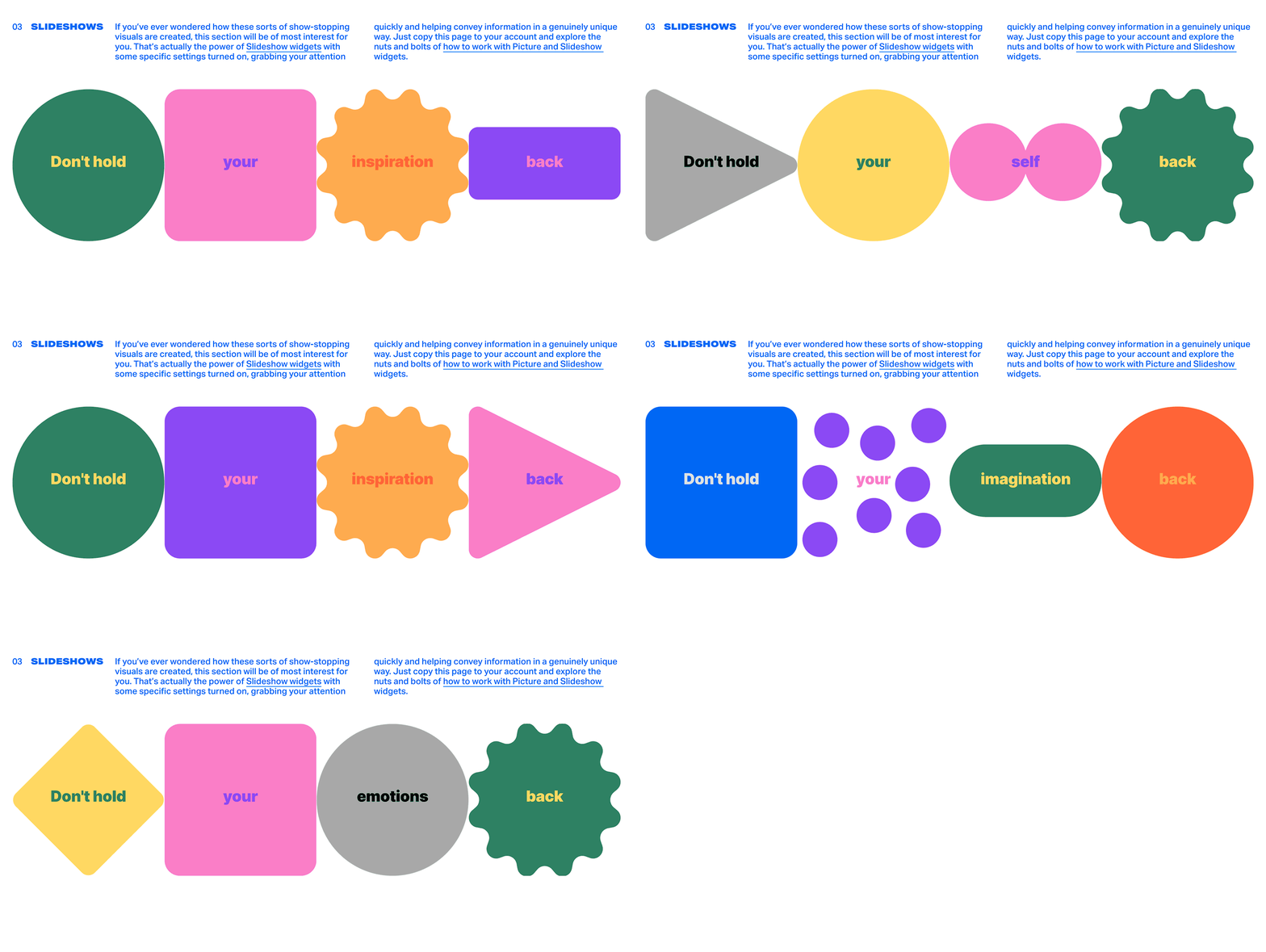
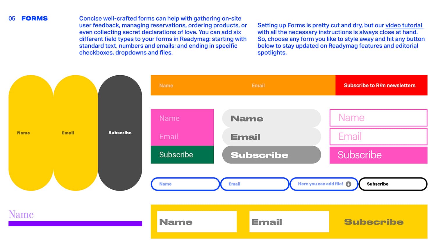
We enable our users to build websites from scratch without developers. Our primary target are digital designers: the interface of Readymag and the workflow with it are conceptually similar to traditional graphic editors. Yet, with our new project—Website Elements Kit—we appeal to a broader audience: this is a construction set of static and animated functional website elements (buttons, headers, menu, slideshows footers, etc.) that you can copy in a click and build it into your own Readymag project.
The idea behind
Website Elements Kit is a free collection of presets with brief basic rules of the web:
The idea of the project stems from our desire to explain and show people how they can make such basic website elements as buttons, footers and headers in a variety of ways. Traditionally, these website sections are also the most tedious things to design. These elements are more technical and many people want to skip them as soon as possible — now you can copy-paste them and then tweak them minimally.
— explains the author of the project, Readymag Designer Tanya Egoshina.
My thought was this, Tanya adds: I can prepare several presets, so that someone can take them ready, saving time for other great things. I’m good at making mobile menus and other website elements—so, I can make several and share them with those, let’s say, who want to save animals in Ukrainian zoos, so that they can focus on the rescue process and less on technical design.
We at Readymag don't want to limit our users to inflexible templates—we believe that both fun and function make for a better design! From a marketing viewpoint, we are always looking for new ways to show the functionality of Readymag in all its glory and engage our community, adds Alya Datiy, Head of Marketing at Readymag.
How certain elements work
The usage scenario is as follows: you choose a desired element(s) from the kit, copy it and paste it to your project, saving much time along the way. This way, the creative process gets even more easy and fun.
Hotspots: They often come in handy when you need to add some text or pictures, but there’s no room in the layout. For instance, if you need to add a footnote or a caption for the products you sell in an e-shop, with its model, size and costs—our hotspot will solve the problem.
This being said, we want to sum things up: use rules as constraints! Constraints sharpen the perspective on the process and stimulate inventiveness. The aesthetic quality of a product is integral to its usefulness because products we use every day affect our personality and our well-being. But only well-executed objects can be beautiful.
Like this project? Support it with your vote!
