Oct 14, 2020
Work practices of five contemporary designers put on display: dissecting Daily Routines

Daily Routines is a project exploring the work practices and everyday life of five designers: Mira Malhotra, Pavel Kedich, Anton Repponen, Anna Seslavinskaya and Becki Kozel. The project serves to prove an old wisdom quickly rediscovered in the times of lockdown: to stay productive, you need a stable routine. Coming up we discover how the best results might be achieved with the help of small regular practices.
In this article, we will walk you through Daily Routines, putting on display places where inspiration links and playlists of designers can be found—and, at the same time, emphasising some of the design highlights (how to create on-scroll animations without coding, for example). If you liked the project, consider voting for it here.
The project was created with Readymag—the browser-based design tool that helps create websites, portfolios and online presentations without coding.
Designers from all over the world
Our heroes are scattered around the world. Pavel is a freelance art director from Riga, Latvia with a passion for editorials. Anna lives in San Francisco, USA, and has a particular interest towards fonts. Mira works in Mumbai, India, and loves illustration—in her interview, she even laments the lack of good crayons in India. Anton lives in NY, USA, and likes music and photography as well as web design and art direction. Becki (New Jersey, USA) was once a cheesemonger and now works for a prominent feminist design studio. In this project we wanted to give a hint about what their everyday lives look like and help readers embrace the diversity of design.

Almost everyone has a playlist for work
Surprisingly, after talking with our heroes, we realized that all their daily routines have much in common. Pieces may differ depending on geographical peculiarities, yet all five have rather strict timetables, as well as a playlist for work, always at hand, and a habit of re-reading any task many times. These common details set the structure for the whole project: playlists present a part of the project menu, inspirational links are down below, and the timetables are presented in the form of ‘routine meters’.
Bringing attention to the details
Browsing through the project, you may notice black and white dots here and there. These are hotspots, containing small, yet precious pieces of the whole day-to-day picture, on which we wanted to lay an emphasis. Usually, they are put near an image of an important item belonging to a designer, offering its story. Hotspots are definitely one of the lesser known and underestimated ways to lay emphasis in web projects. We also think Graphik font greatly pairs with them.

Shots widget visualizes time flow
From a design perspective, one of the most important features in the project is the use of Shots widget—a sequence of animated frames controlled by the user via scroll or mouse movements. We’re really proud of this feature.
All the ‘routine meters’ are purposefully constructed via Shots: ‘Everyone described their timetable a little differently. Shots helped us unify the visual representations of these’, says Tanya Egoshina who designed Daily Routines.
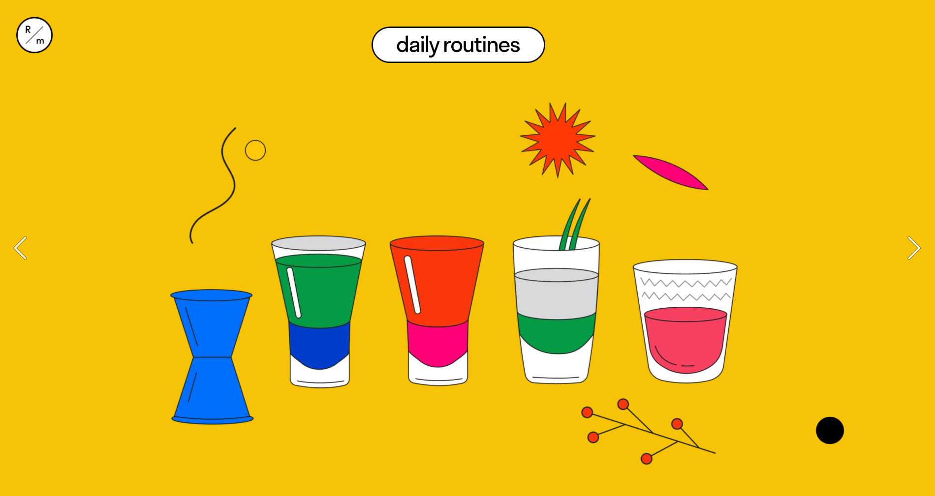
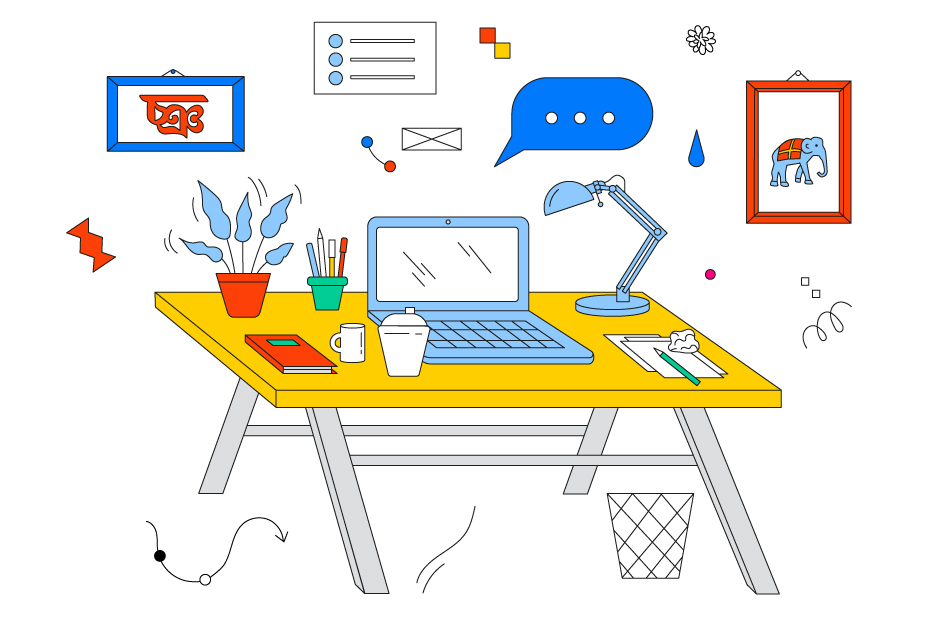
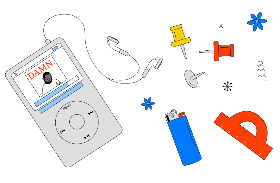
There are also small animations powered by Shots on every page. Pavel Kedich: diminishing liquors (that’s actually a pun: Shots widget depicting shots here, just like in a bar). Anton Repponen: audio controller. Becky Kozel: Ipod iterates songs. Mira Malhotra: changing items on the desk. Anna Seslavinskaya: workout sequence. Make sure you’ve seen them all! They’re worth it.

Work may be fun
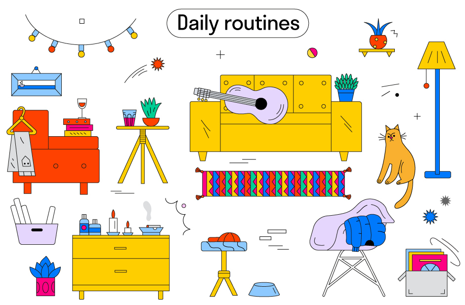
The illustrations for the project were created by Natasha Dzhola, a digital artist and illustration curator at HSE Design School (Russia, Moscow). ‘The photos of our heroes were really diverse from a stylistic perspective, so we decided to use illustrations instead—to unify the look. We also wanted to use more colors than we usually do in our editorials, and Natasha’s illustrations fit the approach perfectly’, says Tanya Egoshina.
We tried to represent our heroes as we saw them from candid interviews: hard-working professionals, still never excessively serious. It might be using a wooden parrot for inspiration, as Mira Malhotra, or playing synthesizers to relax, as Anton Repponen... First and foremost, work should bring you joy, and routines are a way to achieve that—not the other way around.
