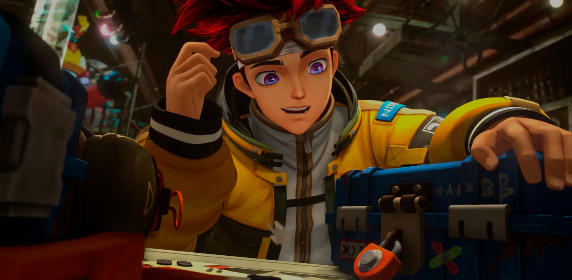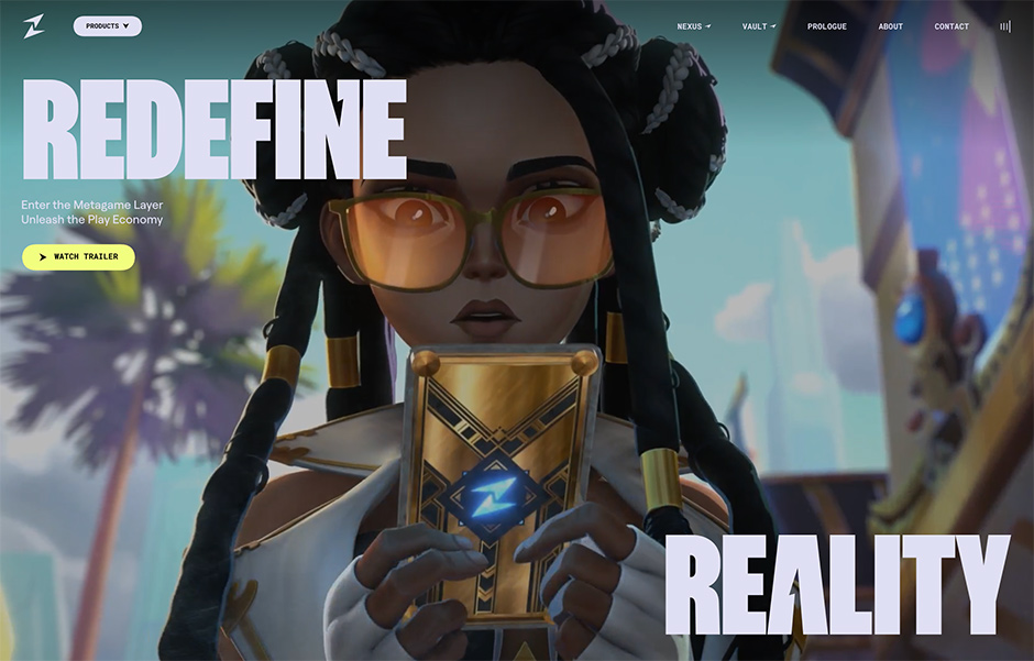
Zentry is a dynamic Web3 ecosystem that aims to bridge the gap between people’s digital and physical lives, immersing players, investors, and creators in the "Play Economy."
Zentry’s vision is to create seamless integration across different games and platforms, allowing users to carry their avatars, assets, achievements, and perks from one game to another via the “Metagame Layer.”
Zentry needed a bold digital showcase to engage audiences and convey its groundbreaking vision. We envisioned a central hub that would unite its interconnected products and serve as a multipurpose platform. The goal was to balance clear, informative content with an engaging, high-energy design to create a digital space that was dynamic and layered while maintaining a seamless user experience.

A Complete Brand Experience
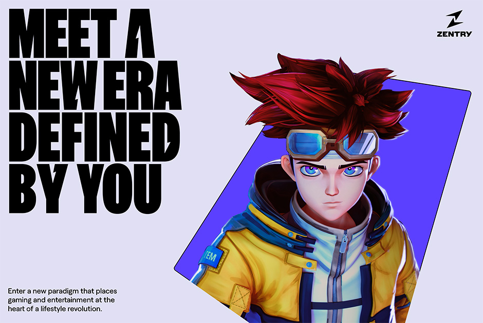
The design process began months ahead of the website. During this initial phase, we developed a strategy and brand system with the client that allowed for a cohesive identity where the digital interface was deeply connected to the entire visual language of the brand. We proposed two distinct creative directions. One focused on a modular approach, emphasising an organic continuum and reaction flow. The other revolved around the concepts of dimensionality and juxtaposition. The client opted for the second option, where typography needed to play a key role. Our early sketches featured distorted, perspective-clashing typefaces for the display headlines. To bring this vision to life, we needed a typeface that could withstand these distortions without looking out of place. It soon became apparent that custom typography was the only choice to fully realize this vision.

Collaborating with type designer Florian Karsten, our team adapted the FK Screamer typeface for unique distortions, creating a recognisable yet elegant glyph system. It became a core feature of Zentry’s brand identity, maintaining its distinctiveness across all touchpoints, while still feeling cohesive within the larger brand framework.
“The Zentry identity is dynamic, bold, and vibrant, with motion embedded into every element—even when it’s static.” – Bruno Arizio, Design Director
Dynamic Motion Design
Motion design was essential to bringing the site to life. The Zentry identity is dynamic, bold, and vibrant, with motion embedded into every element—even when it’s static. Built to be flashy, fast, and reactive, this identity drove the development of a motion system that connects every touchpoint across the site. Every reaction movement, animation curve, and principle was laid out before the design of the website even started. Performance and efficiency were top priorities, so we used memory-efficient web technologies and custom-built solutions for intricate visual effects like the 3D portal masks. This allowed for smooth transitions and high-quality animations across all devices, ensuring an exciting and impactful effect.
Meticulous Sound Design
Good sound design is a crucial element in amplifying the user experience. That’s why we incorporated a meticulously designed dynamic soundtrack that evolves as the user explores, providing a sense of excitement without overwhelming the listener. The experience begins with an upbeat and engaging score, before transitioning to a more subtle ambient feel. The sound effects were carefully blended into the soundtrack for impact and clarity, resulting in a seamless auditory journey through the site.
Technologies
We used a variety of technologies to support high performance and interactivity. For the main front-end technologies, we leveraged Nuxt.js and the Vue.js framework, enhanced by Vite for its comprehensive ecosystem. This project required a significant amount of DOM elements, such as text and dynamic media, and we aimed to minimise the complexity and increase DOM performances by avoiding WebGL. Instead, we relied solely on DOM technologies for intricate effects, such as the 3D portal masks—a central feature that we developed as a custom solution instead of using WebGL or Three.js. Additionally, we utilised a proprietary framework equipped with a suite of utilities crafted from our project history, accelerating development and allowing us to focus on project-specific elements.

Company Info
Resn is the world’s friendliest evil corporation. We work in tireless pursuit of our fiendish goal to bring joy to millions of people. Since 2004, Resn has plotted and schemed to become a leader in the field of interactive development and design. We are in cahoots with some of the world’s best-known brands and agencies and we will stop at nothing to bring a smile to your face. Vile scum.
