Massive congratulations to DASHDIGITAL® for winning Site of the Month May with INKFISH, thanks for all the votes and tweets.
Inkfish, a bold and agile production and advertising agency based in New York City, leads innovative projects in creative technology, production, and design.
DashDigital was asked to develop a comprehensive digital brand system and identity for Inkfish followed by a visually engaging website that prioritises performance and optimization.
Brand Identity
Our team explored various directions to shape Inkfish's brand identity, establishing a compelling concept refined with graphic elements resonant within their industry. The typography mirrors the digital landscape, featuring a bold sans serif as the primary typeface, complemented by a mono typeface. Recognizing Inkfish's strength in client work, we integrated bold typography, patterns, graphic elements, and subtle animations into the brand experience. The result is a modern, polished digital brand system that captures Inkfish's essence.
Design Exploration
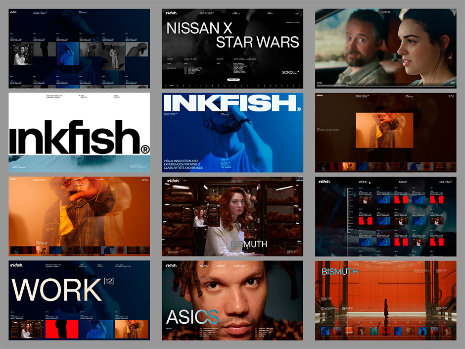
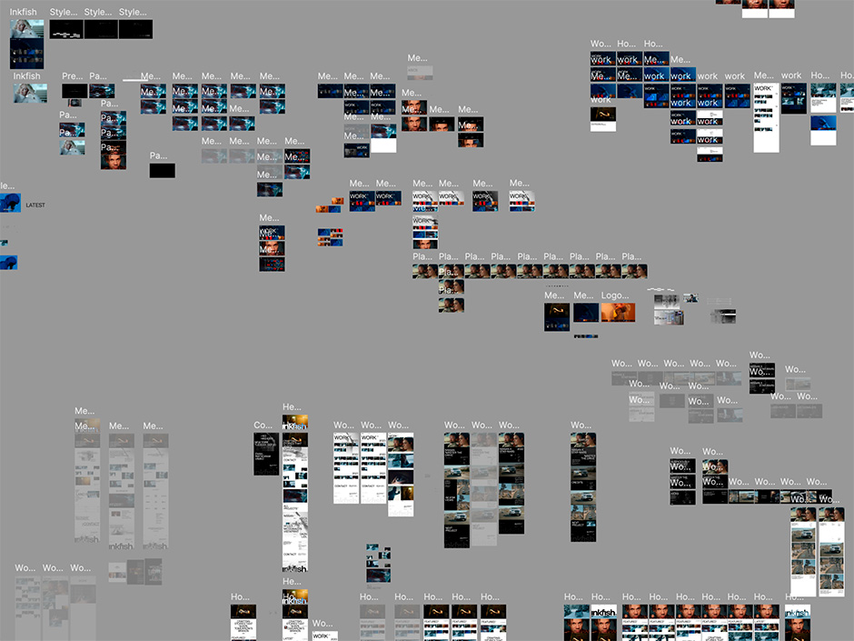
Building on the brand identity, our digital design team explored how to integrate the brand into a digital experience. We experimented with multiple layouts, exploring every aspect of the site, from landing pages to unique video players and fundamental design elements, gradually honing the look and feel into the chosen direction.
“The exploration phase was crucial. We aimed to push boundaries and craft a unique experience for Inkfish. Without exploring multiple concepts, we would have risked missing the essence of the brand.” - Rogan Jansen, Creative Director
UI / UX and Motion
The project delivered a state-of-the-art, visually stunning, and user-friendly website that enables Inkfish to showcase their work effectively while asserting their leadership in the industry. We identified key areas and pages, prioritising user experience and performance.
To balance beauty and usability in the design, it was necessary to pay attention to the small details in both the visual and functional aspects.
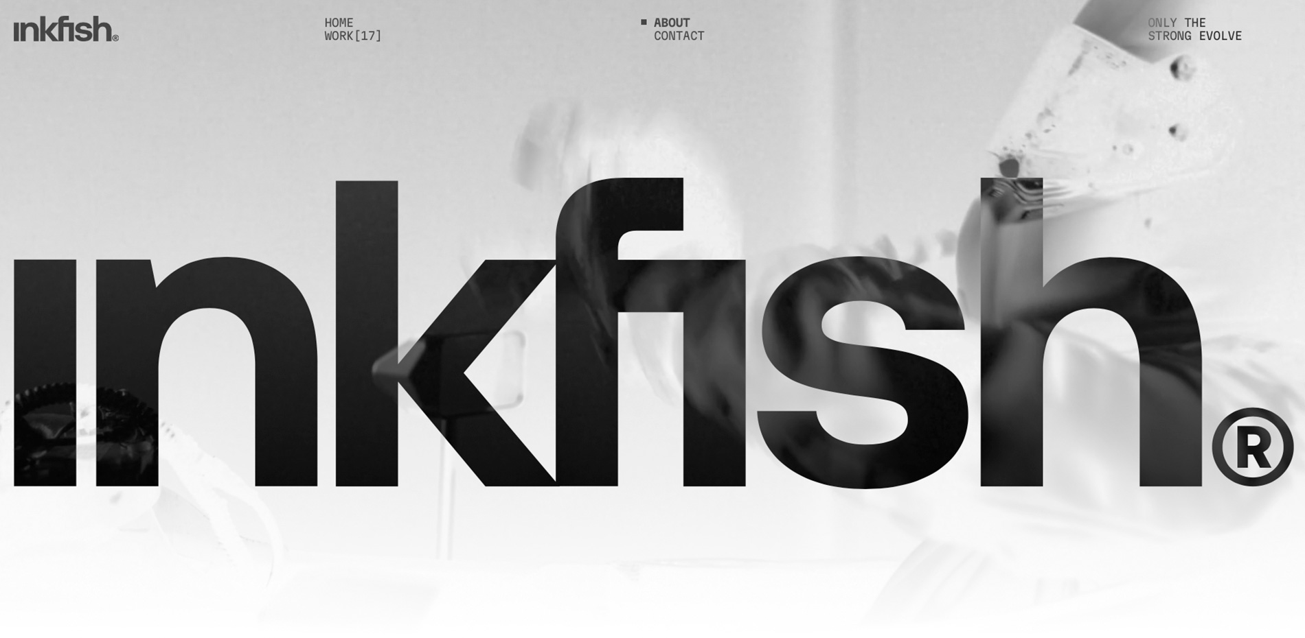
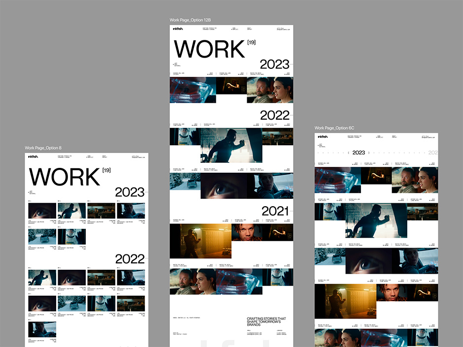
Home Page
A visually impactful home screen was crucial for capturing users' attention instantly. We integrated full-screen and smaller video players to offer versatility and an uninterrupted viewing experience alongside the featured works. Additionally, a unique list-type dropdown on the landing section allows users to interact with featured work without needing to scroll or navigate further.
Dual Video Hero Playlist
The home hero section featuring dual video playback presented unique synchronisation challenges. Our initial implementation using standard HTML5 video elements resulted in subtle lag between when each video started. After extensive experimentation, we developed an innovative solution using a 2D Canvas element. By rendering both videos within a single Canvas, we achieved precise synchronisation, enhanced by a subtle parallax effect to the background video. This approach solved the timing issue and allowed for more advanced visual effects, creating an immersive and visually striking hero section while maintaining performance.
Video Loading & Management
We optimised the video loading using React's built-in hooks, allowing the page to display quickly while the video loads in the background. Users can interact with the page immediately without being hindered by video loading times.
To enhance loading speed on slower internet connections, we've implemented auto-playing preview videos that are shorter in duration. We've also created mobile-specific video versions to optimize performance on mobile connections. All videos are served from Vimeo, using direct links to compressed mp4 files, leveraging their robust content delivery network.
For work cards, videos load only on hover, significantly reducing unnecessary data transfer and improving overall page performance. A micro-interaction where the video subtly sticks to the cursor, inspired by an octopus's suction cups, ties into our overarching digital experience concept.
We also implemented the ability to switch between list and grid views, on the work listing page, for a more intuitive user experience, allowing users to view multiple visuals at once or focus on one at a time. This feature was built with scalability in mind, anticipating future portfolio growth and easing navigation as more work is added.
Video Player
To enhance the user experience, we developed a custom fullscreen video player modal that goes beyond standard functionality. This player includes advanced features such as precise timestamps, screenshot previews, a progress indicator, and custom controls, all designed with UX best practices in mind.
One of the most complex and innovative features is the screenshot preview within the timeline. We implemented a technique to scrub through the video and store screenshots in the component's state, which are then used to populate previews on the client side. This allows users to see a visual representation of the video content as they hover over the timeline, greatly improving navigation and content discovery. The video player is implemented as a DOM client portal, allowing it to load and operate independently of the main page. This architecture ensures that the video player's complexity doesn't impact the overall website performance, maintaining optimal load times and responsiveness.
Page Transition
To create a seamless and engaging user experience between page navigations, we implemented a custom page transition effect. This transition emulates a glitchy video block effect that swipes up across the page, adding a unique and brand-consistent visual element to navigation.
We utilised React Transition Group to manage the transition states, allowing us to precisely control the animation timing. The transition is designed to occur before the old page unloads and after the new page loads, effectively masking the loading process of the new content. This approach not only provides a smooth visual transition but also helps to maintain perceived performance by hiding any potential content loading delays.
Robust and Modular CMS
“At DashDigital, we always strive to keep our websites modular and composable. Our approach leverages a component-based architecture, allowing us to have a reusable and easily maintainable CMS structure.” - James Blyth, Frontend Developer
By implementing a flexible content management system, we empower the client or marketing team to log into the CMS easily and add, remove, or reorder components as they see fit. This modularity not only provides total control over the end result but also enhances the website's scalability and adaptability to changing requirements.
Tech Stack
Motion: GSAP.js + CSS
Scroll: Lenis.js
Transitions: React Transition Group
Preloader: Modified version of Pace
CMS: Prismic
CDN: Cloudflare
Video Provider: Vimeo
Server Architecture
Repository: GitHub
Build & Deployment: Cloudflare Pages
CDN: Cloudflare
SSL/TLS: Cloudflare
DNS Management: Cloudflare
Company Info
DashDigital Studio consists of brand specialists, creative developers, and UI/UX designers based in Cape Town, South Africa. Together, we leverage in-depth research and strategy to build immersive digital experiences that captivate audiences and elevate brands.
Instagram / Website / Linkedin
Credits:
Rogan Jansen - Creative Director
Oleksii Berdnikov - Lead Designer
James Blyth - Frontend Developer
Mike Tshimanga - Designer
Tyron Evans - Project Management