
Progressive Web Apps
The future of the
Mobile
 Web.
Web.
 Web Apps
 Web.
Web.Content
- Foreword
-
Great Mobile Expectations, by Jenny Gove
- Mobile Usage
- User Research: Mobile Web and Native Apps
- The Best of Both: Progressive Web Apps
-
What are Progressive Web Apps, by Chris Heilmann
- A Brief History of Software Delivery
- A Current Need Fulfilled
- Progressive Web Apps to the Rescue
- The Technology Stack
- How to Build Progressive Web Apps, by Sarah Clark & Sam Dutton
-
PWA Design Considerations, by Mustafa Kurtuldu & Ryan Warrender
- Designing For a Shift in User Expectations
- Designing For Different States
- Use Metaphors That Convey Meaning
- Design For All Your Users
- Post PWA Launch
-
Case Studies
- Lancôme
- Trivago
- BMW
- Nikkei
- Afterword
- Resources: Checklist, Tools, Useful Links
Foreword
In recent years, mobile usage has risen to the point where people now spend twice as much time on mobile devices as they do on desktop, and in many countries mobiles are the only device they use. This isn’t news: you’ll have seen the same trends in your site analytics.
With this boom in usage comes expectation. Users demand consistently great experiences on both native apps and mobile websites, and expect to switch seamlessly between them depending on their requirements. Developers and designers now need to build and maintain native apps for multiple operating systems (OS) alongside a mobile website - a process that requires a substantial amount of time and effort. And when - as often happens - the experience delivered by a company’s website and their native app is worlds apart, users end up frustrated. Surely there must be a better way?
Well, now there is: Progressive Web Apps. The concept of a Progressive Web App (PWA) was first introduced in 2015. PWAs are sites that employ modern technology to deliver native app-like experiences on the web. This e-book explores todays mobile web experiences and why PWAs provide revolutionary solutions to improving experiences on the mobile web. We’ll look at what we really mean by a ‘PWA’, the unique features they offer users, how to build one, and how to assess the results.
Great Mobile Expectations, by Jenny Gove
Mobile Usage
Consumers expect mobile to meet their needs for everyday tasks such as shopping, communications, and entertainment, and it is the job of designers and developers to provide experiences that live up to these demands. To do this, mobile experiences need to be fast, installable, reliable and engaging, and should operate in a secure and accessible environment.
Over the last few years there has been a big shift in the digital platforms users occupy, with mobile devices now considerably more commonplace than desktops. ComScore 1 reports that in the majority of countries, mobile users spend more than twice the digital minutes of desktop users. But desktop is still important and continues to contribute 50% or more digital time for retail, portals, business and finance, travel, autos, and education. Mobile audiences have larger reach for some of these categories however 2, and consumers will often switch to the platform that best supports their needs.
In addition to this, populations new to digital, coming online for the first time, have contributed to a gradual shift towards mobile-only internet access. Consumers in Asia Pacific (APAC), in countries like India and Indonesia 3, are encountering the web via mobile device only. And Millennials use mobile devices more than other genera - tions, although adoption is growing significantly among older generations as well 4.
The vast majority of time on mobile is spent in native apps 5, with ComScore reporting that 80% of all mobile minutes in all markets are spent in native apps, versus 20% in mobile web. However, a very limited number of native apps account for that time - primarily social ne - tworking, music, games, and entertainment. And in terms of reach, the mobile web tends to capture larger au - diences: according to ComScore, the mobile web has on average 2.2X more unique visitors per month than native apps 6.
User Research: Mobile Web and Native Apps
The importance of a mobile web presence cannot be overstated, with consumers frequently turning to mobile websites to research and explore their options. In fact, mobile websites are the primary method of discovery, as this participant in a Google user research study explained 7:
“If you’re, like, ‘I know I’m kind of looking for this’, it’s probably easier to go to a mobile website and search… I have this sense that there are more products and content available on a mobile website versus an app.”
Because they are judged to have the best reach, users often look for information across a variety of mobile websites using Search; a helpful way to explore alternative options, prices, and reviews.
Although consumers turn to mobile websites for exploration and discovery, they generally perceive native apps to have greater ease of use. Native apps are created mobile-first from the start and this is an approach that tends to lead to better design around user goals and a smoother experience. Though some mobile websites have been designed very well from the outset and are more usable, and less advanced websites may feature less frequently in search results, users still encounter many websites that provide a poor experience. Cumulative exposure to these may lead users to conclude that native apps do a better job:
“[The apps I like] are really designed to be really user friendly and easy. You can get in, get out, do [your] thing.”
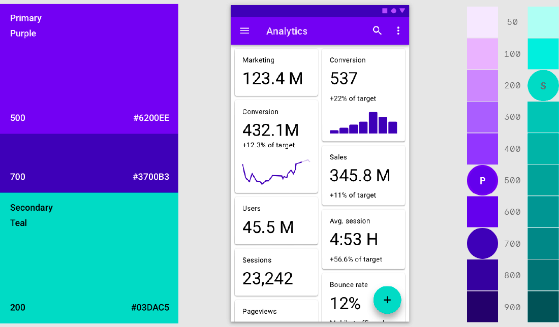
Material Foundation. The color system.
Credits: Material.io
As native apps are often designed for specific tasks, purpose-built to deliver only the most important features, they can also feel more streamlined and goal-oriented than mobile websites:
“In my experience, apps have less features than a website does. So they’re very streamlined, and tailored towards the end result [...]. There's less features on an app, because the goal is to get you there as quickly as possible.”
Native apps often contain features that allow users to store payment details, account information, or settings and preferences, making purchasing an easier and quicker experience. Because of this, they can be perceived as more personalized:
“[An app is] designed to be around you. It’s got your order history right there, easily accessible. It’s probably got some sort of personalization settings [...].”
Native apps are also considered easier to find and access:
“Because it’s there on the screen on my phone, and I know what it looks like and it’s easy to press... A site, unless I bookmark it, which sometimes I forget to do, I’ll have to kind of remember or go to Google and kind of start typing it and see...”
Consumers also feel that native apps give them a faster initial experience:
“I would say the apps almost always work faster than mobile web.”
On the other hand, native apps take up significant storage space on the device, meaning users may only install apps they plan to use frequently:
“I tend to not download apps unless I decide that I really could use them a lot, more than once, with few small exceptions. I don't have a lot of apps that I don't access very much. So if it's a oneoff thing, I will most likely just go to the website, look for the information, then I move on. The app is something that I will use often, over and over again.”
Both mobile websites and native apps must strive to keep their experiences frustration-free for users. Adverts that interfere with the user experience, or frequent, irrelevant notifications that get in the way of consumers’ goals, can all contribute to poor experiences. Users are likely to abandon mobile websites with annoying ads, and turn off notifications completely if they become intrusive:
“I don't want to be scrolling past the ads, or the ads take longer to load, and it's making my phone less functional. I don't want to spend time on that.”
“I find if you have notifications for everything, then nothing is important.”
The reality is that users will switch platforms as required in order to find the information or service they want. A recent study 8 found that 46% of mobile shopping sessions include at least one transition between mobile website and native app. The experience therefore needs to be high quality, fast, reliable, secure, and engaging across all platforms that you support. Additionally, some native apps benefit from having mobile web integrated into them, and technologies like Trusted Web Activities available for Android) allow you to achieve this seamlessly, delivering an experience that has a consistent look and feel.
Users believe, in general, that native apps provide a cleaner and smoother experience, are more tailored to individuals, and are faster to load and use. However, mobile websites are the first port of call for exploring a topic, service or product, and for seeking specific information. In addition, they don’t require downloading; and with advances in technology, mobile websites can be as speedy and usable as native apps. Taking advantage of these new technologies should enable you to deliver great experiences on the web - meeting the user’s every need, every time.
The Best of Both: Progressive Web Apps
Progressive Web Apps (PWA) are websites that use modern web technologies to create mobile web experiences that are closer to those delivered by native apps. Via a link on the homescreen, users can enjoy features that were previously challenging on the web: accessing content offline, receiving notifications from preferred brands, adding favorites to the homescreen. PWAs help improve user engagement and enable seamless conversions - whether for e-commerce, productivity, publishing, games, or media.
While mobile has been one of the main drivers of the technology, desktop is a growing market. PWAs enable frictionless journeys for mobile, tablet, and desktop users, and so regardless of the platform, they have a key role to play.
Let’s look in more depth at what a PWA is, and how they work.
What are Progressive Web Apps, by Cris Heilmann
Progressive Web Apps are an exciting and pragmatic way to deliver the best software functionality to users. But before going into the details of the ‘how’, let's talk quickly about the ‘why’.
A Brief History of Software Delivery
Historically, software was delivered as applications. Youbought it on floppy disks, CDs, or memory sticks, installed it and used it. This cumbersome process meant thatsoftware was rarely upgraded. The cost of creating physical products and mailing them out was high, and whenan error cropped up there was no easy fix.
But the web changed things. Instead of ordering physical media, you simply downloaded and installed thesoftware you needed. As browsers and technology developed, even that process was simplified: instead ofdownloading and installing, you typed in a URL or clickedon a link. Finally, we had proper software-on-demand.The advent of smartphones pushed things forward again.The software-in-a-browser format wasn’t ideal for theWhat areProgressive WebApps,14form factor; typing URLs on a mobile device was tricky.The interfaces we built with web technologies (HTML, CSS,and JavaScript) were often optimized for big screens andmouse interactions. But the main problem was that theyrequired the user to be online - and mobile connectivitytended to be less reliable than a wired connection on adesktop or laptop.
Native apps on iOS and Android delivered what mobilewebsites couldn't: the ability to work offline, and an experience optimized to the form factor of a smartphone.So, we started offering software and media through appstores.
A Current Need Fulfilled
But it has become clear that this is not a perfect solution either. Distributing software to end users via a storeis convenient for developers and it feels more secure, asa curated store can filter malicious software. But it alsomeans building several versions of native apps for differentoperating systems and form factors, which not everyone can afford. Developers are reliant on stores to publish anddistribute an app, and may need to share the profits withthem. The store provider might impose a review periodon new releases - and some users won’t be happy to repeatedly update big apps - so it’s harder to publish newversions.
Delivering our solutions in closed stores and in a nativeformat also involves a lot of assumptions. App stores don’talways support legacy devices, so they rely on users tohave a certain operating system or the newest version ofa device. Users need enough storage available on theirdevice, and of course, native apps tend to involve a lot ofdata, so they require fast, unlimited connections to download and update. Users are expected to have a credit cardto make purchases.
But if we look to markets with the most new users we cansee just how unrealistic even these basic assumptions are.It is therefore vital to find a way to marry the immediacyand low entry barrier of the web with the form-factor optimization and functionality of native apps.
Progressive Web Apps to the Rescue
Enter Progressive Web Apps. As the name suggests,PWAs are applications that use web technologies to giveus the best of both the web and native environments.They are delivered in a progressive way, which means wedon't need to build them in different formats: we delivera basic solution as a website and add extra functionalityas we go.
Progressive enhancement has been used to deliver webcontent for some time - because it makes sense. Insteadof expecting users to have a certain browser or particu-lar hardware, we aim to deliver something that works foreverybody. More up-to-date systems may enable newerand more complex features, but the essential functionsshould just work without the user having to worry.PWAs are delivered via a link in an email, a chat, searchresult, a beacon, a QR code, or from an ad. The PWAprovides a suitable interface for the device and formfactor, is immediately available, and the user can try before buying. Whilst a user interacts with the PWA, wecan check the capabilities of their device and load moredata in the background. We can also offer increasedfunctionality further down the line - offline usage, noti-fications when new data is available, and various otherconveniences.
Initially, PWA descriptions seemed complex and daunting for developers. A PWA needed to be:
- Progressive - more functionality becoming availableon subsequent visits, depending on the capabilitiesof the consumption device.
- Responsive - an interface that catered to the envi-ronment, offering smooth and immediate interac-tion
- Network independent - the PWA functions bothoffline and online as well as on flaky connections
- Native App-like - a PWA must work like any otherapp: fullscreen and in its own context, with no needfor a browser
- Fresh - updates happen automatically with nolong-winded installation process
- Safe - data delivered over secure channels.
- Discoverable - a PWA is available on the web as wellas in app stores.
- Re-engageable - notifications don’t require thePWA to be continuously open.
- Installable - the PWA displays alongside all the otherapps (start menu, icon on homescreen, app searchresult on device...).
- Linkable - accessed via a simple delivery mechanism, such as a link.
As PWAs continued to evolve, we began to develop amore digestable definition of what makes a good PWA.One of the frameworks you might have seen is FIRE: Fast,Installable, Reliable and Engaging.
And refining it down to three characteristics PWAs should be:
- Fast - the first contact with a PWA interface is animmediate, responsive, and enjoyable experience.
- Installable - a PWA installs like any other native app,showing on your desktop or homescreen ratherthan requiring a browser.
- Engaging - the PWA follows the best practices forhigh-quality UX & UI and works irrespective of network state or device capability. The experiencemay be limited, but there’s never an empty screentelling the user to go online or upgrade.
The Technology Stack
Achieving this required a lot of new functionality - functionality which is now available on all browsers and operating systems, and is based on consensus amongst thedifferent companies who maintain them. This makes developing a PWA more achievable than ever, and becausethe PWA technology stack is progressive, it can be assimple as running a PWA as a website in a browser tab.But you can also do more than this, using two new webstandards to increase functionality.
The first step is to build a website that will be your application. It should follow responsive web design principlesand be as small as possible: you want the first experienceto be fast and smooth. Because PWAs are written usingHTML, CSS, and JavaScript, like any other website, thereis no need to install a development environment.
The second step is to create a web manifest - a JSONfile that describes your PWA. It will include the PWA’sname; whether it opens in landscape or portrait; whataccess it needs to the device; its description, screenshots, and icons. The web manifest tells capable browsersand devices that this is a PWA, and essentially defines theuser interface. When a user clicks on a link to a PWA, themanifest will trigger an opportunity to install the application for later use.
The third step is to set up a Service Worker, a JavaScript solution that runs in the background when a useraccesses a PWA. It allows you to define what data tostore on the device and what to reload from the webwhen the user is online again. It also lets you decidewhen and how to update the application, and what notifications the user gets.
PWAs are a natural evolution of how we distribute andconsume software. Because they are based on webtechnologies, they are independent of any operatingsystem or development environment. A responsive, engaging, and exciting website gives you the fast foundation - delivering speed and immediacy. The manifest filemakes the PWA installable - telling a user what they’regetting and how to access it; and Service Workers makeit reliable and engaging - a solution that adapts to network changes and keeps the user notified.
How to Build Progressive Web Apps, by Sarah Clark & Sam Dutton
The goal of PWAs is to build the core of a responsivewebsite and add technologies incrementally to enhancethe experience. That’s what makes them progressive! Tohelp developers level up their skills and understand thenew design mindset, Google has created a course forProgressive Web Apps Training, available at developers.google.com/web/ilt/pwa
This course is aimed at:
- Beginning-to-intermediate web developers.
- Web developers who are comfortable using HTML, CSS, and have modest capability with JavaScript.
- Developers who want to build web experiences that work for everyone.
To see how the course could help you, watch the intro video here.
PWA Design Considerations, by Mustafa Kurtuldu & Ryan Warrender
Designing For a Shift in User Expectations
Progressive Web Apps will inevitably drive a shift inuser expectations. Users may be accustomed to ‘nonetwork’ pages like the Chrome T-Rex, but the momentyou remove a browser’s UI, they will assume a superiorlevel of functionality. Many native apps - news apps, forinstance - work regardless of network connection, sopreviously downloaded content can still be browsed.It is critical that PWAs meet the same standards,otherwise the experience will feel broken.
How do we begin to devise an experience for a PWA? There are a few fundamental considerations:
- Responsiveness - Ensure that a PWA will work on alldevices across mobile, tablet, and desktop.
- Think about UI - Mock up your designs with and without the browser UI to help uncover any potentiallayout issues.
- Different states - Remember to design for different states: online, offline, flaky network, contentloading, and content failing to load.
- App icon - Consider each different OS and providean icon for each.
- Asking permission - Think about when you’llprompt the user to add the PWA to the homescreen. Too soon may seem pushy; too late and theymight not bother.
- Asking for location data - Remember to do this incontext so the user can see its value
Designing For Different States
When first approaching PWAs we tend to think aboutstates as being binary: offline or online. The reality ismore fluid: offline may only last a few seconds, andthere may be a transition period known as Li-Fi, wherethe device believes there is a network but that networklags.
There are multiple reasons why a network might fail, including:
- Poor network coverage.
- Power outages or bad weather conditions.
- “Dead zones” where buildings or train tunnels blockthe network connection.
- Time boxed internet connection (for example in anairport or hotel).
- Cultural practices that require limited or no internet access at specific times or days.
Occupying the user’s time
According to an anecdotal account, Houston Airportfound an ingenious way to deal with long waiting timesfor baggage collection. To solve the issue they switchedarrival gates for the problematic flights. Customers hadfurther to walk, but they spent less time waiting around,which resulted in fewer complaints.
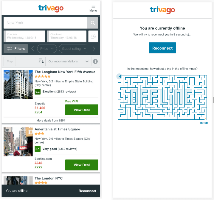
Similarly, an ‘offline state’ needs more than just errormessages or progress bars. Clever ways to engage a userwhile they wait for the network to come back (whichmight only take a few seconds) can make all the difference to how smooth and enjoyable an experience feels.For example trivago, the price comparison site, now letsyou play a game if the network goes down; and they’vefound that 67% of users whose internet connection is interrupted still come back to browse.
The key thing to remember is that it’s vital to replace aloading spinner with something relevant, rather than justa gray box. Skeleton screens are a neat way to show theuser that something is coming, and patterns like the one below can hack the user’s perception, convincing themthat pages are loading faster. But as soon as the contentis available, we need to see it: displaying critical content first ensures that the user sees progress. Youtube,for instance, always makes sure the video loads first;everything else is secondary:
Inform the user of changes
You might need to notify a user for all sorts of reasons:changes in network connection, updates to the site orthe content, price changes in an e-commerce store.Take a look at the examples below:
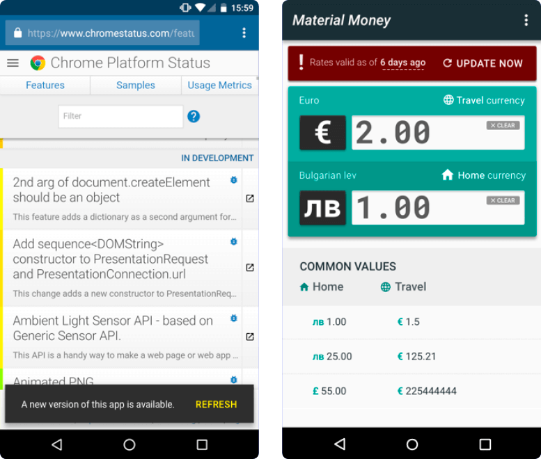
Use Metaphors That Convey Meaning
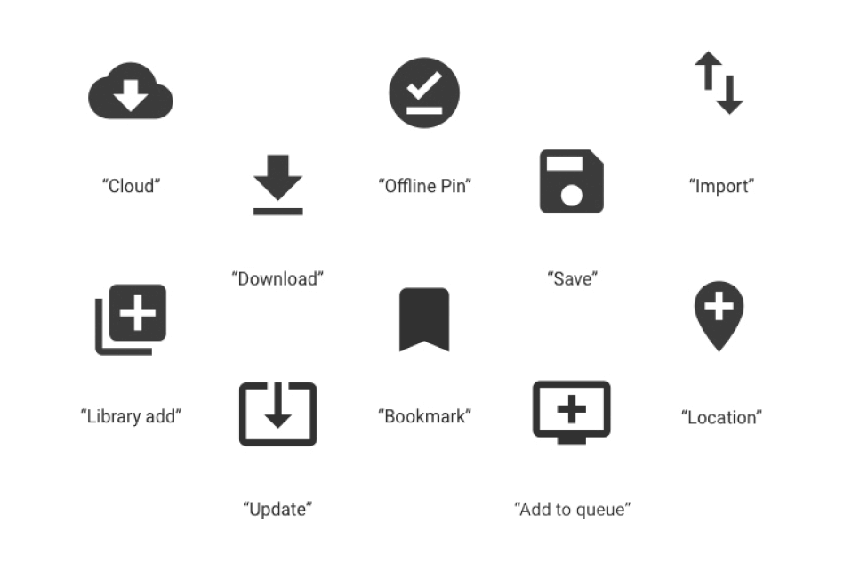
PWA experiences are relatively new, so it’s importantthat the terminology and imagery informs rather thanconfuses the user. Icons alone can be problematic, meaning different things to different people. For example,a floppy disc symbol for ‘save’ might make sense to anOn the left, Chrome status notifies the user to get the latestversion; on the right, Material Money informs the user when thecurrency rates need updating.Progressive Web Apps:the future of the mobile web27older generation but mean nothing to younger people.Likewise, the 'hamburger' menu icon has been known toconfuse users.
Consider how to demonstrate the action you are tryingto convey, rather than presenting the user with an abstract concept. For instance, if your apps require the userto choose which data needs to be synced in case of flakynetworks, asking them to save or download data wouldbe a good prompt.
Example: Material Design Icons that convey meaning.
Design For All Your Users
Developing a PWA demonstrates that a company is prioritizing their users’ time, delivering faster loads and moreengaging functionality. Progressive PWA features shouldtherefore accentuate the experience, not distract fromit. Before deciding which features to add, ask yourselfwhy a user is coming to your site: a well-designed PWAshould make it easier for users to complete their goals.
Below are the top PWA UX best practices:
Less is More - Online, people tend to scan rather thanreading in detail, and prefer not to sift through too muchinformation. If an element on your site has a low ClickThrough Rate (CTR), it’s possible your users can’t see itsvalue or relevance. To address this, prioritize the primaryCall-To-Action (CTA) and remove elements with low engagement, which in turn will reduce your page weight.Have a clear and memorable value proposition in a prominent position. Avoid automatic sliders.
Be Consistent - Ensure fonts, media, and images havea consistent look and feel and contribute to the overallProgressive Web Apps:the future of the mobile web28brand strategy. Retrieve custom fonts on subsequent loads and use device fonts whenever possible.
Perceived performance - Let the user know that they’remaking progress by loading skeleton screens and usingtransition animations. This should help reduce bouncerate and encourage users to wait to continue their journey (or return if a connection is interrupted).
Navigation - Keep the navigation simple, fast, and at the bottom of the viewport, making it easier for users to findtheir way around and return home when needed.
Reduce Friction - Make procedures as smooth as possible.Users tend to have very little patience when tasked withcompleting forms and finalizing the checkout process.
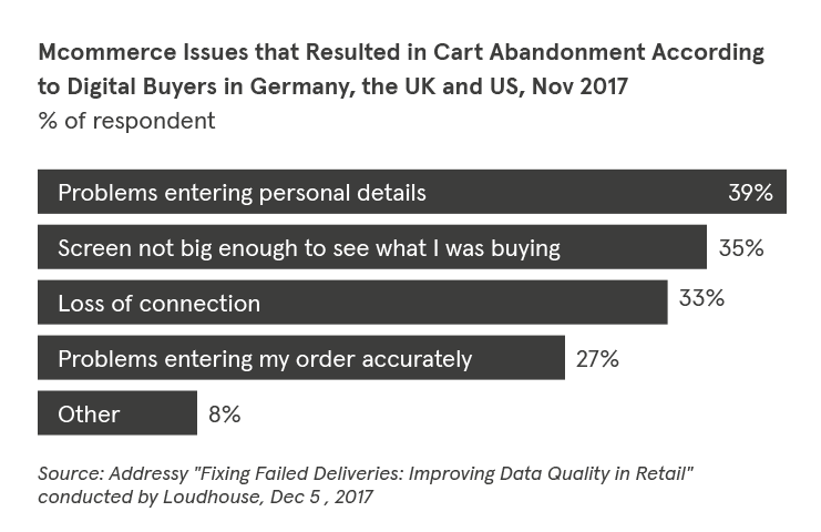
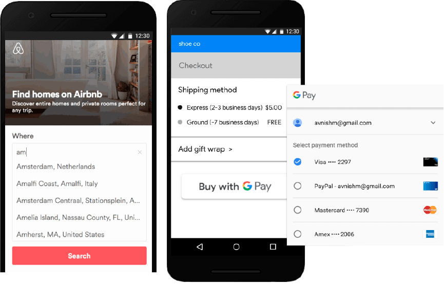
In fact, the most common reason for a user abandoninga cart while shopping on mobile is "problems enteringpersonal details” (see chart below). use expresscheckout solutions like Autofill, Web Payments and One tap sign-in to collate everything a user needs at checkout, while keeping information safe and secure.
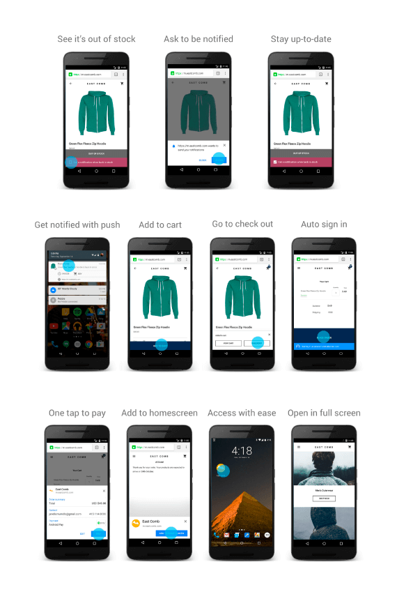
Push Notifications - Push notifications can increase user engagement, but they carry more impact if delivered at the right time. Don’t force the user to opt in on the ho - mepage - imagine walking into a store and immediately being asked by an assistant if you want to be kept up - dated in future. But if you’re trying something on, and someone politely asks if you’d like to know when it be - comes available in the right size, you’re far more likely to say yes. When push notifications add real value, users are far more likely to opt in.
Accessibility - When we say a site is accessible, we mean that the content is available to all, and can be operated by absolutely anybody. Web Content Accessibility Guide - lines (WCAG) 2.0 is a set of best practices put together by experts to address exactly what "accessibility" means, and how to deliver it.
WCAG is organized around four principles, often refe - rred to as POUR:
- Perceivable: Can users perceive the content? Just because something is perceivable with one sense, such as sight, that doesn't mean that all users can experience it. Progressive Web Apps: the future of the mobile web 30
- Operable: Can users navigate the content? A hover interaction, for instance, cannot be operated by someone who can't use a mouse or touch screen.
- Understandable: Can users understand the content? Is the interface clear, and consistent enough to avoid confusion?
- Robust: Can the content be consumed by a wide variety of user agents (browsers)? Does it work with assistive technology?
Post PWA Launch
Congratulations on taking advantage of this revolutionary technology and upgrading your systems to a best-inclass web experience.
Once a PWA is live, it’s important to track user engagement, monitor impact, and iterate the UX as needed. There are several tools and techniques available to help you with this:
Performance - After launching a PWA it is common to see improvements in site speed. Monitor First Contentful Paint (FCP), Time to Interactive (TTI), and Speed Index, continually auditing your PWA experience with Lighthouse, Chrome User Experience Report, and WebPageTest.org. Test the PWA experience across different network conditions and on various hardware devices.
New Acquisitions - Check bounce rate to see if improved performance, transition animations, and skeleton screens are actually keeping the user on the page.
User Engagement - Confirm that PWA features like Add to Homescreen and Web Push are improving user engagement. For Add to Homescreen, use metrics like time on site and repeat visits to compare those who launch from the homescreen vs. those who come through the browser. For Web Push, track CTR for different notifications and again, use time on site and repeat visits to compare those who received notifications vs. those that did not. The engagement metrics for any feature should demonstrate a trend towards a higher conversion rate overall.
Conversions - For most organizations, increasing conversions is one of the main reasons they’ve invested in building a PWA - so they’ll want to know it’s working. Retailers can track conversions by monitoring Average Order Value (AOV) and the exit rate on the page where the checkout funnel begins. Lead generation companies should focus on CTR of the primary Call-To-Action button and the lead to close ratio (successful sales / number of leads * 100). Travel sites can monitor return sessions (customer retention) and channel-specific traffic (i.e. are social shares increasing?).
Case Studies.
Lancôme
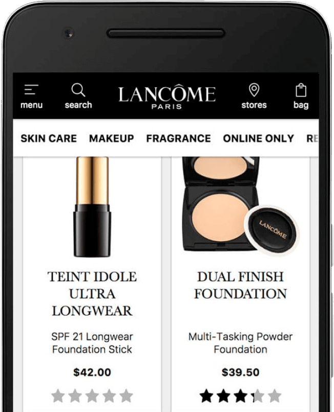
In 2016, Lancôme saw mobile traffic eclipse desktop for the first time. But despite a growing number of mobile site visitors, mobile conversion rate was only 15%, compared to 38% on desktop. Lancôme considered building an app, but decided that their shoppers wouldn’t return to an e-commerce app weekly, let alone daily. So instead they looked to PWA technologies for a web solution that provided an immersive, app-like experience.
With the new PWA, Time to Interactive fell by 84%, with a corresponding 15% decrease in bounce rates. Lancôme saw their mobile sessions rise by more than 50%, and conversions increase by 17%. On Android devices, they took advantage of re-engagement strategies like push notifications, which became very popular: Over 18,000 shoppers have signed up for alerts since the PWA launched in October 2016.
trivago
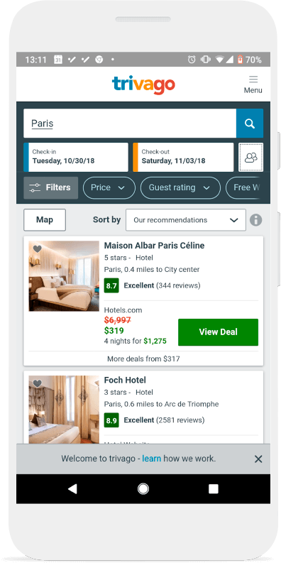
As one of the world’s leading hotel search engines, trivago has a history of innovation. They are always on the lookout for new disruptive solutions, so developing a PWA was a natural next step. Currently their PWA-evolved website is available in 33 languages, across 55 countries, and they report that features like offline access, push notifications and add to homescreen are particularly valuable to their users:
“Just as we now no longer accept websites constantly reloading while we browse for fresh content, mobile users who experience the seamlessness of PWAs will quickly come to expect sites to just work, regardless of flaky wifi or poor mobile reception,” says Tom Dwyer, Project Lead for PWA and Front-End Developer at trivago.
BMW
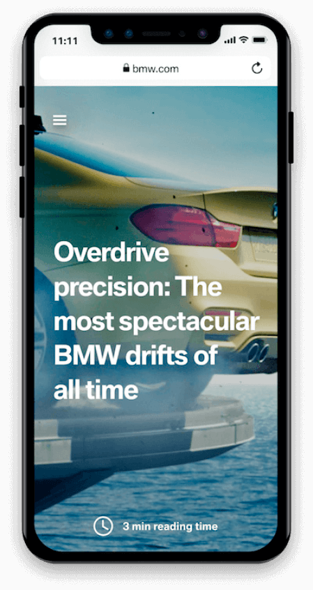
Since 1916, BMW has epitomized quality, style, innovation, and performance. So, when its digital team decided to refresh BMW.com, they had clear expectations as to how it should work, look, and feel. Their agency, Jung von Matt, completely relaunched the site using a PWA shell and all-AMP content. Development took about six months and launched in fall 2017, dramatically increasing performance with colorful, informative, fast-loading article pages.
“Right from the start, our goal was to attract new car enthusiasts with highly-engaging content—and in a way that tangibly reflected our vehicles. To do that, we needed the brand’s new digital home to become a data-driven content platform, built around high-performance technologies like AMP and PWA,” says Joerg Poggenpohl, Global Head of Digital Marketing BMW.
Nikkei
With a publishing history of more than 140 years, Nikkei is one of the most authoritative media businesses in Japan. Along with their traditional print newspaper, they have over 450 million monthly visits to their digital properties. To provide a better user experience and accelerate their business on the web, Nikkei successfully launched a Progressive Web App (PWA) in November 2017. They’re now seeing amazing results from the new platform.
Their Lighthouse score soared from 23 to 82. Their time-to-interactive measurement improved by 14 seconds. Organic traffic, speed, conversion rate, and active daily users all rose as well.

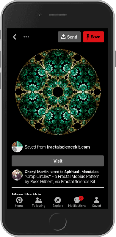
Pinterest historically invested a lot in its iOS and Android apps while the mobile web experience was far from perfect. One year ago (July, 2017) they have brought a team together to rewrite their mobile website from scratch as a PWA. This was the culmination of several years of conversation, months of metrics investigation and one large hypothesis: mobile web can be as good as a native app. And they’ve created a true PWA that supports an app shell, add to homescreen, push notifications, asset caching but also right-to-left languages and even a “night mode”.
And they’ve seen great results across the board. Weekly active users on mobile web have increased 103% year-over-year overall, with a 156% increase in Brazil and 312% increase in India - emerging mobile-first markets. On the engagement side, session length increased by 296%, the number of Pins seen increased by 401% and people were 295% more likely to save a Pin to a board. Logins increased by 370% and new signups increased by 843% year-over-year.
Since they’ve shipped the new experience, mobile web has become the top platform for new signups. And in less than 6 months since fully shipping they already had 800 thousand weekly users using our PWA like a native app (from their homescreen).
More case studies available at:
Afterword
So there you have it: a step-by-step guide to how PWAs have evolved from existing technologies to create seamless native-app like experiences on the web, that work regardless of operating system. Hopefully this guide has given you a good idea of why they are called Progressive Web Apps, how to build and deliver one for your business, and the best practices to employ to keep your users happy, engaged, and online.
Thanks for reading.
Resources: Checklist, Tools, Userful Links
Checklist
Resources
- HTTPArchive Data on PWAs
- PWA Stats by Cloud Four
- Introduction to Service Workers
- Javascript Promises: An Introduction
- Is Service Worker Ready?
- Designing a Progressive Web App icon
- Hacking user perception to make your websites and apps feel faster
- Google Codelab for building Progressive Web Apps
- Mozilla ServiceWorker Cookbook
- Details on the support for ServiceWorkers and WebManifest in Apple Safari/Webkit
- PWA on Windows 10
Tools
- Lighthouse - An open-source, automated tool for improving the quality of web experiences that can be run against any web page, whether public or requiring authentication. It has audits for performance, accessibility, progressive web apps, and more.
- PWA Builder - An open source project by Microsoft that allows you to pre-seed a manifest from an existing URL and create a ServiceWorker for you. The technology delivers both a PWA and fallbacks for any instances where PWA is not supported.
- Workbox - A set of libraries and Node modules that make it easy to cache assets and allow you to take full advantage of the various features used to build Progressive Web Apps.
Mobile Excellences
Getting the fundamentals of mobile sites right is critical, to stay ahead of consumer needs it’s important to lay the groundwork for high performing mobile experiences now.
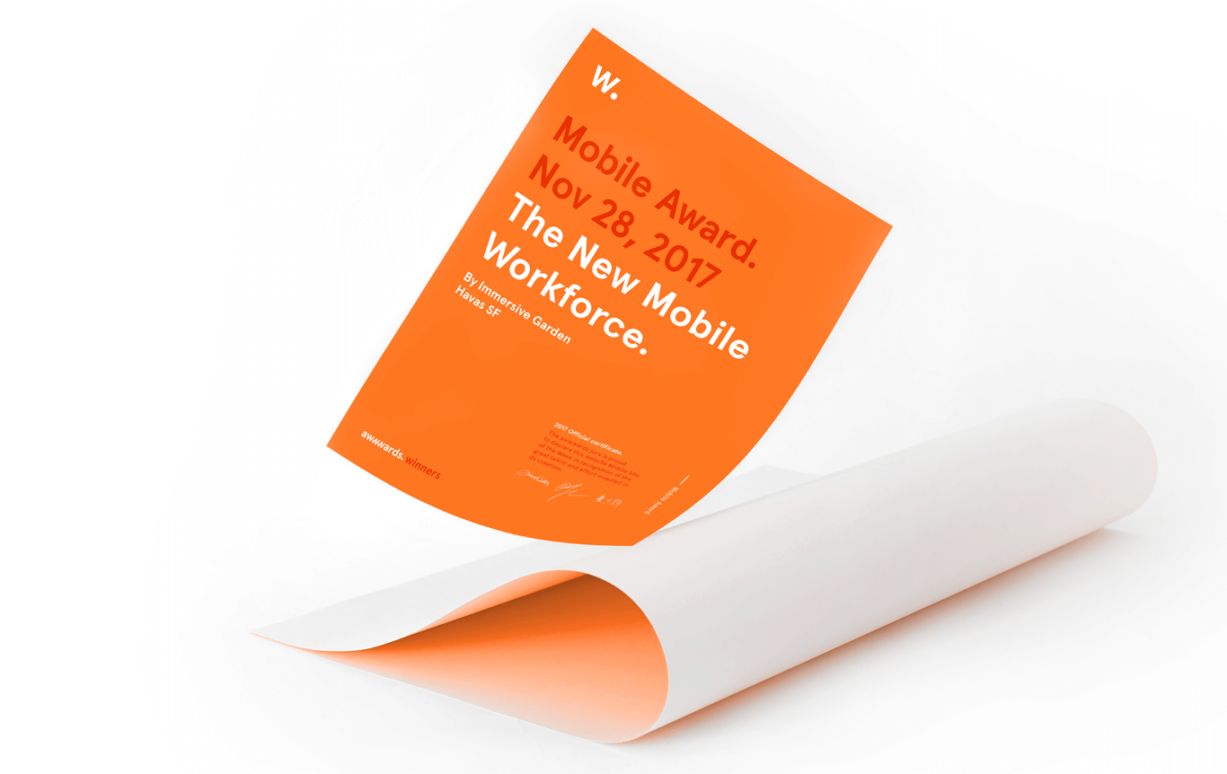
Awwwards.com in collaboration with Google has created this Award for recognizing and rewarding best practices in mobile site design. The process of obtaining a Mobile Excellence Badge is simple and transparent. In order to win the award you must meet the optimization criteria established by Google and Awwwards, which you can see here in these Guidelines.
The Mobile Excellence Award celebrates sites that puts users first, whilst bridging great design with pure performance. It recognizes hard work and aims to raise the standards of the mobile web, allowing people to have a superior experience anytime, anywhere.
Videos
PWAs: Building Bridges to Mobile, Desktop, and Native (Google I/O '18)
Progressive Web Apps (PWAs) enable fast, integrated, reliable, and engaging web experiences. Come and learn how browser vendors are enabling developers to use the web to build installable desktop applications and store-distributed mobile apps, as well as how Google is launching its own PWAs at scale.
Kickstarting Your Journey to Progressive Web Apps (Chrome Dev Summit 2017)
The web is now an even more exciting place to develop, but you may be confused by the changes and not know where to start. In this video, Ewa Gasperowicz covers how to take a web site and turn it into to a Progressive Web App experience, discusses starting points, process, options and tools, and teaches about caveats of PWA development and their solutions.
From Website to Progressive Web App (GDD Europe '17)
In this video, you'll learn where to start with Progressive Web Apps, what to implement, and how to prioritize PWA techniques. You'll also learn how to make the most of 'low hanging fruit' and take advantage of small changes that can have a big impact.
UX Research and Usability Testing: Designer vs. Developer
In this episode, Jenny Gove explains the importance of research and usability testing and discusses various methods and approaches such as conducting a pilot study, identifying target users, and setting up tasks.
Special thanks to:
“Craig Adolph – EMEA mWeb Product Lead at Google for coordinating all these authors:
Jenny Gove – Senior Staff UX Researcher at Google
Chris Heilmann – Developer Evangelist at Microsoft
Sam Dutton, Developer Advocate – Developer Advocate at Google
Sarah Clark – Program Manager, Developer Relations Infrastructure at Google
Mustafa Kurtuldu – Senior Design Advocate at Google
Ryan Warrender - Mobile UX Manager at Google
Shane Cassells - EMEA mWeb Ecosystem Lead at Google
Olga Demidova - EMEA mWeb Marketing Manager


